 CSSでお寿司を作ってみる
CSS3を使用した表現の練習に、様々なお寿司を作成してみました。
HTMLとCSSの全文はこちらになります。
https://codepen.io/maruzou/pen/JeQVGm
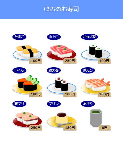
 メニューは馴染みのある9品としました。
下記画像はChromeで確認時のキャプチャになります。
HTML
リスト sushi_list 配下にある li タグがお皿を含んだ個々のお寿司になります。
li タグのクラスを変える事により、お寿司が変更できる様に作成しました。
<ol class="sushi_list">
  <li class="tamago">
    <div class="name">たまご</div>
    <div class="neta">
      <div><span></span></div>
      <div><span></span></div>
    </div>
    <div class="price">100円</div>
  </li>
</ol>
CSS
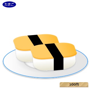
全てを張ると長くなってしまう為、たまごの設定を抜き出しました。
各パーツのサイズ指定は可能な限り%を使用し、状況に合わせてサイズ変更をしやすい様にしました。
タグを少なくする為に、疑似クラス :before と :after を多用しています。
.sushi_list{
  margin: 0 auto;
}
.sushi_list li{
  position: relative;
  display: inline-block;
  margin: 0 5px 10px;
  width: 100px; /* ここを変えると、お寿司のサイズが変更できます */
  height: 100px; /* ここを変えると、お寿司のサイズが変更できます */
}

/* 商品名 */
.sushi_list li .name{
  position: absolute;
  top: 0;
  left: 0;
  padding: 5px 7px;
  color: #fff;
  background: #009;
  box-shadow: 0 1px 1px 0 rgba(0,0,0,.3);
  border-radius: 50% 50%;
  font-size: .6875rem;
}

/* 値札 */
.sushi_list li .price{
  position: absolute;
  bottom: 0;
  right: 0;
  padding: 3px 5px;
  min-width: 30%;
  background: #cbac73;
  background: linear-gradient(135deg, #cbac73 7%, #e2c48d 13%, #cbac73 13%, #cbac73 13%, #cbac73 26%, #e2c48d 38%, #cbac73 38%, #e2c48d 38%, #cbac73 38%, #e2c48d 60%, #cbac73 60%, #cbac73 60%, #e2c48d 75%, #cbac73 75%, #e2c48d 92%, #cbac73 92%);
  box-shadow: 0 -1px 0 0 #b48040 inset, 0 1px 1px 0 rgba(0,0,0,.3);
  border-radius: 5px 5px 0 0;
  font-size: .6875rem;
  font-weight: bold;
  color: #000;
}

/* お皿 */
.tamago:before{
  position: absolute;
  top: 50%;
  left: 0;
  content: '';
  width: 100%;
  height: 40%;
  background: radial-gradient(ellipse at center, rgba(255,255,255,.35) 0%, rgba(255,255,255,.35) 32%, rgba(0,0,0,.15) 35%, rgba(0,0,0,.05) 37%, rgba(0,0,0,0) 50%, rgba(0,0,0,0) 100%), linear-gradient(to right, #fff 0%, #e5e5e5 60%);
  border: solid 1px #fff;
  box-shadow: 0 0 0 2px #3399ff inset, 0 2px 3px 0 rgba(0,0,0,.3);
  border-radius: 50% 50%;
  box-sizing: border-box;
}

/* シャリ奥 */
.tamago .neta div{
  position: absolute;
  top: 40%;
  left: 15%;
  width: 50%;
  height: 30%;
  transform: rotate(-5deg);
  background: #fff;
  background: linear-gradient(to bottom, #fff 0%, #fff 60%, #e5e2cf 100%);
  border: dashed 1px #ccc;
  box-shadow: 0 3px 3px 0 rgba(0,0,0,.1);
  border-radius: 30%;
  box-sizing: border-box;
}
/* シャリ手前 */
.tamago .neta div + div{
  top: 50%;
  left: inherit;
  right: 15%;
}

/* たまご焼き */
.tamago .neta div:before{
  position: absolute;
  top: -5%;
  left: -2%;
  content: '';
  width: 104%;
  height: 60%;
  transform: skewX(15deg);
  background: #fc6;
  background: linear-gradient(to right, #fc6 0%, #fc6 60%, #ffbb33 100%);
  box-shadow: 0 1px 5px 0 rgba(255,255,255,.15) inset,0 -4px 1px 0 rgba(255,153,0,.5) inset, -1px 2px 2px 0 rgba(0,0,0,.1);
  border-radius: 30% 30% 25% 25%;
}

/* 海苔上 */
.tamago .neta span:before{
  position: absolute;
  top: -5%;
  left: 40%;
  content: '';
  display: block;
  width: 23%;
  height: 59%;
  transform: skewX(28deg);
  background: #000;
}

/* 海苔横 */
.tamago .neta span:after{
  position: absolute;
  top: 53%;
  left: 48%;
  content: '';
  display: block;
  width: 23%;
  height: 50%;
  transform: skewX(-5deg);
  background: #000;
}
 苦労した点
苦労した点
限られた疑似クラスをどう使ってパーツを作るか悩みました。
また、お寿司のサイズが小さく、目視では各パーツの位置調整が難しかったです。
作成している最中は、一時的に .sushi_list li のサイズ指定を大きくして調整を行いました。
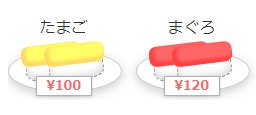
▼width:300px; height:300px;にした時の見た目
 今回の参考サイト
「CSSでいろんなカタチを表現してみる」
https://morobrand.net/mororeco/css/css-shape/
「CSS3リファレンス」
http://www.htmq.com/css3/
「Ultimate CSS Gradient Generator」
http://www.colorzilla.com/gradient-editor/
おまけ
習作1: 角丸長方形を置いただけの状態でした
習作2: 少し作り込み、形になってきました