Excelデータから指定列の組合せをグラフ化
テストデータ
Test.xlsxの内容
| A1 | B1 | C1 | A2 | B2 | C2 |
|---|---|---|---|---|---|
| 1 | 3.3 | 15 | 0.5 | 3.6 | 25 |
| 2 | 3.4 | 18 | 1 | 3.5 | 30 |
| 3 | 3.6 | 20 | 2 | 3.4 | 40 |
| 4 | 3.7 | 25 | 4 | 3.7 | 42 |
| 5 | 3.8 | 28 | 5 | 3.8 | 44 |
| 6 | 3.9 | 30 | 6 | 3.9 | 45 |
| 7 | 4 | 35 | 7 | 4.1 | 48 |
| 8 | 4.1 | 38 | 9 | 4.15 | 50 |
| 9 | 4.2 | 40 | 9.5 | 4.2 | 52 |
| 10 | 4.2 | 42 | 10 | 4.17 | 53 |
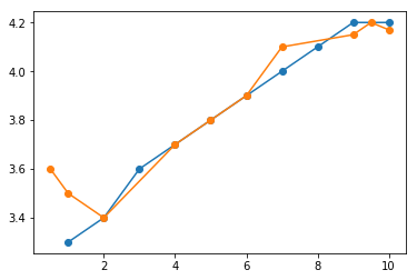
1.2グループのデータ(A1-B1とA2-B2)を1つのグラフにする
import pandas as pd
import matplotlib.pyplot as plt

df= pd.read_excel('Test.xlsx', sheet_name='Sheet1', usecols=[0,1,3,4],header=0)

fig = plt.figure()
ax = fig.add_subplot(1,1,1)

ax.plot('A1', 'B1', data=df, label='No 1', marker='o')
ax.plot('A2', 'B2', data=df, label='No 2', marker='o')

plt.show()
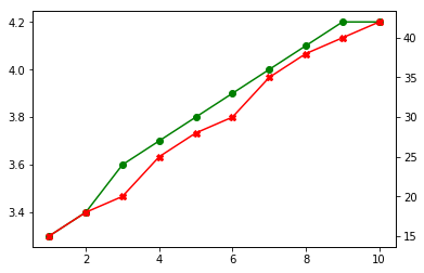
2.2軸(A1-B1とA1-C1)のあるグラフ
import pandas as pd
import matplotlib.pyplot as plt

df= pd.read_excel('Test.xlsx', sheet_name='Sheet1', usecols=[0,1,2] ,header=0)

fig = plt.figure()
ax = fig.add_subplot(1,1,1)

ax.plot('A1', 'B1', data=df, label='B1', marker='o',color="g")
ax1 = ax.twinx()
ax1.plot('A1', 'C1', data=df, label='C1', marker='X',color="r")
plt.show()