最近Gatsbyを使って勉強をしてみています。
Reactを素で使うよりもとっかかりやすく、StarterやPluginの充実、GraphQLの標準装備と個人的には学習コストが少ないし、Reactを最初にやるには良いんじゃないかなとは思ってます。
今回は、Gatsbyを使ってページにモーダルウィンドウの機能を実装するために使えるreact-modalをGatsbyで使う場合に結構ハマってしまったので、備忘録を兼ねてメモです。
react-modalのセットアップ
react-modalの初期設定は簡単です。
npmなりyarnなどを使ってreact-modalをインストールすればOKです。
npm install react-modal
react-modalを使う(1ページに1つのモーダルのみを表示する場合)
まずはシンプルに1ページに1つのモーダルだけを表示する場合です。
例としてmodal-simple.jsというページで設定したとすると以下のようなコードになります。
import React from "react"
import Modal from "react-modal";

// react-modalの初期設定
// root nodeのSelectorを設定
Modal.setAppElement("#___gatsby");
// react-modalのデザインを設定修正する場合の例
Modal.defaultStyles.overlay.backgroundColor = "black";

const ModalSingle = () => {

  //モーダルの表示状態と切り替える為にState(props)を準備
  const [modalIsOpen, setIsOpen] = React.useState(false);

  // shouldCloseOnEscやshouldCloseOnOverlayCloseを使う場合に設定が必要
  const handleCloseModal = () => {
    setIsOpen(false)
  }

  return(
    <div>
      <div className="container">
        ここにモーダルを表示します。
        <button className="button" onClick={() => setIsOpen(true)}>ボタン</button>
      </div>
      <Modal
        isOpen={modalIsOpen}
        onRequestClose={() => handleCloseModal()}
        shouldCloseOnEsc={true}
        shouldCloseOnOverlayClick={true}
      >
        <div>モーダルの表示内容です。</div>
      </Modal>
    </div>
  )
}

export default ModalSingle
これで以下のようなモーダル表示をするためのボタンと、モーダル表示がされるはずです。

ポイントはGatsbyでは明確にprops等が通常見えないので…
React.useState()を使ってステータス管理用のpropsを準備してます。
また、shouldCloseOnEscなどを使いたい場合は、onRequestCloseの定義も必要です。
そこを設定しないと機能しないので気をつけてください。
onRequestClose - react-modal documentation
応用編:1ページに複数モーダルを表示したい場合
上の設定だと1ページに1つのモーダルなら良いのですが、複数だとうまく出来ません。
複数のモーダルの表示を切り替え分けたい場合は、ステータス管理を少し調整するコツが必要です。
import React from "react"
import Modal from "react-modal";
// react-modalの初期設定
// root nodeのSelectorを設定
Modal.setAppElement("#___gatsby");
const ModalMultiple = () => {
// モーダルの表示状態と切り替える為にState(props)を準備
// false = 非表示、数値 = 表示しているModalの番目とする
const [modalIsOpen, setIsOpen] = React.useState(false);
//どのモーダルを表示するのか操作するために関数を準備
const handleOpenModal = (num) => {
setIsOpen(num)
}
// shouldCloseOnEscやshouldCloseOnOverlayCliceを使う場合に設定が必要
// モーダルを非表示の状態にするため、falseを指定する
const handleCloseModal = () => {
setIsOpen(false)
}
return(
<div>
<div className="container">
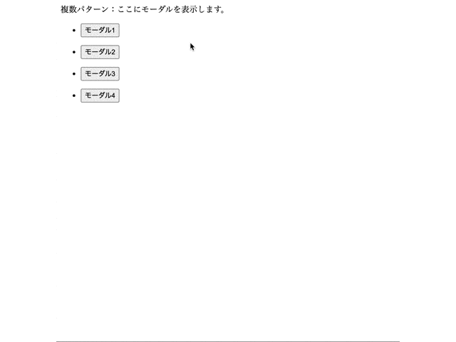
パターン2:ここにモーダルを表示します。
<ul>
<li><button className="button" onClick={() => handleOpenModal(0)}>モーダル1</button></li>
</ul>
<ul>
<li><button className="button" onClick={() => handleOpenModal(1)}>モーダル2</button></li>
</ul>
<ul>
<li><button className="button" onClick={() => handleOpenModal(2)}>モーダル3</button></li>
</ul>
<ul>
<li><button className="button" onClick={() => handleOpenModal(3)}>モーダル4</button></li>
</ul>
</div>
<Modal
isOpen={(modalIsOpen === 0)}
onRequestClose={() => handleCloseModal()}
shouldCloseOnEsc={true}
shouldCloseOnOverlayClick={true}
>
<div>モーダル1の表示内容です。</div>
</Modal>
<Modal
isOpen={(modalIsOpen === 1)}
onRequestClose={() => handleCloseModal()}
shouldCloseOnEsc={true}
shouldCloseOnOverlayClick={true}
>
<div>モーダル2の表示内容です。</div>
</Modal>
<Modal
isOpen={(modalIsOpen === 2)}
onRequestClose={() => handleCloseModal()}
shouldCloseOnEsc={true}
shouldCloseOnOverlayClick={true}
>
<div>モーダル3の表示内容です。</div>
</Modal>
<Modal
isOpen={(modalIsOpen === 3)}
onRequestClose={() => handleCloseModal()}
shouldCloseOnEsc={true}
shouldCloseOnOverlayClick={true}
>
<div>モーダル4の表示内容です。</div>
</Modal>
</div>
)
}
export default ModalMultiple
で定義するisOpenの状態を数値にしてしまえば、その値が合致した時だけ表示されます。
各Modalの表示条件をModalIsOpenの値で条件て設定し、表示制御する関数(今回はhandleOpenModal())を使って制御をすれば動きます。
今回はOnClick要素でOpenしたいモーダルのID(0−3)を指定すれば開くように設定しています。
実際に今回動作を組んでみたサンプルコードをgithubにあげてますので、参考までに。
manji6/gatsby-modal: Gatsby で react-modalを使うサンプル
これがモーダル複数バージョンのサンプルコード
gatsby-modal/modal-multiple.js at main · manji6/gatsby-modal