0. 前書き
今回の記事は「SE入門編」シリーズの一部です。完全版はこちらにあります:
今回の記事のソースはGithubにアップロードしております:
1. 前提条件
今回の記事は【番外編】となっており、HTMLとJQueryの知識があれば十分です。
ただし、既に本編で構築されたソースの上に、表示エリアを動的に設定したため、興味をお持ちの方は本編から着手してください。
2. 今回の記事で出来たこと
・WEBブラウザの判定
・WEBブラウザのサイズ変更に応じて表示エリアを動的に変更する機能が実装されています。
(今回はメニューエリアとコンテンツエリアの表示高さを動的に変更する)
・現時点ではChromeとEdgeのみが実装および検証されており、他のブラウザに関しては各自で実装してください。
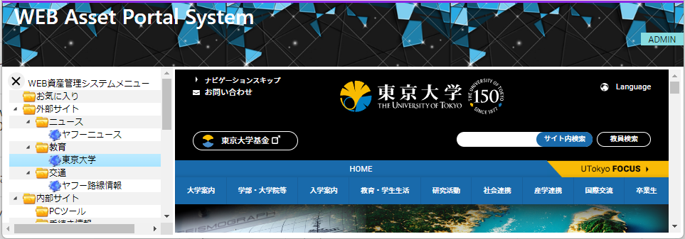
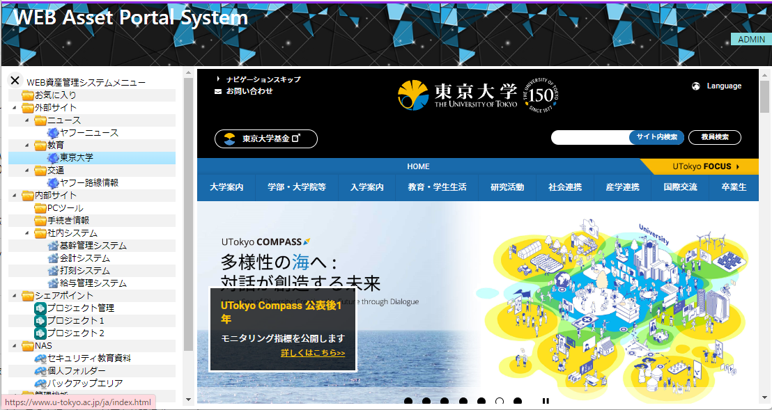
効果(分かりやすくように、コンテンツエリアに東京大学のHPを表示しております):
狭い高さの場合(メニューエリアとコンテンツエリアが上下スクロールバー表示する):
普通の高さ(メニューエリアとコンテンツエリアが上下スクロールバー表示する):
もっと高く調整(メニューエリアに上下スクロールバーがない、コンテンツエリアが上下スクロールバー表示する):

3. 実装
- CSS:初期値(高さ:600px)
.LayoutContents {
	height: 600px;
}
- HTML:メニューエリアのClassにLayoutContentsを設定する
	<nav class="LayoutLeft LayoutContents col-xl-3" id="menu" style="display: true;">
		<iframe class="w-100 h-100" src="/menu"></iframe>
	</nav>
- HTML:コンテンツエリアのClassにLayoutContentsを設定する
	<div class="LayoutLeft LayoutContents text-center col-xl-9" id="container" >
		<iframe id="test" class="w-100 h-100" style="padding: 5px;"  is="x-frame-bypass" src="/blank"></iframe>
	</div>
- JS:ブラウザ情報を確認:ブラウザごとに表示サイズの取得方法が違うため、まずはブラウザ情報を確認する。
	var userBrowser = "chrome";

    var userAgent = window.navigator.userAgent.toLowerCase();

    // ブラウザ情報を確認
    if (userAgent.indexOf('safari') != -1 && userAgent.indexOf('chrome') === -1 && userAgent.indexOf('edge') === -1 && userAgent.indexOf('edg') === -1){ // ブラウザがSafariの場合
    	userBrowser = "safari";
    } else if (userAgent.indexOf('chrome') != -1 && userAgent.indexOf('edge') === -1 && userAgent.indexOf('edg') === -1){ // ブラウザがchromeの場合
    	userBrowser = "chrome";
    } else if(userAgent.indexOf("edg") != -1 || userAgent.indexOf("edge") != -1) { //ブラウザがEdgeの場合
    	userBrowser = "Edge";
    } else if(userAgent.indexOf('msie') != -1 || userAgent.indexOf('trident') != -1) { //ブラウザがIEの場合
    	userBrowser = "IE";
    }
- JS:高さを調整するFunctionを実装する:
chromeとEdgeだけ実装済みです。safariは未確認ですが、IEの場合はthis.innerHeight使えないようです。
※表示幅はBootstrapをつかっているため、既に動的になってます。
    var contentsHeight = 600; // 初期値
	function resizeContents(){
        if(userBrowser == "safari") {

        } else if(userBrowser == "chrome" || userBrowser == "Edge") {
        	contentsHeight = this.innerHeight  - 120 - 10; // 120 : Banner ; 10 : Margin
	        console.log(`contentsHeight:${contentsHeight}`);
        } else if(userBrowser == "IE") {

        }
    	$(".LayoutContents").css('height', contentsHeight + 'px');
	}
- JS:表示エリアのサイズを動的に変更するため、以下の2つイベントにからresizeContents()を呼び出す:
画面をロードする時のイベント:$(window).on("load");
画面サイズ変更する時のイベント:$(window).resize();
	    $(window).on("load", function () {
	    	resizeContents();
	    });

	    $(window).resize(function() {
	    	resizeContents();
	    });
完成
http://localhost:8000/login
を叩いて、ログイン成功したら、WEBブラウザの高さを調整しながら表示エリアの変化を確認してください。
おわりに
プロジェクト全体のソースコードはGitHubにアップロードしました、今回のソースはmain.htmlにあります、ぜひダウンロードして確認してください。
それではまた。