Form要素をcss3でデザインする
Form要素をcss3でデザインすると、入力や選択の操作性・選択肢の可読性がぐっと上がります。
先日Formのコーディングをしたので、何度も何度も調べて書いてきたコードをまとめてみました。
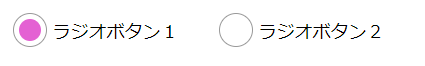
ラジオボタンとチェックボックス
ラジオボタンとチェックボックスは、丸・四角・チェックのすべてをbefore/after要素で作成します。

contact.html
<!--ラジオボタン-->
<input type="radio" name="01" id="01_01" checked="checked"><label for="01_01">ラジオボタン1</label>
<input type="radio" name="01" id="01_02"><label for="01_02">ラジオボタン2</label>

<!--チェックボックス-->
<input type="checkbox" name="02" id="02_01" checked="checked"><label for="02_01">チェックボックス1</label>
<input type="checkbox" name="02" id="02_02"><label for="02_02">チェックボックス2</label>
<input type="checkbox" name="02" id="02_03"><label for="02_03">チェックボックス3</label>
style.css
input[type=radio] ,
input[type=checkbox] {
	display: none;
}
input + label {
	display: inline-block;
	vertical-align: top;
	padding: 15px 40px;
	margin: 0;
	cursor: pointer;
	position: relative;
}
input + label:before {
    content: '';
    position: absolute;
    display: block;
	border: 1px solid #999;
	background-color: #fff;
}
input[type=radio] + label:before {
    top: 8px;
	left: 0;
	width: 34px;
	height: 34px;
	border-radius: 17px;
}
input[type=checkbox] + label:before {
    content: '';
    position: absolute;
    display: block;
    top: 12px;
	left: 0;
	width: 30px;
	height: 30px;
	border-radius: 4px;
	border: 1px solid #999;
	background-color: #fff;
}
input[type=checkbox]:checked + label:after {
    content: '';
    position: absolute;
    display: block;
    top: 14px;
	left: 8px;
	width: 14px;
	height: 22px;
    border-right: 6px solid #e462d3;
    border-bottom: 6px solid #e462d3;
    -webkit-transform: rotate(45deg);
    -ms-transform: rotate(45deg);
    transform: rotate(45deg);
}
input[type=radio]:checked + label:after {
    content: '';
    position: absolute;
    display: block;
    top: 14px;
	left: 6px;
	width: 22px;
	height: 22px;
	border-radius: 11px;
	background-color: #e462d3;
}
プルダウン、テキスト入力、テキストエリア

contact.html
<select name="" id="">
	<option value="">プルダウン</option>
	<option value="aaaaa">プルダウン1</option>
	<option value="bbbbb">プルダウン2</option>
	<option value="ccccc">プルダウン3</option>
</select>

<input type="text" class="input_address" name="" id="" value=""  placeholder="テキスト入力">

<textarea  placeholder="テキストエリアです。"></textarea>
style.css
select,
input[type=text] ,
textarea {
	border-radius: 4px;
	border: 1px solid #999;
	background-color: #fff;
	padding: 10px;
}
input[type=text] {
	width: 100%;
}
input[type=text].input_err {
	border: 1px solid #c44;
	background-color: #fdd;
}