はじめに
JavaScriptを使用してグラフを作成する例はネットを探せば見つかるのですが、VS Codeの拡張機能で作成する方法がわかりませんでした。グラフを作成するサンプルがないか VS Code Extension Samples を調べてみたのですが見つかりませんでした。が、 webview-sample という猫がコーディングをしている動画を表示するサンプルを見つけました。

このサンプルでやっていることは、内部的にHTMLを用意して、imgタグでGIFファイルを指定しているだけです(本当はもっといろいろやってます)。グラフを作るライブラリはいろいろあります。これをHTMLに埋め込むことでグラフを表示できそうです。本記事では、Chart.jsとGoogle Chartsを使ってグラフを表示していきます。
HTMLを表示してみる
まずは単純に"Hello, World"を表示するだけのHTMLを作ってみます。
最初にcreateWebviewPanelでパネルを作成し、パネルのwebview.htmでHTMLを指定します。
      let panel = vscode.window.createWebviewPanel(
        "sample",               // viewType: webview panelのID
        "sample-html",          // タイトル名
        vscode.ViewColumn.One,  // showOption: 1列で表示
      );

      panel.webview.html = `<!DOCTYPE html>
        <html>
        <head></head>
        <body>
        <h1>Hello, World!</h1>
        </body>
        </html>
      `;
ソースの全体は下記のようになります。
import * as vscode from "vscode";

export function activate(context: vscode.ExtensionContext) {
  console.log(
    'Congratulations, your extension "vscode-sample-html" is now active!'
  );

  let disposable = vscode.commands.registerCommand(
    "vscode-sample-html.helloWorld",
    () => {
      vscode.window.showInformationMessage(
        "Hello World from vscode-sample-html!"
      );

      let panel = vscode.window.createWebviewPanel(
        "sample",
        "sample-html",
        vscode.ViewColumn.One
      );

      panel.webview.html = `<!DOCTYPE html>
        <html>
        <head></head>
        <body>
        <h1>Hello, World!</h1>
        </body>
        </html>
      `;
    }
  );

  context.subscriptions.push(disposable);
}

export function deactivate() {}
実行してみます。画面に"Hello, World!"が表示されました!
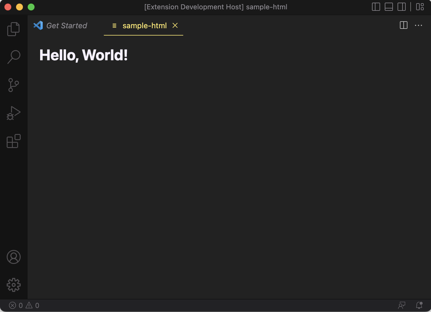
Chart.jsを使ってみる
次にChart.jsを使ってグラフを作成してみます。まずはChart.jsにあるサンプルをHTMLに埋め込んでみます。
      panel.webview.html = `<!DOCTYPE html>
	  <head>
		<html>
		  <meta charset="utf-8"/>
		  <body>
			Test Chart
			<canvas id="myChart" style="background-color: #FFF"></canvas>
			<script
              type="text/javascript"
              src="https://cdnjs.cloudflare.com/ajax/libs/Chart.js/3.2.0/chart.min.js">
            </script>
			<script type="text/javascript">
			  const ctx = document.getElementById("myChart");
			  const myChart = new Chart(ctx, {
				type: "bar",
				data: {
				  labels: ["Red", "Blue", "Yellow", "Green", "Purple", "Orange"],
				  datasets: [
					{
					  label: "# of Votes",
					  data: [12, 19, 3, 5, 2, 3],
					  backgroundColor: [
						"rgba(255, 99, 132, 0.2)",
						"rgba(54, 162, 235, 0.2)",
						"rgba(255, 206, 86, 0.2)",
						"rgba(75, 192, 192, 0.2)",
						"rgba(153, 102, 255, 0.2)",
						"rgba(255, 159, 64, 0.2)",
					  ],
					  borderColor: [
						"rgba(255, 99, 132, 1)",
						"rgba(54, 162, 235, 1)",
						"rgba(255, 206, 86, 1)",
						"rgba(75, 192, 192, 1)",
						"rgba(153, 102, 255, 1)",
						"rgba(255, 159, 64, 1)",
					  ],
					  borderWidth: 1,
					},
				  ],
				},
				options: {
				  scales: {
					y: {
					  beginAtZero: true,
					},
				  },
				},
			  });
			</script>
		  </body>
		</html>
	  </head>`;
実行してみると・・・グラフは表示されません。HTML内にあるJavaScriptを実行できるように、パネル作成時にオプションを指定する必要がありました。
      let panel = vscode.window.createWebviewPanel(
        "chart",
        "Chart",
        vscode.ViewColumn.One,
        {
          enableScripts: true,
        }
      );
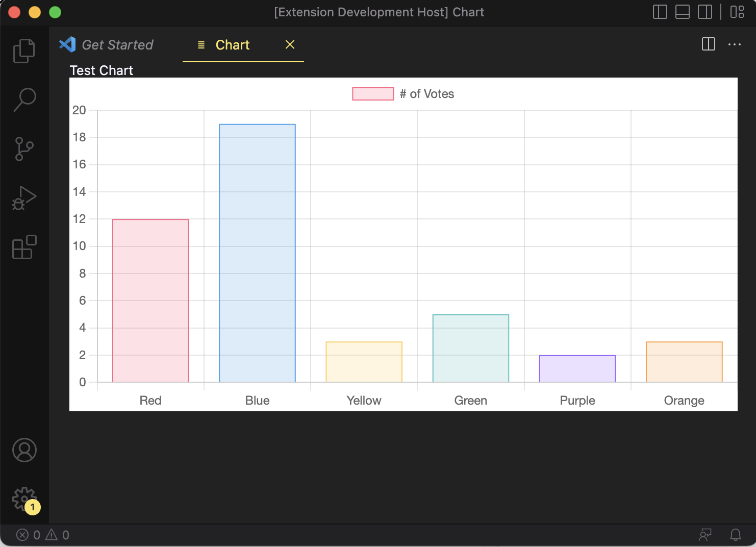
これを実行すると、下図のグラフが表示されました!

ただ、背景が黒だとグラフにあるグリッドが潰れてしまって見えません。canvasの背景色を白にして再度グラフを表示してみます。
<canvas id="myChart" style="background-color: #FFF"></canvas>
いい感じにグラフが表示できました!
データを変数で定義する
前の例ではグラフに表示するデータをHTMLに埋め込んでいます。これだと応用ができないので、データを変数で定義してみます。データの内容はHTML内で指定していたものと同じです。
      let chartConfig = {
        type: "bar",
        data: {
          labels: ["Red", "Blue", "Yellow", "Green", "Purple", "Orange"],
          datasets: [
            {
              label: "# of Votes",
              data: [12, 19, 3, 5, 2, 3],
              backgroundColor: [
                "rgba(255, 99, 132, 0.2)",
                "rgba(54, 162, 235, 0.2)",
                "rgba(255, 206, 86, 0.2)",
                "rgba(75, 192, 192, 0.2)",
                "rgba(153, 102, 255, 0.2)",
                "rgba(255, 159, 64, 0.2)",
              ],
              borderColor: [
                "rgba(255, 99, 132, 1)",
                "rgba(54, 162, 235, 1)",
                "rgba(255, 206, 86, 1)",
                "rgba(75, 192, 192, 1)",
                "rgba(153, 102, 255, 1)",
                "rgba(255, 159, 64, 1)",
              ],
              borderWidth: 1,
            },
          ],
        },
        options: {
          scales: {
            y: {
              beginAtZero: true,
            },
          },
          tooltips: {
            mode: "point",
          },
        },
      };
chartConfigをこのままHTMLに埋め込んでもデータとして認識されないため、JSON形式に変換しておく必要があります。オブジェクトからJSONへの変換はJSON.stringify()を使います。
      panel.webview.html = `<!DOCTYPE html>
        <head>
        <html>
          <meta charset="utf-8"/>
          <body>
          Test Chart
          <canvas id="myChart" style="background-color: #FFF"></canvas>
		  <script
            type="text/javascript"
            src="https://cdnjs.cloudflare.com/ajax/libs/Chart.js/3.2.0/chart.min.js">
          </script>
          <script type="text/javascript">
            const ctx = document.getElementById("myChart");
            const myChart = new Chart(ctx, ${JSON.stringify(chartConfig)});
          </script>
          </body>
        </html>
        </head>`;
変更したプログラムを実行すると先ほどと同じグラフが表示されます。つまり成功です。
ダウンロードしたChart.jsを使用してみる
上の例ではChart.jsを下記のように指定しています。これはHTMLロード時に外部のサイトからchart.jsをダウンロードすることを意味してます。つまりネットワークに接続していない環境ではグラフを表示することができません。
		  <script
            type="text/javascript"
            src="https://cdnjs.cloudflare.com/ajax/libs/Chart.js/3.2.0/chart.min.js">
          </script>
chart.jsをあらかじめダウンロードしておき、拡張機能に組み込んでみます。プロジェクトディレクトリで下記を実行するとchart.jsがダウンロードされます。-Dオプションをつけることで、package.jsonも更新してくれます。
$ npm -D install chart.js
ダウンロードされたchart.jsの場所を確認してみると、node_modules/chart.js/dist/chart.jsにあることがわかります。プログラム内から使用できるように、次のようにして内部ファイルのURIを取得します。
      let libPath = vscode.Uri.file(
        path.join(
          context.extensionPath,
          "node_modules",
          "chart.js",
          "dist",
          "chart.js"
        )
      );
      let scriptUri = panel.webview.asWebviewUri(libPath);
HTML作成時に、上記で取得した scriptUri を指定すればネットワークからダウンロードされなくなります。
      panel.webview.html = `<!DOCTYPE html>
        <head>
        <html>
          <meta charset="utf-8"/>
          <body>
          Test Chart
          <canvas id="myChart" style="background-color: #FFF"></canvas>
          <script type="text/javascript" src="${scriptUri}"></script>
          <script type="text/javascript">
            const ctx = document.getElementById("myChart");
            const myChart = new Chart(ctx, ${JSON.stringify(chartConfig)});
          </script>
          </body>
        </html>
        </head>`;
実行すると、前回と同じグラフが表示されます。
Chart.jsを使用したソースの全体は下記のようになります。
import * as vscode from "vscode";
import * as path from "path";

export function activate(context: vscode.ExtensionContext) {
  console.log('Congratulations, your extension "vscode-chart" is now active!');

  let disposable = vscode.commands.registerCommand(
    "vscode-chart.display",
    () => {
      let panel = vscode.window.createWebviewPanel(
        "chart",
        "Chart",
        vscode.ViewColumn.One,
        {
          enableScripts: true,
        }
      );

      let libPath = vscode.Uri.file(
        path.join(
          context.extensionPath,
          "node_modules",
          "chart.js",
          "dist",
          "chart.js"
        )
      );
      let scriptUri = panel.webview.asWebviewUri(libPath);

      let chartConfig = {
        type: "bar",
        data: {
          labels: ["Red", "Blue", "Yellow", "Green", "Purple", "Orange"],
          datasets: [
            {
              label: "# of Votes",
              data: [12, 19, 3, 5, 2, 3],
              backgroundColor: [
                "rgba(255, 99, 132, 0.2)",
                "rgba(54, 162, 235, 0.2)",
                "rgba(255, 206, 86, 0.2)",
                "rgba(75, 192, 192, 0.2)",
                "rgba(153, 102, 255, 0.2)",
                "rgba(255, 159, 64, 0.2)",
              ],
              borderColor: [
                "rgba(255, 99, 132, 1)",
                "rgba(54, 162, 235, 1)",
                "rgba(255, 206, 86, 1)",
                "rgba(75, 192, 192, 1)",
                "rgba(153, 102, 255, 1)",
                "rgba(255, 159, 64, 1)",
              ],
              borderWidth: 1,
            },
          ],
        },
        options: {
          scales: {
            y: {
              beginAtZero: true,
            },
          },
          tooltips: {
            mode: "point",
          },
        },
      };
      console.log(chartConfig);

      panel.webview.html = `<!DOCTYPE html>
        <head>
        <html>
          <meta charset="utf-8"/>
          <body>
          Test Chart
          <canvas id="myChart" style="background-color: #FFF"></canvas>
          <script type="text/javascript" src="${scriptUri}"></script>
          <script type="text/javascript">
            const ctx = document.getElementById("myChart");
            const myChart = new Chart(ctx, ${JSON.stringify(chartConfig)});
          </script>
          </body>
        </html>
        </head>`;
    }
  );

  context.subscriptions.push(disposable);
}

// this method is called when your extension is deactivated
export function deactivate() {}
Google Chartsを使ってみる
いきなりソースを書いてます。やっていることはChart.jsのときと同様で、HTMLを作成してデータをJSON形式で展開しています。データの構造がCharts.jsとは違っていることがわかります。
import * as vscode from "vscode";
import * as path from "path";

export function activate(context: vscode.ExtensionContext) {
  console.log('Congratulations, your extension "vscode-chart" is now active!');

  let disposable = vscode.commands.registerCommand(
    "vscode-chart.display",
    () => {
      let panel = vscode.window.createWebviewPanel(
        "chart",
        "Chart",
        vscode.ViewColumn.One,
        {
          enableScripts: true,
        }
      );

      let data = {
        cols: [
          { id: "", label: "Color", pattern: "", type: "string" },
          { id: "", label: "Votes", pattern: "", type: "number" },
        ],
        rows: [
          {
            c: [
              { v: "Red", f: null },
              { v: 12, f: null },
            ],
          },
          {
            c: [
              { v: "Blue", f: null },
              { v: 19, f: null },
            ],
          },
          {
            c: [
              { v: "Yellow", f: null },
              { v: 3, f: null },
            ],
          },
          {
            c: [
              { v: "Green", f: null },
              { v: 5, f: null },
            ],
          },
          {
            c: [
              { v: "Purple", f: null },
              { v: 2, f: null },
            ],
          },
          {
            c: [
              { v: "Orange", f: null },
              { v: 3, f: null },
            ],
          },
        ],
      };

      panel.webview.html = `<!DOCTYPE html>
        <html>
        <head>
          <!--Load the AJAX API-->
          <script
            type="text/javascript"
            src="https://www.gstatic.com/charts/loader.js"
          ></script>
          <script type="text/javascript">
            // Load the Visualization API and the corechart package.
            google.charts.load("current", { packages: ["corechart"] });

            // Set a callback to run when the Google Visualization API is loaded.
            google.charts.setOnLoadCallback(drawChart);

            // Callback that creates and populates a data table,
            // instantiates the pie chart, passes in the data and
            // draws it.
            function drawChart() {
              // Create the data table.
              var data = new google.visualization.DataTable(${JSON.stringify(data)});

              // Set chart options
              var options = {
                title: "# of Votes",
                width: 600,
                height: 400,
              };

              // Instantiate and draw our chart, passing in some options.
              var chart = new google.visualization.ColumnChart(
                document.getElementById("chart_div")
              );
              chart.draw(data, options);
            }
          </script>
        </head>

        <body>
          <!--Div that will hold the pie chart-->
          <div id="chart_div"></div>
        </body>
      </html>`;
    }
  );

  context.subscriptions.push(disposable);
}

// this method is called when your extension is deactivated
export function deactivate() {}
実行すると下図グラフが表示されます。Chart.jsとはだいぶ趣きが違っています。よく見慣れたグラフという感じです。

JSONファイルを読み込んで表示してみる
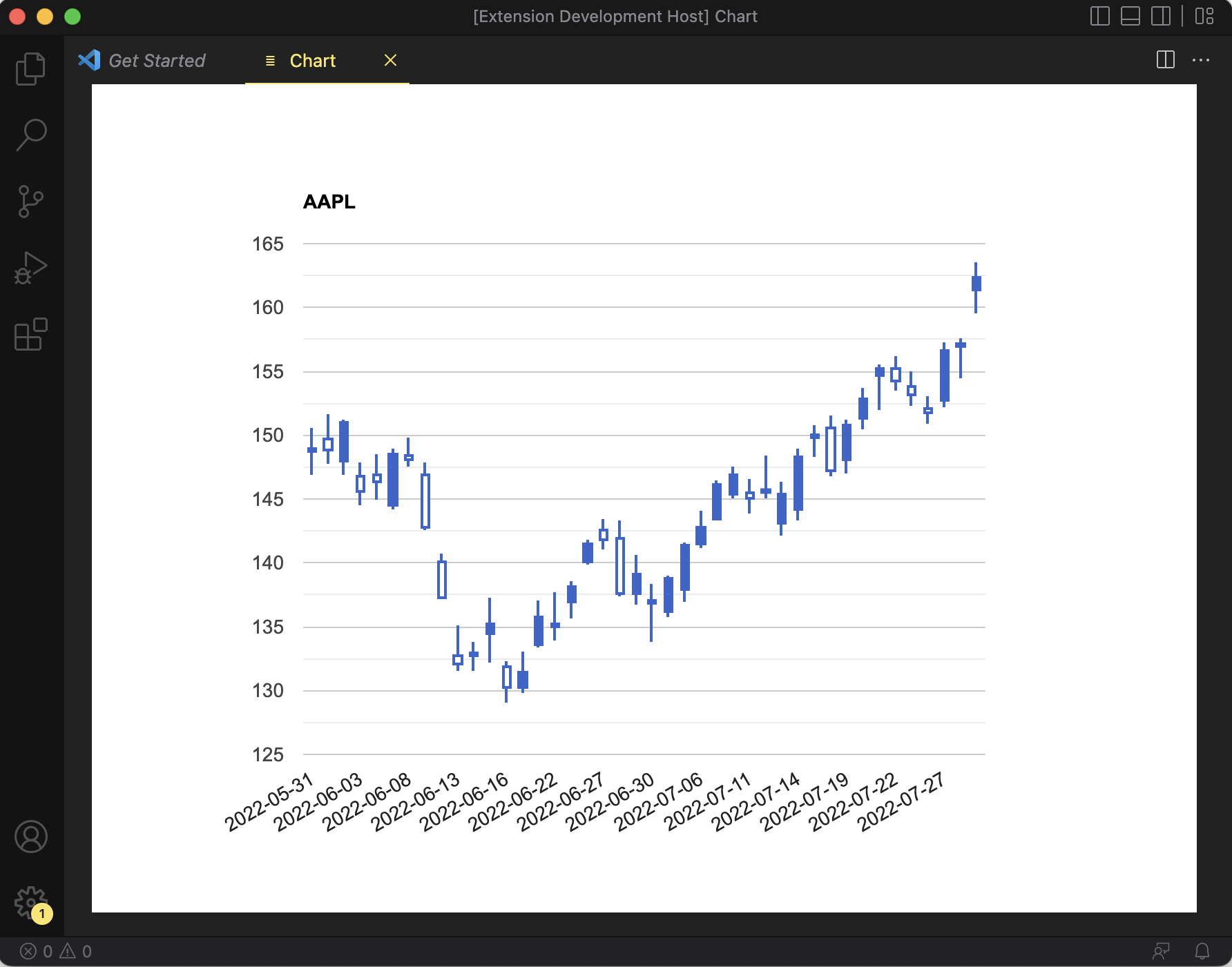
ここではJSONファイルを読み込んでデータを表示してみたいと思います。表示するグラフは株価のローソク足チャートです。ここでは2022/6/1〜2022/7/31のアップルの株価を使います。株価の取得はPythonで簡単なプログラムを作りました。
import sys
import json
import dateutil
import pandas_datareader

FROM_DATE = '2022/06/01'
TO_DATE = '2022/07/31'

if len(sys.argv) != 2:
    print('Usage: get_stock.py stock_code')
    sys.exit(255)

stock_code = sys.argv[1]
from_date = dateutil.parser.parse(FROM_DATE)
to_date = dateutil.parser.parse(TO_DATE)
df = pandas_datareader.data.DataReader(stock_code, 'yahoo', from_date, to_date)

stocks = []
for d in df.iterrows():
    stocks.append([
        d[0].strftime('%Y-%m-%d'),
        d[1]['Low'],
        d[1]['Open'],
        d[1]['Close'],
        d[1]['High']
        ])

with open(f'{stock_code}.json', 'w', encoding='utf-8') as f:
    json.dump(stocks, f, indent=2)
get_stock.pyを実行すると下記のような形式のファイルが出力されます。
[
  [
    "2022-05-31",
    146.83999633789062,
    149.07000732421875,
    148.83999633789062,
    150.66000366210938
  ],
  [
    "2022-06-01",
    147.67999267578125,
    149.89999389648438,
    148.7100067138672,
    151.74000549316406
  ],
  [
    "2022-06-02",
    146.86000061035156,
    147.8300018310547,
    151.2100067138672,
    151.27000427246094
  ],
  (以下省略)
このファイルをプロジェクトフォルダにmediaというフォルダを作成して保存します。
JSONファイルの読み込みです。ライブラリのURIを取得方法はChart.jsのライブラリ取得のときと同様です。
      let jsonPath = vscode.Uri.file(
        path.join(context.extensionPath, "media", "AAPL.json")
      );
      let jsonUri = panel.webview.asWebviewUri(jsonPath);
ファイルの読み込みはfsモジュールを使用します。
import * as fs from "fs";

const data = JSON.parse(fs.readFileSync(jsonUri.path, "utf8"));
このデータを前の例と同様にJSON.stringify()を使ってHTMLに埋め込みます。
グラフの種類はローソク足チャートです。(CandlestickChart)
実行してみると下記のようなグラフが表示されました!
ソース全体は下記のようになります。
import * as vscode from "vscode";
import * as path from "path";
import * as fs from "fs";
import { resolveCliArgsFromVSCodeExecutablePath } from "@vscode/test-electron";

export function activate(context: vscode.ExtensionContext) {
  console.log('Congratulations, your extension "vscode-chart" is now active!');

  let disposable = vscode.commands.registerCommand(
    "vscode-chart.display",
    () => {
      let panel = vscode.window.createWebviewPanel(
        "chart",
        "Chart",
        vscode.ViewColumn.One,
        {
          enableScripts: true,
        }
      );

      let jsonPath = vscode.Uri.file(
        path.join(context.extensionPath, "media", "AAPL.json")
      );
      let jsonUri = panel.webview.asWebviewUri(jsonPath);
      const data = JSON.parse(fs.readFileSync(jsonUri.path, "utf8"));
      const stockCode = path.basename(jsonUri.path, ".json");
      let libPath = vscode.Uri.file(
        path.join(
          context.extensionPath,
          "node_modules",
          "google-charts",
          "dist",
          "googleCharts.js"
        )
      );
      let scriptUri = panel.webview.asWebviewUri(libPath);

      panel.webview.html = `<!DOCTYPE html>
        <html>
        <head>
          <!--Load the AJAX API-->
          <script
            type="text/javascript"
            src="https://www.gstatic.com/charts/loader.js"
          ></script>
          <script type="text/javascript">
            // Load the Visualization API and the corechart package.
            google.charts.load("current", { packages: ["corechart"] });

            // Set a callback to run when the Google Visualization API is loaded.
            google.charts.setOnLoadCallback(drawChart);

            // Callback that creates and populates a data table,
            // instantiates the pie chart, passes in the data and
            // draws it.
            function drawChart() {
              // Create the data table.
              var data = new google.visualization.arrayToDataTable(
                ${JSON.stringify(data)}, true);

              // Set chart options
              var options = {
                title: "${stockCode}",
                legend: "none",
                width: 800,
                height: 600,
              };

              // Instantiate and draw our chart, passing in some options.
              var chart = new google.visualization.CandlestickChart(
                document.getElementById("chart_div")
              );

              chart.draw(data, options);
            }
          </script>
        </head>

        <body>
          <!--Div that will hold the pie chart-->
          <div id="chart_div"></div>
        </body>
      </html>`;
    }
  );

  context.subscriptions.push(disposable);
}

// this method is called when your extension is deactivated
export function deactivate() {}
終わりに
今回はVS Codeでグラフを表示してみました。個人的に興味のある株価のローソク足チャートも表示することができました。しかし株価を表示するだけならYahoo Financeなどのページを見た方が全然便利ですね。ということでこのツールが日の目を見ることはないと思います。ただVS Codeでグラフを表示できるということ、いろいろなシーンで使えそうです。
VS Codeの拡張機能に関しては下記のような記事も書いています。ご参考になればと思います。
参考にしたサイト
- webview-sample (Cat Coding)
https://github.com/microsoft/vscode-extension-samples/tree/main/webview-sample
Cat Codingのサンプルです。 - Webview API
https://code.visualstudio.com/api/extension-guides/webview
Cat Codingの解説ページです。HTMLを使ったVS Code拡張機能を作るためのノウハウが詰まってます。おすすめです - Chart.js
https://www.chartjs.org/docs/latest/ - Google Charts
https://developers.google.com/chart