よく使うのに鳥頭なのですぐ忘れるためまとめました。
color
背景色。
普通にContainerの方で使えますが、BoxDecorationを使う場合はこちらの方に記入しないとエラーが出ます。

Container(
  height: 100,
  width: 300,
  decoration: BoxDecoration(
    color: Colors.red
  ),
)
border
枠線。
色や太さの設定ができます。
その他にも上だけ枠線を設定することもできます。
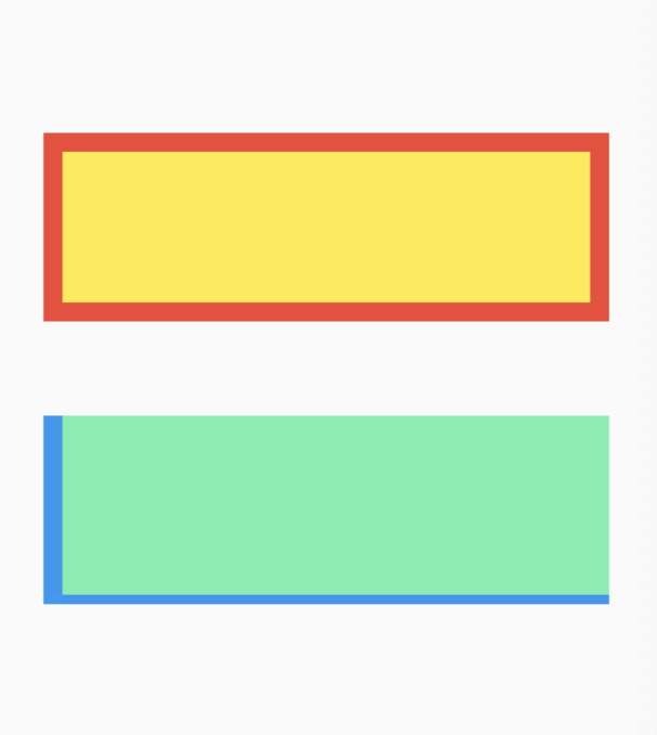
 Container(
   height: 100,
   width: 300,
   decoration: BoxDecoration(
     color: Colors.yellow,
     border: Border.all(color: Colors.red, width: 10),
   ),
 ),
 Container(
   height: 100,
   width: 300,
   decoration: BoxDecoration(
     color: Colors.greenAccent,
     border: Border(
       left: BorderSide(
         color: Colors.blue,
         width: 10.0
       ),
       bottom: BorderSide(
         color: Colors.blue,
         width: 5.0
       ),
     ),
   ),
 ),
borderRadius
角。
角の度合いを設定できます。
一部の角だけ角を変えることもできます。

 Container(
   height: 100,
   width: 300,
   decoration: BoxDecoration(
     color: Colors.red,
     border: Border.all(color: Colors.black, width: 10),
     borderRadius: BorderRadius.circular(20.0),
   ),
 ),
 Container(
   height: 100,
   width: 300,
   decoration: BoxDecoration(
     color: Colors.blue,
     borderRadius: BorderRadius.only(
       topLeft: Radius.circular(30.0),
       topRight: Radius.circular(30.0),
     ),
   ),
 ),
丸が作りたいとき

 Container(
   height: 100,
   width: 300,
   decoration: BoxDecoration(
     color: Colors.red,
     shape: BoxShape.circle,
   ),
 ),
borderRadiusプロパティの代わりにshapeプロパティで書いてあげます。
boxShadow
影。

 Container(
   height: 100,
   width: 300,
   decoration: BoxDecoration(
     color: Colors.red,
     borderRadius: BorderRadius.circular(20.0),
     boxShadow: [
       BoxShadow(
         blurRadius: 20.0,
         color: Colors.red.withOpacity(0.5),
         offset: Offset(10, 15),
       ),
     ],
   ),
 ),
 Container(
   height: 100,
   width: 300,
   decoration: BoxDecoration(
     color: Colors.blue,
     boxShadow: [
       BoxShadow(
         color: Colors.black,
         offset: Offset(15,20),
         spreadRadius: 10.0,
       ),
     ],
   ),
 ),
下表はBoxShadowのプロパティを簡単にまとめたものです。
| プロパティ名 | 説明 | |
|---|---|---|
| color | Color | 影の色 |
| borderRadius | double | 影の広がり具合(値が大きいほど薄く大きく広がる) |
| offset | Offset | 影のズレ具合 Offset(x,y) |
| spreadRadius | double | 影の色の広がり具合(値を大きくしても色は薄くならない) |
gradient
グラデーション。

 Container(
   height: 100,
   width: 300,
   decoration: BoxDecoration(
     borderRadius: BorderRadius.circular(20.0),
     gradient: LinearGradient(
       begin: Alignment.topLeft,
       end: Alignment(0.9, 0.0),
       colors: [
         const Color(0xffee0000),
         const Color(0xffffa500)
       ],
     ),
   ),
 ),
 Container(
   height: 100,
   width: 300,
   decoration: BoxDecoration(
     gradient: RadialGradient(
       radius: 0.6,
       colors: [
         const Color(0xff000080),
         const Color(0xff4169e1),
       ],
     tileMode: TileMode.repeated,
     ),
   ),
 ),
簡単な解説
LinearGradient …… 線でグラデーション
| プロパティ名 | 説明 | |
|---|---|---|
| begin | AlignmentGeometry | グラデーションの開始位置 |
| end | AlignmentGeometry | グラデーションの終了位置 |
| colors | List | グラデーションに使う色のリスト |
| tileMode | TileMode | 繰り返したりできる |
RadialGradient …… 円でグラデーション
| プロパティ名 | 説明 | |
|---|---|---|
| center | AlignmentGeometry | グラデーションの開始位置 |
| radius | double | 円の大きさ |
| colors | List | グラデーションに使う色のリスト |
| tileMode | TileMode | 繰り返したりできる |
image
画像。
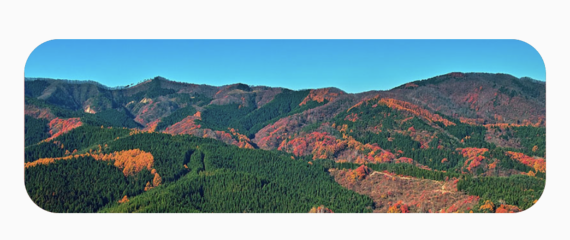
 Container(
   height: 100,
   width: 300,
   decoration: BoxDecoration(
     borderRadius: BorderRadius.circular(20.0),
     image: DecorationImage(
       image: AssetImage("assets/images/mountain.jpg"),
       fit: BoxFit.cover
     ),
   ),
 ),
最後に
閲覧頂きありがとうございました。何かしらに役立てば幸いです。
また、間違いなどがありましたらご指摘ください。