flexboxでbox内で順番を入れ替える方法をご紹介いたします。レスポンシブで結構使う時があると思いますので、ぜひ覚えてください。
横並びのよくみるレイアウト
まずはHTML。
index.html
    <div class="parent">
        <div class="child child-1">1</div>
        <div class="child child-2">2</div>
        <div class="child child-3">3</div>
    </div>
次にCSSです。
style.css
.parent{
    display: flex;
}
.child{
    width: 100px;
    height: 100px;
    background: red;
    color: white;
    margin-right: 10px;
}
.child-1{
    order: 0;
}
.child-2{
    order: 1;
}
.child-3{
    order: 2;
}
これで下記のようになります。
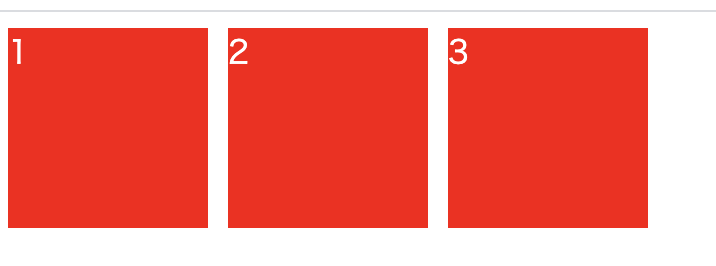
このorderのスタイルは順番を入れ替える必要のない時は必要ありません。
それでは、入れ替える方法を見ていきましょう。
flexboxで要素を入れ替える
要素を入れ替えるスタイルはこうです。
style.css
.parent{
    display: flex;
}
.child{
    width: 100px;
    height: 100px;
    background: red;
    color: white;
    margin-right: 10px;
}
.child-1{
    order: 2;
}
.child-2{
    order: 1;
}
.child-3{
    order: 0;
}
こうするとこのようになります。
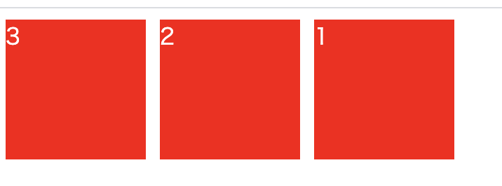
つまり、orderを指定するだけで順番の入れ替えが容易にできてしまいます。注意する点は、orderは0からスタートすることです。
縦並びでも入れ替える
次に縦並びでも入れ替えを見てみましょう。
HTMLは変わらず、CSSが変わります。
style.css
.parent{
    display: flex;
    flex-direction: column;
}
.child{
    width: 100px;
    height: 100px;
    background: red;
    color: white;
    margin-bottom: 10px;
}
.child-1{
    order: 0;
}
.child-2{
    order: 1;
}
.child-3{
    order: 2;
}
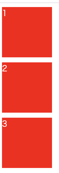
これでこうなります。
これを入れ替えます。
style.css
.parent{
    display: flex;
    flex-direction: column;
}
.child{
    width: 100px;
    height: 100px;
    background: red;
    color: white;
    margin-bottom: 10px;
}
.child-1{
    order: 2;
}
.child-2{
    order: 1;
}
.child-3{
    order: 0;
}
こうなります。
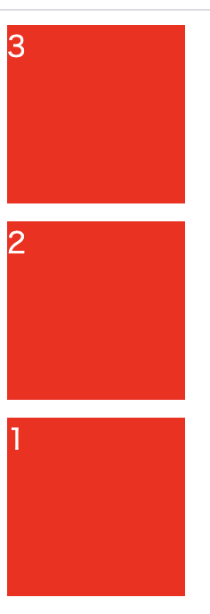
このように例え縦並びだったとしてもorderの指定で簡単に順番を入れ替えることができます。
覚えておきましょう!