はっぴーめりーくりすます!
とは言いますが、もう年末間近です。
年末といえば、一年の振り返りをする方も多いと思います。
今年は、例年に比べて観に行った映画が多かった気がしました。
自分が今年一番印象に残っているのは、アベンジャーズです。
ということで、今回は、アベンジャーズ劇中に登場するインフィニティ・ストーンを
pug + scssで作ってみました。
インフィニティ・ストーンって何ぞや
詳しくはこちら
今回は、ガントレットに装着されている状態を作ります。
完成品
See the Pen css infinity stone by Harold Winston (@harold_winston) on CodePen.
概要
今回作成にあたって
https://codepen.io/YusukeNakaya/pen/RjQGzg?editors=1100
↑こちらを参考にさせていただきました。
cssのみで、色々な作品を作ってらっしゃる方です。
しゅごい
基本の形を作る
最初に、石の原型を作ります。
.stone--space
.stone {
  position: relative;
  width: 23vh;
  height: 37vh;
  filter: blur(1px);
  overflow: hidden;
  border-radius: 50%;
  box-shadow: inset 0 0 13px 3px #000;
}
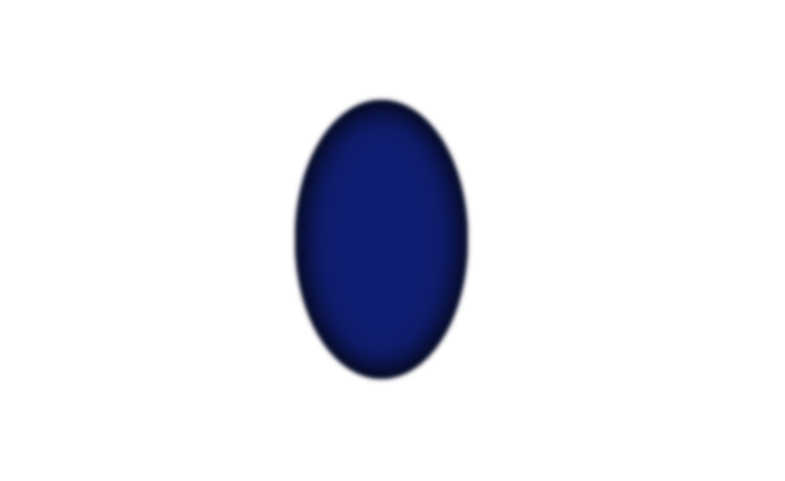
縦長の楕円形を作ります。サイズはcodepen上でのバランスで設定しています。
ポイントとして、blurで少しだけぼかす事で表面の滑らかさを出します。
そして、内に力が溜まってそうな感じを出すために、box-shadowを内側に設定しています。
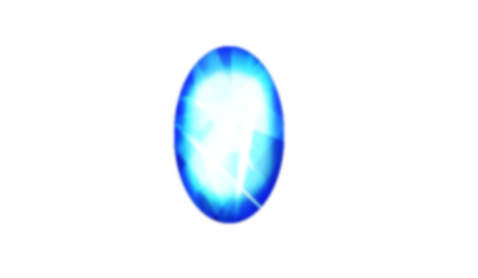
エネルギー源を作ってみる
内に秘めたるパワー・・・
勝手ではありますが入れてみました。
.stone--space
  .stone_inner--space
&_inner {
  width: 70%;
  height: 70%;
  filter: blur(3px);
  position: absolute;
  top: 50%;
  left: 50%;
  transform: translate(-50%, -50%);
  border-radius: 50px;

  &--space {
    @extend .stone_inner;
    background-color: #13B4FF;
  }
}

scssは追加した内容を抜粋したものです。
インナー部分には、外枠よりも少し強めにblurをかけて、色は明るめにしています。
輝きの再現
仕上げとなる輝きが反射しているのを再現します。
.stone--space
  .stone_inner--space
  - for (i = 0; i < 60; i++)
    .cut--space
.cut {
  mix-blend-mode: color-dodge;
  position: absolute;
  top: 50%;
  left: 50%;
  transform: translate(-50%, -50%);
  &--space {
    @extend .cut;

    @for $i from 1 through 100 {
      &:nth-child(#{$i}) {
        width: random(150) + 200px;
        height: random(300) + 200px;
        clip-path: polygon(
          random(100) + 0% random(100) + 0%,
          random(100) + 0% random(100) + 0%,
          random(100) + 0% random(100) + 0%
        );
        animation: sapphireBlue random(3000) + 2000ms random(1000) * -1ms ease-in-out infinite alternate;
        background: linear-gradient(
            random(360) + 0deg,
            rgba(0, 0, 0, 0.5) 0%,
            rgba(103, 195, 252, 0.5) 8%,
            rgba(38, 0, 255, 0.5) 16%,
            rgba(255, 255, 255, 0.5) 25%,
            rgba(38, 0, 255, 0.5) 34%,
            rgba(103, 195, 252, 0.5) 42%,
            rgba(0,0,0,0.5) 50%
        );
        background-size: 100% 200%;
      }
    }
  }
}
@keyframes sapphireBlue {
  0% {
    background-position: 0% 0%;
  }
  100% {
    background-position: 0% 100%;
  }
}
共通の設定として、positionによる中央配置とmix-blend-modeを設定しています。
mix-blend-mode
CSS の mix-blend-mode プロパティは、要素の内容物と親要素の内容物や要素の背景をどのように混合するかを設定します。
引用:mix-blend-mode - CSS: カスケーディングスタイルシート | MDN
輝きを再現するために、サイズが様々な多数の要素を重ね合わせるので、変化をつけるために使用しています。
forでwrap内に、複数の要素をrandom()を使用してサイズや配置を設定しています。
clip-pathは、頂点の数を3つに、サイズはランダムで設定しています。
clip-path: polygon(
  random(100) + 0% random(100) + 0%,
  random(100) + 0% random(100) + 0%,
  random(100) + 0% random(100) + 0%
);
background: linear-gradient(
  random(360) + 0deg,
  rgba(0, 0, 0, 0.5) 0%,
  rgba(103, 195, 252, 0.5) 8%,
  rgba(38, 0, 255, 0.5) 16%,
  rgba(255, 255, 255, 0.5) 25%,
  rgba(38, 0, 255, 0.5) 34%,
  rgba(103, 195, 252, 0.5) 42%,
  rgba(0,0,0,0.5) 50%
);
各要素のグラデーション設定は
Ultimate CSS Gradient Generator
を利用して設定しました。
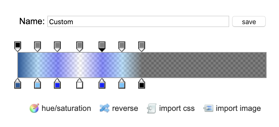
設定したパラメータの見た目はこんな感じです。
単品が完成
ひとまず、スペース・ストーンが完成しました。
See the Pen old infinity by Harold Winston (@harold_winston) on CodePen.
全色揃えてみました
 全色verは[こちら](https://codepen.io/harold_winston/pen/gObLpmj)
ちなみに
実は、冒頭で掲載した完成品は、全色揃えてみた後に、全体的なサイズを小さくし、要素数を減らした内容です。
理由としては、単純に描画数が*6になったことで処理が重くなったからです。
完成品は、mix-blend-modeもlightenに変更することで、表面が少し滑らかになった気がします。
最後に
以前から、cssで色々作ってみたいと考えていましたが、実際に作ってみると難しいなあと思いました(小並)
今回は参考を見つつ、調査しつつでの作成となりましたが、自分のイメージ力だけで作れるようになってみたいものです。
おまけ
以前、案件にて余りにもIEへの怒りが爆発した為に生まれました。
See the Pen internet explorer icon by Harold Winston (@harold_winston) on CodePen.