記事の概要
前回に引き続きExcelVBAでグラフを描画します。
今回は第二弾ということで、前回作成した集合棒状グラフの見た目を整えていきます。
ここに載せるのはほんの一例です。出来ることやコードの書き方はもっとあるので参考程度に...。
( 前回記事 : 【Excel VBA】集合棒状グラフを3パターンで描画する )
環境
・Excel2016
・Windows10
グラフの見た目を変更する
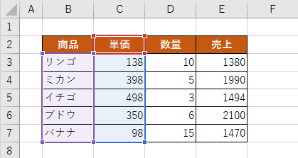
使用するのは、この記事で作成した2つ目のグラフ
Public Sub Graph_Bar2()

 Dim ws As Worksheet
    Set ws = Sheets(1)

 Dim LastRow As Long
    LastRow = ws.Cells(Rows.Count, 2).End(xlUp).Row         '---B列の最終行を求める

       Range(ws.Cells(2, 2), ws.Cells(LastRow, 3)).Select   '---B2~C列の最終行を選択

       With ws.Shapes.AddChart.Chart          '---アクティブシートにグラフを作成
          .ChartType = xlColumnClustered      '---グラフの種類を「集合縦棒」にする
          .SetSourceData Source:=Selection    '---選択したセルをグラフの範囲にする
       End With

End Sub
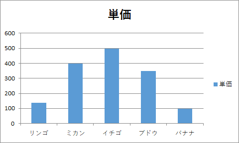
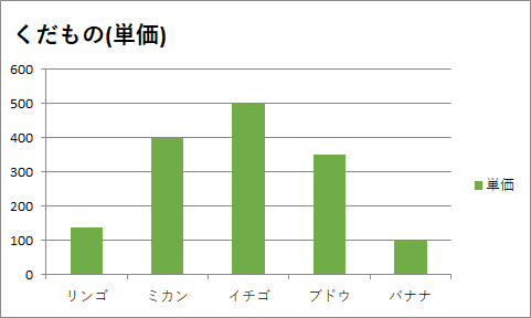
シンプルなのでこれを使います。
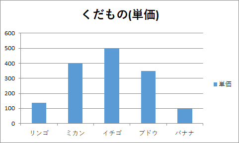
①タイトルを変更する
⑴タイトルを「単価」から「くだもの(単価)」へ変更
コード
Public Sub Graph_Bar2()

 Dim ws As Worksheet
    Set ws = Sheets(1)

 Dim LastRow As Long
    LastRow = ws.Cells(Rows.Count, 2).End(xlUp).Row         '---B列の最終行を求める

       Range(ws.Cells(2, 2), ws.Cells(LastRow, 3)).Select   '---B2~C列の最終行を選択

       With ws.Shapes.AddChart.Chart          '---アクティブシートにグラフを作成
          .ChartType = xlColumnClustered      '---グラフの種類を「集合縦棒」にする
          .SetSourceData Source:=Selection    '---選択したセルをグラフの範囲にする

          '前回からの追加部分
          '================================================================================================
          .HasTitle = True                                 '---グラフタイトル表示
          .ChartTitle.Text = "くだもの(単価)"               '---タイトル設定
          '================================================================================================

       End With

End Sub
変更後のグラフ
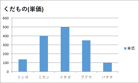
⑵タイトルの位置と文字サイズを変更
コード
Public Sub Graph_Bar2()

 Dim ws As Worksheet
    Set ws = Sheets(1)

 Dim LastRow As Long
    LastRow = ws.Cells(Rows.Count, 2).End(xlUp).Row         '---B列の最終行を求める

       Range(ws.Cells(2, 2), ws.Cells(LastRow, 3)).Select   '---B2~C列の最終行を選択

       With ws.Shapes.AddChart.Chart          '---アクティブシートにグラフを作成
          .ChartType = xlColumnClustered      '---グラフの種類を「集合縦棒」にする
          .SetSourceData Source:=Selection    '---選択したセルをグラフの範囲にする

          '前回からの追加部分
          '====================================================================================================
          .HasTitle = True                         '---グラフタイトル表示

          With .ChartTitle
             .Text = "くだもの(単価)"               '---タイトル設定
             .Top = 5                              '---タイトル位置設定(上)
             .Left = 0                             '---タイトル位置設定(左)
             .Font.Size = 16                       '---タイトル文字サイズ設定
          End With
          '====================================================================================================

       End With

End Sub
変更後のグラフ
②色を変更する
色はRGB以外にもColorIndex,SchemeColor,組込定数で指定することが出来ます。
細かく指定できるのでRGBでの指定が良いのかなと個人的には思いますが、
ここは使用しているExcelのバージョンと好み次第かと思います。
⑴全ての項目を同じ色で設定
コード
Public Sub Graph_Bar2()

 Dim ws As Worksheet
    Set ws = Sheets(1)

 Dim LastRow As Long
    LastRow = ws.Cells(Rows.Count, 2).End(xlUp).Row         '---B列の最終行を求める

       Range(ws.Cells(2, 2), ws.Cells(LastRow, 3)).Select   '---B2~C列の最終行を選択

       With ws.Shapes.AddChart.Chart          '---アクティブシートにグラフを作成
          .ChartType = xlColumnClustered      '---グラフの種類を「集合縦棒」にする
          .SetSourceData Source:=Selection    '---選択したセルをグラフの範囲にする

          '前回からの追加部分
          '====================================================================================================
          .HasTitle = True                         '---グラフタイトル表示

          With .ChartTitle
             .Text = "くだもの(単価)"               '---タイトル設定
             .Top = 5                              '---タイトル位置設定(上)
             .Left = 0                             '---タイトル位置設定(左)
             .Font.Size = 16                       '---タイトル文字サイズ設定
          End With

          .FullSeriesCollection(1).Format.Fill.ForeColor.RGB = RGB(112, 173, 71)       '---全項目を同じ色で設定
          '===================================================================================================

       End With

End Sub
変更後のグラフ
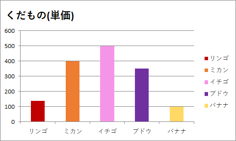
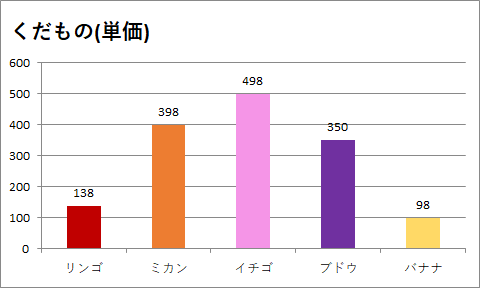
⑵項目ごとに違う色で設定
色を変えることが出来ました!!…が、折角くだものでグラフを作成しているのでカラフルにしたいと思います。
コード
Public Sub Graph_Bar2()

 Dim ws As Worksheet
    Set ws = Sheets(1)

 Dim LastRow As Long
    LastRow = ws.Cells(Rows.Count, 2).End(xlUp).Row         '---B列の最終行を求める

       Range(ws.Cells(2, 2), ws.Cells(LastRow, 3)).Select   '---B2~C列の最終行を選択

       With ws.Shapes.AddChart.Chart          '---アクティブシートにグラフを作成
          .ChartType = xlColumnClustered      '---グラフの種類を「集合縦棒」にする
          .SetSourceData Source:=Selection    '---選択したセルをグラフの範囲にする

          '前回からの追加部分
          '====================================================================================================
          .HasTitle = True                         '---グラフタイトル表示

          With .ChartTitle
             .Text = "くだもの(単価)"               '---タイトル設定
             .Top = 5                              '---タイトル位置設定(上)
             .Left = 0                             '---タイトル位置設定(左)
             .Font.Size = 16                       '---タイトル文字サイズ設定
          End With

          With .FullSeriesCollection(1)
             .Points(1).Interior.Color = RGB(192, 0, 0)        '---項目ごとに違う色で設定
             .Points(2).Interior.Color = RGB(237, 125, 49)
             .Points(3).Interior.Color = RGB(245, 149, 231)
             .Points(4).Interior.Color = RGB(112, 48, 160)
             .Points(5).Interior.Color = RGB(255, 217, 102)
          End With
          '====================================================================================================

       End With

End Sub
変更後のグラフ
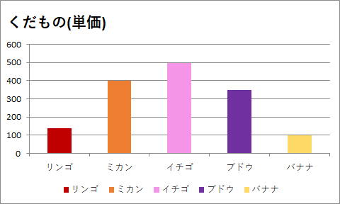
③凡例を変更する
⑴凡例の位置をグラフ右からグラフ下へ変更
ここも好みの部分かと思いますが、私はグラフはなるべく大きく見せたいので、よく凡例を上だの下だのに移動させます。
コード
Public Sub Graph_Bar2()

 Dim ws As Worksheet
    Set ws = Sheets(1)

 Dim LastRow As Long
    LastRow = ws.Cells(Rows.Count, 2).End(xlUp).Row         '---B列の最終行を求める

       Range(ws.Cells(2, 2), ws.Cells(LastRow, 3)).Select   '---B2~C列の最終行を選択

       With ws.Shapes.AddChart.Chart          '---アクティブシートにグラフを作成
          .ChartType = xlColumnClustered      '---グラフの種類を「集合縦棒」にする
          .SetSourceData Source:=Selection    '---選択したセルをグラフの範囲にする

          '前回からの追加部分
          '====================================================================================================
          .HasTitle = True                         '---グラフタイトル表示

          With .ChartTitle
             .Text = "くだもの(単価)"               '---タイトル設定
             .Top = 5                              '---タイトル位置設定(上)
             .Left = 0                             '---タイトル位置設定(左)
             .Font.Size = 16                       '---タイトル文字サイズ設定
          End With

          With .FullSeriesCollection(1)
             .Points(1).Interior.Color = RGB(192, 0, 0)        '---項目ごとに違う色で設定
             .Points(2).Interior.Color = RGB(237, 125, 49)
             .Points(3).Interior.Color = RGB(245, 149, 231)
             .Points(4).Interior.Color = RGB(112, 48, 160)
             .Points(5).Interior.Color = RGB(255, 217, 102)
          End With

          .Legend.Position = xlLegendPositionBottom            '---凡例の位置を設定
          '====================================================================================================

       End With

End Sub
変更後のグラフ
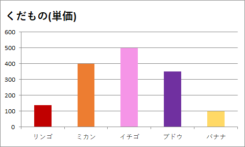
⑵凡例を非表示に変更
「そもそも凡例を表示しなくてもいいや」という場合はこちら。
コード
Public Sub Graph_Bar2()

 Dim ws As Worksheet
    Set ws = Sheets(1)

 Dim LastRow As Long
    LastRow = ws.Cells(Rows.Count, 2).End(xlUp).Row         '---B列の最終行を求める

       Range(ws.Cells(2, 2), ws.Cells(LastRow, 3)).Select   '---B2~C列の最終行を選択

       With ws.Shapes.AddChart.Chart          '---アクティブシートにグラフを作成
          .ChartType = xlColumnClustered      '---グラフの種類を「集合縦棒」にする
          .SetSourceData Source:=Selection    '---選択したセルをグラフの範囲にする

          '前回からの追加部分
          '====================================================================================================
          .HasTitle = True                         '---グラフタイトル表示

          With .ChartTitle
             .Text = "くだもの(単価)"               '---タイトル設定
             .Top = 5                              '---タイトル位置設定(上)
             .Left = 0                             '---タイトル位置設定(左)
             .Font.Size = 16                       '---タイトル文字サイズ設定
          End With

          With .FullSeriesCollection(1)
             .Points(1).Interior.Color = RGB(192, 0, 0)        '---項目ごとに違う色で設定
             .Points(2).Interior.Color = RGB(237, 125, 49)
             .Points(3).Interior.Color = RGB(245, 149, 231)
             .Points(4).Interior.Color = RGB(112, 48, 160)
             .Points(5).Interior.Color = RGB(255, 217, 102)
          End With

          .HasLegend = False                                   '---凡例を非表示
          '====================================================================================================

       End With

End Sub
変更後のグラフ
④データラベルを変更する
⑴数値のデータラベルを表示する
コード
Public Sub Graph_Bar2()

 Dim ws As Worksheet
    Set ws = Sheets(1)

 Dim LastRow As Long
    LastRow = ws.Cells(Rows.Count, 2).End(xlUp).Row         '---B列の最終行を求める

       Range(ws.Cells(2, 2), ws.Cells(LastRow, 3)).Select   '---B2~C列の最終行を選択

       With ws.Shapes.AddChart.Chart          '---アクティブシートにグラフを作成
          .ChartType = xlColumnClustered      '---グラフの種類を「集合縦棒」にする
          .SetSourceData Source:=Selection    '---選択したセルをグラフの範囲にする

          '前回からの追加部分
          '====================================================================================================
          .HasTitle = True                         '---グラフタイトル表示

          With .ChartTitle
             .Text = "くだもの(単価)"              '---タイトル設定
             .Top = 5                              '---タイトル位置設定(上)
             .Left = 0                             '---タイトル位置設定(左)
             .Font.Size = 16                       '---タイトル文字サイズ設定
          End With

          With .FullSeriesCollection(1)
             .Points(1).Interior.Color = RGB(192, 0, 0)        '---項目ごとに違う色で設定
             .Points(2).Interior.Color = RGB(237, 125, 49)
             .Points(3).Interior.Color = RGB(245, 149, 231)
             .Points(4).Interior.Color = RGB(112, 48, 160)
             .Points(5).Interior.Color = RGB(255, 217, 102)
          End With

          .HasLegend = False                                   '---凡例を非表示

          With .SeriesCollection(1)
             .HasDataLabels = True                             '---データラベルを表示
             .DataLabels.ShowValue = True                      '---データラベルの数値を表示
          End With
          '====================================================================================================

       End With

End Sub
変更後のグラフ
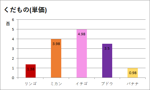
⑵データラベルの表示位置を内側軸寄りに変更する
これも好み…。グラフはかなり好みが出る気がします。
このブドウみたいにキツイ色を使うこともあるので、普段はこうしないのですが「こんなこともできるよ!!」ということで上げておきます。
コード
Public Sub Graph_Bar2()

 Dim ws As Worksheet
    Set ws = Sheets(1)

 Dim LastRow As Long
    LastRow = ws.Cells(Rows.Count, 2).End(xlUp).Row         '---B列の最終行を求める

       Range(ws.Cells(2, 2), ws.Cells(LastRow, 3)).Select   '---B2~C列の最終行を選択

       With ws.Shapes.AddChart.Chart          '---アクティブシートにグラフを作成
          .ChartType = xlColumnClustered      '---グラフの種類を「集合縦棒」にする
          .SetSourceData Source:=Selection    '---選択したセルをグラフの範囲にする

          '前回からの追加部分
          '====================================================================================================
          .HasTitle = True                         '---グラフタイトル表示

          With .ChartTitle
             .Text = "くだもの(単価)"              '---タイトル設定
             .Top = 5                              '---タイトル位置設定(上)
             .Left = 0                             '---タイトル位置設定(左)
             .Font.Size = 16                       '---タイトル文字サイズ設定
          End With

          With .FullSeriesCollection(1)
             .Points(1).Interior.Color = RGB(192, 0, 0)        '---項目ごとに違う色で設定
             .Points(2).Interior.Color = RGB(237, 125, 49)
             .Points(3).Interior.Color = RGB(245, 149, 231)
             .Points(4).Interior.Color = RGB(112, 48, 160)
             .Points(5).Interior.Color = RGB(255, 217, 102)
          End With

          .HasLegend = False                                   '---凡例を非表示

          With .SeriesCollection(1)
             .HasDataLabels = True                             '---データラベルを表示
             .DataLabels.ShowValue = True                      '---データラベルの数値を表示
             .DataLabels.Position = xlLabelPositionInsideEnd   '---データラベルの位置を設定
          End With
          '====================================================================================================

       End With

End Sub
変更後のグラフ

キツイ色に対して設定すると最高に見づらくなりますね。
⑤ラベルを変更する
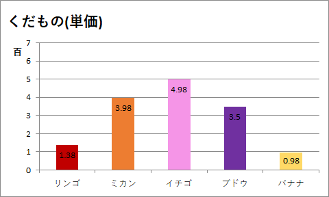
⑴表示単位のラベルを「百」に設定
さりげなく「.DisplayUnitLabel.Orientation = xlHorizontal 」…と書いていますが、これを除くと「百」が左に90度回転した状態で表示されます。
コード
Public Sub Graph_Bar2()

 Dim ws As Worksheet
    Set ws = Sheets(1)

 Dim LastRow As Long
    LastRow = ws.Cells(Rows.Count, 2).End(xlUp).Row         '---B列の最終行を求める

       Range(ws.Cells(2, 2), ws.Cells(LastRow, 3)).Select   '---B2~C列の最終行を選択

       With ws.Shapes.AddChart.Chart          '---アクティブシートにグラフを作成
          .ChartType = xlColumnClustered      '---グラフの種類を「集合縦棒」にする
          .SetSourceData Source:=Selection    '---選択したセルをグラフの範囲にする

          '前回からの追加部分
          '====================================================================================================
          .HasTitle = True                         '---グラフタイトル表示

          With .ChartTitle
             .Text = "くだもの(単価)"               '---タイトル設定
             .Top = 5                              '---タイトル位置設定(上)
             .Left = 0                             '---タイトル位置設定(左)
             .Font.Size = 16                       '---タイトル文字サイズ設定
          End With

          With .FullSeriesCollection(1)
             .Points(1).Interior.Color = RGB(192, 0, 0)      '---項目ごとに違う色で設定
             .Points(2).Interior.Color = RGB(237, 125, 49)
             .Points(3).Interior.Color = RGB(245, 149, 231)
             .Points(4).Interior.Color = RGB(112, 48, 160)
             .Points(5).Interior.Color = RGB(255, 217, 102)
          End With

          .HasLegend = False                                 '---凡例を非表示

          With .SeriesCollection(1)
             .HasDataLabels = True                           '---データラベルを表示
             .DataLabels.ShowValue = True                    '---データラベルの数値を表示
             .DataLabels.Position = xlLabelPositionInsideEnd '---データラベルの位置を設定
          End With

          With .Axes(xlValue)
             .DisplayUnit = xlHundreds                      '---表示単位のラベルを設定
             .DisplayUnitLabel.Orientation = xlHorizontal   '---表示単位の向きを設定
          End With
          '====================================================================================================

       End With

End Sub
変更後のグラフ
⑵境界値の最大値を600から700へ変更
コード
Public Sub Graph_Bar2()

 Dim ws As Worksheet
    Set ws = Sheets(1)

 Dim LastRow As Long
    LastRow = ws.Cells(Rows.Count, 2).End(xlUp).Row         '---B列の最終行を求める

       Range(ws.Cells(2, 2), ws.Cells(LastRow, 3)).Select   '---B2~C列の最終行を選択

       With ws.Shapes.AddChart.Chart          '---アクティブシートにグラフを作成
          .ChartType = xlColumnClustered      '---グラフの種類を「集合縦棒」にする
          .SetSourceData Source:=Selection    '---選択したセルをグラフの範囲にする

          '前回からの追加部分
          '====================================================================================================
          .HasTitle = True                         '---グラフタイトル表示

          With .ChartTitle
             .Text = "くだもの(単価)"               '---タイトル設定
             .Top = 5                              '---タイトル位置設定(上)
             .Left = 0                             '---タイトル位置設定(左)
             .Font.Size = 16                       '---タイトル文字サイズ設定
          End With

          With .FullSeriesCollection(1)
             .Points(1).Interior.Color = RGB(192, 0, 0)      '---項目ごとに違う色で設定
             .Points(2).Interior.Color = RGB(237, 125, 49)
             .Points(3).Interior.Color = RGB(245, 149, 231)
             .Points(4).Interior.Color = RGB(112, 48, 160)
             .Points(5).Interior.Color = RGB(255, 217, 102)
          End With

          .HasLegend = False                                 '---凡例を非表示

          With .SeriesCollection(1)
             .HasDataLabels = True                           '---データラベルを表示
             .DataLabels.ShowValue = True                    '---データラベルの数値を表示
             .DataLabels.Position = xlLabelPositionInsideEnd '---データラベルの位置を設定
          End With

          With .Axes(xlValue)
             .DisplayUnit = xlHundreds                       '---表示単位のラベルを設定
             .DisplayUnitLabel.Orientation = xlHorizontal    '---表示単位の向きを設定
             .MaximumScale = 700                             '---境界値の最大値を設定
          End With

          '====================================================================================================

       End With

End Sub
変更後のグラフ
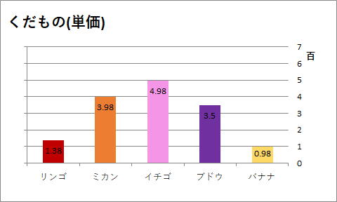
⑶軸ラベルの位置を左端から右端へ変更
コード
Public Sub Graph_Bar2()

 Dim ws As Worksheet
    Set ws = Sheets(1)

 Dim LastRow As Long
    LastRow = ws.Cells(Rows.Count, 2).End(xlUp).Row         '---B列の最終行を求める

       Range(ws.Cells(2, 2), ws.Cells(LastRow, 3)).Select   '---B2~C列の最終行を選択

       With ws.Shapes.AddChart.Chart          '---アクティブシートにグラフを作成
          .ChartType = xlColumnClustered      '---グラフの種類を「集合縦棒」にする
          .SetSourceData Source:=Selection    '---選択したセルをグラフの範囲にする

          '前回からの追加部分
          '====================================================================================================
          .HasTitle = True                         '---グラフタイトル表示

          With .ChartTitle
             .Text = "くだもの(単価)"              '---タイトル設定
             .Top = 5                              '---タイトル位置設定(上)
             .Left = 0                             '---タイトル位置設定(左)
             .Font.Size = 16                       '---タイトル文字サイズ設定
          End With

          With .FullSeriesCollection(1)
             .Points(1).Interior.Color = RGB(192, 0, 0)      '---項目ごとに違う色で設定
             .Points(2).Interior.Color = RGB(237, 125, 49)
             .Points(3).Interior.Color = RGB(245, 149, 231)
             .Points(4).Interior.Color = RGB(112, 48, 160)
             .Points(5).Interior.Color = RGB(255, 217, 102)
          End With

          .HasLegend = False                                 '---凡例を非表示

          With .SeriesCollection(1)
             .HasDataLabels = True                           '---データラベルを表示
             .DataLabels.ShowValue = True                    '---データラベルの数値を表示
             .DataLabels.Position = xlLabelPositionInsideEnd '---データラベルの位置を設定
          End With

          With .Axes(xlValue)
             .DisplayUnit = xlHundreds                      '---表示単位のラベルを設定
             .DisplayUnitLabel.Orientation = xlHorizontal   '---表示単位の向きを設定
             .MaximumScale = 700                            '---境界値の最大値を設定
             .TickLabelPosition = xlHigh                    '---ラベルの位置を設定
          End With
          '====================================================================================================

       End With

End Sub
変更後のグラフ
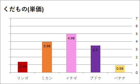
軸ラベルは無事に右に移動できましたが、「百」が隠れてしまいました...。
「⑥プロットエリアを変更する」でプロットエリアを調整して全体が表示されるようにします。
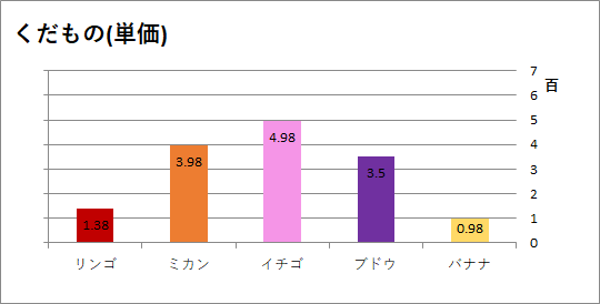
⑥プロットエリアを変更する
プロットエリアはグラフそのものが描かれている場所のことです。
コード
Public Sub Graph_Bar2()

 Dim ws As Worksheet
    Set ws = Sheets(1)

 Dim LastRow As Long
    LastRow = ws.Cells(Rows.Count, 2).End(xlUp).Row         '---B列の最終行を求める

       Range(ws.Cells(2, 2), ws.Cells(LastRow, 3)).Select   '---B2~C列の最終行を選択

       With ws.Shapes.AddChart.Chart          '---アクティブシートにグラフを作成
          .ChartType = xlColumnClustered      '---グラフの種類を「集合縦棒」にする
          .SetSourceData Source:=Selection    '---選択したセルをグラフの範囲にする

          '前回からの追加部分
          '====================================================================================================
          .HasTitle = True                         '---グラフタイトル表示

          With .ChartTitle
             .Text = "くだもの(単価)"               '---タイトル設定
             .Top = 5                              '---タイトル位置設定(上)
             .Left = 0                             '---タイトル位置設定(左)
             .Font.Size = 16                       '---タイトル文字サイズ設定
          End With

          With .FullSeriesCollection(1)
             .Points(1).Interior.Color = RGB(192, 0, 0)     '---項目ごとに違う色で設定
             .Points(2).Interior.Color = RGB(237, 125, 49)
             .Points(3).Interior.Color = RGB(245, 149, 231)
             .Points(4).Interior.Color = RGB(112, 48, 160)
             .Points(5).Interior.Color = RGB(255, 217, 102)
          End With

          .HasLegend = False                                 '---凡例を非表示

          With .SeriesCollection(1)
             .HasDataLabels = True                           '---データラベルを表示
             .DataLabels.ShowValue = True                    '---データラベルの数値を表示
             .DataLabels.Position = xlLabelPositionInsideEnd '---データラベルの位置を設定
          End With

          With .Axes(xlValue)
             .DisplayUnit = xlHundreds                      '---表示単位のラベルを設定
             .DisplayUnitLabel.Orientation = xlHorizontal   '---表示単位の向きを設定
             .MaximumScale = 700                            '---境界値の最大値を設定
             .TickLabelPosition = xlHigh                    '---ラベルの位置を設定
          End With

          With .PlotArea
             .Left = 25                                '---プロットエリアの位置を設定
             .Top = 40                                 '---プロットエリアの位置を設定
          End With
          '====================================================================================================

       End With

End Sub
変更後のグラフ
全体が表示されるようになりました。
⑦チャートエリア(グラフエリア)を変更する
チャートエリアはプロットエリアも凡例も軸も…すべてひっくるめたエリアのことです。
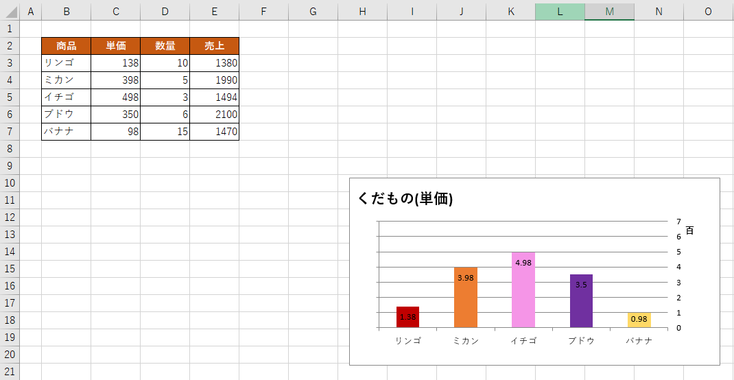
⑴チャートエリアの大きさを変更する
コード
Public Sub Graph_Bar2()

 Dim ws As Worksheet
    Set ws = Sheets(1)

 Dim LastRow As Long
    LastRow = ws.Cells(Rows.Count, 2).End(xlUp).Row         '---B列の最終行を求める

       Range(ws.Cells(2, 2), ws.Cells(LastRow, 3)).Select   '---B2~C列の最終行を選択

       With ws.Shapes.AddChart.Chart          '---アクティブシートにグラフを作成
          .ChartType = xlColumnClustered      '---グラフの種類を「集合縦棒」にする
          .SetSourceData Source:=Selection    '---選択したセルをグラフの範囲にする

          '前回からの追加部分
          '====================================================================================================
          .HasTitle = True                         '---グラフタイトル表示

          With .ChartTitle
             .Text = "くだもの(単価)"               '---タイトル設定
             .Top = 5                              '---タイトル位置設定(上)
             .Left = 0                             '---タイトル位置設定(左)
             .Font.Size = 16                       '---タイトル文字サイズ設定
          End With

          With .FullSeriesCollection(1)
             .Points(1).Interior.Color = RGB(192, 0, 0)      '---項目ごとに違う色で設定
             .Points(2).Interior.Color = RGB(237, 125, 49)
             .Points(3).Interior.Color = RGB(245, 149, 231)
             .Points(4).Interior.Color = RGB(112, 48, 160)
             .Points(5).Interior.Color = RGB(255, 217, 102)
          End With

          .HasLegend = False                                 '---凡例を非表示

          With .SeriesCollection(1)
             .HasDataLabels = True                           '---データラベルを表示
             .DataLabels.ShowValue = True                    '---データラベルの数値を表示
             .DataLabels.Position = xlLabelPositionInsideEnd '---データラベルの位置を設定
          End With

          With .Axes(xlValue)
             .DisplayUnit = xlHundreds                      '---表示単位のラベルを設定
             .DisplayUnitLabel.Orientation = xlHorizontal   '---表示単位の向きを設定
             .MaximumScale = 700                            '---境界値の最大値を設定
             .TickLabelPosition = xlHigh                    '---ラベルの位置を設定
          End With

          With .PlotArea
             .Left = 25                               '---プロットエリアの位置を設定
             .Top = 40                                '---プロットエリアの位置を設定
          End With

          With .ChartArea
             .Width = 400                             '---チャートエリアのサイズを設定
             .Height = 200                            '---チャートエリアのサイズを設定
          End With
          '====================================================================================================

       End With

End Sub
変更後のグラフ
横長にしてみました。
⑵チャートエリアの位置を変更する
表示位置の指定をしていないので、こんなところにグラフが出ています。
任意の位置にグラフが表示されるようにします。
コード
Public Sub Graph_Bar2()

 Dim ws As Worksheet
    Set ws = Sheets(1)

 Dim LastRow As Long
    LastRow = ws.Cells(Rows.Count, 2).End(xlUp).Row         '---B列の最終行を求める

       Range(ws.Cells(2, 2), ws.Cells(LastRow, 3)).Select   '---B2~C列の最終行を選択

       With ws.Shapes.AddChart.Chart          '---アクティブシートにグラフを作成
          .ChartType = xlColumnClustered      '---グラフの種類を「集合縦棒」にする
          .SetSourceData Source:=Selection    '---選択したセルをグラフの範囲にする

          '前回からの追加部分
          '====================================================================================================
          .HasTitle = True                         '---グラフタイトル表示

          With .ChartTitle
             .Text = "くだもの(単価)"               '---タイトル設定
             .Top = 5                              '---タイトル位置設定(上)
             .Left = 0                             '---タイトル位置設定(左)
             .Font.Size = 16                       '---タイトル文字サイズ設定
          End With

          With .FullSeriesCollection(1)
             .Points(1).Interior.Color = RGB(192, 0, 0)      '---項目ごとに違う色で設定
             .Points(2).Interior.Color = RGB(237, 125, 49)
             .Points(3).Interior.Color = RGB(245, 149, 231)
             .Points(4).Interior.Color = RGB(112, 48, 160)
             .Points(5).Interior.Color = RGB(255, 217, 102)
          End With

          .HasLegend = False                                 '---凡例を非表示

          With .SeriesCollection(1)
             .HasDataLabels = True                           '---データラベルを表示
             .DataLabels.ShowValue = True                    '---データラベルの数値を表示
             .DataLabels.Position = xlLabelPositionInsideEnd '---データラベルの位置を設定
          End With

          With .Axes(xlValue)
             .DisplayUnit = xlHundreds                      '---表示単位のラベルを設定
             .DisplayUnitLabel.Orientation = xlHorizontal   '---表示単位の向きを設定
             .MaximumScale = 700                            '---境界値の最大値を設定
             .TickLabelPosition = xlHigh                    '---ラベルの位置を設定
          End With

          With .PlotArea
             .Left = 25                               '---プロットエリアの位置を設定
             .Top = 40                                '---プロットエリアの位置を設定
          End With

          With .ChartArea
             .Width = 400                             '---チャートエリアのサイズを設定
             .Height = 200                            '---チャートエリアのサイズを設定
             .Top = Range("B10").Top                  '---チャートエリアの位置を設定
             .Left = Range("B10").Left                '---チャートエリアの位置を設定
          End With
         '====================================================================================================

       End With

End Sub
変更後のグラフ
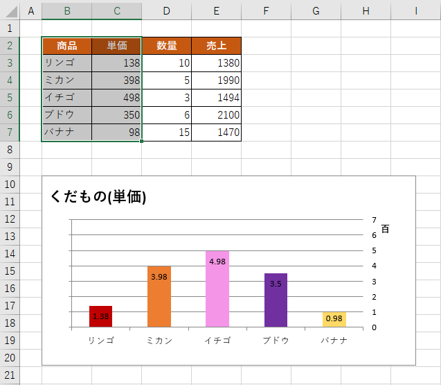
表の下にグラフを移動しました。何個もグラフを描画する場合に便利です。