概要
この記事では、CSSだけを使ってトグルボタン(あるいはスイッチ)を作ります。デザインは次の通りです。
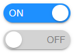
スイッチ部はチェックボックス、丸ボタンは「::after」と「::before」疑似要素で作成します。完成後に調べたらQiitaに同様の投稿が結構あったのですが、がんばって作ったので供養します。
ソースコード
HTML
<label
	><input type="checkbox" checked
	><span>ON</span
	><span>OFF</span
></label>
CSS
/* ---- 共通部 ---- */
input[type=checkbox] {
	display: none;
}
label>input[type=checkbox]~span {
	display: flex;
	justify-content: space-between;
	align-items: center;
	width: 90px;
	height: 28px;
	font-size: 14px;
	border-style: none;
	border-radius: 15px; // =(丸ボタンのサイズ÷2)+(丸ボタンのmargin)
	box-shadow: 0 2px 2px 0 rgba(0,0,0,0.14), 0 1px 5px 0 rgba(0,0,0,0.12), 0 3px 1px -2px rgba(0,0,0,0.2);
}

/* ---- スイッチがONのとき ---- */
label>input[type=checkbox]:checked+span {
	display: flex;

	/* ---- ボタンのデザイン ---- */
	padding-left: 8px;
	color: white;
	background-color: dodgerblue;
}
label>input[type=checkbox]:checked+span+span {
	display: none;
}

/* ---- スイッチがOFFのとき ---- */
label>input[type=checkbox]+span {
	display: none;
}
label>input[type=checkbox]+span+span {
	display: flex;

	/* ---- ボタンのデザイン ---- */
	padding-right: 8px;
	color: gray;
	background-color: lightgray;
}

/* ---- 丸ボタンのデザイン ---- */
label>input[type=checkbox]:checked+span::after, label>input[type=checkbox]+span+span::before {
	display: block;
	vertical-align: middle;
	width: 24px;
	height: 24px;
	margin: 3px;
	border-radius: 50%;
	background-color: white;
	box-shadow: 0 2px 2px 0 rgba(0,0,0,0.14), 0 1px 5px 0 rgba(0,0,0,0.12), 0 3px 1px -2px rgba(0,0,0,0.2);
	content: "";
}