はじめに
Webレイアウトでよく使われるCSSのpositionプロパティ。中でも「relative」と「absolute」は、要素の配置を自由にコントロールできる強力な機能です。今回は、それぞれの使い方や違い、注意点を初心者向けに解説します。
positionでレイアウトの自由が広がる
デフォルトでは、HTML要素は上から順に積み重なっていきますが、positionを使うことで、「好きな場所」に要素を配置できるようになります。特に、
-
position: relative(相対配置) -
position: absolute(絶対配置)
の2つは、組み合わせて使うことでレイアウトの幅が大きく広がります。
使い方
position: relative とは?
親要素やその場の位置を基準に、「少しだけズラす」時に使います。要素自体は文書の流れに残ります。
style.css
.relative-box {
  background-color: bisque;
  position: relative;
  top: 20px;    /* 上から20pxズラす */
  left: 10px;   /* 左から10pxズラす */
}
index.html
<div class="relative-box">
  これはrelativeのサンプルです
</div>
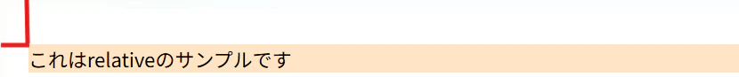
わかりやすく赤で線を書きましたが、配置がズレていることがわかります。
※ただ、ずらすだけならmarginが主に使われるので、position: relativeが単体で使われることはあまりなく、position: absoluteと組み合わせて使われます。
position: absolute とは?
親要素(position: relative/absolute/fixed/sticky のいずれかが指定されている要素)を基準に、「完全に好きな位置」に配置できます。要素は通常の文書フローから外れます。
style.css
.parent {
  background-color: bisque;
  position: relative;
  margin-top: 100px;
}
.child {
  background-color: lightblue;
  position: absolute;
  top: 10px;
  right: 20px;
}
index.html
<div class="parent">
  親要素
  <div class="child">
    子要素(absolute)
  </div>
</div>

親要素の位置からに対して子要素がtopから10px、rightから20pxになっていることがわかります。
relativeとabsoluteの組み合わせで力を発揮する
position: absoluteは、「一番近いpositionが設定された親要素」を基準に配置されます。
例えば、親にrelativeを設定すると、子のabsoluteは親の左上基準で動きます。
実用例
index.html
<div class="image-wrapper">
  <img src="https://via.placeholder.com/200x150" alt="サンプル画像">
  <span class="new-tag">NEW</span>
</div>
style.css
.image-wrapper {
  position: relative; /* これが基準になる */
  display: inline-block;
}

.image-wrapper img {
  display: block;
  width: 250px;
  height: 250px;
}

.new-tag {
  position: absolute;
  top: 8px;
  right: 8px;
  background: #e00;
  color: #fff;
  font-size: 12px;
  padding: 8px 12px;
  border-radius: 8px;
  font-weight: bold;
  box-shadow: 0 2px 4px rgba(0,0,0,0.15);
  z-index: 2;
}
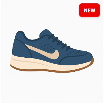
よくあるデザインに応用させることもできました。
注意点
-
position: absoluteを使うと、普通の流れから外れる(absolute要素が独立して浮くイメージ)ため、思わぬ重なりや崩れが発生することがあります - absoluteで配置した要素は、「スクロールしても動かない」わけではなく、親要素内で動きます
- 固定表示したいときはfixedを検討しましょう
- 親にpositionが設定されていないと、absoluteはbodyを基準にして配置されます
- スマホやレスポンシブ対応時、absolute配置は注意が必要です
最後に
position: relativeとposition: absoluteを使いこなすと、Webデザインの幅が大きく広がります。
まずは小さなパーツで試してみて、どんな動きをするのか確認してみるのがおすすめです。