はじめに
Webサイトやアプリの第一印象は“ボタン”で決まると言っても過言ではありません。
この記事では、シンプルだけど「おっ!」と思われる、ビジュいい(=ビジュアルが良い)ボタンをHTML&CSSだけで作る方法を紹介します。
基本的な作り方
まずはHTMLとCSSだけで作る、ベーシックなボタンから見ていきます。
index.html
<button class="btn">Click me!</button>
style.css
.btn {
  padding: 12px 32px;
  border: none;
  border-radius: 8px;
  background: #6366f1;
  color: #fff;
  font-size: 1.1rem;
  cursor: pointer;
  transition: background 0.2s, box-shadow 0.2s;
}
.btn:hover {
  background: #818cf8;
  box-shadow: 0 4px 16px rgba(99, 102, 241, 0.2);
}

レイアウトにこだわったボタン
ここからは、より“映える”ボタンをいくつか紹介します。
アイコン入りボタン(FontAwesomeやSVG利用)
index.html
<button class="btn btn-icon">
  <!-- ダウンロードアイコンSVG例 -->
<svg width="18" height="18" viewBox="0 0 20 20" fill="none" xmlns="http://www.w3.org/2000/svg">
  <path d="M10 3V13M10 13L6 9M10 13L14 9" stroke="currentColor" stroke-width="2" stroke-linecap="round" stroke-linejoin="round"/>
  <rect x="4" y="15" width="12" height="2" rx="1" fill="currentColor"/>
</svg>
  Download
</button>
style.css
.btn-icon {
  display: flex;
  align-items: center;
  gap: 8px;
  background: #10b981;
  color: #fff;
  border: none;
}

モダン・グラデーションボタン
滑らかなグラデーションに微細な影、ホバーでは動きを加えるスタイルです。
index.html
<button class="btn-modern">Click Me</button>
style.css
.btn-modern {
  padding: 14px 36px;
  font-size: 1rem;
  font-weight: 600;
  color: #fff;
  background: linear-gradient(45deg, #6b73ff, #000dff);
  border: none;
  border-radius: 30px;
  box-shadow: 0 6px 12px rgba(0, 13, 255, 0.3);
  cursor: pointer;
  transition: background 0.4s, transform 0.2s, box-shadow 0.2s;
}
.btn-modern:hover {
  background: linear-gradient(45deg, #000dff, #6b73ff);
  transform: translateY(-3px);
  box-shadow: 0 12px 24px rgba(0, 13, 255, 0.4);
}
.btn-modern:active {
  transform: translateY(-1px);
  box-shadow: 0 8px 16px rgba(0, 13, 255, 0.35);
}
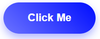
- なめらかな45°グラデーションが映える
- box-shadow+transformで浮遊感と押下感を両立
- hover:背景の色が反転。典型的なグラデーションの応用です
ニューモーフィック風浮き上がるボタン
背景と調和しつつ、柔らかな浮遊感と陰影を意識したデザインです。
index.html
<button class="btn-neu">Submit</button>
style.css
.btn-neu {
  padding: 14px 36px;
  font-size: 1rem;
  color: #333;
  background: #e0e5ec;
  border-radius: 12px;
  box-shadow:
    inset 4px 4px 8px rgba(255,255,255,0.8),
    inset -4px -4px 8px rgba(0,0,0,0.1),
    8px 8px 16px rgba(0,0,0,0.07);
  border: none;
  cursor: pointer;
  transition: box-shadow 0.3s, transform 0.2s;
}
.btn-neu:hover {
  transform: translateY(-2px);
  box-shadow:
    inset 2px 2px 4px rgba(255,255,255,0.8),
    inset -2px -2px 4px rgba(0,0,0,0.1),
    12px 12px 24px rgba(0,0,0,0.1);
}
.btn-neu:active {
  transform: translateY(0);
  box-shadow:
    inset 4px 4px 8px rgba(0,0,0,0.1),
    inset -4px -4px 8px rgba(255,255,255,0.8);
}

- 背景色に近い陰影で浮き沈みするニューモーフィック風デザイン
- 光源の方向まで考えたInset+Outsetシャドウでリアルな立体感
- 微妙なhover/activeの変化で操作感も◎
Tips
- box-shadowやfilterで手軽に高級感アップ!
-
:activeや:focusで押した感じも追加 - アニメーションは
transitionで自然に - 可読性を高めるには十分なコントラストを
- レスポンシブ対応は
min-widthやvw活用で
| ボタンスタイル | 特徴 | コードポイント |
|---|---|---|
| グラデーション + 浮き上がる効果 | CTAに最適、視認性◎ |
linear-gradient + box-shadow + transform
|
| ニューモーフィック | 柔らかい印象、高級感 |
inset + outset シャドウの組合せ |
| 両者とも | hover・activeで動きも付与 |
transition, :hover, :active
|
transform: translate;の覚え方
transform: translateY(-3px);と言われてもどっちにズレるのだろう?とわからないですよね。
CSSやHTMLは、画面左上が(0,0)です。
+-------------------→ X(右に行くほどプラス)
|
|
|
↓
Y(下に行くほどプラス)
ボタン以外にもtransformのよくある書き方
-
transform: translateX(10px);… 横方向に移動 -
transform: translateY(-3px);… 縦方向に移動 -
transform: scale(1.2);… 拡大縮小 -
transform: rotate(15deg);… 回転
最後に
ボタン一つでサイト全体の印象は大きく変わります。
ぜひ今回紹介したサンプルやTipsを使って、あなたのWebサイトに“ビジュいいボタン”を追加してみてください!