概要
今年も 「N予備校動くWebアプリコンテスト2023 冬」 のコンテストを担当させていただくことになりました。
コンテストは2017年から夏・冬に開催しておりまして、今年で7年目となります。
N予備校を学んでいる皆さん!ご応募お待ちしております 
さて、2022年の夏からコンテストを担当させていただいているのですが、コンテストのページも作成しております。
これまで以下のページを担当してきました。
- 2022年夏
- 2022年冬
年々、Webページでできる表現は増えてきているなと感じます。
毎回できることを色々と調べて、サイトに取り入れています!
N予備校動くWebアプリコンテスト2023 冬のページ
そして今年作ったコンテストページはこちらです!
※ コンテスト自体の概要は、ぜひこちらのコンテストページをご覧ください!
イラストは、もちろん自分で書いたわけではなく、素材サイトからもらってきたものです。
ぐにゃぐにゃ動くものも、様々なサイトのものを参考にしています。
そんな中で、「スクロールすると下からコンテンツが出てくる」 という動きは、CSSアニメーションを使って簡単に書くことができましたので、こちらのやり方を紹介します!
「スクロールすると下からコンテンツが出てくる」 という動き
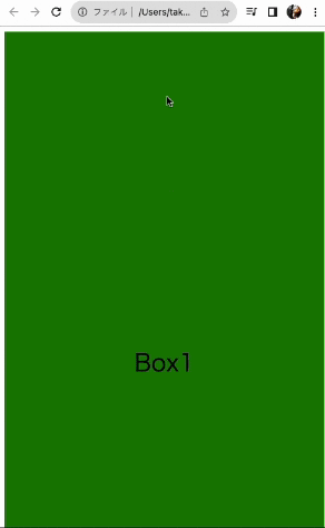
とりあえずサンプルとして、ボックスを3つ作ります。
<!DOCTYPE html>
<html lang="ja">
<head>
    <meta charset="UTF-8">
    <meta name="viewport" content="width=device-width, initial-scale=1.0">
    <title>スクロールすると下から出てくる</title>
</head>
<body>
    <div>Box1</div>
    <div>Box2</div>
    <div>Box3</div>
    <style>
        div {
            width: 100%;
            height: 1000px;
            text-align: center;
            font-size: 36px;
            line-height: 1000px;
        }
        div:nth-child(1) {
            background: green;
        }
        div:nth-child(2) {
            background: blue;
        }
        div:nth-child(3) {
            background: orange;
        }
    </style>
</body>
</html>
アニメーションを定義
次に、下から出てくるCSSアニメーションを定義します。
要素の高さ50%下の位置から不透明度を0から1に変化させることで、下からスッと出てくるアニメーションを実現します。
div {
    ...
    animation-duration: 1s;
    animation-name: below;
}

@keyframes below {
    from {
        opacity: 0;
        transform: translateY(50%);
    }

    to {
        opacity: 1;
        transform: translateY(0%);
    }
}
要素の位置までスクロールしてきたらアニメーションするようにする
しかしこれだと、ページ読み込み時に見える要素しかアニメーションされません。
そこで、要素の位置までスクロールしてきたらアニメーションするようにします。
これは、JavaScriptの IntersectionObserver を利用して実現します。
プログラムは以下のようになります。
<!DOCTYPE html>
<html lang="ja">
<head>
    <meta charset="UTF-8">
    <meta name="viewport" content="width=device-width, initial-scale=1.0">
    <title>スクロールすると下から出てくる</title>
</head>
<body>
    <div class="animation">Box1</div>
    <div class="animation">Box2</div>
    <div class="animation">Box3</div>
    <style>
        div {
            width: 100%;
            height: 1000px;
            text-align: center;
            font-size: 36px;
            line-height: 1000px;
        }
        .animation {
            visibility: hidden;
        }
        .animation.active {
            visibility: visible;
            animation-duration: 1s;
            animation-name: below;
        }
        div:nth-child(1) {
            background: green;
        }
        div:nth-child(2) {
            background: blue;
        }
        div:nth-child(3) {
            background: orange;
        }
        @keyframes below {
            from {
                opacity: 0;
                transform: translateY(50%);
            }

            to {
                opacity: 1;
                transform: translateY(0%);
            }
        }
    </style>
    <script>
        const options = {
            root: null,
            rootMargin: "-40% 0px",
            threshold: 0
        };
        const animationObserver = new IntersectionObserver((entries) => {
        entries.forEach((entry) => {
            if (entry.intersectionRatio > 0) {
                entry.target.classList.add("active");
            }
        });
        }, options);
        document.querySelectorAll(".animation").forEach((element) => {
            animationObserver.observe(element);
        });
    </script>
</body>
</html>
アニメーションしたい要素に animation クラスを付与し、スクロールで見えてきたら active クラスを付与します。
active クラスにアニメーションを仕込んでいます。
.animation {
    visibility: hidden;
}
.animation.active {
    visibility: visible;
    animation-duration: 1s;
    animation-name: below;
}
要素が40%見えてきたら、アニメーションが発動されるようにしています。
const options = {
    root: null,
    rootMargin: "-40% 0px",
    threshold: 0
};
const animationObserver = new IntersectionObserver((entries) => {
entries.forEach((entry) => {
    if (entry.intersectionRatio > 0) {
        entry.target.classList.add("active");
    }
});
}, options);
このように、簡単にアニメーションを実現することができました。
下から以外にも、左からスライドするアニメーションや拡大するアニメーションも実現することができます。
終わりに
N予備校は、双方向参加型の生授業、オリジナル教材、フォーラムを搭載した学習サイト・アプリです。プログラミング、大学受験、WEBデザイン、動画クリエイターなどの豊富な講座があなたの学びに答えます。
ぜひ覗いてみてください!