クリスマスなので、CSSとJavaScriptで絵を描きました。
クリスマス、と言って想起するもの、といえば「枯れ木」「途中で諦められた雪だるま」ということで、クリスマスに地球のどこかで起きているであろう風景が偲ばれれば成功です。
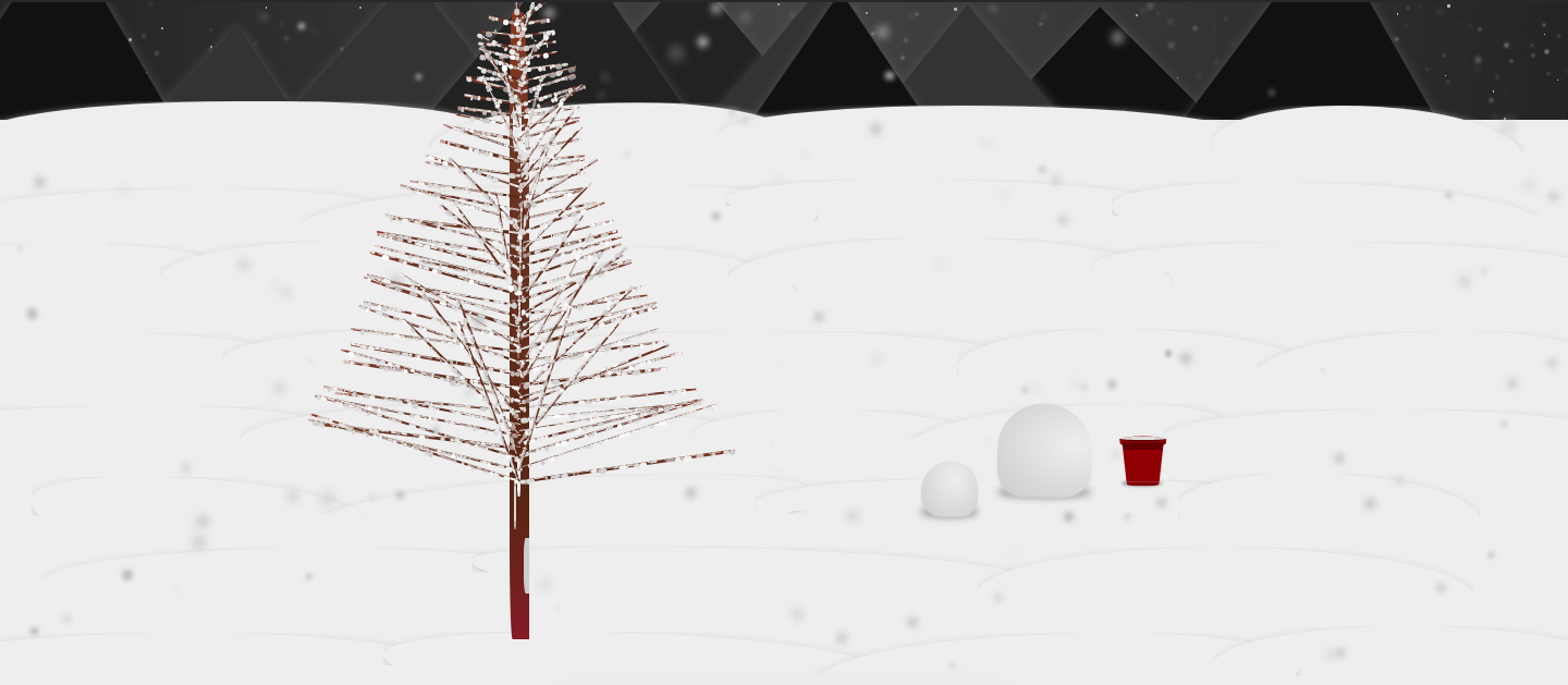
成果物はCodepen上に公開 https://codepen.io/kyoyababa/pen/maPMZM していますが、レンダリング完了まで1500ms前後を要するのでメモリ消費にご注意ください。
全体のHTML
HTMLは別に面白いことはなく、DOM生成とスタイル指定のために各オブジェの親要素を用意しているのみです。
<div class="background-and-objects">
  <div class="background">
    <ul id="background-snows" class="snows"></ul>
    <ul id="mountains" class="mountains"></ul>
    <ul id="snow-horizons" class="snow-horizons"></ul>
  </div>

  <div class="objects">
    <div class="tree">
      <div id="stem-container" class="stem-container"></div>
      <ul id="right-branch" class="right-branch"></ul>
      <ul id="left-branch" class="left-branch"></ul>
      <ul id="front-branch" class="front-branch"></ul>
    </div>

    <div class="snow-man">
      <ul id="bowls" class="bowls"></ul>
      <div id="bucket-container" class="bucket-container"></div>
    </div>
  </div>
</div>

<ul id="forward-snows" class="snows"></ul>
ツリー(オウシュウトウヒ)のレンダリング
ツリー部分は大きく4つの要素に分かれており、「幹」「向かって右側の枝群」「向かって左側の枝群」「手前に向かっている枝群」でそれぞれ一定範囲内でランダムに要素を配置しています。
- 枝ごとにランダムに設定しているスタイル(いずれも浮動小数点値)
-
width= 25px ~ 225px -
height= 2px ~ 4px -
margin-top= 8px ~ 12px -
transform: rotate()= -180deg ~ 20deg
-

class Tree {
  constructor() {
    this.renderStem();
    this.renderBranches('right');
    this.renderBranches('left');
    this.renderBranches('front');
  }

  renderStem() {
    const $stemContainer = document.getElementById(`stem-container`);
    $stemContainer.insertAdjacentHTML(
      'beforeend',
      `<div class="stem"></div> `
    );
  }

  renderBranches(direction) {
    const $branchList = document.getElementById(`${direction}-branch`);
    const branchLength = 40;
    const branchWidthes = this.getBranchWidthes(direction, branchLength);
    for (let i = 0; i < branchLength; i++) {
      $branchList.insertAdjacentHTML(
        'beforeend',
        `<li style="${
          this.getBranchStyle(direction, branchWidthes[i])
        }"></li>`
      );
    }
  }

  getBranchWidthes(direction, branchLength) {
    const widthes = [];
    for(let i = 0; i < branchLength; i++) {
      const maxWidth = direction !== 'front' ? 200 : 150;
      const width = Math.random() * maxWidth + 25;
      widthes.push(width);
    }
    return widthes.sort((a, b) => a - b);
  }

  getBranchStyle(direction, width) {
    return `
      width: ${width}px;
      height: ${Math.random() * 2 + 2}px;
      margin-top: ${Math.random() * 4 + 8}px;
      transform: rotate(${this.getRotationValue(direction)}deg);
    `;
  }

  getRotationValue(direction) {
    switch(direction) {
      case 'right': return (Math.random() * 15 + 5) * -1;
      case 'left': return Math.random() * 15 + 5;
      case 'front': return (Math.random() * 165 + 15) * -1;
    }
  }
}
ツリーに積もった雪のレンダリング
上記だけだとただの「枯れ木」で、実際に雪が振っている場所にあるには違和感があるので、それぞれの枝にこちらもランダムに雪を積もらせます。枝にそれぞれ、枝の横幅の1/4の数の <div> を付与し、ランダムに雪玉を生成しているイメージです。
- 枝上の雪玉ごとにランダムに設定しているスタイル(いずれも浮動小数点値、
background-colorのみ0xrrのRGBA値)-
width= 0px ~ 10px -
height= 0px ~ 6px -
border-radius= 70% ~ 100% -
background-color= rgba(205 ~ 255, 205 ~ 255, 205 ~ 255, 0.5 ~ 1)
-

renderPiledUpSnow(direction)  {
  const $branches = document.getElementById(`${direction}-branch`).querySelectorAll('li');

  for(let i = 0; i < $branches.length; i++) {
    const branchWidth = parseInt($branches[i].style.width, 10);

    for(let j = 0; j < branchWidth / 4; j++) {
      $branches[i].insertAdjacentHTML(
        'beforeend',
        `<div style="${
          this.getSnowStyle(direction)
        }"></div>`
      );
    }
  }
}

getSnowStyle(direction) {
  const borderRadius = Math.random() * 30 + 70;
  const color = Math.floor(Math.random() * 50) + 205;
  const opacity = Math.random() + 0.5;

  return `
    width: ${Math.random() * 10}px;
    height: ${Math.random() * 6}px;
    border-radius: ${borderRadius}%;
    ${direction === 'front' ? 'transform: translate(0, -50%);' : ''}
    background-color: rgba(${color}, ${color}, ${color}, ${opacity});
  `;
}
同じ要領で、幹のほうにもいい感じに雪が付いている感じにしました。
renderIngrainedSnow() {
  const $stem = document.getElementById('stem');
  const snowLength = Math.random() * 20;

  function getSnowStyle() {
    const width = Math.random() * 10;
    const height = Math.random() * 30 + 30;
    const top = Math.random() * 100;
    const left = Math.random() * (100 - width);
    const borderRadius = Math.random() * 25 + 25;
    const color = Math.floor(Math.random() * 50) + 205;
    const opacity = Math.random() + 0.9;

    return `
      top: ${top}%;
      left: ${left}%;
      width: ${width}px;
      height: ${height}px;
      border-radius: ${borderRadius}%;
      background-color: rgba(${color}, ${color}, ${color}, ${opacity});
    `;
  }

  for (let i = 0; i < snowLength; i++) {
    $stem.insertAdjacentHTML(
      'beforeend',
      `<div style="${
        getSnowStyle()
      }"></div>`
    );
  }
}
雪だるまを構成する(構成し得る)バケツのレンダリング
バケツはCSSでひたすらいい感じになるように組みました。慣れると、台形や楕円をすぐに作れるようになります。

わかりやすいように要素を分解した図も掲載します。

<div class="bucket">
  <div class="bucket-top"></div>
  <div class="bucket-bottom"></div>
</div>
.bucket,
.bucket-top,
.bucket-bottom {
  position: relative;

  &::before,
  &::after {
    content: '';
    position: relative;
    display: block;
  }
}

.bucket {
  &::after {
    width: 70px;
    height: 0;
    margin-left: 16px;
    border-top: 9px solid darken(#dc0000, 4%);
    border-left: 2px solid transparent;
    border-right: 2px solid transparent;
    border-bottom-right-radius: 100%;
    border-bottom-left-radius: 100%;
  }
}

.bucket-top {
    z-index: 1;

    &::before,
    &::after {
      width: 100px;
    }

    &::before {
      z-index: 1;
      height: 10px;
      border: 3px solid #dc0000;
      border-radius: 100%;
      background-image: linear-gradient(
        to bottom,
        darken(#dc0000, 10%),
        darken(#dc0000, 20%)
      );
    }

    &::after {
      z-index: 0;
      height: 18px;
      margin-top: -10px;
      border-right: 3px solid #dc0000;
      border-left: 3px solid #dc0000;
      border-bottom-right-radius: 100%;
      border-bottom-left-radius: 100%;
      background-color: #dc0000;
    }
  }

  .bucket-bottom {
    width: 74px;
    height: 0;
    margin-top: -10px;
    margin-left: 6px;
    border-top: 90px solid #dc0000;
    border-left: 10px solid transparent;
    border-right: 10px solid transparent;

    &::before,
    &::after {
      height: 0;
      border-right: 2px solid transparent;
      border-left: 2px solid transparent;
    }

    &::before {
      width: 90px;
      margin-top: -90px;
      margin-left: -10px;
      border-top: 12px solid darken(#dc0000, 15%);
    }

    &::after {
      width: 86px;
      margin-left: -8px;
      border-top: 6px solid darken(#dc0000, 15%);
      border-bottom-right-radius: 100%;
      border-bottom-left-radius: 100%;
    }
  }
}
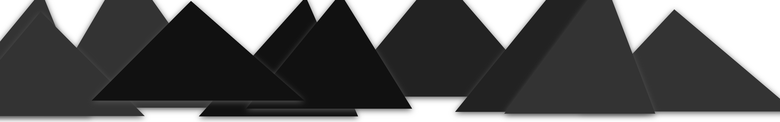
山の配置
山については、ランダムに三角形ぽいものが並ぶようにしているだけですが、微妙に z-index 値がランダムに重なるようにし、それなりにそれっぽく見えるようにしました。
- 山ごとにランダムに設定しているスタイル(いずれも浮動小数点値)
-
z-index= 0 ~ 12 (要素数が12のため) -
margin-left= -300px ~ -150px -
border-right-width= 100px ~ 250px -
border-left-width= 150px ~ 250px -
border-bottom-width= 200px ~ 300px -
border-bottom-color= #111111 || #222222 || #333333 || #444444 -
transform: translateY()= -100px ~ -50px
-
.mountains {
  overflow-x: hidden;
  position: absolute;
  top: 0;
  right: -200px;
  left: -200px;
  display: flex;
  justify-content: center;

  .mountain {
    position: relative;
    border-style: solid;
    border-color: transparent;
    filter: drop-shadow(0 3px 6px #555555);
  }
}
class Mountains {
  constructor() {
    this.renderMountains();
  }

  renderMountains() {
    const mountainsLength = 10;
    const $mountains = document.getElementById(`mountains`);
    for (let i = 0; i < mountainsLength; i++) {
      $mountains.insertAdjacentHTML(
        'beforeend',
        `<li class="mountain" style="${
          this.getMountainStyle(mountainsLength)
        }"></li>`
      );
    }
  }

  getMountainStyle(mountainsLength) {
    const zIndex = Math.floor(Math.random() * mountainsLength);
    const marginLeft = (Math.random() * 150 + 150) * -1;
    const rightWidth = Math.random() * 150 + 100;
    const leftWidth = Math.random() * 100 + 150;
    const bottomWidth = Math.random() * 100 + 200;
    const colorCode = Math.floor(Math.random() * 3) + 1;
    const translationY = (Math.random() * 50 + 50) * -1;

    return `
      z-index: ${zIndex};
      margin-left: ${marginLeft}px;
      border-right-width: ${rightWidth}px;
      border-left-width: ${leftWidth}px;
      border-bottom-width: ${bottomWidth}px;
      border-bottom-color: #${colorCode * 111111};
      transform: translate(0, ${translationY}px);
    `;
  }
}
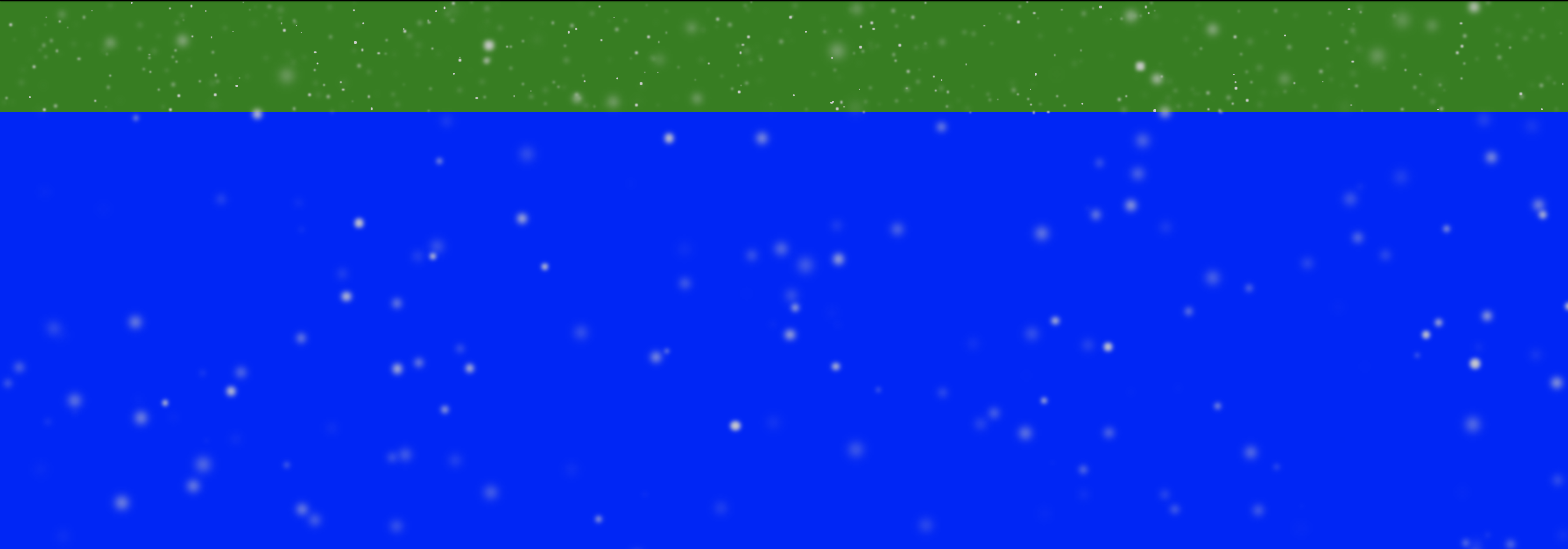
雪の配置
降っている雪は、合計400個の <li></li> 要素を画面上にレンダリングして、微妙に大きさやぼかし具合を変えているだけです。(貧弱なブラウザでなくても、相当負荷がかかっていそうではある。)
山の向こうに降っている雪と、手間に降っている雪をそれぞれ配置しました。
-
山の向こうに降っている各雪のランダムなスタイル(いずれも浮動小数点値)
-
top= 0px ~ 140px -
left= 0% ~ 100% -
size= 1px ~ 3px -
blur= 0px ~ 3px
-
-
手前に降っている各雪のランダムなスタイル(いずれも浮動小数点値)
-
top= 0px ~ 700px -
left= 0% ~ 100% -
size= 1px ~ 11px -
blur= 2px ~ 6px
-
緑背景箇所が、山の向こうに降っている雪が配置されるエリア( z-index 値を山群要素より低い値に設定)。
手前に降っている雪は緑背景と青背景のいずれにも配置され得ます。
class Snows {
  constructor() {
    this.letItSnows();
  }

  letItSnows() {
    const $forwardSnows = document.getElementById(`forward-snows`);
    const forwardSnowsLength = 100;
    for (let i = 0; i < forwardSnowsLength; i++) {
      $forwardSnows.insertAdjacentHTML(
        'beforeend',
        `<li class="snow" style="${
          this.getSnowStyle('forward')
        }"></li>`
      );
    }

    const $backgroundSnows = document.getElementById(`background-snows`);
    const backgroundSnowsLength = 300;
    for (let i = 0; i < backgroundSnowsLength; i++) {
      $backgroundSnows.insertAdjacentHTML(
        'beforeend',
        `<li class="snow" style="${
          this.getSnowStyle('background')
        }"></li>`
      );
    }
  }

  getSnowStyle(type) {
    let offsetTop;
    let offsetLeft;
    let size;
    let blur;

    switch(type) {
      case 'forward':
        offsetTop = Math.random() * 700;
        offsetLeft = Math.random() * 100;
        size = Math.random() * 10 + 1;
        blur = Math.random() * 4 + 2;
        break;

      case 'background':
        offsetTop = Math.random() * 140;
        offsetLeft = Math.random() * 100;
        size = Math.random() * 2 + 1;
        blur = Math.random() * 3;
        break;
    }

    return `
      top: ${offsetTop}px;
      left: ${offsetLeft}%;
      width: ${size}px;
      height: ${size}px;
      filter: blur(${blur}px);
    `;
  }
}
おまけ:ベツレヘムの星
結局使いませんでしたが、ベツレヘムの星(クリスマスツリーの一番上によく飾ってあるやつ。マタイの福音書では、賢者にイエス生誕を知らせたものとされる)も作りました。
https://codepen.io/kyoyababa/pen/aPNGrz

それでは来年も、佳きCSSライフを。