この記事は古いです。
下記など公式ドキュメントを参照ください。
https://developer.wordpress.org/block-editor/
自己紹介
石川栄和 @kurudrive
株式会社ベクトル
代表取締役 / フロントエンドエンジニア
好きなもの : スケボー / スプラトゥーン2

■ こんなの作ってます
- WordPressテーマ「Lightning」
- WordPressテーマ「BizVektor」
- 見積書・請求書管理用WordPressテーマ
「BillVektor」 - お城めぐりGPSスタンプラリー戦国攻城記
- スケボーブログ
今日の内容
- Gutenbergとは?
- Gutenbergの特徴
- Web制作者が最低限抑えておきたいポイント
- はじめてのブロック開発
- とりあえず作ってみる
- 任意のclassをつける
- 編集可能にする
- ツールバーをつける
- 画像とテキストのブロック
- 編集可能領域が複数あるブロック
- 使い所の考察
Gutenbergとは?
- WordPress 5.0 から搭載予定の新エディタ
- 現在はプラグインとして利用可能
- 今までのビジュアルエディタ(WYSIWYG)と違って、様々なレイアウトが容易になる。
- 入力画面がガラリとかわる
Gutenbergの特徴
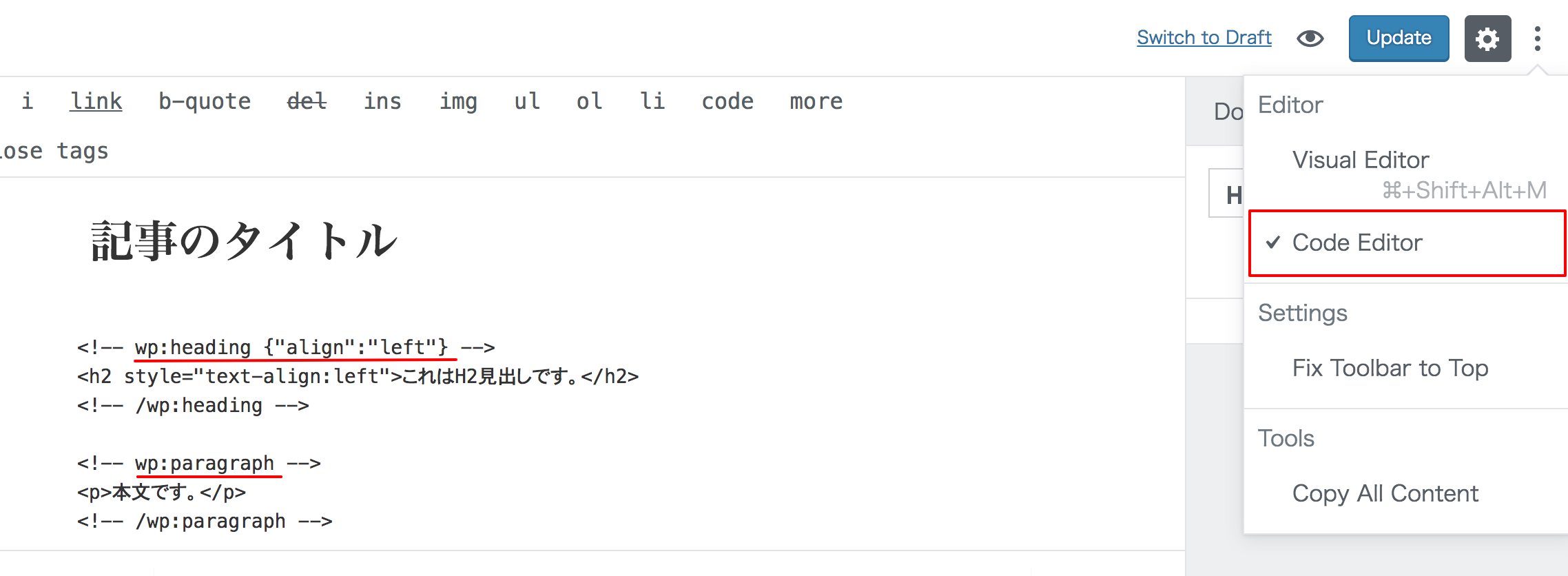
編集イメージ
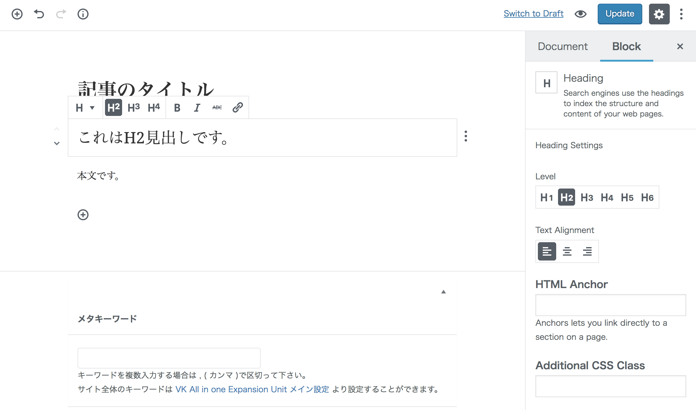
ブロック要素の情報はHTMLコメント
※ レイアウトにショートコードを使ったりしていないので、プラグインをGutenbergを使用しなかったとしてもショートコードがそのまま表示されたりしない。
Web制作者が最低限
抑えておきたいポイント
編集画面の独自CSSを読み込む
現状 add_editor_style( 'editor.css' ) ではGutenbergの編集画面には反映されないので、以下の方法で読み込む必要がある。
add_action( 'enqueue_block_editor_assets', 'gutenberg_examples_enqueue_block_editor_assets' );
function gutenberg_examples_enqueue_block_editor_assets() {
	wp_enqueue_style(
		'gutenberg-examples-editor',
		plugins_url( 'css/style.css', __FILE__ ),
		array( 'wp-edit-blocks' ),
		filemtime( plugin_dir_path( __FILE__ ) . 'css/style.css' )
	);
}
公開画面に独自CSSを読み込む
※テーマで既にCSSを読み込み済みの場合は不要
add_action( 'enqueue_block_assets', 'gutenberg_examples_enqueue_block_assets' );
function gutenberg_examples_enqueue_block_assets() {
	wp_enqueue_style(
		'gutenberg-examples',
		plugins_url( 'css/style.css', __FILE__ ),
		array( 'wp-blocks' ),
		filemtime( plugin_dir_path( __FILE__ ) . 'css/style.css' )
	);
}
Gutenberg独自のクラスへの対応
画像やレイアウトなどGutenberg独自のclassがあるので、Gutenberg用のCSSを用意する。
現行エディタで言う所の
.alignleft / .alignright / .aligncenter
.wp-caption / .wp-caption img / .wp-caption-text
.gallery / .gallery-item / .gallery-caption
.wp-smiley
など
例) Cover Image ブロック
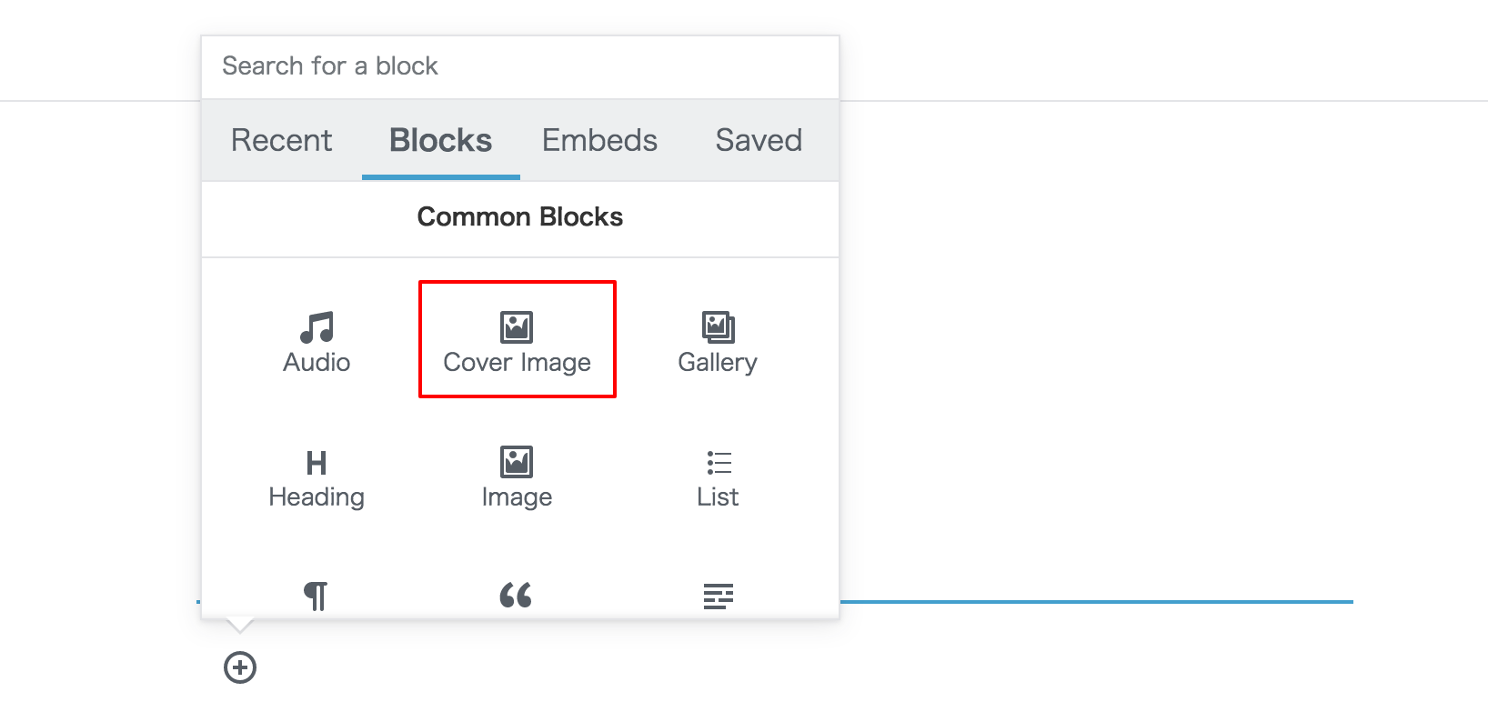
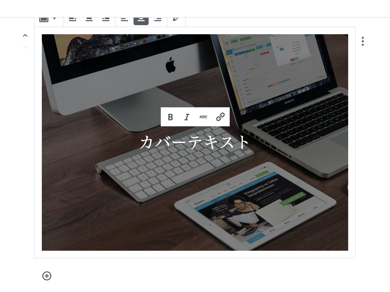
某テーマで見ると...
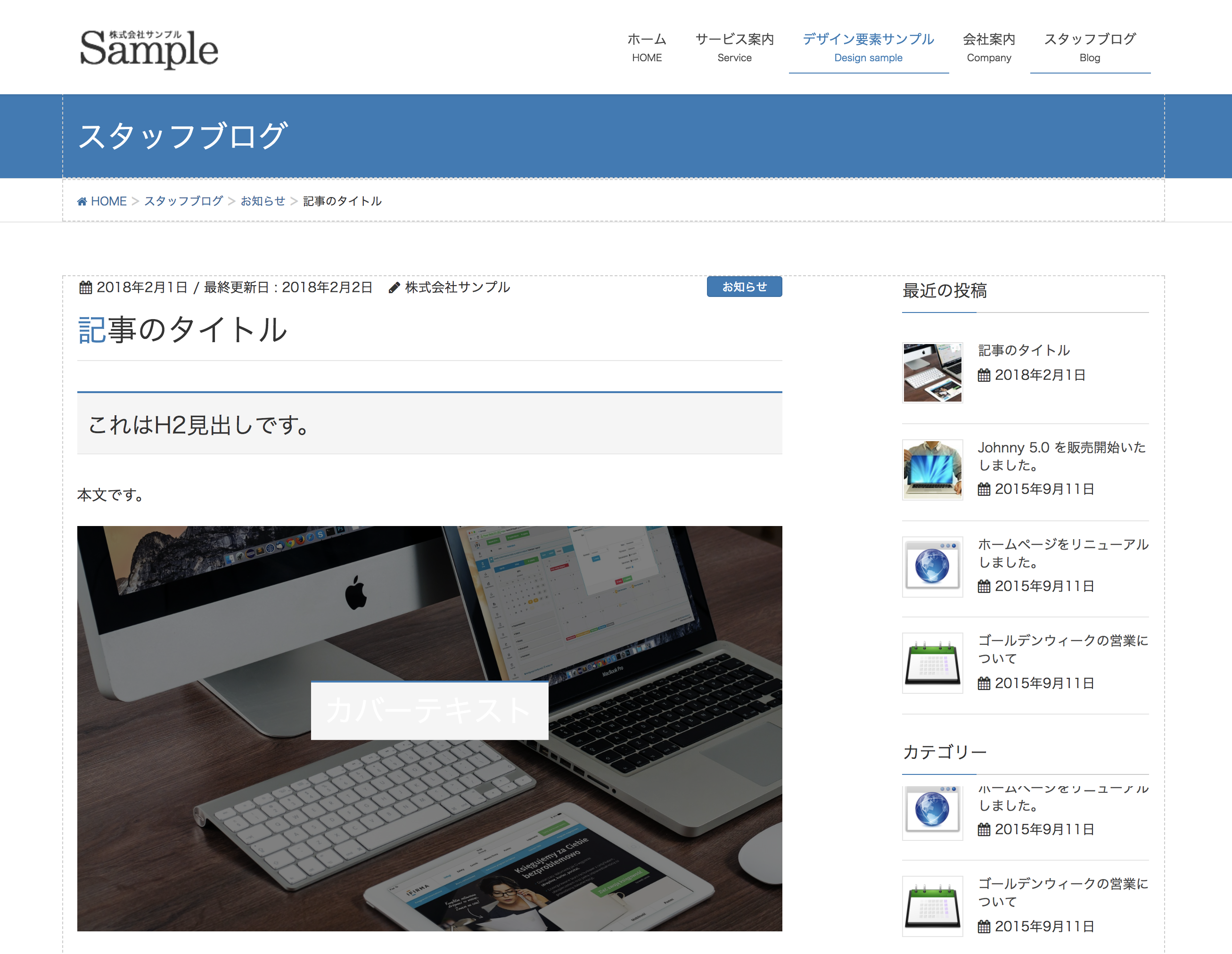
(;゚ Д゚) …!?
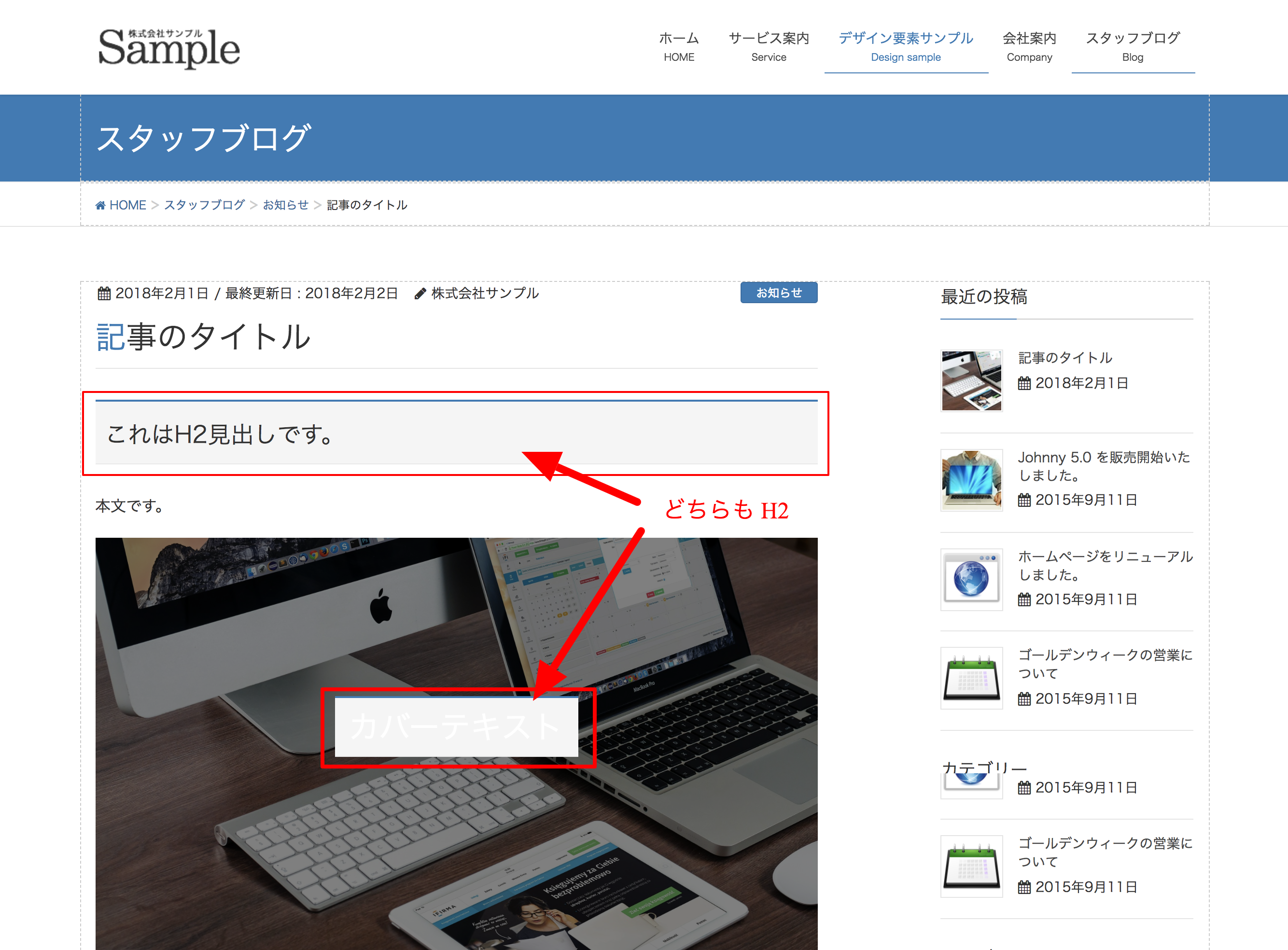
とは言っても標準ブロックだと気になるのは
- カバー画像
.wp-block-cover-image h2 - ギャラリー
.wp-block-gallery - テキストカラム
.wp-block-text-columns
くらいかと...。
はじめての
Gutenbergブロック開発
Gutenbergブロック開発
下記の記事がとてもわかりやすかったので
前半はほぼそのままです。
詳しい解説などありますので是非確認してみてください。
[WordPress] はじめてのGutenberg Custom Block Type
開発環境の準備
- VCCWやDockerなどローカルの開発環境を用意する。
- プラグイン「Gutenberg」をインストール・有効化。
- 作業用のプラグインディレクトリを用意する。
wp-cli が入っている場合は
$ wp scaffold plugin my-gutenberg-examples
ビルド環境の準備
JSX(React)
- Gutenbergの開発はPHPじゃなくてJavaScript
- FacebookのReactで使われているJavaScriptの独自拡張構文
- JSXはHTMLっぽいタグで書いたものをいい感じにJSにしてくれる。
(SASSみたいな感じ...?)
ESNext
最新の書き方やブラウザ依存する書き方でも、どのブラウザでも安定して動くように書き換えてくれる
インストール
-
とりあえず package.json ファイルを作成 (中身は空でOK)
-
ターミナルでプラグインディレクトリに移動し
npm initを叩くと package.json が作成される
※よくわからんかったら適当にEnter連打でOK -
JSXとESNextのビルドに必要なライブラリをインストール
$ npm i babel-core babel-loader babel-plugin-transform-react-jsx babel-preset-env cross-env webpack
ビルド設定ファイルの作成
設定ファイル(webpack.config.js)を作成
module.exports = {
	entry: './block.js', // ビルド前
	output: {
		path: __dirname,
		filename: 'block.build.js', // ビルド後
	},
	module: {
		loaders: [{
			test: /.js$/,
			loader: 'babel-loader',
			exclude: /node_modules/,
		}, ],
	},
};
Babelの設定ファイル(.babelrc)を作成
{
	"presets": [
		[
			"env",
			{
				"modules": false
			}
		]
	],
	"plugins": [
		[
			"transform-react-jsx",
			{
				"pragma": "wp.element.createElement"
			}
		]
	]
}
build コマンドの追加
package.json ファイルに
  "scripts": {
    "build": "cross-env BABEL_ENV=default NODE_ENV=production webpack"
  },
を追加したら、 npm run buld で block.js がビルドされて block.build.js ファイルが作成されます。
ビルドしてみる
block.jsに
const hw = <h1>Hello World</h1>;
と書いて、npm run buld すると...
block.build.jsには下記のように出力されます。
var hw = wp.element.createElement(
  "h1",
  null,
  "Hello World"
);
ビルドしたBlock用JSの読み込み
add_action( 'enqueue_block_editor_assets', 'gutenberg_examples_enqueue_block_editor_assets' );
function gutenberg_examples_enqueue_block_editor_assets() {
	// JSの読み込み
	wp_enqueue_script(
		'gutenberg-examples',
		plugins_url( 'block.build.js', __FILE__ ),
		array( 'wp-blocks', 'wp-i18n', 'wp-element' ),
		filemtime( plugin_dir_path( __FILE__ ) . 'block.build.js' )
	);
	// CSSの読み込み
	wp_enqueue_style(
		'gutenberg-examples-editor',
		plugins_url( 'css/style.css', __FILE__ ),
		array( 'wp-edit-blocks' ),
		filemtime( plugin_dir_path( __FILE__ ) . 'css/style.css' )
	);
}
ではやってみよう!
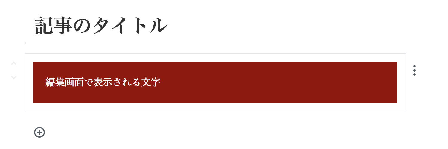
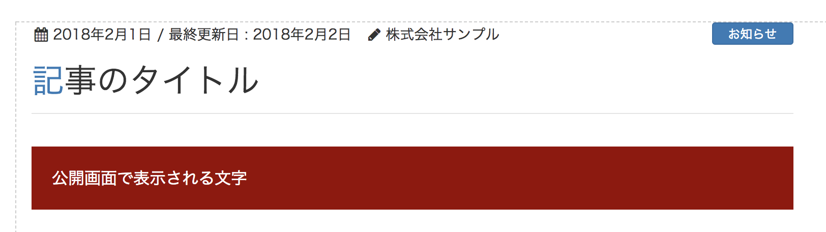
サンプル1
まずは作ってみる
const { __ } = wp.i18n;
const { registerBlockType } = wp.blocks;
const blockStyle = {
backgroundColor: '#900',
color: '#fff',
padding: '20px',
};
registerBlockType( 'gutenberg-examples/example-01', {
title: __( 'Example: 01' ), // ブロック名
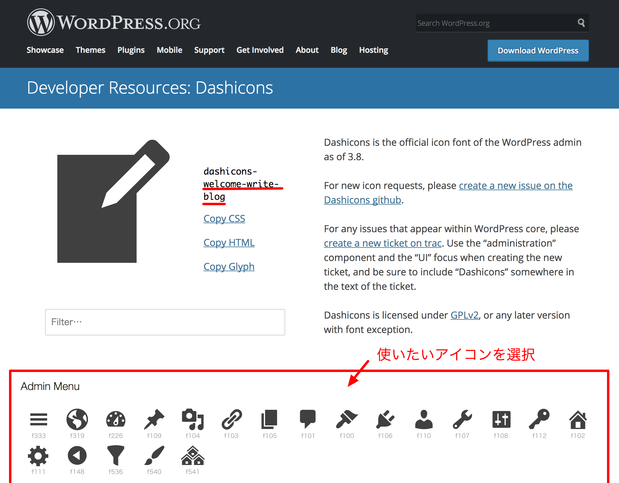
icon: 'welcome-write-blog', // アイコン
category: 'layout', // ブロックのカテゴリー
edit() {
return <div style={ blockStyle }>編集画面で表示される文字</div>;
},
save() {
return <div style={ blockStyle }>公開画面で表示される文字</div>;
},
} );
作成結果
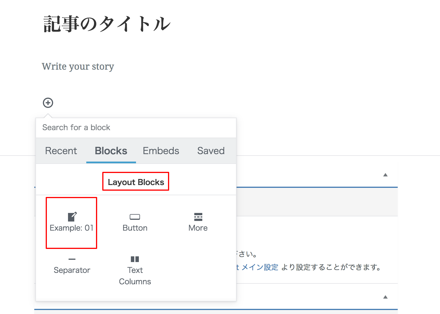
アイコンの指定(Dashicons)
編集画面
公開画面
簡単そう!
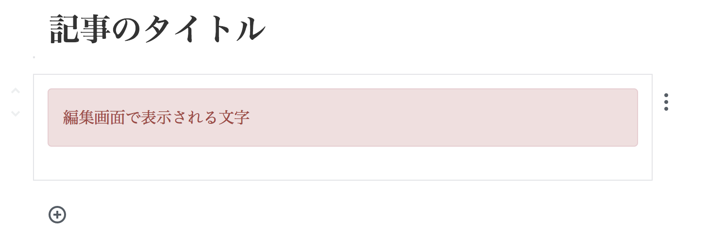
サンプル2
classの指定
任意のclass名を指定する
const { __ } = wp.i18n;
const { registerBlockType } = wp.blocks;

registerBlockType( 'gutenberg-examples/example-02', {
	title: __( 'Example: 02' ),
	icon: 'warning',
	category: 'layout',
	edit() {
		return <p className="alert alert-danger">編集画面で表示される文字</p>;
	},
	save() {
		return <p className="alert alert-danger">公開画面で表示される文字</p>;
	},
} );
編集画面
公開画面
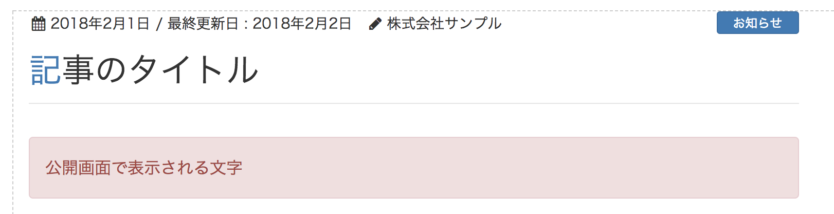
出力されているHTML
<p class="wp-block-gutenberg-examples-example-02 alert alert-danger">公開画面で表示される文字</p>
registerBlockType で登録した名前を元にして
classが自動的に付与される
registerBlockType( 'gutenberg-examples/example-02', {
いけるやん!
これで編集画面で
文字打ち変えれば
ええんろ!

_| ̄|...○
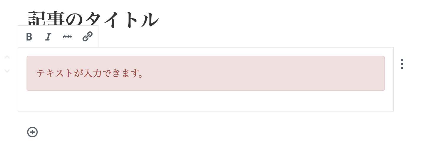
サンプル3
編集可能なテキストブロック
const { __ } = wp.i18n;
const { registerBlockType, Editable, source: { children } } = wp.blocks;

registerBlockType( 'gutenberg-examples/example-03', {
	title: __( 'Example: 03' ),
	icon: 'warning',
	category: 'layout',
	attributes: {
		content: {
			type: 'array',
			source: 'children',
			selector: 'p',
		},
	},
	edit: props => {
		const { attributes: { content }, focus, className, setFocus } = props;
		const onChangeContent = newContent => {
			props.setAttributes( { content: newContent } );
		};
		return (
			<Editable
				className="alert alert-danger"
				onChange={ onChangeContent }
				value={ content }
				focus={ focus }
				onFocus={ setFocus }
				/>
		);
	},
	save: props => (
		<p className="alert alert-danger">
			{ props.attributes.content }
		</p>
	)
} );
編集可能になる
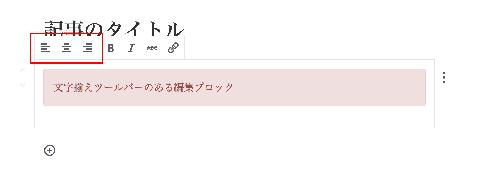
サンプル4
ツールバーのある編集ブロック
const { __ } = wp.i18n;
const {
	registerBlockType,
	Editable,
	source: { children },
	AlignmentToolbar,
	BlockControls
} = wp.blocks;

registerBlockType( 'gutenberg-examples/example-04', {
	title: __( 'Example: 04' ),
	icon: 'warning',
	category: 'layout',
	attributes: {
		content: {
			type: 'array',
			source: 'children',
			selector: 'p',
		},
	},
	edit: props => {
		const {
			attributes: {
				content,
				alignment
			},
			focus,
			className,
			setFocus
		} = props;

		const onChangeContent = newContent => {
			props.setAttributes( { content: newContent } );
		};

		const onChangeAlignment = newAlignment => {
			props.setAttributes( { alignment: newAlignment } );
		};

		return (
			<div>
				{
					!! focus && (
						<BlockControls>
							<AlignmentToolbar
								value={ alignment }
								onChange={ onChangeAlignment }
							/>
						</BlockControls>
					)
				}
				<Editable
					className="alert alert-danger"
					style={ { textAlign: alignment } }
					onChange={ onChangeContent }
					value={ content }
					focus={ focus }
					onFocus={ setFocus }
					/>
			</div>
		);
	},
	save: props => {
		let classes = '';
		if ( props.attributes.alignment ) {
			classes = 'gutenberg-examples-align-' + props.attributes.alignment;
		}
		return (
			<p className="alert alert-danger">
				{ props.attributes.content }
			</p>
		);
	}
} );
※ 右寄せや左寄せ指定した場合は公開画面用にもそのスタイルを用意しておかないと反映されないので注意
サンプル5
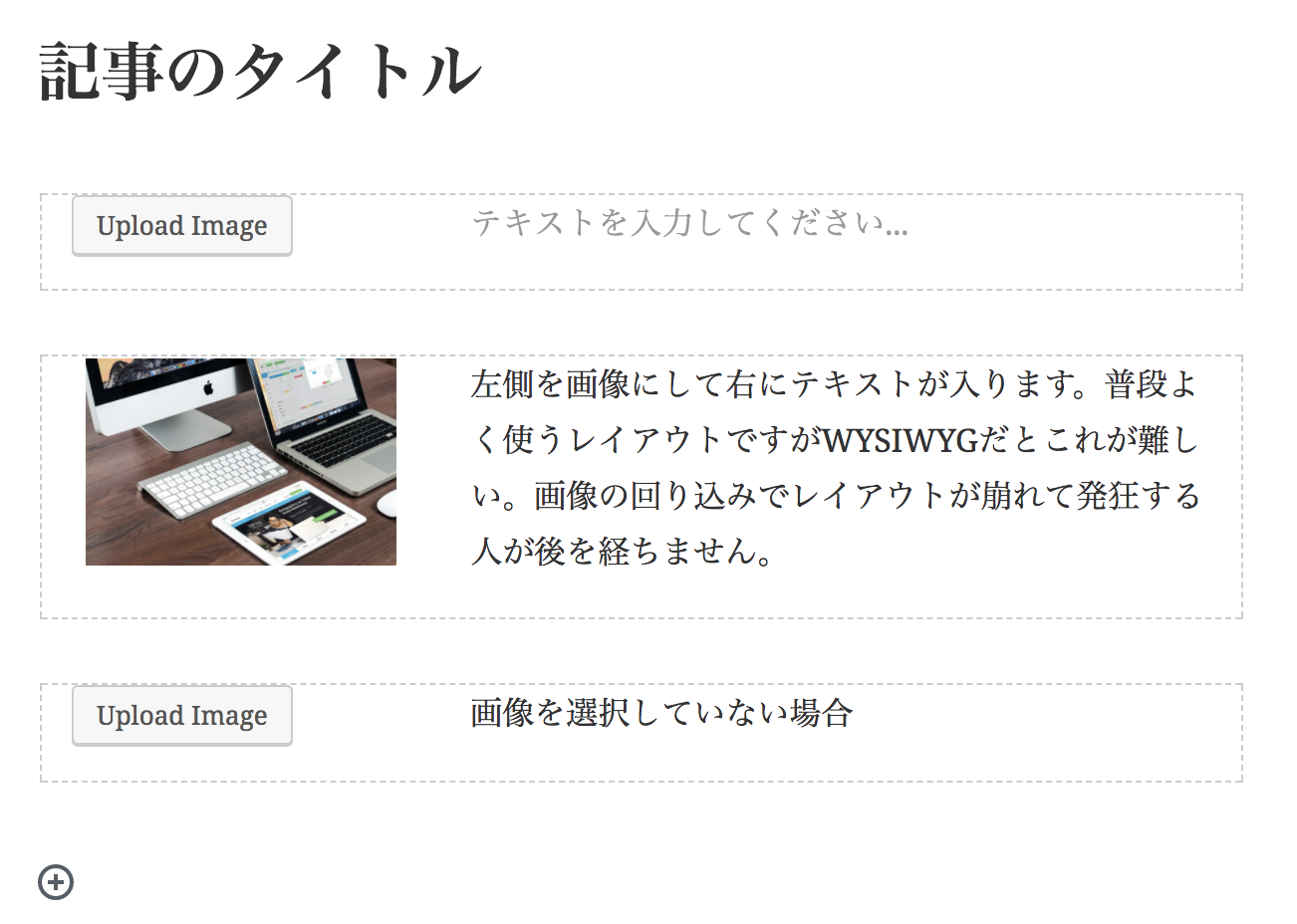
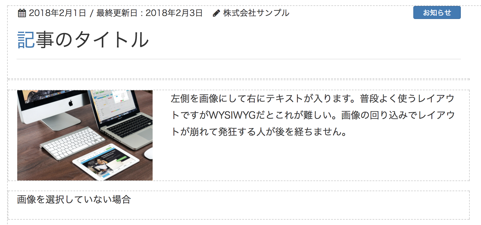
画像とテキストのブロック
- めっちゃ苦手だったやつ! -
編集画面
公開画面
const { __ } = wp.i18n;
const {
	registerBlockType,
	Editable,
	MediaUpload,
	source: {
		attr,
		children
	}
} = wp.blocks;
const { Button } = wp.components;

registerBlockType( 'gutenberg-examples/example-05', {
	title: __( 'Example: 05' ),
	icon: 'index-card',
	category: 'layout',
	attributes: {
		mediaID: {
			type: 'number',
		},
		mediaURL: {
			type: 'string',
			source: 'attribute',
			selector: 'img',
			attribute: 'src',
		},
		textarea: {
			type: 'array',
			source: 'children',
			selector: '.col-txt',
		},
	},
	edit: props => {
		const focusedEditable = props.focus ? props.focus.editable || 'mediaID' : null;
		const attributes = props.attributes;
		const onSelectImage = media => {
			props.setAttributes( {
				mediaURL: media.url,
				mediaID: media.id,
			} );
		};
		const onChangeTextarea = value => {
			props.setAttributes( { textarea: value } );
		};
		const onFocusTextarea = focus => {
			props.setFocus( _.extend( {}, focus, { editable: 'textarea' } ) );
		};

		return (
			<div className="row">
				<div className="col-md-4">
					<MediaUpload
						onSelect={ onSelectImage }
						type="image"
						value={ attributes.mediaID }
						render={ ( { open } ) => (
							<Button className={ attributes.mediaID ? 'image-button' : 'button button-large' } onClick={ open }>
								{ ! attributes.mediaID ? __( 'Upload Image' ) : <img src={ attributes.mediaURL } /> }
							</Button>
						) }
					/>
				</div>
				<Editable
					tagName="div"
					multiline="p"
					className="col-md-8 col-txt"
					placeholder={ __( 'テキストを入力してください...' ) }
					value={ attributes.textarea }
					onChange={ onChangeTextarea }
					focus={ focusedEditable === 'textarea' }
					onFocus={ onFocusTextarea }
				/>
			</div>
		);
	},
	save: props => {
		const {
			className,
			attributes: {
				mediaURL,
				textarea
			}
		} = props;
		return (
			<div className="row row-gt-layout">
				{
					mediaURL && (
						<div className="col-md-4">
						<img className={ className } src={ mediaURL } />
						</div>
					)
				}
				<div className="col-md-8 col-txt">
					{ textarea }
				</div>
			</div>
		);
	}
} );
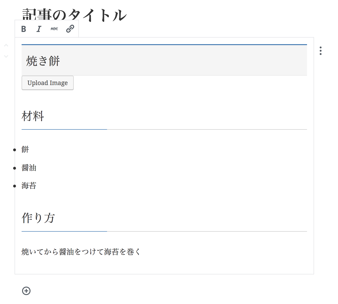
サンプル6
編集可能領域が
複数あるブロック
編集画面の編集可能領域の例
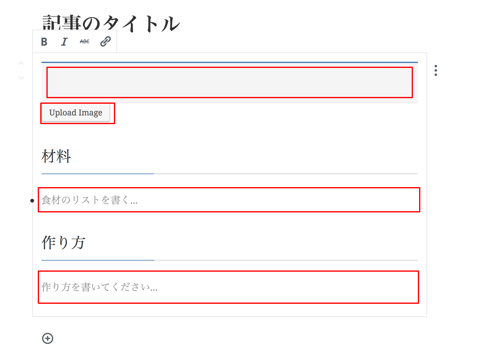
入力例
const { __ } = wp.i18n;
const {
	registerBlockType,
	Editable,
	MediaUpload,
	source: {
		attr,
		children
	}
} = wp.blocks;
const { Button } = wp.components;

registerBlockType( 'gutenberg-examples/example-05', {
	title: __( 'Example: 05' ),
	icon: 'index-card',
	category: 'layout',
	attributes: {
		title: {
			type: 'array',
			source: 'children',
			selector: 'h2',
		},
		mediaID: {
			type: 'number',
		},
		mediaURL: {
			type: 'string',
			source: 'attribute',
			selector: 'img',
			attribute: 'src',
		},
		ingredients: {
			type: 'array',
			source: 'children',
			selector: '.ingredients',
		},
		instructions: {
			type: 'array',
			source: 'children',
			selector: '.steps',
		},
	},
	edit: props => {
		const focusedEditable = props.focus ? props.focus.editable || 'title' : null;
		const attributes = props.attributes;
		const onChangeTitle = value => {
			props.setAttributes( { title: value } );
		};
		const onFocusTitle = focus => {
			props.setFocus( _.extend( {}, focus, { editable: 'title' } ) );
		};
		const onSelectImage = media => {
			props.setAttributes( {
				mediaURL: media.url,
				mediaID: media.id,
			} );
		};
		const onChangeIngredients = value => {
			props.setAttributes( { ingredients: value } );
		};
		const onFocusIngredients = focus => {
			props.setFocus( _.extend( {}, focus, { editable: 'ingredients' } ) );
		};
		const onChangeInstructions = value => {
			props.setAttributes( { instructions: value } );
		};
		const onFocusInstructions = focus => {
			props.setFocus( _.extend( {}, focus, { editable: 'instructions' } ) );
		};

		return (
			<div className={ props.className }>
				<Editable
					tagName="h2"
					placeholder={ __( 'Write Recipe title…' ) }
					value={ attributes.title }
					onChange={ onChangeTitle }
					focus={ focusedEditable === 'title' }
					onFocus={ onFocusTitle }
				/>
				<div className="recipe-image">
					<MediaUpload
						onSelect={ onSelectImage }
						type="image"
						value={ attributes.mediaID }
						render={ ( { open } ) => (
							<Button className={ attributes.mediaID ? 'image-button' : 'button button-large' } onClick={ open }>
								{ ! attributes.mediaID ? __( 'Upload Image' ) : <img src={ attributes.mediaURL } /> }
							</Button>
						) }
					/>
				</div>
				<h3>{ __( 'Ingredients' ) }</h3>
				<Editable
					tagName="ul"
					multiline="li"
					placeholder={ __( 'Write a list of ingredients…' ) }
					value={ attributes.ingredients }
					onChange={ onChangeIngredients }
					focus={ focusedEditable === 'ingredients' }
					onFocus={ onFocusIngredients }
					className="ingredients"
				/>
				<h3>{ __( 'Instructions' ) }</h3>
				<Editable
					tagName="div"
					multiline="p"
					className="steps"
					placeholder={ __( 'Write the instructions…' ) }
					value={ attributes.instructions }
					onChange={ onChangeInstructions }
					focus={ focusedEditable === 'instructions' }
					onFocus={ onFocusInstructions }
				/>
			</div>
		);
	},
	save: props => {
		const {
			className,
			attributes: {
				title,
				mediaURL,
				ingredients,
				instructions
			}
		} = props;
		return (
			<div className={ className }>
				<h2>
					{ title }
				</h2>
				{
					mediaURL && (
						<img className="recipe-image" src={ mediaURL } />
					)
				}
				<ul className="ingredients">
					{ ingredients }
				</ul>
				<div className="steps">
					{ instructions }
				</div>
			</div>
		);
	}
} );
使い所の考察
カスタムフィールドとの使い分け
構造的な長所と短所
- __絞り込み__や__並び替え__をする項目はカスタムフィールドのままになる
- ブロックが増えると探しにくいのでむやみに増やしすぎない方が良い
- カスタムフィールドはビルド環境とかなくてもPHPなら簡単に書ける
Gutenbergと相性の良い使用例
- スタッフ紹介
(スタッフ一人分の情報量が少なく、1ページに複数人掲載する場合) - 飲食店のメニュー
- 吹き出しブロック
- レイアウトブロック
→ 同じ要素を繰り返す場合
→ リピーターブロック的なものがBlockに置き換わりやすい
従来の手法でも良いと思われる例
- 商品紹介や不動産情報など、情報量が多くて1ページ1投稿で検索が重要なもの
- 入力フィールドが繰り返しじゃないものは、ブロックを探して選択しなくてもそのまま入力欄が見えているカスタムフィールドの方がユーザーが迷わず直感的に入力しやすい。
参考記事
- Gutenberg Handbook
- gutenberg-examples
- Gutenberg Handbook 読書メモ (2) Block Tutorial
- [WordPress] はじめてのGutenberg Custom Block Type
- [WordPress] Gutenbergの3つのレンダリング: 静的ブロックと動的ブロック、そしてクライアントサイドレンダリング
Special Thanks
- @ryo511 さん
- 岡本秀高 @motchi0214 さん
- @Toro_Unit さん