概要
react-sidenavを使ってみました。サイドバーを作成するライブラリですね。
公式をみてみるとstyled-componentsも使っていたのでこの期に学んでみました。
完成形はこちらです。
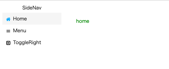
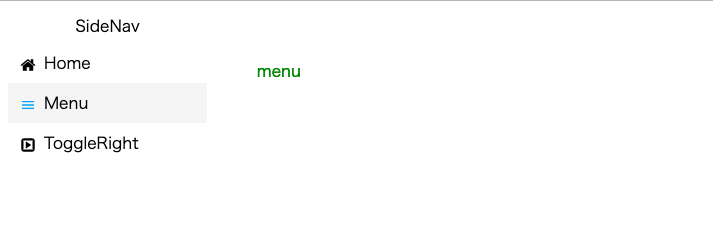
クリックするとアイコン色や背景色を変え、文字を表示しています。
必要なものをインストール
yarn add react-sidenav react-icons-kit styled-components
yarnでインストールしています。アイコンはreact-icons-kitを使います。
create-react-appで作りますが最初の方は割愛します。
styled-components
後々使うstyled-componentsを最初に作っておきます。
styled/sidenav.js
import styled from 'styled-components';

export const SideNavContainer = styled.div`
  display: flex;
  flex-direction: column;
  height: 100%;
  width: 20%;
`;

export const Title = styled.div`
  display: flex;
  justify-content: center;
  align-items: center;
  padding: 5px;
`;
学んでわかりましたがかなり便利ですね。
コンポーネント
MainPage.js
import React from 'react';
import { SideNavContainer, Title } from '../styled/sidenav';

import AppNavigation from './sidenav';


class MainPage extends React.Component {
  state = { selectedPath: 'home'};

  changePath = (path) => {
    this.setState({ selectedPath: path });
  }

  displayText = () => {
    return (
      <div style={{ margin: '50px', color: 'green' }}>
        {this.state.selectedPath}
      </div>
    );
  }

  render() {
    return (
      <div style={{ display: 'flex' }}>
        <SideNavContainer>
          <Title>SideNav</Title>
          <AppNavigation changePath={this.changePath} />
        </SideNavContainer>
        {this.displayText()}
      </div>
    );
  }
}

export default MainPage;
styled-componentsから引っ張ってきたものをここで使っています。
ここではstateで選ばれたものを管理してその変更を文字で表示しています。
AppNavigationの部分がsidenavなので見ていきましょう。
sidenav/index.js
import React from 'react';
import { Nav, SideNav, NavIcon } from 'react-sidenav';
import { Icon } from 'react-icons-kit';
import styled from 'styled-components';

import { home } from 'react-icons-kit/fa/home';
import { ic_menu } from 'react-icons-kit/md/ic_menu';
import { toggleRight } from 'react-icons-kit/fa/toggleRight';

const theme = {
  hoverBgColor: '#f5f5f5',
  selectionBgColor: '#f5f5f5',
  selectionIconColor: '#03A9F4',
};

const Text = styled.div`
  padding-left: 8px;
`;


class AppNavigation extends React.Component {
  state = { selectedPath: ''};

  onItemSelection = (arg) => {
    this.setState({ selectedPath: arg.path });
    this.props.changePath(arg.path);
  };

  render() {
    return (
      <SideNav
        theme={theme}
        defaultSelectedPath="home"
        selectedPath={this.state.selectedPath}
        onItemSelection={this.onItemSelection}
      >
        <Nav id={"home"}>
          <NavIcon>
            <Icon icon={home} />
          </NavIcon>
          <Text>Home</Text>
        </Nav>
        <Nav id={"menu"}>
          <NavIcon>
            <Icon icon={ic_menu} />
          </NavIcon>
          <Text>Menu</Text>
        </Nav>
        <Nav id={"toggle"}>
          <NavIcon>
            <Icon icon={toggleRight} />
          </NavIcon>
          <Text>ToggleRight</Text>
        </Nav>
      </SideNav>
    );
  }
};

export default AppNavigation;
注目ポイントは<SideNav>の部分ですね。
defaultSelectedPathで開いた時に選択したい要素を指定できます。
selectedPathで選ばれている要素をstateで管理しています。
onItemSelectionは選んだ時の動作で、これで状態を変更し、親のstateも変更して、文字も変えているという感じです。
まとめ
react-sidenavを使ってみました。
react-icons-kitといい、便利なライブラリが多いですね。
うまく活用していきたいです。
styled-componentsもいい勉強になりました。