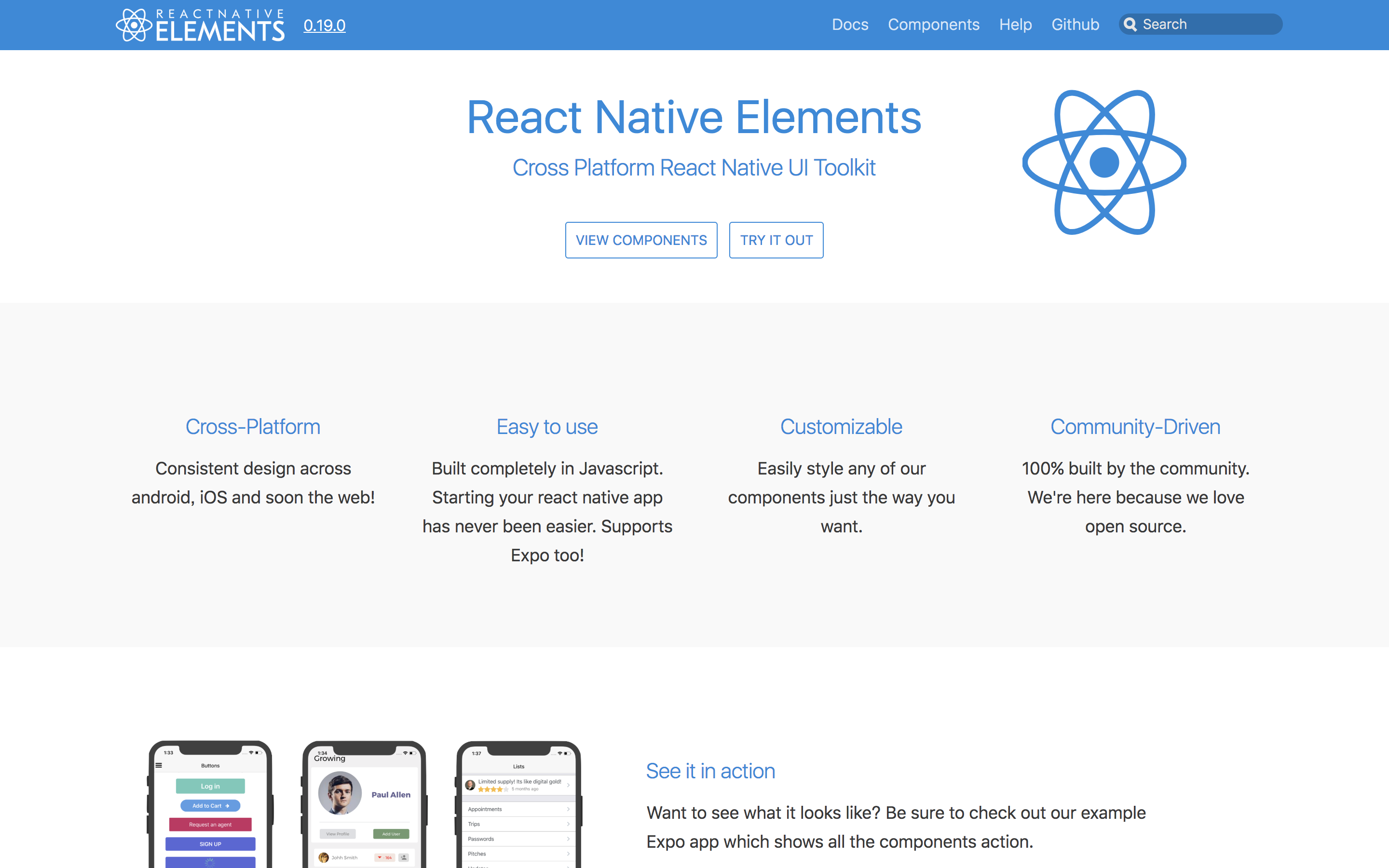
どんな記事?
React Nativeのスター1万超えのUIライブラリ
React Native Elements
の使用方法についてまとめた記事です。
今回はプロジェクトを作るところから始めてみます。
また、バージョンは 0.19.0を使用しております。
また、@y_tsubukuが開発するyaritori - メール共有システムも、良ければご覧ください 
プロジェクトを作成 
create-react-native-appでさくっと。
# プロジェクト作成
$create-react-native-app elements_example
# 作ったプロジェクトのルートディレクトリへ移動
$cd elements_example
# 起動
$yarn start
起動時はこんなかんじ

また、App.jsはこんなかんじになっています。
App.js
import React from 'react';
import { StyleSheet, Text, View } from 'react-native';

export default class App extends React.Component {
  render() {
    return (
      <View style={styles.container}>
        <Text>Open up App.js to start working on your app!</Text>
        <Text>Changes you make will automatically reload.</Text>
        <Text>Shake your phone to open the developer menu.</Text>
      </View>
    );
  }
}

const styles = StyleSheet.create({
  container: {
    flex: 1,
    backgroundColor: '#fff',
    alignItems: 'center',
    justifyContent: 'center',
  },
});
作成+起動を確認できたので、続いてReact Native Elementsをインストールしていきましょう。
React Native Elementsをインストール 
$yarn add react-native-elements
これでエラーなどでなければOK。
それでは、実際に動かしながら試していきましょう。
※React Native Elementsには多くのComponentが含まれます。
「全部みたいよ〜」という方は、Overviewから探すと良さそうです。
Avatar
- ユーザアイコンなどに。
- 表示はイメージ・文字・アイコンから選択可能。
- サイズは、
small,medium,large,xlargeから選べる。 - propsに
roundedを付加すると、丸くしてくれる。 - まさにAvatar。使いやすいですね。

Avatar.js
import React from 'react';
import { StyleSheet, View } from 'react-native';
import { Avatar } from 'react-native-elements'

export default class App extends React.Component {
  render() {
    return (
      <View style={styles.container}>
        <Avatar
          small
          rounded
          source={{uri: "https://qiita-image-store.s3.amazonaws.com/0/99874/profile-images/1511169192"}}
          onPress={() => console.log("Works!")}
          activeOpacity={0.7}
        />
        <Avatar
          medium
          rounded
          source={{uri: "https://qiita-image-store.s3.amazonaws.com/0/99874/profile-images/1511169192"}}
          onPress={() => console.log("Works!")}
          activeOpacity={0.7}
        />
        <Avatar
          large
          rounded
          source={{uri: "https://qiita-image-store.s3.amazonaws.com/0/99874/profile-images/1511169192"}}
          onPress={() => console.log("Works!")}
          activeOpacity={0.7}
        />
        <Avatar
          xlarge
          rounded
          source={{uri: "https://qiita-image-store.s3.amazonaws.com/0/99874/profile-images/1511169192"}}
          onPress={() => console.log("Works!")}
          activeOpacity={0.7}
        />
        <Avatar
          xlarge
          rounded
          title="津"
          onPress={() => console.log("Works!")}
          activeOpacity={0.7}
        />
        <Avatar
          xlarge
          rounded
          icon={{name: 'user', type: 'font-awesome'}}
          onPress={() => console.log("Works!")}
          activeOpacity={0.7}
        />
      </View>
    );
  }
}

const styles = StyleSheet.create({
  container: {
    flex: 1,
    backgroundColor: '#fff',
    alignItems: 'center',
    justifyContent: 'center',
  },
});
※アイコンがうまくでないよーって人 
Icon in Avatar doesn't work
あたりが参考になるかも。
Button
- ボタン
-
raisedで浮き上がらせたり、largeで大きくしたり。 - actionは
onPressやonLongPressで付けられる。

Button.js
import React from 'react';
import { StyleSheet, View } from 'react-native';
import { Button } from 'react-native-elements'

export default class App extends React.Component {
  render() {
    return (
      <View style={styles.container}>
        <Button
          backgroundColor="#ff5622"
          title='普通のボタン'
          style={styles.button}/>
        <Button
          backgroundColor="#ff5622"
          title='onPress/onLongPress'
          style={styles.button}
          onPress={() => console.log('押されたよ')}
          onLongPress={() => console.log('長く押されたよ')}/>/>
        <Button
          raised
          backgroundColor="#009588"
          title='RAISED(ちょっと浮き上がる)'
          style={styles.button}/>
        <Button
          icon={{name: 'cached'}}
          backgroundColor="#9c26b0"
          title='アイコン付き'
          style={styles.button}/>
        <Button
          large
          backgroundColor="#8ac34a"
          title='largeだとこのくらいの大きさ'
          style={styles.button}/>
        <Button
          large
          iconRight={{name: 'code'}}
          backgroundColor="#ffc107"
          title='右にもアイコンを付けられる'
          style={styles.button}/>
        <Button
          large
          backgroundColor="#25292f"
          icon={{name: 'mark-github', type: 'octicon'}}
          title='OCTICONも使える'
          style={styles.button}/>

      </View>
    );
  }
}

const styles = StyleSheet.create({
  container: {
    flex: 1,
    backgroundColor: '#fff',
    // alignItems: 'center',
    justifyContent: 'center',
  },
  button: {
    margin: 10
  }
});
Card
- なんだかんだで便利なCard
- Card + 何か で使うことが多くなると思います

Card.js
import React from 'react';
import { StyleSheet, View, Text } from 'react-native';
import { Card, ListItem, Button } from 'react-native-elements'

const users = [
  {
    name: 'こんな',
    avatar: 'https://qiita-image-store.s3.amazonaws.com/0/99874/profile-images/1511169192'
  },
  {
    name: 'ふうに',
    avatar: 'https://qiita-image-store.s3.amazonaws.com/0/99874/profile-images/1511169192'
  },
  {
    name: 'リスト形式で',
    avatar: 'https://qiita-image-store.s3.amazonaws.com/0/99874/profile-images/1511169192'
  },
  {
    name: '出せます',
    avatar: 'https://qiita-image-store.s3.amazonaws.com/0/99874/profile-images/1511169192'
  },
]

export default class App extends React.Component {
  constructor(props) {
    super(props);
  }


  render() {
    return (
      <View style={styles.container}>
        <Card containerStyle={{padding: 0}}>
          {
            users.map((u, i) => {
              return (
                <ListItem
                  key={i}
                  roundAvatar
                  title={u.name}
                  avatar={{uri: u.avatar}}
                />
              );
            })
          }
        </Card>

        <Card
          title='メディア系でよくあるカード'
          image={{uri: 'https://qiita-image-store.s3.amazonaws.com/0/99874/87e36084-8db9-58c1-4e4d-2cce8d490741.png'}}>
          <Text style={{marginBottom: 10}}>
            割りと簡単に出せますね。便利かも。長いと勝手に改行されます
          </Text>
          <Button
            icon={{name: 'eye', type: 'octicon'}}
            backgroundColor='#03A9F4'
            title='もっとみる'/>
        </Card>

      </View>
    );
  }
}

const styles = StyleSheet.create({
  container: {
    flex: 1,
    backgroundColor: '#fff',
    // alignItems: 'center',
    justifyContent: 'center',
  }
});
Divider
- シンプルな区切り線

Divider.js
import React from 'react';
import { StyleSheet, View } from 'react-native';
import { Divider } from 'react-native-elements'

export default class App extends React.Component {
  render() {
    return (
      <View style={styles.container}>
        <Divider style={{ backgroundColor: 'blue' }} />
      </View>
    );
  }
}

const styles = StyleSheet.create({
  container: {
    flex: 1,
    backgroundColor: '#fff',
    // alignItems: 'center',
    justifyContent: 'center',
  },
  button: {
    margin: 10
  }
});
Form
-
FormLabelにフォーム用のラベル -
FormInputに表示、入力時の処理 -
FormValidationMessageにバリデーションエラーメッセージ- ただの赤いテキストがでるだけ(propsのlabelStyleで変更可能)なので、バリデーションロジックは自分で実装しないといけない。

Form.js
import React from 'react';
import { StyleSheet, View } from 'react-native';
import { FormLabel, FormInput, FormValidationMessage } from 'react-native-elements'

export default class App extends React.Component {
  constructor(props) {
    super(props);
    this.state = {name: '', email: ''};
  }

  requiredMessage = input => {
    return input === '' ? <FormValidationMessage>入力して下さい</FormValidationMessage> : <View/>
  };


  render() {
    const {name, email} = this.state;

    return (
      <View style={styles.container}>
        <FormLabel>名前</FormLabel>
        <FormInput
          onChangeText={name => this.setState({name})}
          value={name}/>
        {this.requiredMessage(name)}

        <FormLabel>メールアドレス</FormLabel>
        <FormInput
          onChangeText={email => this.setState({email})}
          value={email}/>
        {this.requiredMessage(email)}
      </View>
    );
  }
}

const styles = StyleSheet.create({
  container: {
    flex: 1,
    backgroundColor: '#fff',
    // alignItems: 'center',
    justifyContent: 'center',
  }
});
SearchBar
- イケてる検索バー
-
roundを指定すれば、インプットの四隅が丸くなる -
lightThemeを指定すれば、ライトグレーのような薄い基調になる -
iconで、標準のアイコン(ルーペ)から、自分で指定したアイコンに、から変更できる

SearchBar.js
import React from 'react';
import { StyleSheet, View } from 'react-native';
import { SearchBar } from 'react-native-elements'

export default class App extends React.Component {
  constructor(props) {
    super(props);
  }


  render() {
    return (
      <View style={styles.container}>
        <SearchBar
          onChangeText={text => console.log(text)}
          onClearText={text => console.log(text)}
          placeholder='検索キーワード…'/>

        <SearchBar
          noIcon
          placeholder='noIconでアイコン消せる'/>

        <SearchBar
          round
          placeholder='roundで丸く'/>

        <SearchBar
          lightTheme
          placeholder='lightTheme'/>

        <SearchBar
          lightTheme
          icon={{type: 'octicon', name: 'squirrel'}}
          placeholder='アイコンは自分で指定することも可能'/>
      </View>
    );
  }
}

const styles = StyleSheet.create({
  container: {
    flex: 1,
    backgroundColor: '#fff',
    // alignItems: 'center',
    justifyContent: 'center',
  }
});
終わりに
コンポーネントの量が多く、全ては紹介しきれませんでしたが、導入の手助けになれば幸いです。
次はこれらのコンポーネントを利用して、実践的な内容に入っていきます。
twitter: @y_tsubuku やってるので、お気軽にフォローしてください 