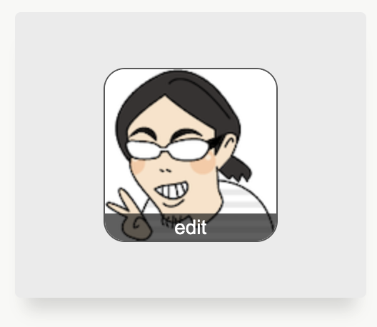
やりたいこと
よくある、こういうヤツ。
手順
- 箱を作って画像とボタンを置く
- 綺麗に配置する (flex)
- 画像にボタンを重ねる (position)
- はみ出た分を消す (overflow)
画像を丸くすると、ボタンが良い感じに置けなくなるので、箱を丸くする方針。
箱を作って画像とボタンを置く
<div class="iconContainer">
  <img src="./kura.png" alt="" width="120px" height="120px" />
  <button>edit</button>
</div>
.iconContainer img {
  border: 1px solid #00000050;
}
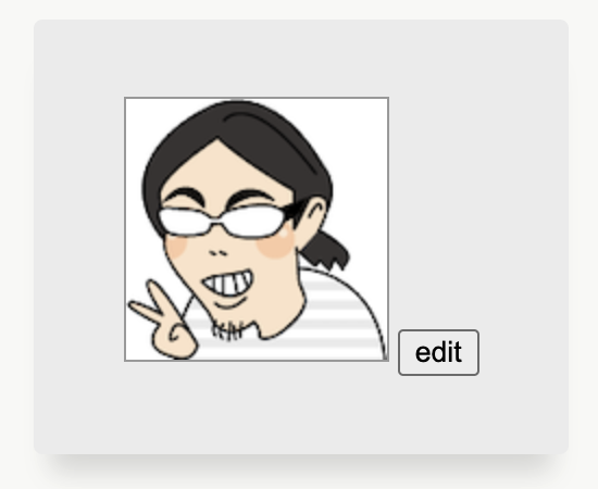
画像の大きさは 120px x 120px で固定とし、分かりやすいように、ほんのり枠線をつけた。html はもう変えないので、以降 CSS のみ。
綺麗に配置する

.iconContainer {
  display: flex;
  justify-content: center;
  align-items: center;
  flex-direction: column;
}
.iconContainer img {
  border: 1px solid #00000050;
}
.iconContainer button {
  width: 100%;
  background-color: #00000095;
  border: none;
  outline: none;
  cursor: pointer;
  color: #fff;
  font-size: 14px;
  padding: 2px 0;
}
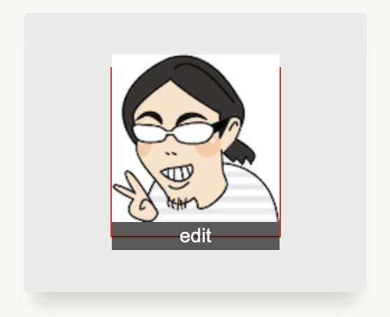
縦に並べて、ボタンをフラットにした。
画像にボタンを重ねる
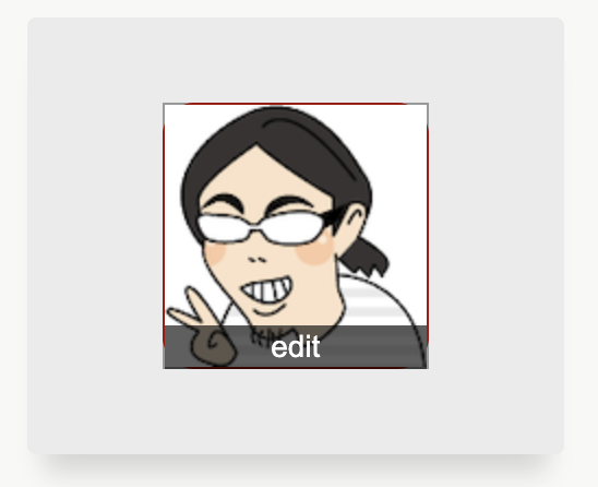
ボタン分縦に伸びたので、このままではまんまるにならないので、箱にサイズを与えて、作業しやすいように赤い Border をつけた。念の為画像にも同じサイズをつけておいた。
.iconContainer {
  ...
  border: 1px solid red;
  width: 120px;
  height: 120px;
}
.iconContainer img {
  ...
  width: 120px;
  height: 120px;
}
.iconContainer button {...}
.iconContainer {
  ...
  border-radius: 15px;
}
.iconContainer img {
  ...
  position: relative;
  top: 10px;
}
.iconContainer button {
  ...
  position: relative;
  bottom: 10px;
}
画像を下に、ボタンを上にずらした。はみ出る部分が分かりやすいように箱の Border をちょっと丸くした。
はみ出た部分を消す
.iconContainer {
  ...
  border: 1px solid #00000095;
  ...
  overflow: hidden;
}
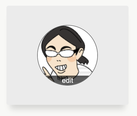
赤い Border を黒くして、overflow を hidden としてはみ出た部分を消した。
完成
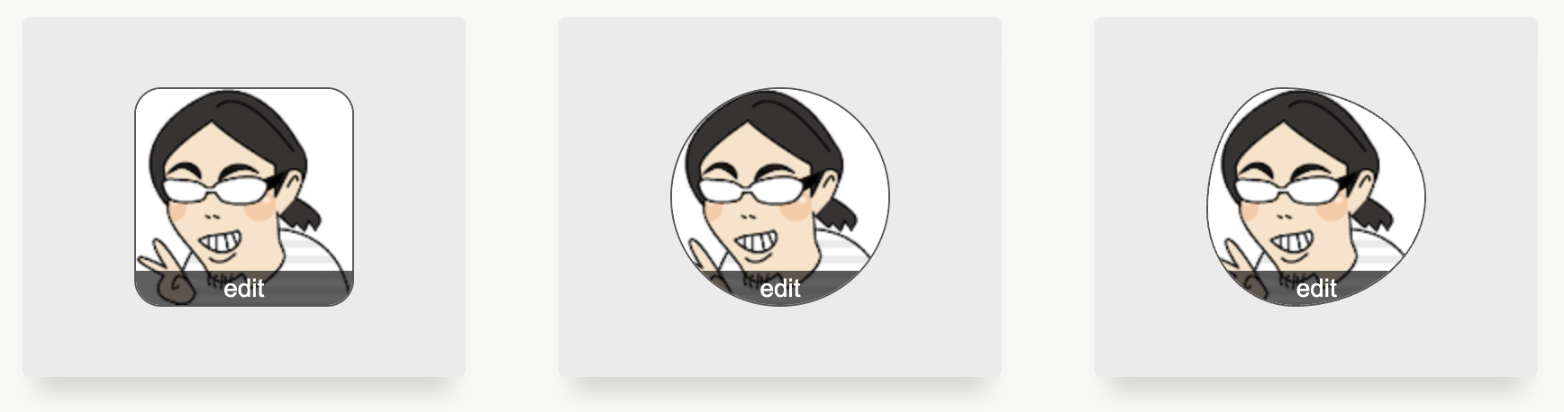
あとは、border-radius の値を調整すれば、だいたいどんな形でも行ける。before, after を使って形をつくるもの(スーパー楕円とか)は、この方法だとうまく行かない。
まんまるの場合のコード
<div class="iconContainer">
  <img src="./kura.png" alt="" width="120px" height="120px" />
  <button>edit</button>
</div>
.iconContainer {
  display: flex;
  justify-content: center;
  align-items: center;
  flex-direction: column;
  border: 1px solid #00000095;
  width: 120px;
  height: 120px;
  border-radius: 9999px;
  overflow: hidden;
}
.iconContainer img {
  border: 1px solid #00000050;
  width: 120px;
  height: 120px;
  position: relative;
  top: 10px;
}
.iconContainer button {
  width: 100%;
  background-color: #00000095;
  border: none;
  outline: none;
  cursor: pointer;
  color: #fff;
  font-size: 14px;
  padding: 2px 0;
  position: relative;
  bottom: 10px;
}
作ってみれば、たいした内容でもなかったが、勉強用素材として良さそうな気がした。
おしまい。