はじめに
先日、iPhoneで画面を確認した時に画像が縦に伸びるという事象が起きました。
Google Chrome(以下、Chrome)のデベロッパーツールでiPhoneでの見え方を確認した時には問題なかったのに...と焦ったので解決方法についてまとめようと思います。
事象
| Chrome(Windows)で見た時 | Safari(iOS)で見た時 |
|---|---|
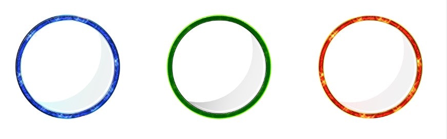 |
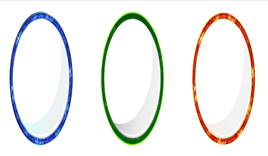 |
上記のように、Safariでは画像が縦に伸びてしまっている状態でした。
事象発生時に書いていたコードは以下のような感じです。
index.html
	<div class="flex-container">
		<img src="./img/blue.png" alt="青の円">
		<img src="./img/green.png" alt="緑の円">
		<img src="./img/red.png" alt="赤の円">
	</div>
style.css
.flex-container {
	display: flex;
	}
.flex-container img {
	width: 30%;
	height: auto;
}
内容としては以下。
- 親要素のdisplayプロパティにflexを指定し、画像を横並びに
- 子要素にimg(画像)を入れて、高さにautoを指定
原因
調べたところ、どうやらflexコンテナの子要素に直接img(画像)を入れると、iOSのSafariでは画像のアスペクト比が崩れて縦に伸びてしまうようです。
解決方法
解決方法はいくつかあるようです。
方法①:flexコンテナに対してalign-items: flex-start;を指定する
style.css
.flex-container {
	display: flex;
    align-items: flex-start;
}
これでflexアイテム(ここでは画像)がコンテナの開始位置から配置され、画像が伸びずに元の比率を保てます。
方法②:HTMLの構造を変える
index.html
	<div class="flex-container">
		<div class="item"><img src="./img/blue.png" alt="青の円"></div>
		<div class="item"><img src="./img/green.png" alt="緑の円"></div>
		<div class="item"><img src="./img/red.png" alt="赤の円"></div>
	</div>
imgをdivタグなどで囲み、画像をflexアイテムの子要素になるようにしてあげることでも解決できるようです。