はじめに
Next.js と shadcn/ui を組み合わせて、簡単にダークモードを実装する方法を紹介します。shadcn/ui は、Radix UI をベースにしたコンポーネントライブラリで、柔軟なカスタマイズ性が特徴です。
環境構築
Next.jsプロジェクトの作成
まず、Next.js 公式ドキュメントを参考にプロジェクトを作成します。
shadcn/ui は Tailwind を使用するため、以下は Yes を選択してください。
Would you like to use Tailwind CSS? Yes
shadcn/uiの導入
shadcn/ui 公式ドキュメントを参考に shadcn/ui をプロジェクトに追加します。
npx shadcn@latest init
UIコンポーネントの追加
モードの切替に使用する Switch コンポーネントと、見た目の確認用に Button コンポーネントを追加します。
npx shadcn@latest add switch
npx shadcn@latest add button
shadcn/ui のコンポーネントはデフォルトではsrc/components/uiに追加されます。
デフォルトの格納場所は、components.jsonで設定を変更できます。
UIコンポーネントの配置
作成した UI コンポーネントを page.tsx や header.tsx に追加します。
モードの状態がわかりやすいように Switch の左右にアイコンを配置します。
スタイルは適宜調整してください。
//app/page.tsx
import React from 'react';
import { Button } from '@/app/components/ui/button';
import { Switch } from '@/app/components/ui/switch';
import { Moon, Sun } from "lucide-react" //`太陽と月のマーク
export default function Home() {
  return (
    <main className="flex justify-center items-center">
      <div className="flex items-center space-x-8 min-h-screen">
        <h1>My Application</h1>
        <Button>Button</Button> {/*ただのボタン*/}
        <div className="flex items-center space-x-2">
          <Sun className="h-4 w-4" />
          <Switch /> {/*モード切替用のボタン*/}
          <Moon className="h-4 w-4" />
        </div>
      </div>
    </main>
  );
}
こんな感じになります。

ダークモードの設定
next-themes のインストール
shadcn/ui は next-themes を使用してテーマを管理できます。
公式ドキュメントの手順通りに next-themes をインストールします。
npm install next-themes
ThemeProvider の作成
// app/theme-provider.tsx
'use client';
import { ThemeProvider as NextThemeProvider } from 'next-themes';
import { useEffect, useState } from 'react';
export const ThemeProvider = ({ children, ...props }: React.ComponentProps<typeof NextThemeProvider>) => {
  const [mounted, setMounted] = useState(false);
  useEffect(() => {
    setMounted(true);
  }, []);
  if (!mounted) return null; // クライアント側でのみレンダリング
  return <NextThemeProvider {...props}>{children}</NextThemeProvider>;
};
ハイドレーションエラーの回避
next-themes を使ってダークモードを実装すると、Hydration error(サーバー側とクライアント側のデータの不一致)が発生することがあります。
そのため mounted 状態を管理し、クライアントサイドでのみレンダリングを行うことで、ハイドレーションエラーを回避します。
参考:React公式ドキュメント
ThemeProviderをルートレイアウトに適用
// app/layout.tsx
import React from "react"
import "@/app/styles/globals.css";
import { ThemeProvider } from "@/app/theme-provider"
interface RootLayoutProps {
  children: React.ReactNode
}
export default function RootLayout({ children }: RootLayoutProps) {
  return (
    <>
      <html lang="ja">
        <body className="bg-background text-foreground">
          <ThemeProvider
            attribute="class"
            defaultTheme="light"
            enableSystem
            disableTransitionOnChange
          >
            {children}
          </ThemeProvider>
        </body>
      </html>
    </>
  )
}
Themeの切替の処理を追加
//app/page.tsx
'use client' // 追加
import React from 'react';// 追加
import { Button } from '@/app/components/ui/button';
import { Switch } from '@/app/components/ui/switch';
import { Moon, Sun } from "lucide-react"
import { useTheme } from 'next-themes';
export default function Home() {
  const { theme, setTheme } = useTheme(); // 追加
  return (
    <main className="flex justify-center items-center">
      <div className="flex items-center space-x-8 min-h-screen">
        <h1>My Application</h1>
        <Button>Button</Button>
        <div className="flex items-center space-x-2">
          <Sun className="h-4 w-4" />
          <Switch checked={theme === "dark"} onCheckedChange={(checked) => setTheme(checked ? "dark" : "light")} /> {/* 追加 */}
          <Moon className="h-4 w-4" />
        </div>
      </div>
    </main>
  );
}
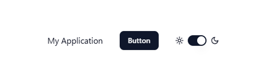
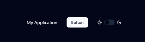
これで実装は完了です。モードによって、以下のように背景色やテキストの色が変わります。
▼ライトモード
▼ダークモード
色のカスタマイズ
ライトモード、ダークモードの色はglobals.cssでデフォルトで設定されているので、お好みに応じて変更してください。
/*app/styles/globals.css*/
@layer base {
  :root {
    --background: oklch(1 0 0);
    --foreground: oklch(0.129 0.042 264.695);
    /* 省略 */
  }
  .dark {
    --background: oklch(0.129 0.042 264.695);
    --foreground: oklch(0.984 0.003 247.858);
    /* 省略 */
  }
}
まとめ
以上で、Next.js と shadcn/ui を使ったダークモードの実装が完了しました。
next-themes を利用することで簡単にテーマを切り替えられます。
また、shadcn/ui のコンポーネントはカスタマイズしやすいので、好みに合わせてデザインを調整してみてください!
オブジェクティブグループではXの投稿も平日毎日行っています!
IT関連の小ネタや便利技から、日常のアニメ・ゲーム布教なども幅広く投稿してるので、
ご興味のある方は是非フォロー・いいねをお願いします。