1
1

Delete article

Deleted articles cannot be recovered.

Draft of this article would be also deleted.

Are you sure you want to delete this article?

【レスポンシブ】折り返されるカラムレイアウト(Ant Design)

Posted at

概要

Reactでフロントエンド画面開発中、外側の枠(もとい画面幅)に合わせて折りたたまれるカラムレイアウトを記述したところ中々使い勝手が良く好評でしたのでご紹介します。
動作イメージは下記画像の通り。

ResponsiveMultiColumnLayout.png

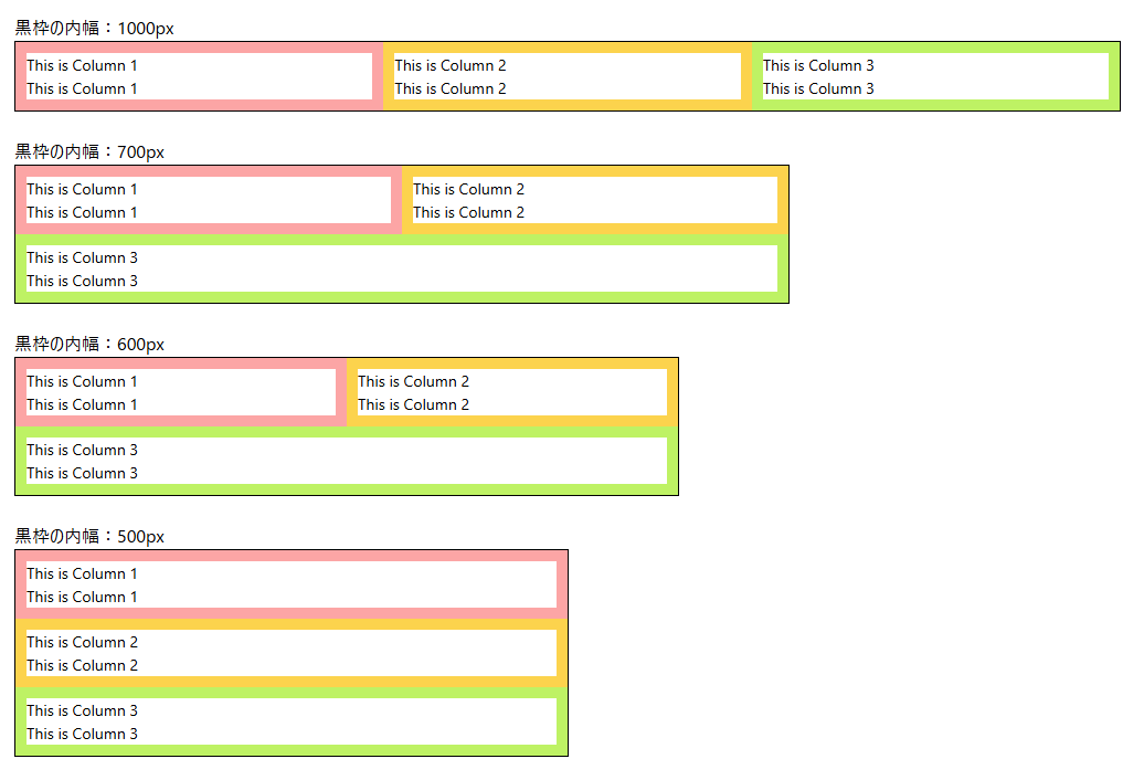
基本的には外枠一杯に広がり、欲しいカラム数で横幅が等分されます。
カラムに設定された最小幅を下回ると自動で折り返されます。

コード

Ant DesignライブラリのRow,Colを使用します。

import {Row, Col } from 'antd';

const ResponsiveMultiColumnLayout: React.FC = () => {
  const columns = 3; //何列カラムにするか

  return (
      <Row>
        {Array.from({ length: columns }, (_, i) => i).map((col) => (
          <Col key={col} style={{
              flex: `1 1 ${100 / columns}%`,
              boxSizing: 'border-box',
              minWidth: '300px' // 最小幅は適切に調整
            }}>
            This is Column ${col+1}
          </Col >
        ))}
      </Row >
  );
};

上記コードは画像イメージと異なりボーダーの着色等はしていませんので、用途に合わせてカスタマイズいただけますと幸いです。

1
1
0

Register as a new user and use Qiita more conveniently

  1. You get articles that match your needs
  2. You can efficiently read back useful information
  3. You can use dark theme
What you can do with signing up
1
1

Delete article

Deleted articles cannot be recovered.

Draft of this article would be also deleted.

Are you sure you want to delete this article?