はじめに
分類モデルの評価方法であるROC曲線について、整理してみます。
ROC曲線とは
ROC曲線の英語表記は、Receiver Operating Characteristicと言います。なんでReceiver?と思う人も多いと思います。これは、受信アンテナのReceiverを意味しています。この分類モデルの諸知見は、軍用レーダーの識別性能を評価する過程で生まれたからです。
Receiver Operating Cheracteristicとは、飛行機からの反射する電磁波を受信し、敵機と友軍機をどこまでちゃんと分類できるかの特性を表すパラメータです。
時代が過ぎて、医学、マシンビジョンなどでも同じ指標として使えるようになりました。
実際にやってみよう。
下記のグラフで青と赤を分類する問題を考えます。青の分布の右側で、赤の分布が重なっています。ここで閾値を変えながら、諸特性がどう変わるか見てみましょう。

ここで見る特性は二つです。
- True Positive : 陽性者を正しく陽性と判定。
- False Positive : 陰性者を間違って陽性と判定。
実際の生産現場での品質検査装置を考えると理解しやすくなります。
陽性をOK品、陰性をNG品とします。
- True Positive : OK品を正しくOK品と判定。
- False Positive : NG品を間違ってOK品と判定。
品質検査装置だと、お客さんにNG品を出荷しないことを第一に考えるでしょう。
従って、この場合、Falser Positiveをゼロに近付けることが重要となります。
True Positiveの場合、この数字がよろしくないと、OK品を正しくOK品と判定する割合が低いことを意味します。つまり、OK品なのにNG品と判定される製品が増えることで、再検査の手間が増えることになります。
従って、品質検査装置では、まずFalse Positiveをいかに低くするか。次にTrue Positive Rateをいかに高くするかを目標に、分類器の作ることになります。
簡単な実験
- OKデータとNGデータを作ります。
リアルさを追求し、データ数を多くします。
import numpy as np
import matplotlib.pyplot as plt
from sklearn.metrics import roc_curve, auc

# データの数
n_OK = int(1e4)
n_NG = int(1e3)

# 平均
mean_OK =4
mean_NG = 3
# 標準偏差
std_OK = 0.5
std_NG = 0.5

# リスト作成
NG_data = np.random.normal(loc=mean_NG,scale=std_NG,size= n_NG)
OK_data = np.random.normal(loc=mean_OK,scale=std_OK,size=n_OK)
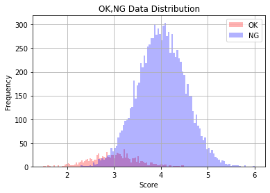
データのヒストグラムを見ます。
plt.hist(NG_data, bins=100, color='red', alpha=0.3,density=False, label='OK')
plt.hist(OK_data, bins=100, color='blue',alpha=0.3,density=False, label='NG')
plt.xlabel('Score')
plt.ylabel('Frequency')
plt.title('OK,NG Data Distribution')
plt.grid()
plt.legend()
plt.show()
OKとNGのデータ数が不均衡であるため、分布がちょっと見づらいです。
密度ヒストグラムに描きなおします。
plt.hist(NG_data, bins=100, color='red', alpha=0.3,density=True, label='OK')
plt.hist(OK_data, bins=100, color='blue',alpha=0.3,density=True, label='NG')
plt.xlabel('Score')
plt.ylabel('%')
plt.title('OK,NG Data Distribution')
plt.grid()
plt.legend()
plt.show()

OKデータとNGデータを連結し、一つのArrayにします。(ほぼ、リストだけどnumpyだからArrayと言っているだけです。)
# Score Data
Score_data = np.hstack((OK_data, NG_data))
print(Score_data.shape)
print(Score_data)

(11000,)
[3.67842272 3.88199995 4.11435603 ... 2.68119577 3.07894119 1.97999698]
# Label Data
OK_Label= [np.random.randint(1,2) for i in range(n_OK)]
NG_Label =[np.random.randint(0,1) for i in range(n_NG)]
Label_data =np.hstack((OK_Label, NG_Label))
print(Label_data.shape)
print(Label_data)

(11000,)
[1 1 1 ... 0 0 0]
scikit-learnのroc_curveを利用します。
fpr, tpr, thresholds  = roc_curve(y_true=Label_data, y_score=Score_data)
auc_value = auc(x=fpr, y=tpr)
fpr, tpr, thresholdsの中身を見てみましょう。何となく見えてきましたね。
print('False positive rate',fpr)

print('True positive rate',tpr)

print('Thresholds',thresholds)

False positive rate [0.    0.    0.    ... 0.926 0.926 1.   ]
True positive rate [0.000e+00 1.000e-04 1.736e-01 ... 9.999e-01 1.000e+00 1.000e+00]
Thresholds [7.00178475 6.00178475 4.49017217 ... 2.29069633 2.29030245 1.48938665]
ROC曲線を書くだけです。
plt.figure(figsize=(8,8))
plt.plot(fpr, tpr, color='blue', marker='o')

plt.xlabel('FPR: False positive rate')
plt.ylabel('TPR: True positive rate')
plt.title( 'auc value:' + str(auc_value))
plt.grid()
plt.show()

plt.savefig('./roc_curve.png')

ちょっとした実験
OKとNGが完全に重なった場合、どうなるかやってみたいと思います。
# データの数
n_OK = int(1e4)
n_NG = int(1e3)

# 平均
mean_OK =4
mean_NG = 4
# 標準偏差
std_OK = 0.5
std_NG = 0.5

# リスト作成
NG_data = np.random.normal(loc=mean_NG,scale=std_NG,size= n_NG)
OK_data = np.random.normal(loc=mean_OK,scale=std_OK,size=n_OK)
plt.hist(NG_data, bins=100, color='red', alpha=0.3,density=True, label='OK')
plt.hist(OK_data, bins=100, color='blue',alpha=0.3,density=True, label='NG')
plt.xlabel('Score')
plt.ylabel('%')
plt.title('OK,NG Data Distribution')
plt.grid()
plt.legend()
plt.show()

Score_data = np.hstack((OK_data, NG_data))
print(Score_data.shape)
print(Score_data)

OK_Label= [np.random.randint(1,2) for i in range(n_OK)]
NG_Label =[np.random.randint(0,1) for i in range(n_NG)]
Label_data =np.hstack((OK_Label, NG_Label))
print(Label_data.shape)
print(Label_data)

fpr, tpr, thresholds  = roc_curve(y_true=Label_data, y_score=Score_data)
auc_value = auc(x=fpr, y=tpr)

plt.figure(figsize=(8,8))
plt.plot(fpr, tpr, color='blue', marker='o')

plt.xlabel('FPR: False positive rate')
plt.ylabel('TPR: True positive rate')
plt.title( 'auc value:' + str(auc_value))
plt.grid()
plt.show()

plt.savefig('./roc_curve.png')
有名なauc=0.5のROC曲線です。

参考資料
https://note.nkmk.me/python-sklearn-roc-curve-auc-score/
https://note.nkmk.me/python-numpy-random/