読んだ本
『[第2版]Python 機械学習プログラミング 達人データサイエンティストによる理論と実践 (impress top gear)』
↑ちょっとデータを変えて色々遊んでいますが、基本的にはこの本の2章をそのままやっただけです。
2. 分類問題 ー 単純な機械学習アルゴリズムのトレーニング
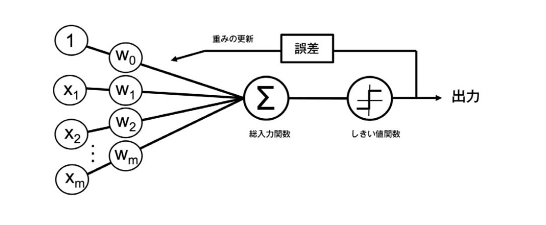 これはパーセプトロンの基本概念の簡単な図 (『Python 機械学習プログラミング 達人データサイエンティストによる理論と実践』第二章より引用)
パーセプトロンの初期の学習規則
-
重み $ \mathbf{w} $ を0または値の小さい乱数で初期化する
-
トレーニングサンプル $ \mathbf{x}^{(i)} $ ごとに次の手順を実行する。
-
出力値 $ \hat{y} $ を計算する
-
重みを更新する
-
$$ w_j := w_j + \Delta w_j $$
$$ \Delta w_j = \eta (y^{(i)} - \hat{y}^{(i)}) x^{(i)}_j $$
$ \eta $ は学習率(通常、0.0よりも大きく、1.0以下の定数)$ y^{(i)} $ はi番目のトレーニングサンプルの真のクラスラベル、
$ \hat{y}^{(i)} $ は予測されたクラスラベル。
予測値 $ \hat{y}^{(i)} $ は
$$ z = w_0 x_0 + w_1 x_1 + ... + w_m x_m = \mathbf{w^T x} $$
および
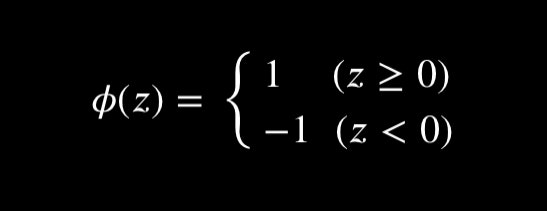
により決定される。
パーセプトロンでは線形分離可能で、学習率が十分小さい時のみ収束が保証される。
2.2 パーセプトロンの学習アルゴリズムをPythonで実装する
2.2.1 オブジェクト指向のパーセプトロンAPI
import numpy as np
class Perceptron(object):
    """パーセプトロンの分類器

    パラメータ
    -----------
    eta : float
        学習率(0.0より大きく1.0以下の値)
    n_iter : int
        トレーニングデータのトレーニング回数
    random_state : int
        重み初期化用乱数シード
    属性
    -----------
    w_ : 1次元配列
        適合後の重み
    errors_ : リスト
        各エポックでの誤分類(更新)の数
    """
    def __init__(self, eta=0.01, n_iter=50, random_state=1):
        self.eta = eta
        self.n_iter = n_iter
        self.random_state = random_state

    def fit(self, X, y):
        """トレーニングデータに適合される

        パラメータ
        ------------
        X : {配列のようなデータ構造}, shape = [n_samples, n_features]
            トレーニングデータ
            n_samplesはサンプルの個数, n_featuresは特徴量の個数
        y : 配列のようなデータ構造, shape = [n_samples]
            目的変数

        戻り値
        ------------
        self : object
        """
        rgen = np.random.RandomState(self.random_state)
        self.w_ = rgen.normal(loc=0.0, scale=0.01, size=1 + X.shape[1])
        self.errors_ = []

        for _ in range(self.n_iter): # トレーニング回数分トレーニングデータを反復
            errors = 0
            for xi, target in zip(X, y): # 各サンプルで重みを更新
                # 重み w_1, ..., w_m の更新
                # Δw_j = η (y^(i)真値 - y^(i)予測) x_j (j = 1, ..., m)
                update = self.eta * (target - self.predict(xi))
                self.w_[1:] += update * xi
                # 重み w_0 の更新 Δw_0 = η (y^(i)真値 - y^(i)予測)
                self.w_[0] += update
                # 重みの更新が0でない場合は誤分類としてカウント
                errors += int(update != 0.0)
            # 反復回数ごとの誤差を格納
            self.errors_.append(errors)
        return self

    def net_input(self, X):
        """総入力を計算"""
        return np.dot(X, self.w_[1:]) + self.w_[0]

    def predict(self, X):
        """1ステップ後のクラスラベルを返す"""
        return np.where(self.net_input(X) >= 0.0, 1, -1)
2.3 Irisデータセットでのパーセプトロンモデルのトレーニング
from sklearn.datasets import load_iris
import pandas as pd
iris = load_iris()
df = pd.DataFrame(iris.data, columns=iris.feature_names)
df['target'] = iris.target
# df.loc[df['target'] == 0, 'target'] = "setosa"
# df.loc[df['target'] == 1, 'target'] = "versicolor"
# df.loc[df['target'] == 2, 'target'] = "virginica"
df.head()
| sepal length (cm) | sepal width (cm) | petal length (cm) | petal width (cm) | target | |
|---|---|---|---|---|---|
| 0 | 5.1 | 3.5 | 1.4 | 0.2 | 0 |
| 1 | 4.9 | 3.0 | 1.4 | 0.2 | 0 |
| 2 | 4.7 | 3.2 | 1.3 | 0.2 | 0 |
| 3 | 4.6 | 3.1 | 1.5 | 0.2 | 0 |
| 4 | 5.0 | 3.6 | 1.4 | 0.2 | 0 |
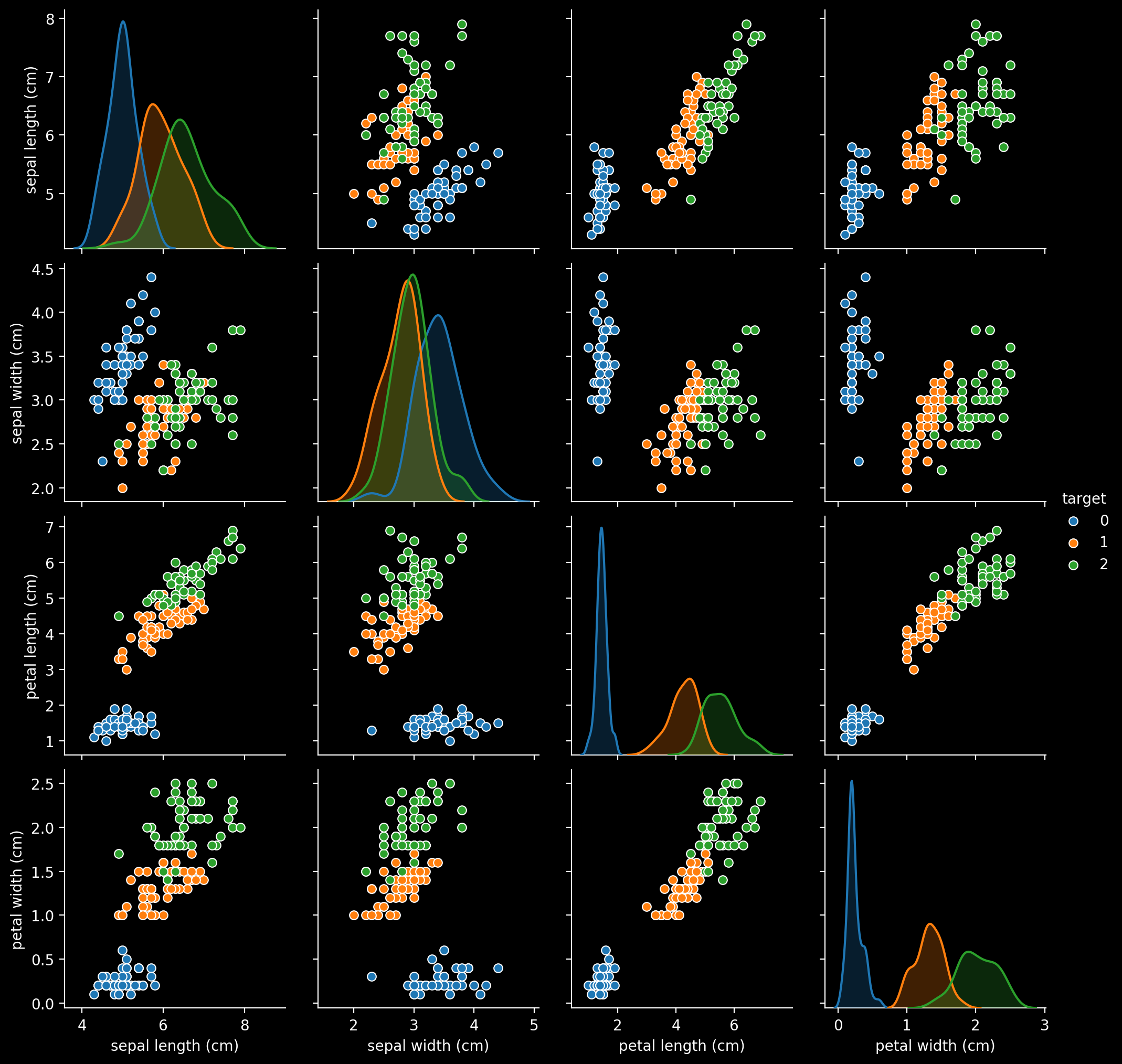
import seaborn as sns
sns.pairplot(df, hue='target')
二値分類なので線形分離できそうな二種類に絞る。
また視覚的に見やすいように特徴量は2次元にする。
ラベル0と2で適当にすれば大体分離できるだろう。(本とは違うものを使いたい)
import numpy as np
import matplotlib.pyplot as plt
df2 = df.query("target != 1").copy() # label 1を除外
df2["target"] -= 1 # ラベルを1と-1に揃える

plt.scatter(df2.iloc[:50, 3], df2.iloc[:50, 1], color='blue', marker='o', label='setosa')
plt.scatter(df2.iloc[50:, 3], df2.iloc[50:, 1], color='green', marker='o', label='virginica')
plt.xlabel('petal width [cm]')
plt.ylabel('sepal width [cm]')
plt.legend(loc='upper left')
plt.show()
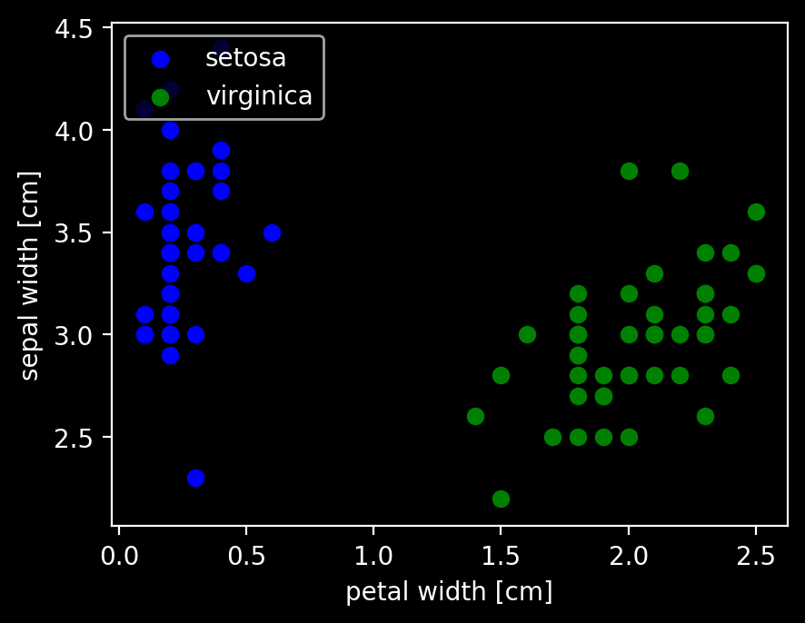
上のpairplotの右から1つ目、上から2つ目と同じように抜き出してプロットした。
このデータでパーセプトロンのアルゴリズムをトレーニングする。
X = df2[['petal width (cm)', 'sepal width (cm)']].values
Y = df2['target'].values

ppn = Perceptron(eta=0.1, n_iter=10)
ppn.fit(X, Y)
plt.plot(range(1, len(ppn.errors_) + 1), ppn.errors_, marker='o')
plt.xlabel('Epochs')
plt.ylabel('Number of update')
plt.show()
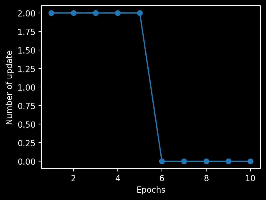
6回目のエポックでパーセプトロンが収束したことがわかる。
決定境界を可視化するために簡単かつ便利な関数を実装する。
from matplotlib.colors import ListedColormap

def plot_decision_regions(X, y, classifier, resolution=0.02):

    # マーカーとカラーマップの準備
    markers = ('s', 'x', 'o', '^', 'v')
    colors = ('red', 'blue', 'lightgreen', 'gray', 'cyan')
    cmap = ListedColormap(colors[:len(np.unique(y))])

    # 決定領域のプロット
    x1_min, x1_max = X[:, 0].min() - 1, X[:, 0].max() + 1
    x2_min, x2_max = X[:, 1].min() - 1, X[:, 1].max() + 1
    # グリッドポイントの生成
    xx1, xx2 = np.meshgrid(np.arange(x1_min, x1_max, resolution),
                           np.arange(x2_min, x2_max, resolution))
    # 各特徴量を1次元配列に変換して予測を実行
    Z = classifier.predict(np.array([xx1.ravel(), xx2.ravel()]).T)
    # 予測結果を元のグリッドポイントのデータサイズに変換
    Z = Z.reshape(xx1.shape)
    # グリッドポイントの等高線のプロット
    plt.contourf(xx1, xx2, Z, alpha=0.3, cmap=cmap)
    # 軸の範囲の設定
    plt.xlim(xx1.min(), xx1.max())
    plt.ylim(xx2.min(), xx2.max())

    # クラスごとにサンプルをプロット
    for idx, cl in enumerate(np.unique(y)):
        plt.scatter(x=X[y == cl, 0],
                    y=X[y == cl, 1],
                    alpha=0.8,
                    c=colors[idx],
                    marker=markers[idx],
                    label=cl,
                    edgecolor='black')
# 決定領域のプロット
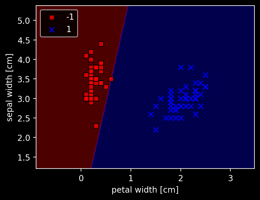
plot_decision_regions(X, Y, classifier=ppn)
plt.xlabel('petal width [cm]')
plt.ylabel('sepal width [cm]')
plt.legend(loc='upper left')
plt.show()
分けられないような場合もやってみる。
予想:収束はしなく、エポック数の限界で止まる。errorはマシにはなりそう。
import numpy as np
import matplotlib.pyplot as plt
df3 = df.query("target != 0").copy() # label 0を除外
y = df3.iloc[:, 4].values
y = np.where(y == 1, -1, 1) # label 1を-1に、その他(label 2)を1にする

plt.scatter(df3.iloc[:50, 1], df3.iloc[:50, 0], color='orange', marker='o', label='versicolor')
plt.scatter(df3.iloc[50:, 1], df3.iloc[50:, 0], color='green', marker='o', label='virginica')
plt.xlabel('sepal width [cm]')
plt.ylabel('sepal length [cm]')
plt.legend(loc='upper left')
plt.show()
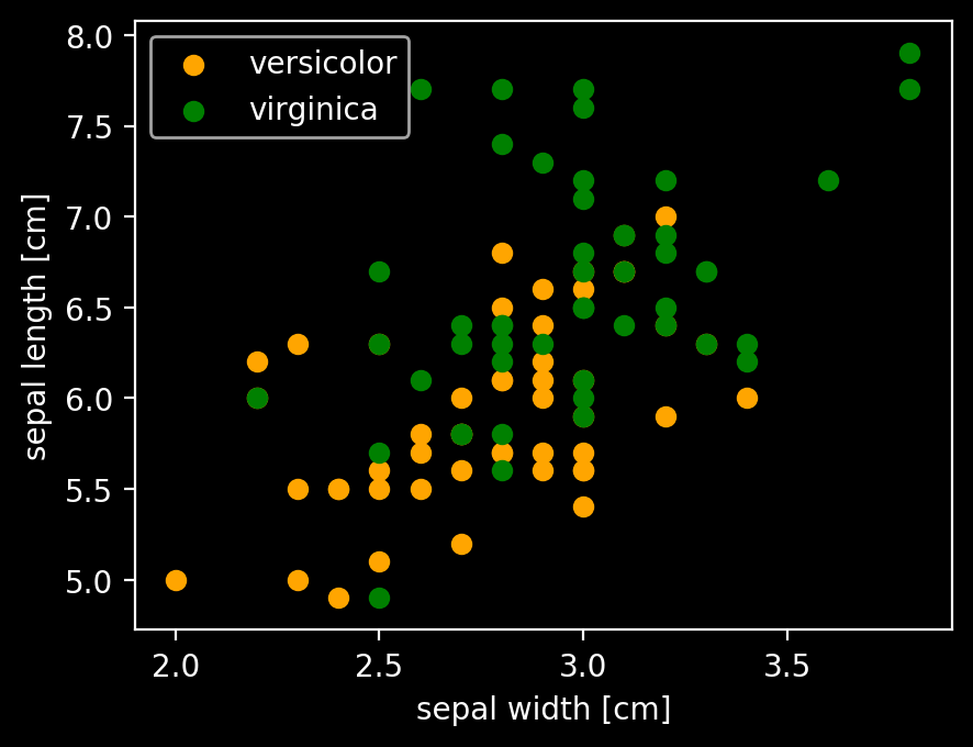
上のpairplotの右から3つ目、上から1つ目と同じように抜き出してプロットした。
X2 = df3[['sepal width (cm)', 'sepal length (cm)']].values

ppn = Perceptron(eta=0.1, n_iter=100)
ppn.fit(X2, y)
plt.plot(range(1, len(ppn.errors_) + 1), ppn.errors_, marker='o')
plt.xlabel('Epochs')
plt.ylabel('Number of update')
plt.show()

# 決定領域のプロット
plot_decision_regions(X2, y, classifier=ppn)
plt.xlabel('sepal width [cm]')
plt.ylabel('sepal length [cm]')
plt.legend(loc='upper left')
plt.show()
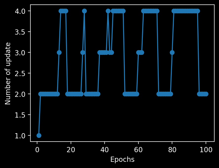
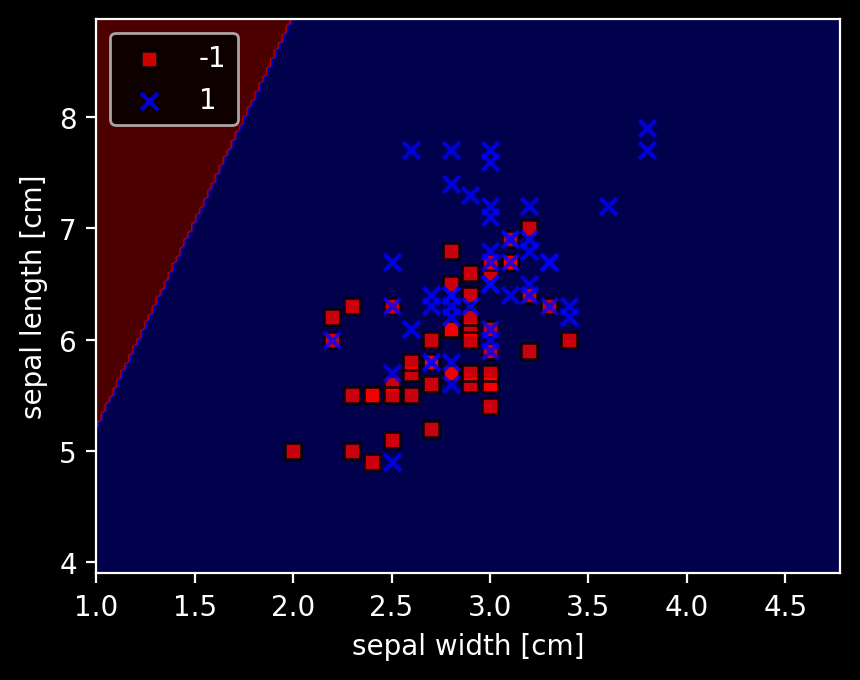
全く分類されなかった。目で見るとyが大きい方がなんとなくlabel 1が多くなっているので、y = 6くらいで適当に分離するかと思ったが、そうではないらしい。