はじめに
この記事は、SLP KBIT Advent Calender 2019の22日目の記事です。
Vue.jsのコンポーネントについての理解を深めたいので、基本的な機能を持つボタンを自作してみたいと思います。
Vue.jsのインストールとプロジェクト作成はvue-cliでコマンド叩くだけなので省略します。
使用環境
Node.js v12.13.1
npm 6.12.1
@vue/cli 4.0.5
とりあえず作ってみる
クリックしたときに親コンポーネントにイベントを通知するようにします。
子コンポーネントから親コンポーネントにイベントを通知するには、$emitを使います。
第一引数でイベント名を登録します。第二引数以降で変数を渡すことも可能ですが、今回は使いません。
親コンポーネント側では適当なメソッドを作成してイベントが発火したことを確認します。
<template>
  <div>
    <MyButton @click="click('my-button')"></MyButton>
  </div>
</template>

<script>
import MyButton from './components/MyButton.vue';

export default {
  components: {
    MyButton
  },
  methods: {
    click(message) {
      alert(message);
    }
  }
}
</script>
<template>
  <div @click="click">ボタン</div>
</template>

<script>
export default {
  methods: {
    click() {
      this.$emit('click');
    }
  }
}
</script>
これでボタンが完成しました。
とはいかない
さすがにこれだけではただクリックできるだけのテキストです。
これがボタンだとユーザに知らせるため、少しデザインを変更してみましょう。
MyButton.vueにstyleを追加して、ボタンっぽく見せてみます。
ソースコードの重複する部分は省略します。
<template>
  <div class="button" @click="click">ボタン</div>
</template>

<script>
...
</script>

<style lang="scss" scoped>
  .button {
    padding-left: 2px;
    padding-right: 2px;
    display: inline-block;
    border: 2px solid rgb(255,194,64);
    background: linear-gradient(to bottom, rgb(255,244,92), rgb(240,229,86));
  }
</style>
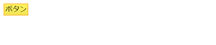
陰影をつけて立体感を出したら少しだけそれっぽくなりました。
黄色なのは黄色が好きだからです。
もっとボタンっぽくする
マウスホバー時とクリック時のデザインを追加して、このボタンが押せること、ボタンを押したことを知らせます。
まずborderを半透明にしておき、マウスホバー時にはっきり表示させようと思います。
カーソルも矢印から指に変えてわかりやすくします。
クリック時には陰影を反転し、ボタンが押せたことをわかりやすくします。
v-bind:classにオブジェクトを渡すことでクラスを動的に切り替えることができます。
isClicked、isEnteredの真偽値によって、それぞれのクラスが適用されるかが決まります。
cssは後に読み込まれたものが優先されるので、わざわざbuttonクラスを外す必要はありません。
それぞれのイベントが発火したときに値を切り替えることで実現します。
<template>
  <div
    class="button"
    v-bind:class="{clicked: isClicked, entered: isEntered}"
    @click="click"
    @mousedown="mousedown"
    @mouseup="mouseup"
    @mouseenter="mouseenter"
    @mouseleave="mouseleave"
  >ボタン</div>
</template>

<script>
export default {
  data() {
    return {
      isClicked: false,
      isEntered: false
    }
  },
  methods: {
    click() {...},
    mousedown() {
        this.isClicked = true;
    },
    mouseup() {
      this.isClicked = false;
    },
    mouseenter() {
        this.isEntered = true;
    },
    mouseleave() {
      this.isEntered = false;
    }
  }
}
</script>

<style lang="scss" scoped>
  .button {
    padding-left: 2px;
    padding-right: 2px;
    display: inline-block;
    border: 2px solid rgba(255,194,64,.5);
    background: linear-gradient(to bottom, rgb(255,244,92), rgb(240,229,86));
  }

  .clicked {
    background: linear-gradient(to top, rgb(255,244,92), rgb(240,229,86));
  }

  .entered {
    cursor: pointer;
    border: 2px solid rgba(255,194,64,1);
  }
</style>

それっぽーい。
もう見た目は完全にボタンですね。
ラベルを変更する
次に親コンポーネントからボタンのラベルを変更できるようにします。
slotをつかうことで、子コンポーネントの<slot></slot>が、親コンポーネントのタグの中の要素で置換されます。
<template>
  <div>
    <MyButton @click="click('my-button')">スロット</MyButton>
  </div>
</template>

<script>
...
</script>
<template>
  <div
    ...
  >
    <slot></slot>
  </div>
</template>

<script>
...
</script>

<style lang="scss" scoped>
...
</style>
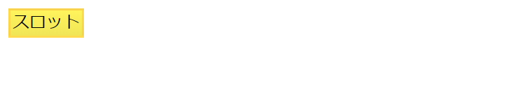
これで任意のラベルのボタンが作れるようになりました。
状態を追加する
もう少し機能を追加していきます。
バリデーションなどで条件を満たさないと押せないボタンってありますよね。
そのために子コンポーネント側でdisableの状態を作成します。
親コンポーネントから真偽値を渡し、子コンポーネントではpropsで受け状態を操作します。
disableがtrueの場合は、ボタン全体を半透明にし、ボタンの機能を使えないようにします。
値を渡す場合はdisable="true"のように書きますが、真偽値の場合はdisableと記述するだけでtrueを渡すことができます。
<template>
  <div>
    <MyButton @click="click('my-button')">ボタン</MyButton>
    <MyButton @click="click('my-button')" disable>disable</MyButton>
  </div>
</template>

<script>
...
</script>
<template>
  <div
    class="button"
    v-bind:class="{clicked: isClicked, entered: isEntered, disabled: disable}"
    @click="click"
    @mousedown="mousedown"
    @mouseup="mouseup"
    @mouseenter="mouseenter"
    @mouseleave="mouseleave"
  >
    <slot></slot>
  </div>
</template>

<script>
export default {
  data() {...},
  props: {
    disable: {
      type: Boolean,
      default: false
    }
  },
  methods: {
    click() {
      if (!this.disable) {
        this.$emit('click');
      }
    },
    mousedown() {
      if (!this.disable) {
        this.isClicked = true;
      }
    },
    mouseup() {...},
    mouseenter() {
      if (!this.disable) {
        this.isEntered = true;
      }
    },
    mouseleave() {...}
  }
}
</script>

<style lang="scss" scoped>
  .button {...}
  .clicked {...}
  .entered {...}
  .disabled {
    cursor: default;
    opacity: .6;
  }
</style>

disable状態を実装できました。
これで文句なしにボタンといえるでしょう。
おわりに
今回は$emitやpropsを使ってボタンを作成しました。
他にも、propsで指定の色名を受け取って色の変更などができるといいですね。
Vue.jsは面白いので全人類が一度は触ってみるべきだと思います。
あとみんなどうやってきれいにgif撮ってるんですかね。