JupyterLab で IRuby と iruby-plotly を使うというアホほどマイナーな使用事例に関するメモです。
https://github.com/zach-capalbo/iruby-plotly
(2019年6月18日現在 Github Star が1つしかない)
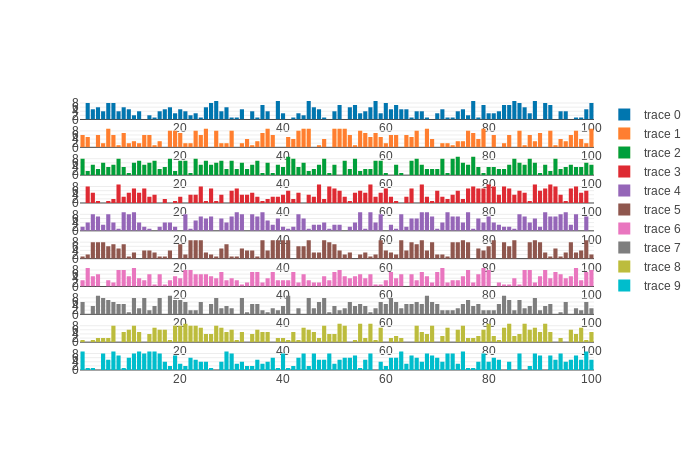
gridを指定すればグラフを並べられる。
注意点は、それぞれのグラフについて別々のxaxis、yaxisを指定するところ。これをやらないと、plotly先生はよかれと思ってグラフをまとめてしまう。なおかつ、x0, y0だと正常に動かないみたい。なんでだろ
rquire 'iruby/plotly'

data = Array.new(10){ |i|
{
  x: [*1..100],
  y: Array.new(100){rand(10)},
  xaxis: "x#{i+1}",
  yaxis: "y#{i+1}",
  type: 'bar',
}}

layout = {
  grid: {rows: 10, columns: 1, pattern: 'independent'},
    height: 800
}

IRuby.plotly(data, layout)
こうすれば
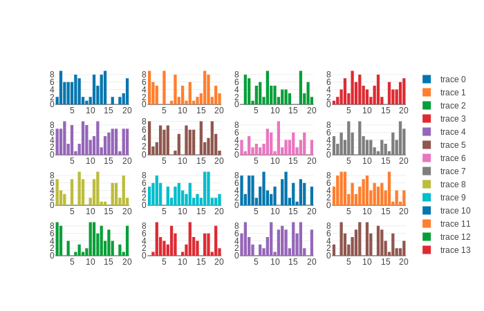
data = Array.new(16){ |i|
{
  x: [*1..20],
  y: Array.new(20){rand(10)},
  xaxis: "x#{i+1}",
  yaxis: "y#{i+1}",
  type: 'bar',
}}

layout = {
  grid: {rows: 4, columns: 4, pattern: 'independent'},
    height: 800
}

IRuby.plotly(data, layout);
こうなる。
typeが line なら
grid 2, 8なら
べんり過ぎる。
便利すぎるけど導入めんどうくさいし、知名度低いから誰も使わないんだろうな…