はじめに
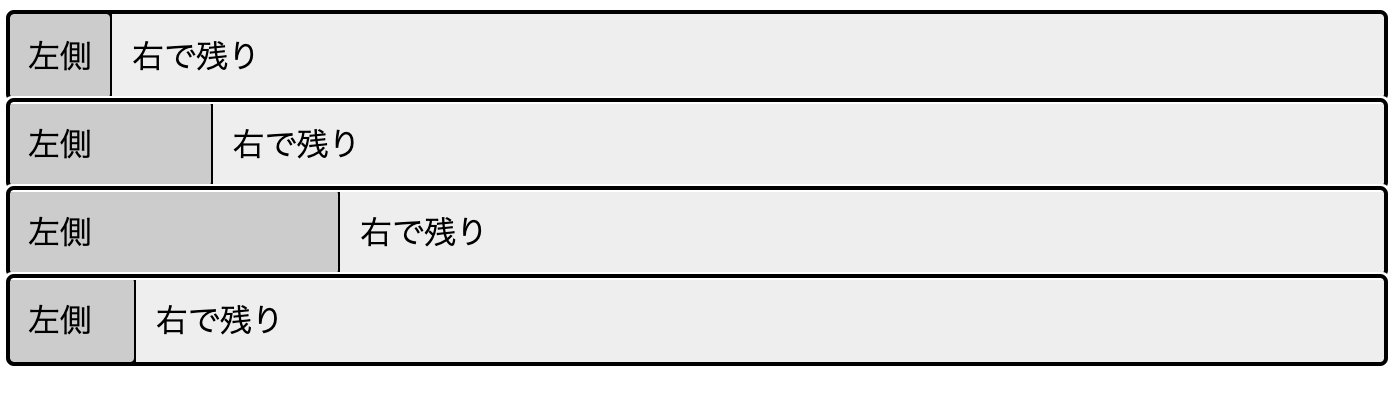
左側のスペースに合わせて右側は残り全部という事はよくあるのですが、CSSを実際にかけない事があったので、メモ程度に残しておきます。
index.html
<!DOCTYPE html>
<html lang="ja">
<head>
    <meta charset="UTF-8">
    <meta name="viewport" content="width=device-width, initial-scale=1.0">
    <link rel="stylesheet" href="styles.css">
    <title>Flex Wrap Sample</title>
</head>
<body>
    <div class="flex-wrap">
        <div class="left-column">左側</div>
        <div class="right-column">右で残り</div>
    </div>
    <div class="flex-wrap">
        <div class="left-column" style="width: 100px;">左側</div>
        <div class="right-column">右で残り</div>
    </div>
    <div class="flex-wrap">
        <div class="left-column" style="width: 200px;">左側</div>
        <div class="right-column">右で残り</div>
    </div>
    <div class="flex-wrap">
        <div class="left-column" style="width: 50px;">左側</div>
        <div class="right-column">右で残り</div>
    </div>
</body>
</html>
styles.css
.flex-wrap{
    display: flex;
    outline: auto;
}
.left-column{
    white-space: nowrap;
    background-color: #ccc;
    outline: auto;
    padding: 10px;
}
.right-column{
    width: 100%;
    background-color: #eee;
    padding: 10px;
}