HTML,CSSで乃木坂46のロゴを描く
<!DOCTYPE html>
<html>
<head>
  <meta charset="utf-8">
  <title>乃木坂ロゴ</title>
  <style>
  .nogilogo {
    background: linear-gradient(to bottom right, #fff 50%, #812990 50.3%) no-repeat bottom right/100% 100%;
    width: 200px;
    height: 200px;
    position: relative;
  }
  .nogilogo::after {
    content: "46";
    font: 60px/1em -webkit-pictograph;
    color: #fff;
    right: 4px;
    bottom: 0;
    position: absolute;
  }
  </style>
</head>
<body>
  <div class="nogilogo"></div>
</body>
</html>
結果
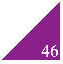
こんな感じになる。
メモ
コメントで教えて頂いたスタイルに修正した。
background: linear-gradient(to bottom right, #fff 50%, #812990 50.3%) no-repeat bottom right/100% 100%;
ボーダーをトリッキーな使い方をしていたため、余計な空白が空いたりしたけど、linear-gradientだととてもスマート。
font: 60px/1em -webkit-pictograph;
fontのおかげで簡略化された。 
旧スタイル
<!DOCTYPE html>
<html>
<head>
  <meta charset="utf-8">
  <title>乃木坂ロゴ</title>
  <style>
  .nogilogo {
    display: inline-block;
    position: relative;
    border-style: solid;
    border-width: 0 0 200px 200px;
    border-color: transparent transparent #812990 transparent;
  }
  .nogilogo::after {
    content: "46";
    width: max-content;
    position: absolute;
    bottom: -210px;
    right: 2px;
    color: white;
    font-size: 64px;
    font-family: -webkit-pictograph;
  }
  </style>
</head>
<body>
  <span class="nogilogo"></span>
</body>
</html>
  border-style: solid;
  border-width: 0 0 200px 200px;
  border-color: transparent transparent #812990 transparent;
cssで三角形を作るときには定番のボーダー
display: inline-block;
inline-blockでないと謎の空間が上に出てくる。
.nogilogo::after {
  content: "46";
  width: max-content;
  position: absolute;
  bottom: -210px;
  right: 2px;
  color: white;
  font-size: 64px;
  font-family: -webkit-pictograph;
}
もっと簡略化できそうな気がする。