概要
スマホ、タブレットでMATLABが使えるアプリMATLAB Mobileというものがあります。
コマンドを書くだけでなくスマホ、タブレットで取得したセンサーデータ(位置、角速度、方向、磁場、加速度、マイク)を取得することができます。
この機能を使い旅行中の移動を可視化するということがこの記事の内容です。
この記事ではMATLAB Homeを使用していますが、記事中のコードをMATLAB Mobileで実行することでも同様のことができます。
目次
- MATLABの地図表示
- MATLAB Mobileでデータ取得
- 経路ログの表示
- 旅行の移動ログを表示する
- まとめ
MATLABの地図表示
MATLABは標準で地図をいろいろな形式で表示することができます。
% 地図の表示
geoaxes('Basemap','colorterrain');
結果

たった1行で地図が表示できてしまいます。
'colorterrain'の部分を変更することで様々な形式の地図が表示できます。
地図の種類については公式HPを参照してください。
これをベースに旅行中の移動を地図上に表示します。
MATLAB Mobileでデータ取得
データの取得方法は以下の通り。
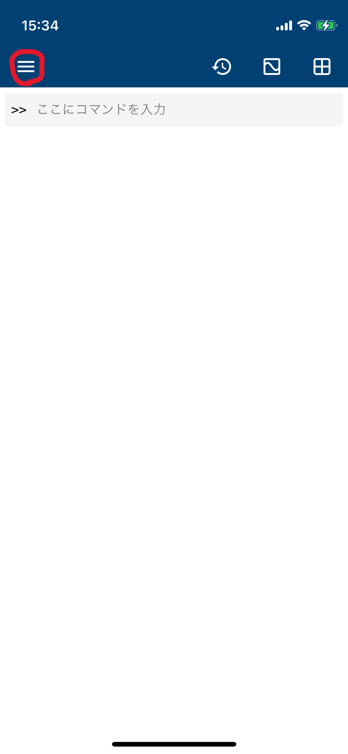
①MATLAB Mobileを入手後自分のMathWorksアカウントでログイン
②左上のメニューボタン(写真中の赤い丸部分)を選択
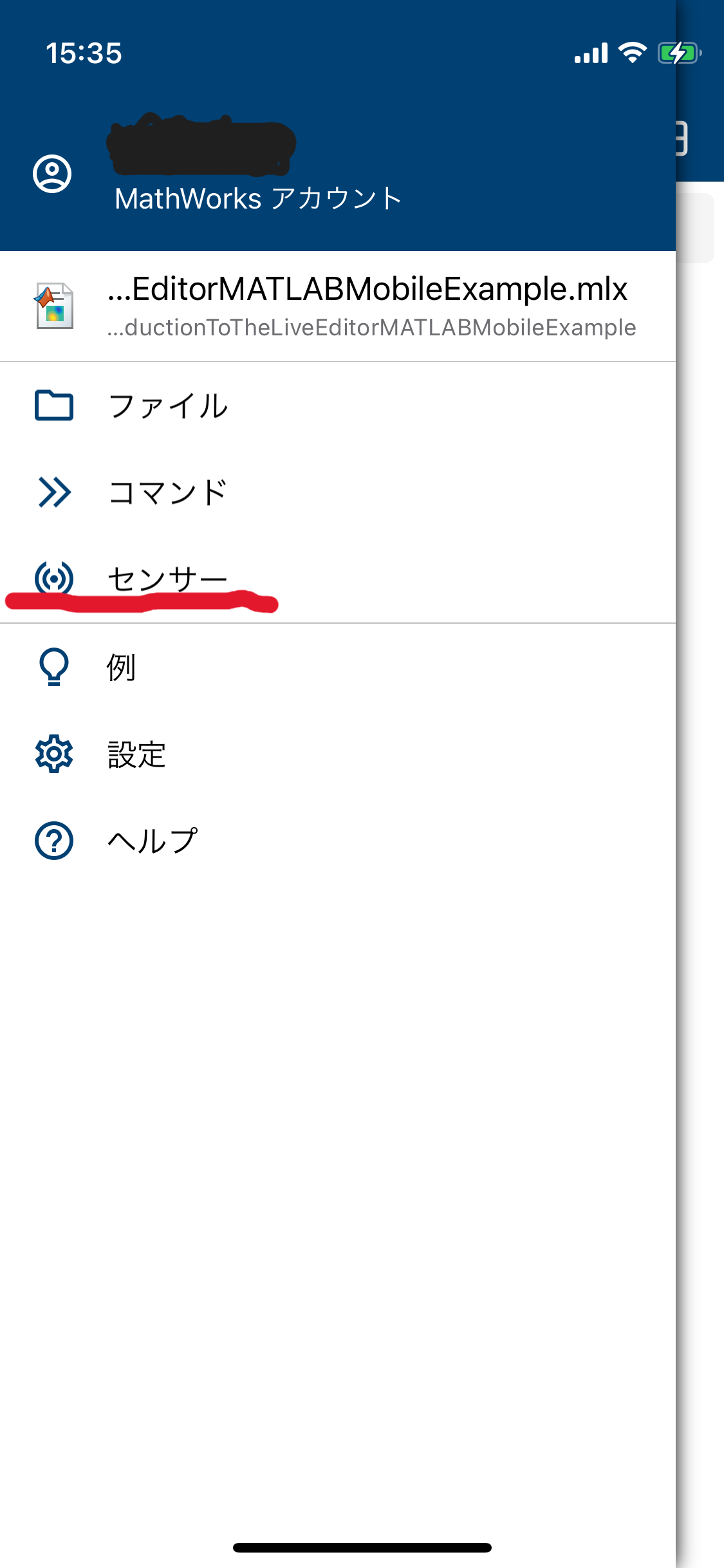
③下記画面になるのでセンサーを選択
④取得したいセンサーデータを選んで開始ボタンを押す。
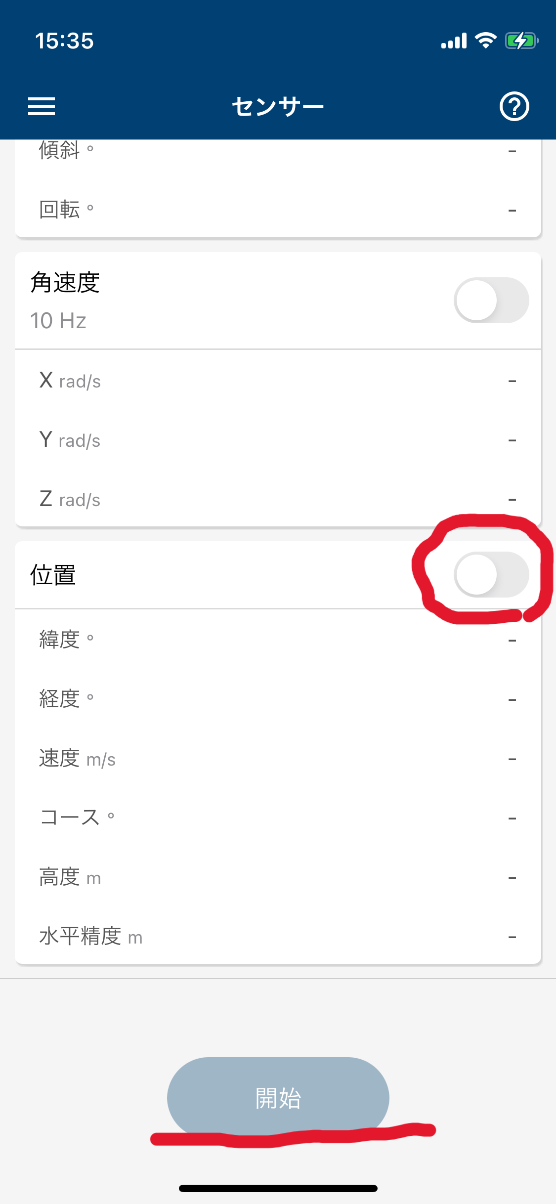
データの取得をやめたいときは開始ボタンを押した後に出てくる停止ボタンを押します。
データの保存をするとMATLAB Drive上の"MobileSensorData"というファイル内にデータが保存されます。
(MATLAB Driveの説明も本来であれば必要でしょうが今回は割愛します。)
経路ログの表示
取得したセンサーデータを使って経路ログの表示をしてみます。
% データの読み込み
data = load("test_data.mat")

% 緯度経度
latT = data.Position.latitude;
lonT = data.Position.longitude;

% MAPの設定
geoMap = 'satellite';
gx = geoaxes('Basemap',geoMap);

geolimits(gx,[min(latT) max(latT)], [min(lonT) max(lonT)])
geolimits(gx,'manual')
hold(gx,'on')

geoplot(gx,latT(1),lonT(1),'r-*', 'LineWidth',2)
drawnow
for t=1:length(latT)-1
    geoplot(gx,latT(t:t+1),lonT(t:t+1),'r-*', 'LineWidth',2)
    drawnow
end
hold(gx,'off')
実行結果
※データは自作したものです。
これで旅行の記録を可視化する準備ができました。
旅行の移動ログを表示する
MATLAB Mobileでセンサーデータ(位置)を取得すると以下のデータが取得できます。(参照)
| structのカラム名 | データの意味[単位] | 説明 |
|---|---|---|
| Timestamp | 時刻 | |
| latitude | 緯度[°] | |
| longtitude | 経度[°] | |
| speed | 速度[m/s] | |
| corse | コース[°] | 北を基準とした進路 |
| altitude | 高度[m] | 海抜高度 |
| hacc | 水平精度[m] | 経度と緯度を中心とする円によって 定義される水平精度 |
先の例のように地図上に緯度経度のみを表示するのでは少々面白みに欠けるので
今回はSpeedをカラーバーを使って表示して移動中の速度を表示してみます。
センサーデータは分割して取得したのでまずはつなぎ合わせる処理をします。
分割データをつなぎ合わせる処理
データの前処理
%% ========センサーデータを分割して取得したのでつなぎ合わせる処理========
% フォルダのパスを指定
folderPath = 'matファイルをまとめたフォルダのパス'; % フォルダのパスを指定してください

% フォルダ内のすべての .mat ファイルを取得
files = dir(fullfile(folderPath, '*.mat'));

% すべての .mat ファイルを読み込み
for k = 1:length(files)
    % ファイル名を取得 (拡張子なし)
    [~, fileName, ~] = fileparts(files(k).name);

    % ファイルを読み込み
    data = load(fullfile(folderPath, files(k).name));

    % ワークスペースに新しい変数として保存
    % evalを使って動的に変数を作成
    eval([fileName ' = data;']);
end

% ワークスペース内のすべての変数名を取得
vars = whos;

% 空の構造体を初期化
combinedPosition = struct('latitude', [], 'longitude', [], 'altitude', [] ,'speed', [], 'course', [], 'hacc', []);

% ワークスペース内のすべての "sensorlog_" で始まる変数をチェック
for k = 1:length(vars)
    % 変数名が "sensorlog_" で始まるか確認
    if startsWith(vars(k).name, 'sensorlog_')
        % evalin関数を使用してベースワークスペースから変数を取得
        data = evalin('base', vars(k).name);

        % Positionフィールドが存在するか確認
        if isfield(data, 'Position')
            % Positionフィールドの各フィールドを結合
            combinedPosition.latitude = [combinedPosition.latitude; data.Position.latitude];
            combinedPosition.longitude = [combinedPosition.longitude; data.Position.longitude];
            combinedPosition.altitude = [combinedPosition.altitude; data.Position.altitude];
            combinedPosition.speed = [combinedPosition.speed; data.Position.speed];
            combinedPosition.course = [combinedPosition.course; data.Position.course];
            combinedPosition.hacc = [combinedPosition.hacc; data.Position.hacc];
        else
            warning('Variable %s does not contain a Position field.', vars(k).name);
        end
    end
end
地図とデータの表示
データを地図上に表示
%データの間引き
num_thinning = 20

latT = combinedPosition.latitude;
lonT = combinedPosition.longitude;
speedT = combinedPosition.speed;

% マップにデータをプロットする
figure; % Create a new figure
geoMap = 'streets';
gx = geoaxes('Basemap',geoMap);

geolimits(gx,[min(latT) max(latT)], [min(lonT) max(lonT)]);
geolimits(gx,'manual');
hold(gx,'on');

% 速度データの標準化
minSpeed = min(speedT);
maxSpeed = max(speedT);
normSpeed = (speedT - minSpeed) / (maxSpeed - minSpeed);

% カラーマップの作成
cmap = jet(256); % Use jet colormap with 256 colors
colormap(gx, cmap);
colorbar('peer', gx, 'eastoutside'); % Add colorbar on the right side of the map

% 標準化した速度データを地図上に表示
for t = 1:num_thinning:length(latT)-num_thinning
    colorIdx = round(normSpeed(t) * 255) + 1; % Determine color index based on normalized speed
    geoplot(gx, latT(t:t+1), lonT(t:t+1), 'LineWidth', 2, 'Marker','o' ,'Color', cmap(colorIdx, :));
    drawnow;% Add text "データ1" near the plot

end

hold(gx,'off');
実行結果
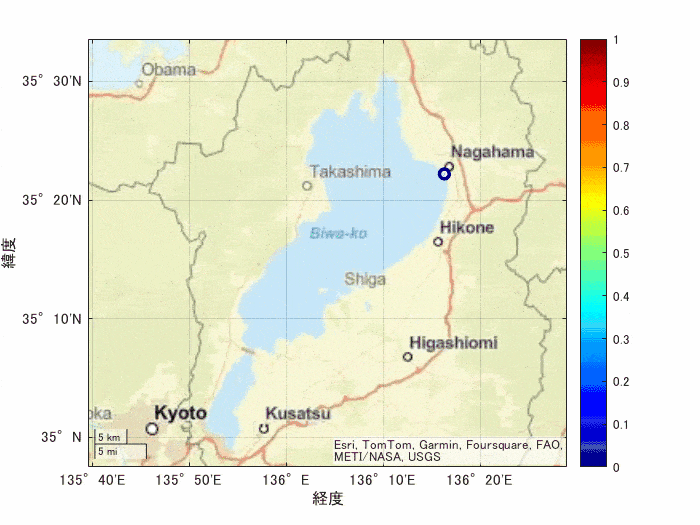
琵琶湖1周のデータが可視化できました。
今回の例でのカラーバーは1(赤)に近ければデータ中では相対的に速度が速いことを示しています。
大津付近では比較的ゆっくり、高島、長浜付近では比較的速い移動をしていたようです。
まとめ
こんな要領でMATLAB Mobileを使って取得したセンサーデータを可視化できます。
使い方次第では面白いことができそうです。
(MATLAB EXPOで利用例が紹介されていたりするのかな?)