KerasのCifar10の画像をモデルを作ってで画像分類する
データのダウンロード
#cifar10のデータダウンロード
from keras.datasets import cifar10
(X_train, Y_train), (X_test, Y_test) = cifar10.load_data()
データの確認
print(X_train[0], Y_train.shape)
print(X_train.shape, Y_train.shape)

import matplotlib.pyplot as plt
plt.title(Y_train[0])
plt.imshow(X_train[0])
plt.show()

[[[ 59  62  63]
  [ 43  46  45]
  [ 50  48  43]
  ...
  [158 132 108]
  [152 125 102]
  [148 124 103]]

 [[ 16  20  20]
  [  0   0   0]
  [ 18   8   0]
  ...
  [123  88  55]
  [119  83  50]
  [122  87  57]]

 [[ 25  24  21]
  [ 16   7   0]
  [ 49  27   8]
  ...
  [118  84  50]
  [120  84  50]
  [109  73  42]]

 ...

 [[208 170  96]
  [201 153  34]
  [198 161  26]
  ...
  [160 133  70]
  [ 56  31   7]
  [ 53  34  20]]

 [[180 139  96]
  [173 123  42]
  [186 144  30]
  ...
  [184 148  94]
  [ 97  62  34]
  [ 83  53  34]]

 [[177 144 116]
  [168 129  94]
  [179 142  87]
  ...
  [216 184 140]
  [151 118  84]
  [123  92  72]]]

[[6]
 [9]
 [9]
 ...
 [9]
 [1]
 [1]]

(50000, 32, 32, 3) (50000, 1)
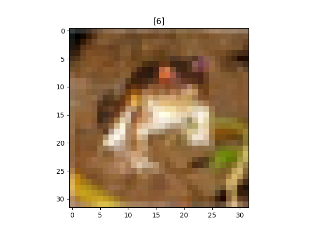
・上の3×3行列の集まりが画像を表している。
・各画像に対応する数字の行列が画像のタイトルを表す。
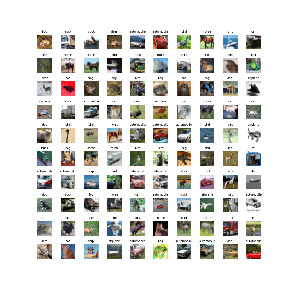
100個画像を取り出してどんな画像化を確認
import matplotlib.pyplot as plt
fig = plt.figure(figsize=(10,10))
#画像ごとにタイトルをつける
label = ["airplane", "automobile", "bird", "cat", "deer", "dog", "flog", "horse", "ship", "truck"]
for i in range(100):
  plt.subplot(10, 10, i+1)
  plt.subplots_adjust(wspace=0.4, hspace=0.6)
  plt.imshow(X_train[i])
  plt.title(label[Y_train[i][0]], fontsize = 7)
  plt.axis("off")
plt.show()
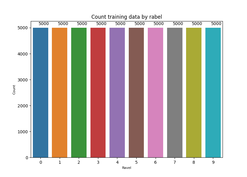
各ラベルがトレーニングデータにどのくらい入ってるのか確認
import seaborn as sns
ax = sns.countplot(x=Y_train.ravel())
plt.xlabel("Ravel", fontsize = 8)
plt.ylabel("Count", fontsize = 8)
plt.title('Count training data by rabel')
for p in ax.patches:
    ax.annotate((p.get_height()), (p.get_x()+0.3, p.get_height()+100))
plt.show()
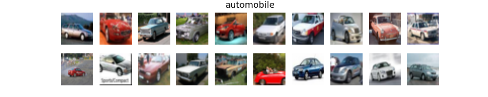
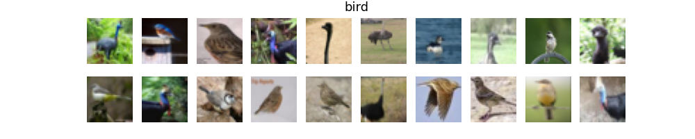
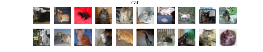
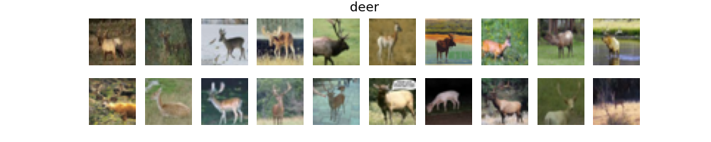
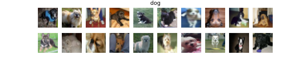
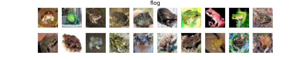
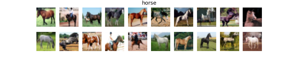
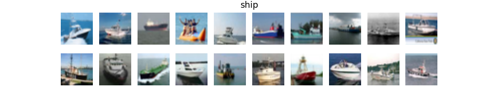
各ラベルごとに画像を20枚ずつ取り出して見てみる
#画像データを正規化
X_train = X_train.astype('float32')
X_test = X_test.astype('float32')
X_train = X_train/ 255
X_test = X_test/255

#各画像の平均画像を見てみる
import matplotlib.pyplot as plt
plt.figure(figsize=(1,8))
for j in range(10):
    xtrains = np.zeros(3072, dtype = float)
    for i in range(50000):
        if Y_train[i] == j:
            xtrains += np.ravel(X_train[i])

    xim = xtrains / 5000
    plt.subplot(10, 1, j+1)
    plt.xticks([])
    plt.yticks([])
    plt.imshow(xim.reshape(32,32,3))
plt.show()
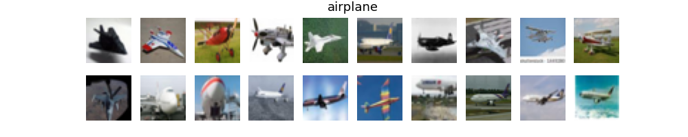
各ラベルごとに平均画像を見てみる
import seaborn as sns
for t in  [0, 1, 2, 3, 4, 5, 6, 7, 8, 9]:
    fig = plt.figure(figsize=(10,2))
    h = 0
    k = 0
    plt.title(label[t], fontsize = 13)
    plt.xticks([])
    plt.yticks([])
    sns.despine(top=True, right=True, left=True, bottom=True)
    while h < 20:
        if Y_train[k] == t:
            fig.add_subplot(2, 10, h+1)
            plt.xticks([])
            plt.yticks([])
            sns.despine(top=True, right=True, left=True, bottom=True)
            plt.imshow(X_train[k])
            k += 1
            h += 1
        else:
            k += 1
    plt.show()
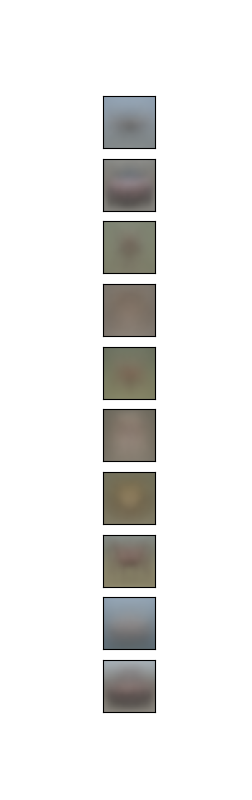
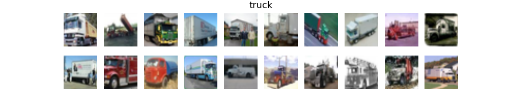
・上からラベル順に並んでいる。
・背景の色が特徴的で、一番目(airplane)や下二つ(ship、truck)は屋外を連想させる色をしている。
CNNで分類
モデルの作成
#CNNモデルを作る
from keras.models import Sequential
from keras.layers import Dense, Flatten, Conv2D, MaxPooling2D, AvgPool2D
model = Sequential()
model.add(Conv2D(32, (5,5), activation = 'relu', padding = 'same', input_shape = (32,32,3)))
model.add(MaxPooling2D(pool_size=(2, 2)))
model.add(Dense(32, activation = "relu"))

model.add(Conv2D(32, (5,5), activation = 'relu', padding = 'same'))
model.add(Dense(32, activation = "relu"))
model.add(AvgPool2D(pool_size=(2, 2)))

model.add(Conv2D(64, (5,5), activation = 'relu', padding = 'same'))
model.add(Dense(64, activation = "relu"))
model.add(AvgPool2D(pool_size=(2, 2)))

model.add(Conv2D(64, (4,4), activation = 'relu', padding = 'same'))
model.add(Dense(64, activation = "relu"))

model.add(Conv2D(10, (1,1), activation = 'relu', padding = 'same'))
model.add(Flatten())
model.add(Dense(10, activation = "softmax"))
学習実行
from tensorflow import keras
from keras import optimizers
Y_train_oh = keras.utils.to_categorical(Y_train, 10)
Y_test_oh = keras.utils.to_categorical(Y_test, 10)
opt = keras.optimizers.RMSprop(lr=1e-5, rho=0.9, epsilon=1e-08, decay=0.0)
model.compile(optimizer = opt, loss = "categorical_crossentropy", metrics=["accuracy"])
history = model.fit(X_train, Y_train_oh, validation_split=0.25, epochs=100, verbose=1)
ヒストリーの可視化
fig = plt.figure(figsize=(8, 8))
#ヒストリーの可視化(正確差)
fig.add_subplot(1, 2, 1)
acc = history.history['accuracy']
val_acc = history.history['val_accuracy']
plt.plot(label="Training accuracy")
plt.plot(label="Validation accuracy")
plt.title('Model accuracy')
plt.ylabel('Accuracy')
plt.xlabel('Epoch')
plt.legend(['Train', 'Test'], loc='best')

#ヒストリーの可視化(損失)
fig.add_subplot(1, 2, 2)
loss = history.history["loss"]
val_loss = history.history["val_loss"]
plt.plot(label="Training loss")
plt.plot(label="validation loss")
plt.title('Model loss')
plt.ylabel('Loss')
plt.xlabel('Epoch')
plt.legend(['Train', 'Test'], loc='best')
plt.show()
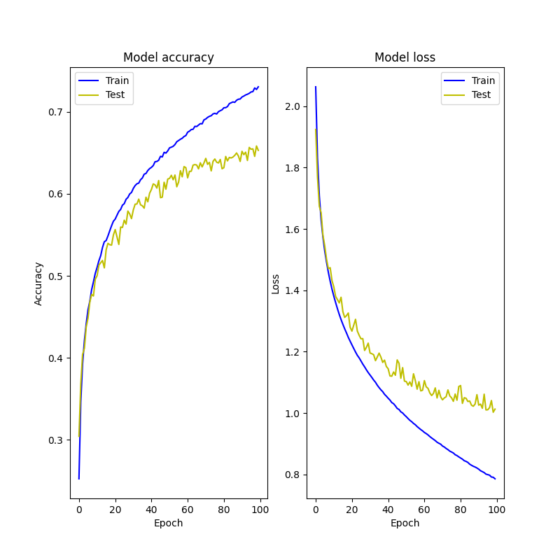
エポック=100じゃ足りない
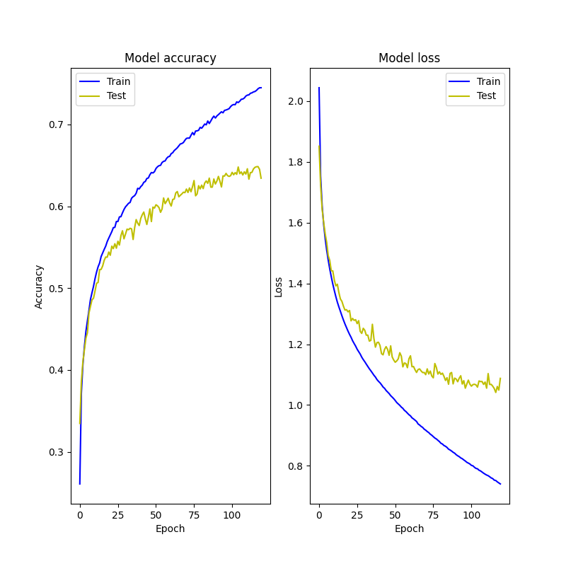
エポック=120
エポック=700
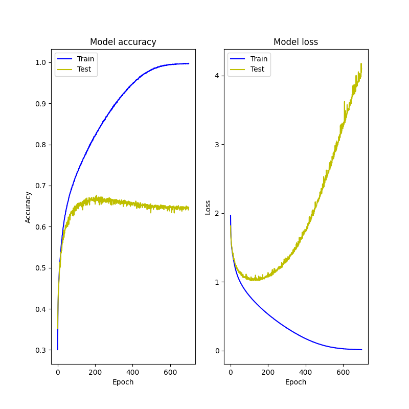
トレーニングの方はうまく機能してる。
テスト損失は一定量下がると上昇してしまう。
→勾配消失問題??