まとめ
translateするのは要素なので、要素のレイアウト(ボックスモデル)が肝要。
font-sizeを大きくすると、親のwidthより文字が大きくなることがあり、見かけの文字長と親のwidthに食い違いが生じる。
その結果、想定していないアニメーション結果になることがあるので、
文字長とwidthは同一になるようにするといいかも。
逆に文字より十分以上にwidthを確保していても想定以上の変化量になるので、余分にあればいいというわけでもない。
(font-sizeとdivからはみ出すことはゲンミツには直接の原因ではないですが、デフォルトのフォントサイズでははみ出るほど長く入力しないことと、私の遭遇ケースよりのタイトルです)
あらまし
あるところに改行したくないテキストがありました。
今は画面内に収まっていますがwhite-space: nowrap;をかけています。
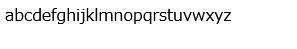
ただ、標準のフォントサイズだと小さいので大きくしようとしました。
<!DOCTYPE html>
<html>
<head>
<style type="text/css">
html {
overflow: hidden;
}
div {
white-space: nowrap;
}
.big {
font-size: 256px;
}
</style>
</head>
<body>
<div>
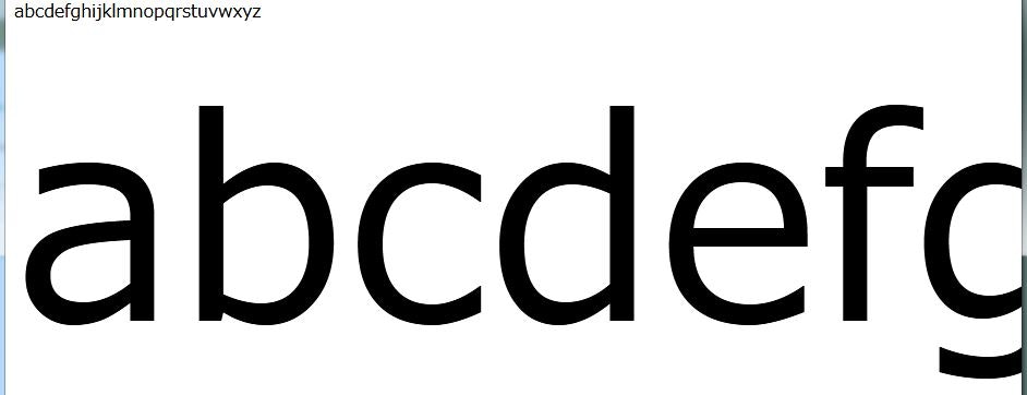
abcdefghijklmnopqrstuvwxyz
</div>
<div class="big">
abcdefghijklmnopqrstuvwxyz
</div>
</body>
</html>
あらあら、画面から飛び出して後半が見えません。
改行はしたくないですし、横スクロールも長大なので不恰好です。
ここは古のmarqueeタグで文字をスクロールして表示したいです。
しかし、marqueeはすでに廃止されているので、CSSのアニメーションで再現します。
調べてみると、どうやら
transform: translate(0);
で初期状態。そこから
transform: translate(-100%);
で全体が消えるまで左方向に移動アニメーションすることで実現できそうです。
<!DOCTYPE html>
<html>
<head>
<style type="text/css">

html {
  overflow: hidden;
}

div {
  white-space: nowrap;
}

.big {
  font-size: 256px;
}

.anime {
  animation-duration: 5s;
  animation-iteration-count: infinite;
  animation-timing-function: linear;
  animation-name: marquee;
}
@keyframes marquee {
  0% {
    transform: translate(0);
  }
  100% {
    transform: translate(-100%);
  }
}

</style>
</head>
<body>

<div>
abcdefghijklmnopqrstuvwxyz
</div>

<div class="big">
abcdefghijklmnopqrstuvwxyz
</div>

<div class="big anime">
abcdefghijklmnopqrstuvwxyz
</div>

</body>
</html>
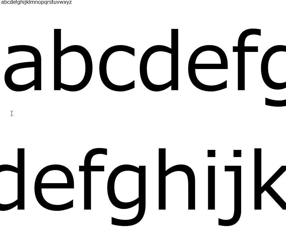
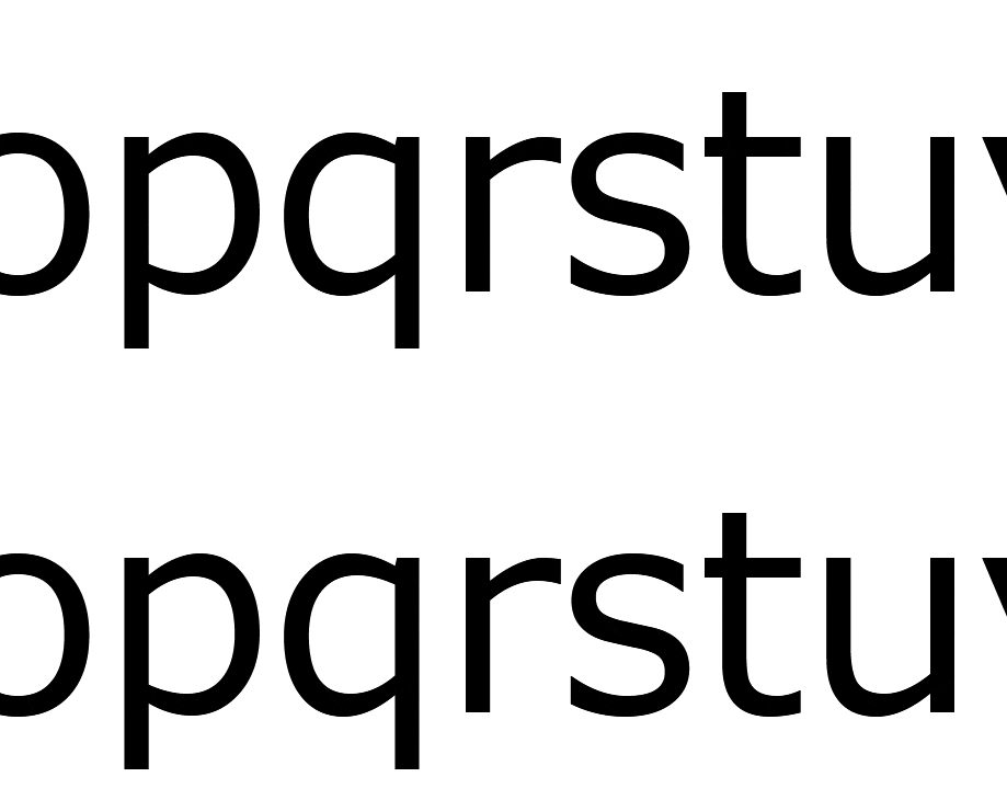
スクロールはしますが、mあたりでアニメーションが終了してしまいます。
末尾までアニメーションしません。
開発者ツールで見た結果、アニメーションはdivのボックスモデルに働いているらしく、また文字がそのボックスよりはみ出ていることがわかりました。
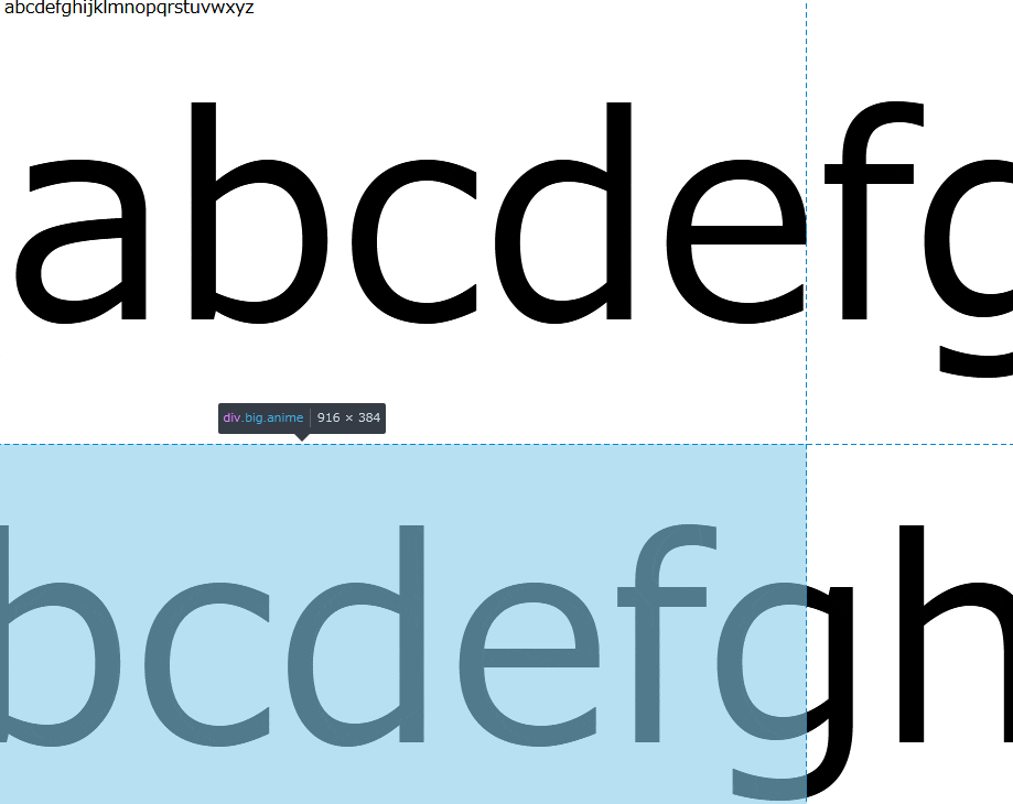
ボックスモデルの変化が-100%になってアニメーションが終了していることがわかります。
が、文字はまだまだwidth以上に続いているので途切れているようになります。
解決方法
ここでdivをwidth: 100%にするのはおそらく解決方法になりません。100%になるのは親のサイズに対してですし、親も大きくしてもウィンドウサイズと同じぐらいでしょうか。
軽く見た感じでは、手軽な解消方法は二通りありそうです。
display属性を変更する
display: inline-blockにするとwidthが調整されます。
inlineでは今度はanimationが効かなくなるので共存するならこちらで。
width属性を変更する
width: max-contentあるいはwidth: min-contentで、widthを内部で持つ要素の大きさに自動でフィットしてくれます。
これがfont-sizeの変更にも対応してくれました。
やや新しめの値で、CSS3としては草案段階のよう?ですがモダンブラウザならOK。
<!DOCTYPE html>
<html>
<head>
<style type="text/css">

html {
  overflow: hidden;
}

div {
  white-space: nowrap;
}

.big {
  font-size: 256px;
}

.anime {
  animation-duration: 5s;
  animation-iteration-count: infinite;
  animation-timing-function: linear;
  animation-name: marquee;
}
@keyframes marquee {
  0% {
    transform: translate(0);
  }
  100% {
    transform: translate(-100%);
  }
}

.display {
  display: inline-block;
}

.content {
  width: max-content;
}

</style>
</head>
<body>

<div class="big anime display">
abcdefghijklmnopqrstuvwxyz
</div>

<div class="big anime content">
abcdefghijklmnopqrstuvwxyz
</div>

</body>
</html>
ということで、大きい文字をmarqueeスクロールさせることができました。
font-sizeでblock要素からはみ出る原理を理解していないので鬼門かも。