はじめに
今回はBootstrapを使用してアコーディオンを使用してみました。
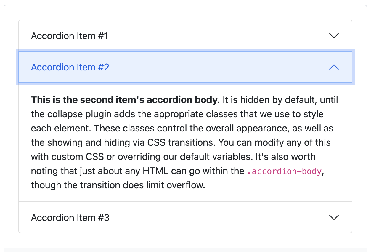
(アコーディオンとは下記画像のようなものです!)
しかし、このアコーディオンは一つのページで複数使用する場合、
そのまま記述してしまうと、一つの問題が発生してしまうので注意が必要です。
本記事では起こってしまう問題と解決策について記述させていただきます!
(※今回はBootstrapの基本的な使い方等は割愛させていただきます。)
開発環境
Bootstamp バージョン5
Ruby on Rails バージョン2.6.5
起こってしまう問題
通常アコーディオンの設定は下記を記述することで使用することができます。
<div class="accordion" id="accordionExample">
  <div class="accordion-item">
    <h2 class="accordion-header" id="headingOne">
      <button class="accordion-button" type="button" data-bs-toggle="collapse" data-bs-target="#collapseOne" aria-expanded="true" aria-controls="collapseOne">
        Accordion Item #1
      </button>
    </h2>
    <div id="collapseOne" class="accordion-collapse collapse show" aria-labelledby="headingOne" data-bs-parent="#accordionExample">
      <div class="accordion-body">
        <strong>This is the first item's accordion body.</strong> It is hidden by default, until the collapse plugin adds the appropriate classes that we use to style each element. These classes control the overall appearance, as well as the showing and hiding via CSS transitions. You can modify any of this with custom CSS or overriding our default variables. It's also worth noting that just about any HTML can go within the <code>.accordion-body</code>, though the transition does limit overflow.
      </div>
    </div>
  </div>
  <div class="accordion-item">
    <h2 class="accordion-header" id="headingTwo">
      <button class="accordion-button collapsed" type="button" data-bs-toggle="collapse" data-bs-target="#collapseTwo" aria-expanded="false" aria-controls="collapseTwo">
        Accordion Item #2
      </button>
    </h2>
    <div id="collapseTwo" class="accordion-collapse collapse" aria-labelledby="headingTwo" data-bs-parent="#accordionExample">
      <div class="accordion-body">
        <strong>This is the second item's accordion body.</strong> It is hidden by default, until the collapse plugin adds the appropriate classes that we use to style each element. These classes control the overall appearance, as well as the showing and hiding via CSS transitions. You can modify any of this with custom CSS or overriding our default variables. It's also worth noting that just about any HTML can go within the <code>.accordion-body</code>, though the transition does limit overflow.
      </div>
    </div>
  </div>
  <div class="accordion-item">
    <h2 class="accordion-header" id="headingThree">
      <button class="accordion-button collapsed" type="button" data-bs-toggle="collapse" data-bs-target="#collapseThree" aria-expanded="false" aria-controls="collapseThree">
        Accordion Item #3
      </button>
    </h2>
    <div id="collapseThree" class="accordion-collapse collapse" aria-labelledby="headingThree" data-bs-parent="#accordionExample">
      <div class="accordion-body">
        <strong>This is the third item's accordion body.</strong> It is hidden by default, until the collapse plugin adds the appropriate classes that we use to style each element. These classes control the overall appearance, as well as the showing and hiding via CSS transitions. You can modify any of this with custom CSS or overriding our default variables. It's also worth noting that just about any HTML can go within the <code>.accordion-body</code>, though the transition does limit overflow.
      </div>
    </div>
  </div>
</div>
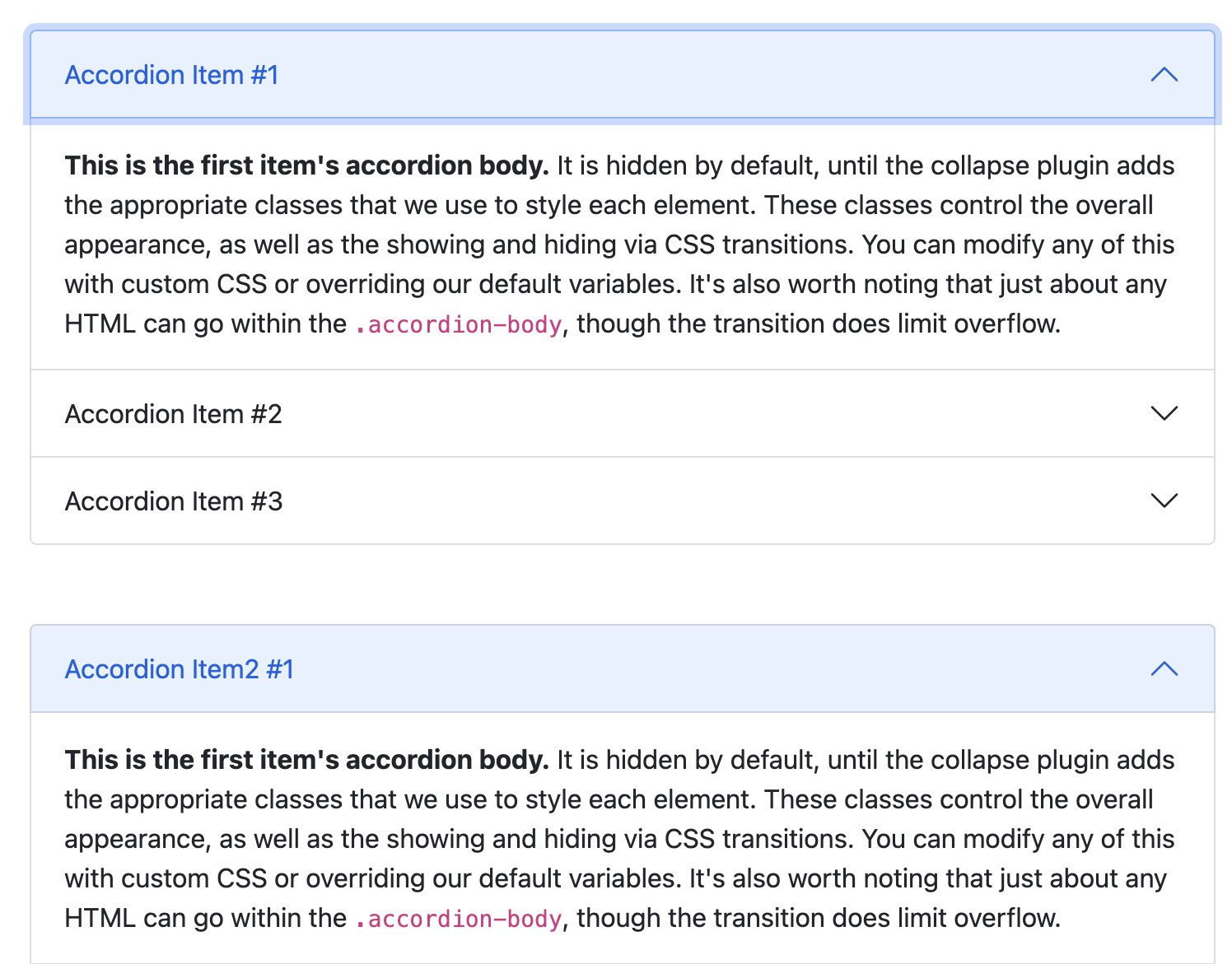
しかし、下記画像のようにアコーディオンを1つのページで2つ使用したい場合はそのままコピーしてしまうと、、、
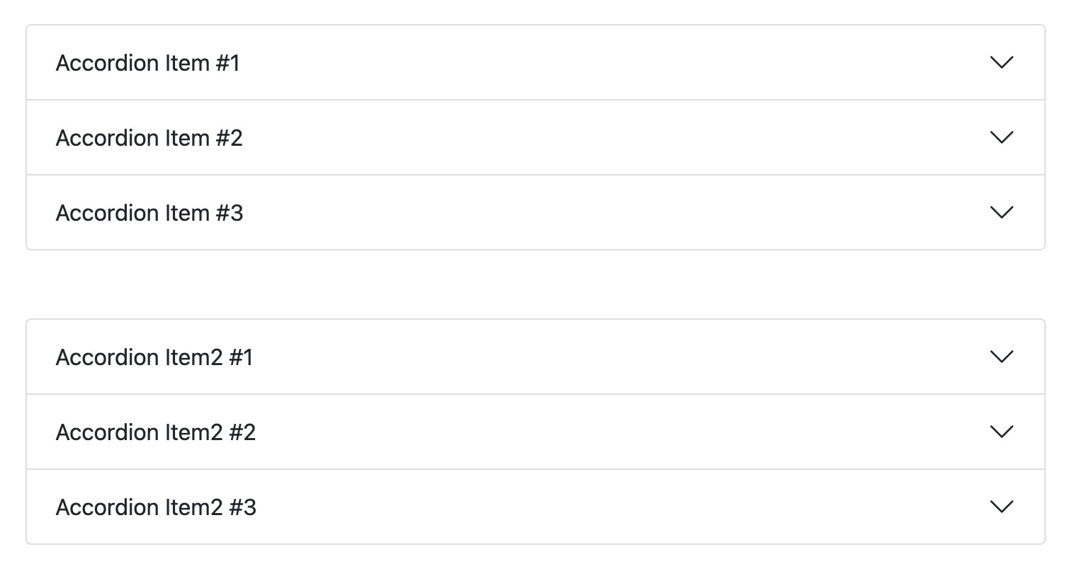
下記画像のように『Accordion Item #1』を押すと、『Accordion Item2 #1』も同時に展開されてしまいます。
解決策
この問題を解決するためにはふたつめ以降のアコーディオンの『data-bs-target』と
それに合わさっている『id』の値を変えてあげる必要があります
ひとつのアコーディオンのコードで見たときに
  <div class="accordion-item">
    <h2 class="accordion-header" id="headingOne">
      <button class="accordion-button" type="button" data-bs-toggle="collapse" data-bs-target="#collapseOne" aria-expanded="true" aria-controls="collapseOne">
        ↪︎ここの『data-bs-target』の中の値と
      </button>
    </h2>
    <div id="collapseOne" class="accordion-collapse collapse show" aria-labelledby="headingOne" data-bs-parent="#accordionExample">
                ↪︎ここの『id』の値を変更してあげないといけません!    (『data-bs-target』と『id』の値は合わせてあげる必要があります)
      <div class="accordion-body">
        <strong>This is the first item's accordion body.</strong> It is hidden by default, until the collapse plugin adds the appropriate classes that we use to style each element. These classes control the overall appearance, as well as the showing and hiding via CSS transitions. You can modify any of this with custom CSS or overriding our default variables. It's also worth noting that just about any HTML can go within the <code>.accordion-body</code>, though the transition does limit overflow.
      </div>
    </div>
  </div>
終わりに/完成形
ふたつめ以降のアコーディオンを作成する際に『data-bs-target』とそれに連携されている『id』を
ひとつめと変えてあげることで、同時に展開される問題が解決しました!
完成形
<div class="accordion" id="accordionExample">
  <div class="accordion-item">
    <h2 class="accordion-header" id="headingOne">
      <button class="accordion-button" type="button" data-bs-toggle="collapse" data-bs-target="#collapseOne" aria-expanded="true" aria-controls="collapseOne">
        Accordion Item #1
      </button>
    </h2>
    <div id="collapseOne" class="accordion-collapse collapse show" aria-labelledby="headingOne" data-bs-parent="#accordionExample">
      <div class="accordion-body">
        <strong>This is the first item's accordion body.</strong> It is hidden by default, until the collapse plugin adds the appropriate classes that we use to style each element. These classes control the overall appearance, as well as the showing and hiding via CSS transitions. You can modify any of this with custom CSS or overriding our default variables. It's also worth noting that just about any HTML can go within the <code>.accordion-body</code>, though the transition does limit overflow.
      </div>
    </div>
  </div>
  <div class="accordion-item">
    <h2 class="accordion-header" id="headingTwo">
      <button class="accordion-button collapsed" type="button" data-bs-toggle="collapse" data-bs-target="#collapseTwo" aria-expanded="false" aria-controls="collapseTwo">
        Accordion Item #2
      </button>
    </h2>
    <div id="collapseTwo" class="accordion-collapse collapse" aria-labelledby="headingTwo" data-bs-parent="#accordionExample">
      <div class="accordion-body">
        <strong>This is the second item's accordion body.</strong> It is hidden by default, until the collapse plugin adds the appropriate classes that we use to style each element. These classes control the overall appearance, as well as the showing and hiding via CSS transitions. You can modify any of this with custom CSS or overriding our default variables. It's also worth noting that just about any HTML can go within the <code>.accordion-body</code>, though the transition does limit overflow.
      </div>
    </div>
  </div>
  <div class="accordion-item">
    <h2 class="accordion-header" id="headingThree">
      <button class="accordion-button collapsed" type="button" data-bs-toggle="collapse" data-bs-target="#collapseThree" aria-expanded="false" aria-controls="collapseThree">
        Accordion Item #3
      </button>
    </h2>
    <div id="collapseThree" class="accordion-collapse collapse" aria-labelledby="headingThree" data-bs-parent="#accordionExample">
      <div class="accordion-body">
        <strong>This is the third item's accordion body.</strong> It is hidden by default, until the collapse plugin adds the appropriate classes that we use to style each element. These classes control the overall appearance, as well as the showing and hiding via CSS transitions. You can modify any of this with custom CSS or overriding our default variables. It's also worth noting that just about any HTML can go within the <code>.accordion-body</code>, though the transition does limit overflow.
      </div>
    </div>
  </div>
</div>


-----------------ふたつめのアコーディオン-----------------

<div class="accordion" id="accordionExample">
  <div class="accordion-item">
    <h2 class="accordion-header" id="headingOne">
      <button class="accordion-button" type="button" data-bs-toggle="collapse" data-bs-target="#collapseOne1" aria-expanded="true" aria-controls="collapseOne">

 ↪︎ data-bs-targetを変更

        Accordion Item #1
      </button>
    </h2>
    <div id="collapseOne1" class="accordion-collapse collapse show" aria-labelledby="headingOne" data-bs-parent="#accordionExample">

↪︎ idを変更

      <div class="accordion-body">
        <strong>This is the first item's accordion body.</strong> It is hidden by default, until the collapse plugin adds the appropriate classes that we use to style each element. These classes control the overall appearance, as well as the showing and hiding via CSS transitions. You can modify any of this with custom CSS or overriding our default variables. It's also worth noting that just about any HTML can go within the <code>.accordion-body</code>, though the transition does limit overflow.
      </div>
    </div>
  </div>
  <div class="accordion-item">
    <h2 class="accordion-header" id="headingTwo">
      <button class="accordion-button collapsed" type="button" data-bs-toggle="collapse" data-bs-target="#collapseTwo2" aria-expanded="false" aria-controls="collapseTwo">

↪︎ data-bs-targetを変更

        Accordion Item #2
      </button>
    </h2>
    <div id="collapseTwo2" class="accordion-collapse collapse" aria-labelledby="headingTwo" data-bs-parent="#accordionExample">

↪︎ idを変更

      <div class="accordion-body">
        <strong>This is the second item's accordion body.</strong> It is hidden by default, until the collapse plugin adds the appropriate classes that we use to style each element. These classes control the overall appearance, as well as the showing and hiding via CSS transitions. You can modify any of this with custom CSS or overriding our default variables. It's also worth noting that just about any HTML can go within the <code>.accordion-body</code>, though the transition does limit overflow.
      </div>
    </div>
  </div>
  <div class="accordion-item">
    <h2 class="accordion-header" id="headingThree">
      <button class="accordion-button collapsed" type="button" data-bs-toggle="collapse" data-bs-target="#collapseThree3" aria-expanded="false" aria-controls="collapseThree">

↪︎ data-bs-targetを変更

        Accordion Item #3
      </button>
    </h2>
    <div id="collapseThree3" class="accordion-collapse collapse" aria-labelledby="headingThree" data-bs-parent="#accordionExample">

↪︎ idを変更

      <div class="accordion-body">
        <strong>This is the third item's accordion body.</strong> It is hidden by default, until the collapse plugin adds the appropriate classes that we use to style each element. These classes control the overall appearance, as well as the showing and hiding via CSS transitions. You can modify any of this with custom CSS or overriding our default variables. It's also worth noting that just about any HTML can go within the <code>.accordion-body</code>, though the transition does limit overflow.
      </div>
    </div>
  </div>
</div>