今日の目標
CSSでアニメーションを作る際の基本コードを知る
今回作成したアニメーションはこちら
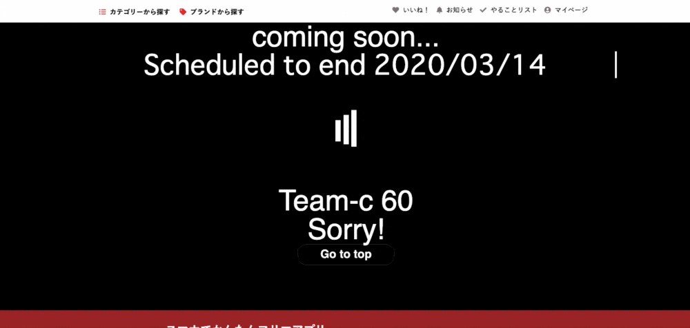
「現在工事中のページです」ってのをアニメーションで表現してみました
チームで開発したwebサイトにアニメーションをつけてみたのでその記述の大枠を振り返ってみたいと思います。
使うのは @keyframeとanimationプロパティです
アニメーションを作るのに必要なこと
@keyframeを知ろう
アニメーションを動かすためには、@kyeframesを用いて、アニメーション開始から終了するまでどのようなアニメーションをするのか指定を行います。
@keyframes 任意の名前 {
  0% {
       開始時の動きの指定
  }
  100% {
       終了時の動きの指定
  }
}
動きの指定には、opacityやtransformなどを用います
.ready-page
  .ready-page__main
    .ready-page__main__text

      %h1.comingsoon
        coming soon...

      %p.schedule
        Scheduled to end

        2020/03/14
    .loader Loading...
  %h1.teamname
    Team-c 60
  %h2.sorry
    Sorry!
    .ready-page__main__return
      = link_to "Go to top",root_path,class:"ready-page__main__return__to__toppage"
上記のようにhtmlを書いて
fade-inの @keyframesのcssは以下のようになります。
@keyframes fade-in1 {
  0% {
    opacity: 0;
  }
  100% {
    opacity: 1;
  }
}
アニメーションプロパティを知ろう
@keyframes で指定したアニメーションとアニメーション開始から終了までの時間を指定するにはanimation プロパティで指定します。
| プロパティ | 働き |
|---|---|
| animation-name | アニメーションの名前を指定 |
| animation-duration | アニメーションが始まって終わるまでの時間を指定 |
| animation-timing-function | アニメーションの進行の度合いを指定 |
| animation-delay | アニメーションが始まる時間を指定 |
| animation-iteration-count | アニメーションの繰り返し回数を指定 |
| animation-direction | アニメーションの再生方向を指定 |
| animation-fill-mode | アニメーションの開始前、終了後のスタイルを指定 |
| animation-play-state | アニメーションの再生・停止を指定 |
| animation | 上記、8つのプロパティを一括で指定 |
実際のフェードインのアニメーションプロパティの設定(秒数などで表示を調整)
h1.teamname{
  opacity: 0;
  text-align: center;
  color: white;
  font-size: 60px;
  animation-name: fade-in1;
  animation-duration: 5s;
  animation-timing-function: ease-out;
  animation-delay: 5s;
  animation-iteration-count: 1;
  animation-direction: normal;
  animation-fill-mode: forwards;
}
@keyframesと組み合わせて
h1.teamname{
  opacity: 0;
  text-align: center;
  color: white;
  font-size: 60px;
  animation-name: fade-in1;
  animation-duration: 5s;
  animation-timing-function: ease-out;
  animation-delay: 5s;
  animation-iteration-count: 1;
  animation-direction: normal;
  animation-fill-mode: forwards;
}
@keyframes fade-in1 {
  0% {
    opacity: 0;
  }
  100% {
    opacity: 1;
  }
@keyframesで開始時 opacity 0
で設定し、そこからアニメーションが始まり(アニメーションプロパティの設定)
@keyframesでアニメーション終了時 opacity 1で終わる
というコードです
タイピングアニメーションの@keyframes
@keyframes typing { from { width: 0; } }
@keyframes caret { 50% { border-color: transparent; } }
タイピングアニメーションのプロパティ
animation: typing 5s steps(15, end), caret .3s step-end infinite;
これを組み合わせて 色サイズなんかも整えると以下のように
@keyframes typing { from { width: 0; } }
@keyframes caret { 50% { border-color: transparent; } }
p.schedule{
  color: white;
  text-align: center;
  font-size: 60px;
  margin-top: 30px;
  font-family: monospace;
  width: 30ch;
  border-right: .08em solid;
  overflow: hidden;
  font-size: 4em;
  white-space: nowrap;
  animation: typing 5s steps(15, end), caret .3s step-end infinite;
  margin: 0 auto;
}
今回は フェードインとタイピングとloadingの3種類のアニメーションを使いました。
完成形
.ready-page
  .ready-page__main
    .ready-page__main__text

      %h1.comingsoon
        coming soon...

      %p.schedule
        Scheduled to end

        2020/03/14
    .loader Loading...
  %h1.teamname
    Team-c 60
  %h2.sorry
    Sorry!
    .ready-page__main__return
      = link_to "Go to top",root_path,class:"ready-page__main__return__to__toppage"
.loader,
.loader:before,
.loader:after {
  background: #ffffff;
  -webkit-animation: load1 1s infinite ease-in-out;
  animation: load1 1s infinite ease-in-out;
  width: 1em;
  height: 10em;
}
.loader {
  color: #ffffff;
  text-indent: -9999em;
  margin: 88px auto;
  position: relative;
  font-size: 11px;
  -webkit-transform: translateZ(0);
  -ms-transform: translateZ(0);
  transform: translateZ(0);
  -webkit-animation-delay: -0.16s;
  animation-delay: -0.16s;
}
.loader:before,
.loader:after {
  position: absolute;
  top: 0;
  content: '';
}
.loader:before {
  left: -1.5em;
  -webkit-animation-delay: -0.32s;
  animation-delay: -0.32s;
}
.loader:after {
  left: 1.5em;
}
@-webkit-keyframes load1 {
  0%,
  80%,
  100% {
    box-shadow: 0 0;
    height: 4em;
  }
  40% {
    box-shadow: 0 -2em;
    height: 5em;
  }
}
@keyframes load1 {
  0%,
  80%,
  100% {
    box-shadow: 0 0;
    height: 4em;
  }
  40% {
    box-shadow: 0 -2em;
    height: 5em;
  }
}

.ready-page{
  background-color:black;
  height: 600px;
}
h1.comingsoon{
  color: white;
  text-align: center;
  font-size: 60px;
}
@keyframes typing { from { width: 0; } }
@keyframes caret { 50% { border-color: transparent; } }
p.schedule{
  color: white;
  text-align: center;
  font-size: 60px;
  margin-top: 30px;
  font-family: monospace;
  width: 30ch;
  border-right: .08em solid;
  overflow: hidden;
  font-size: 4em;
  white-space: nowrap;
  animation: typing 5s steps(15, end), caret .3s step-end infinite;
  margin: 0 auto;
}

h1.teamname{
  opacity: 0;
  text-align: center;
  color: white;
  font-size: 60px;
  animation-name: fade-in1;
  animation-duration: 5s;
  animation-timing-function: ease-out;
  animation-delay: 5s;
  animation-iteration-count: 1;
  animation-direction: normal;
  animation-fill-mode: forwards;
}
@keyframes fade-in1 {
  0% {
    opacity: 0;
  }
  100% {
    opacity: 1;
  }
}
h2.sorry{
  opacity: 0;
  text-align: center;
  color: white;
  font-size: 60px;
  animation-name: fade-in1;
  animation-duration: 4s;
  animation-timing-function: ease-out;
  animation-delay: 8s;
  animation-iteration-count: 1;
  animation-direction: normal;
  animation-fill-mode: forwards;
}
.ready-page__main__return__to__toppage{
  opacity: 1;
  text-align: center;
  color: white;
  font-size: 60px;
  width:200px;
  font-size:24px;
  font-weight:bold;
  text-decoration:none;
  display:block;
  padding:8px 0 10px;
  border:1px solid #333;
  margin: 0 auto;
  border-radius: 20px;
}
冒頭でもご紹介しましたが動作はこんな感じ
@keyframesとアニメーションプロパティの使い方を覚えれば いろんなアニメーションが制作できます。
htmlはhaml記法で cssは scssで書いています。