はじめに
scikit-learn でパーセプトロンをためしたときのメモ
モデルのトレーニング
アヤメのデータセットを使ってトレーニングしました。
後々可視化するために 150 個のサンプルの「がく片の長さ」と「花びらの長さ」を特徴行列Xに代入し、対応する品種のクラスラベルをベクトルyに代入する。
from sklearn import datasets
import numpy as np
# データセットのロード
iris = datasets.load_iris()
# 3,4列目の特徴量の抽出
X = iris.data[:,[2,3]]
# クラスラベルの取得
y = iris.target
np.unique(y)を実行することでクラスラベルを取得することができます。
実行結果から、アヤメのクラス名が既に整数で格納されていることが確認できました。
print("Class labels:",np.unique(y))
# 実行結果
Class labels: [0 1 2]
トレーニングデータセットとテストデータセットの分割
scikit-learnのmodel_selectionモジュールのtrain_test_splitを使用した。
X 配列と y 配列を 30%のテストデータと 70%のトレーニングデータに分割します。
from sklearn.model_selection import train_test_split
# トレーニングデータとテストデータに分割
# 全体の30%をテストデータとする
X_train,X_test,y_train,y_test = train_test_split(
                                X,y,test_size=0.3,random_state = 0)
特徴量の標準化
勾配降下法を使って特徴量の標準化をします。
scikit-learnのpreprocessingモジュールのStandardScalerクラスを使って特徴量の標準化をしました。
from sklearn.preprocessing import StandardScaler
# インスタンス変数の作成
sc = StandardScaler()
# トレーニングデータの平均と標準偏差を計算
sc.fit(X_train)
# 平均と標準偏差を用いて標準化
X_train_std = sc.transform(X_train)
X_test_std = sc.transform(X_test)
StandardScalerクラスのfitメソッドでトレーニングデータから平均値と標準偏差を計算しています。
そのあとに、transformメソッドで推定されたパラメータを使ってデータを標準化しています。
パーセプトロンのトレーニング
fitメソッドを使ってトレーニングデータにモデルを適合させます。
from sklearn.linear_model import Perceptron
# エポック数40、学習率0.1でパーセプトロンのインスタンスを作成
ppn = Perceptron(n_iter = 40,eta0 = 0.1,random_state=0,shuffle=True)
# トレーニングデータをモデルに適合される
ppn.fit(X_train_std,y_train)
予測をする
predictメソッドを使って予測を行います。
# テストデータで予測
y_pred = ppn.predict(X_test_std)
# 誤分類のサンプルを表示
print('Missclassified samples:%d'%(y_test != y_pred).sum())
# 実行結果
Missclassified samples:9
9 つの誤分類があることがわかりました。
また、metricsモジュールを使うことで正解率が計算することができます。
from sklearn.metrics import accuracy_score
# 正解率の表示
print('Accuracy:%.2f'%accuracy_score(y_test,y_pred))
# 実行結果
Accuracy:0.80
y_testが正解でy_predが予測したクラスラベルです。
決定領域のプロット
最後にパーセプトロンモデルの決定領域のプロットをします。
はじめにモデルの可視化のための関数としてplot_decision_regionsを宣言します。
from matplotlib.colors import ListedColormap
import matplotlib.pyplot as plt

def plot_decision_regions(X,y,classifier,test_idx,resolution = 0.02):
    #マーカーとカラーマップの用意
    markers = ('s','x','o','^','v')
    colors = ('red','blue','lightgreen','gray','cyan')
    cmap = ListedColormap(colors[:len(np.unique(y))])
    #決定領域のプロット
    x1_min,x1_max = X[:,0].min() - 1,X[:,0].max() + 1
    x2_min,x2_max = X[:,1].min() - 1,X[:,1].max() + 1
    #グリッドポイントの作成
    xx1,xx2 = np.meshgrid(np.arange(x1_min,x1_max,resolution),
                         np.arange(x2_min,x2_max,resolution))
    #特徴量を一次元配列に変換して予測を実行する
    Z = classifier.predict(np.array([xx1.ravel(),xx2.ravel()]).T)
    #予測結果をグリッドポイントのデータサイズに変換
    Z = Z.reshape(xx1.shape)
    #グリッドポイントの等高線のプロット
    plt.contourf(xx1,xx2,Z,alpha = 0.4,cmap = cmap)
    #軸の範囲の設定
    plt.xlim(xx1.min(),xx1.max())
    plt.ylim(xx2.min(),xx2.max())
    #クラスごとにサンプルをプロット
    #matplotlibが1.5.0以下ならc = cmapをc=colors[idx]に変更
    for idx,cl in enumerate(np.unique(y)):
        plt.scatter(x=X[y==cl,0],y=X[y == cl,1],alpha=0.8,c = cmap(idx),marker=markers[idx],label=cl)
    #テストサンプルを目立たせる
    if test_idx:
        X_test,y_test = X[test_idx,:],y[test_idx]
        plt.scatter(X_test[:,0],X_test[:,1],c='',alpha = 1,linewidths=1,marker='o',s = 55,label = 'test set')
次のコードを実行してグラフをプロットしていきます。
# トレーニングデータとテストデータの特徴量を行方向に結合
X_combined_std = np.vstack((X_train_std,X_test_std))
# トレーニングデータとテストデータのラベルを結合
y_combined = np.hstack((y_train,y_test))
# 決定境界のプロット
plot_decision_regions(X=X_combined_std,y=y_combined,classifier=ppn,test_idx=range(105,150))
# 軸ラベルの設定
plt.xlabel('petal length [standardized]')
plt.ylabel('petal width [standardized]')
# 凡例の設定
plt.legend(loc = 'upper left')
# グラフの表示
plt.show()
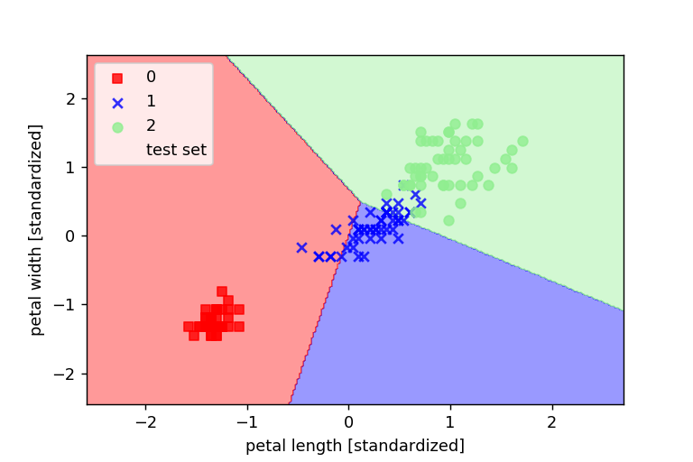
結果として完全に区切ることはできませんでした。
完全に線形分離が可能なデータセットじゃないと収束することがないことがわかりました。