はじめに
パーセプトロンを一から実装した時のまとめ
パーセプトロンの理論
まず、2 つのクラスを1(陽性)と-1(陰性)に分けます。
そうすると活性化関数$φ$が定義できます。
この活性化関数は特定の入力$x$に対応する重みベクトル$w$の線形結合を引数とします。
Z = \sum_{i=1}^{n}w_ix_i
\quad
w = \begin{pmatrix}
w_1 \\
w_2 \\
\vdots \\
w_n
\end{pmatrix}
\quad
x = \begin{pmatrix}
x_1 \\
x_2 \\
\vdots \\
x_n
\end{pmatrix}
活性化関数には単位ステップ関数を使います
φ(z) = \left\{
\begin{array}{ll}
1 & (z \gt \theta) \\
-1 & (z \lt \theta)
\end{array}
\right.
$\theta$はしきい値です
パーセプトロンの学習規則
-
重み$w$を 0 または小さな乱数で初期化する
-
トレーニングサンプル$x^{(i)}$毎に以下の手順を実行する
- 出力$\breve{y}$を計算する
- 重み$w$を更新する
重みベクトル$w$の各重み$w_i$は同時に更新され以下の式で表されます。
w_i := w_i + \Delta w_i
$\Delta w_i$の計算は以下のようにされます。
\Delta w_i = \eta(y_i - \breve{y_i})x_i^{(i)}
$\eta$は学習率で$0<\eta<1$です。
$y_i$はトレーニングクラスラベルで$\breve{y_i}$は予測クラスラベルです。
実装
以下の環境で実装しました。
実装した後に、実際にアヤメのデータセットを使って訓練していきます。
-
python 3.6
-
JupyterLab 0.35.4
使用したモジュールはnumpyです。
データセットを入手して処理するためのpandasと可視化するためにmatplotlibを使います。
コード
class Perceptron(object):
    """
    パーセプトロン分類機

    eta:学習率
    n_iter:トレーニング回数
    ーーーー
    属性
    w_ :一次元配列
        適合後の重み
    errors_ :リスト
        各エポックでの誤分類数
    """
    def __init__(self,eta = 0.01,n_iter = 10):
        self.eta = eta
        self.n_iter = n_iter

    def fit(self,X,y):
        """
        トレーニングデータに適応させる
        パラメータ
        ----------
        X:トレーニングデータ(配列のようなデータ構造)、shape = {n_samples,n_features}
        y:配列のようなデータ構造,shape={n_samples}、目的変数

        戻り値
        self:object
        """
        self.w_ = np.zeros(1 + X.shape[1])
        self.errors_ = []

        for _ in range(self.n_iter):   #トレーニングデータの回数分反復
            errors = 0
            for xi,target in zip(X,y):  #Xとyのデータを同時に取り出す
                #重みWn(n=>1)の更新   △w = 学習率*(答え-予測結果)*X
                update = self.eta * (target - self.predict(xi))
                self.w_[1:] += update * xi
                #重みW0の更新
                self.w_[0] += update
                #重みの更新が0出ない場合に誤分類としてカウント
                errors += int(update !=0.0)
            #誤差を格納
            self.errors_.append(errors)
        return self
    #挿入力を計算
    def net_input(self,X):
        return np.dot(X,self.w_[1:]) + self.w_[0]
    #1ステップ後のクラスラベルを返す
    def predict(self,X):
        return np.where(self.net_input(X) >= 0.0,1,-1)
モデルの訓練
最初にデータの入手をします。
# Irisデータセットの入手
import pandas as pd

df = pd.read_csv('https://archive.ics.uci.edu/ml/machine-learning-databases/iris/iris.data',header=None)
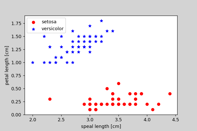
次にデータのプロットをしました。
# グラフの描画
import matplotlib.pyplot as plt
# 1-100番目まで目的変数の抽出
y = df.iloc[0:100,4].values
# Iris-setosa を-1 iris-verginica を1に変換
y = np.where(y == 'Iris-setosa',-1,1)
# 1-100行目の1,3列めの抽出
X = df.iloc[0:100,[1,3]].values
# グラフのプロット
plt.scatter(X[:50,0],X[:50,1],color = 'red',marker = 'o',label = 'setosa')
plt.scatter(X[50:100,0],X[50:100,1],color = 'blue',marker = '*',label='versicolor')
# 軸ラベルの設定
plt.xlabel('speal length [cm]')
plt.ylabel('petal length [cm]')
# 凡例の表示
plt.legend(loc = 'upper left')

plt.show()
これのような画像が出力されるはずです。
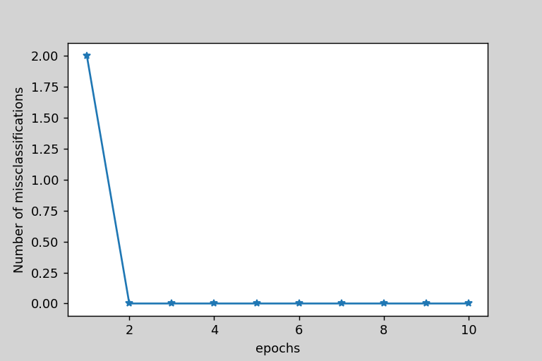
次に、実際に実装したモデルのトレーニングをします。トレーニングした後に間違えたデータの個数をエポック毎にプロットしました。
ppn = Perceptron(eta = 0.1,n_iter = 10)
# モデルの適合
ppn.fit(X,y)
plt.plot(range(1,len(ppn.errors_)+1),ppn.errors_,marker='*')
# 軸ラベルの設定
plt.xlabel("epochs")
plt.ylabel("Number of missclassifications")
plt.show()
2回で収束したことがわかりました。
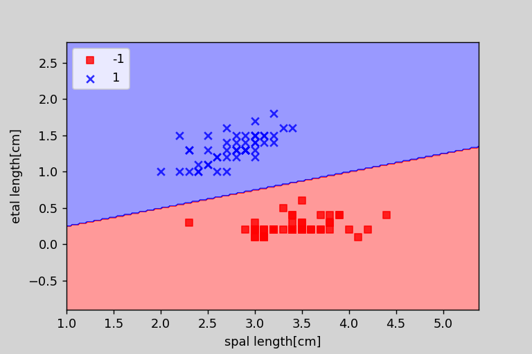
次に、パーセプトロンが学習した境界線をプロットする関数を実装して、実際に表示しました。
from matplotlib.colors import ListedColormap

def plot_decision_regions(X,y,classifier,resolution = 0.02):
    #マーカーとカラーマップの用意
    markers = ('s','x','o','^','v')
    colors = ('red','blue','lightgreen','gray','cyan')
    cmap = ListedColormap(colors[:len(np.unique(y))])
    #決定領域のプロット
    x1_min,x1_max = X[:,0].min() - 1,X[:,0].max() + 1
    x2_min,x2_max = X[:,1].min() - 1,X[:,1].max() + 1
    #グリッドポイントの作成
    xx1,xx2 = np.meshgrid(np.arange(x1_min,x1_max,resolution),
                         np.arange(x2_min,x2_max,resolution))
    #特徴量を一次元配列に変換して予測を実行する
    Z = classifier.predict(np.array([xx1.ravel(),xx2.ravel()]).T)
    #予測結果をグリッドポイントのデータサイズに変換
    Z = Z.reshape(xx1.shape)
    #グリッドポイントの等高線のプロット
    plt.contourf(xx1,xx2,Z,alpha = 0.4,cmap = cmap)
    #軸の範囲の設定
    plt.xlim(xx1.min(),xx1.max())
    plt.ylim(xx2.min(),xx2.max())
    #クラスごとにサンプルをプロット
    #matplotlibが1.5.0以下ならc = cmapをc=colors[idx]に変更
    for idx,cl in enumerate(np.unique(y)):
        plt.scatter(x=X[y==cl,0],y=X[y == cl,1],alpha=0.8,c = cmap(idx),marker=markers[idx],label=cl)


plot_decision_regions(X,y,classifier=ppn)
plt.xlabel('spal length[cm]')
plt.ylabel('etal length[cm]')
# 凡例の設定
plt.legend(loc = 'upper left')
plt.show()
以下の画像のようになりました。