序
Zennでこの記事を読んでいて、
unjs/theme-colorsというライブラリの存在を知ったのですが、
これ使ったら、FlutterにあるColorscheme.fromSeed()みたいなことができるんじゃないかということで、やってみました。
- Flutterと全く同じ機能ではなくて、気軽にいい感じのカラーパレットを作りたい、という要求を満たすためのものです。
実装
- こんな感じで実装しました。
- 最近
Objectをreduceでこねくり回すのがマイブームです。 - 前景色をどうするかの閾値はいくらか試して感覚で決めたので、
400〜600あたりで特に文字が見づらくなる色があるかもしれません。
- 最近
import { getColors } from 'theme-colors';
const PREFIX_COLORS_ON = 'on-';

// 各色を背景としたときの前景色を決める
const generateOnColors = (colors: Record<string, string>) => {
  return Object.keys(colors).reduce((prev, cur) => {
    const onColor = colors[cur]
      .substring(1)
      .match(/.{2}/g)
      ?.map((hex) => parseInt(hex, 16));
    const blightness = onColor
      ? (Math.max(...onColor) + Math.min(...onColor)) / 2 / 255
      : 0;
    // NOTE: 閾値は感覚で決めている
    const onColorBlightness =
      blightness > 0.8
        ? '900'
        : blightness > 0.7
        ? '800'
        : blightness > 0.6
        ? '700'
        : blightness > 0.5
        ? '300'
        : blightness > 0.2
        ? '200'
        : '100';
    return { ...prev, [cur]: colors[onColorBlightness] };
  }, {} as Record<string, string>);
};

// カラースケールを逆転(50⇔950)する
const reverseColorScale = (colors: Record<string, string>) => {
  return Object.keys(colors).reduce((prev, cur) => {
    return { ...prev, [cur]: colors[Math.abs(parseInt(cur) - 1000)] };
  }, {} as Record<string, string>);
};

export default function (
  colors: { [colorName: string]: string },
  isDark = false
) {
  return Object.keys(colors).reduce((prev, cur) => {
    // シードから11段階のカラースケールを作る
    const colorScale = getColors(colors[cur]);
    // 各色の前景色を決める
    const onColors = generateOnColors(colorScale);
    return {
      ...prev,
      [cur]: {
        // 数値のpostfixを略した場合は、シードに使った色が出る
        DEFAULT: colors[cur],
        // ダークモード用に色を作るときはスケールを逆転する
        ...(isDark ? reverseColorScale(colorScale) : colorScale),
      },
      // 前景色
      [`${PREFIX_COLORS_ON}${cur}`]: {
        DEFAULT: onColors[500],
        ...(isDark ? reverseColorScale(onColors) : onColors),
      },
    };
  }, {});
}
-
tailwind.config.tsでこいつを呼びます。
import type { Config } from 'tailwindcss';
import { createThemes } from 'tw-colors';
import generateColorScales from './generateColorScales';

const config: Config = {
  content: [
    './components/**/*.{js,ts,jsx,tsx,mdx}',
    './app/**/*.{js,ts,jsx,tsx,mdx}',
  ],
  theme: {
    colors: {
      ...generateColorScales({
        primary: '#8ec07c',
        secondary: '#458588',
        tertiary: '#d79921',
      }),
    },
  },
};
export default config;
- これで、
bg-primary-400とかtext-on-secondary-600とかborder-tertiaryといったユーティリティクラスが使えるようになります。-
DEFAULTキーに渡したカラーコードがそのまま入ってるので、border-primaryならprimaryに指定した色の罫線になります。
-
こんな感じ
globals.css
@tailwind base;
@tailwind components;
@tailwind utilities;

@layer components {
  .colortile > p {
    @apply h-16 w-16 rounded-xl shadow-xl p-2;
  }
}
-
pタグに全部入れると大変なため。
pages.tsx
export default function Home() {
  return (
    <main className="flex min-h-screen flex-col items-center gap-4 bg-primary-50">
      <h1 className="border-b-2 border-primary text-4xl font-extrabold uppercase text-on-primary-200">
        Color Scale Generator for Tailwind CSS
      </h1>
      <h2 className="border-b-2 border-primary text-2xl font-extrabold uppercase text-on-primary-200">
        Primary Colors
      </h2>
      <div className="flex flex-row gap-2 colortile">
        <p className="bg-primary-50 text-on-primary-50">50</p>
        <p className="bg-primary-100 text-on-primary-100">100</p>
        <p className="bg-primary-200 text-on-primary-200">200</p>
        <p className="bg-primary-300 text-on-primary-300">300</p>
        <p className="bg-primary-400 text-on-primary-400">400</p>
        <p className="bg-primary-500 text-on-primary-500">500</p>
        <p className="bg-primary-600 text-on-primary-600">600</p>
        <p className="bg-primary-700 text-on-primary-700">700</p>
        <p className="bg-primary-800 text-on-primary-800">800</p>
        <p className="bg-primary-900 text-on-primary-900">900</p>
        <p className="bg-primary-950 text-on-primary-950">950</p>
      </div>

      <h2 className="border-b-2 border-secondary text-2xl font-extrabold uppercase text-on-secondary-200">
        Secondary Colors
      </h2>
      <div className="flex flex-row gap-2 colortile">
        <p className="bg-secondary-50 text-on-secondary-50">50</p>
        <p className="bg-secondary-100 text-on-secondary-100">100</p>
        <p className="bg-secondary-200 text-on-secondary-200">200</p>
        <p className="bg-secondary-300 text-on-secondary-300">300</p>
        <p className="bg-secondary-400 text-on-secondary-400">400</p>
        <p className="bg-secondary-500 text-on-secondary-500">500</p>
        <p className="bg-secondary-600 text-on-secondary-600">600</p>
        <p className="bg-secondary-700 text-on-secondary-700">700</p>
        <p className="bg-secondary-800 text-on-secondary-800">800</p>
        <p className="bg-secondary-900 text-on-secondary-900">900</p>
        <p className="bg-secondary-950 text-on-secondary-950">950</p>
      </div>

      <h2 className="border-b-2 border-tertiary text-2xl font-extrabold uppercase text-on-tertiary-200">
        Tertiary Colors
      </h2>
      <div className="flex flex-row gap-2 colortile">
        <p className="bg-tertiary-50 text-on-tertiary-50">50</p>
        <p className="bg-tertiary-100 text-on-tertiary-100">100</p>
        <p className="bg-tertiary-200 text-on-tertiary-200">200</p>
        <p className="bg-tertiary-300 text-on-tertiary-300">300</p>
        <p className="bg-tertiary-400 text-on-tertiary-400">400</p>
        <p className="bg-tertiary-500 text-on-tertiary-500">500</p>
        <p className="bg-tertiary-600 text-on-tertiary-600">600</p>
        <p className="bg-tertiary-700 text-on-tertiary-700">700</p>
        <p className="bg-tertiary-800 text-on-tertiary-800">800</p>
        <p className="bg-tertiary-900 text-on-tertiary-900">900</p>
        <p className="bg-tertiary-950 text-on-tertiary-950">950</p>
      </div>
    </main>
  );
}
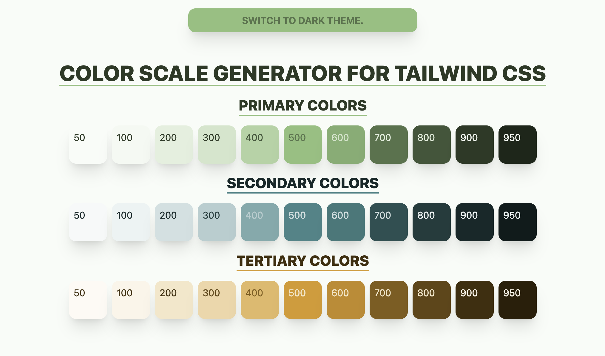
- 結構いい感じじゃないでしょうか?

動かしてみる
ダークテーマも作る
- 上のStackBlitzでやっているのですが、
tw-colorsというライブラリを使うと、テーマを簡単に定義して切替できます。- テーマはTailwind CSSの
theme.colorsに設定するのと同じように設定できます。
- テーマはTailwind CSSの
-
tailwind.config.tsのconfigをこんな感じにします。-
generateColorScales()の第二引数にtrueを渡すと、ダークモード用にスケールを逆転するようにしています。
-
//tailwind.config.ts
import type { Config } from 'tailwindcss';
import { createThemes } from 'tw-colors';
import generateColorScales from './generateColorScales';

const config: Config = {
  content: [
    './components/**/*.{js,ts,jsx,tsx,mdx}',
    './app/**/*.{js,ts,jsx,tsx,mdx}',
  ],
  theme: {},
  plugins: [
    createThemes({
      light: {
        ...generateColorScales({
          primary: '#8ec07c',
          secondary: '#458588',
          tertiary: '#d79921',
        }),
      },
      dark: {
        ...generateColorScales(
          {
            primary: '#d79921',
            secondary: '#cc241d',
            tertiary: '#3c3836',
          },
          true
        ),
      },
    }),
  ],
};
export default config;
テーマスイッチャーを実装する
-
classNameにlightが指定されていれば、bg-primaryといったユーティリティクラスがライトテーマ用の色に、darkならダークテーマ用になります。- 今回は
lightとdarkにしていますが、createThemes()で渡したオブジェクトのキーがそのままテーマ名になりますので、classNameで指定してあげればOKです。
- 今回は
- テーマ切替ボタンも作ってみました。
// ./app/components/ThemeSwitcher.tsx
'use client';

import { ReactNode, useState } from 'react';

export default function ThemeSwitcher(props: { children: ReactNode }) {
  const [isDark, setIsDark] = useState(false);

  return (
    <div className={`${isDark ? 'dark' : 'light'}`}>
      <div className="w-full bg-primary-50 text-center">
        <button
          className="mx-auto my-4 mb-12 w-96 rounded-xl bg-primary p-2 font-bold uppercase text-on-primary shadow-xl"
          onClick={() => setIsDark(!isDark)}
        >
          {`Switch to ${!isDark ? 'dark' : 'light'} theme.`}
        </button>
      </div>
      {props.children}
    </div>
  );
}
-
layout.tsxでは、childrenをThemeSwitcherで囲います。
import ThemeSwitcher from './components/ThemeSwitcher';

// ...

export default function RootLayout({
  children,
}: {
  children: React.ReactNode;
}) {
  return (
    <html lang="ja">
      <body>
        <ThemeSwitcher>{children}</ThemeSwitcher>
      </body>
    </html>
  );
}
- こうすると、
ThemeSwitcherの子要素にテーマカラーが反映されるようになります。
結果
ライトテーマ
ダークテーマ
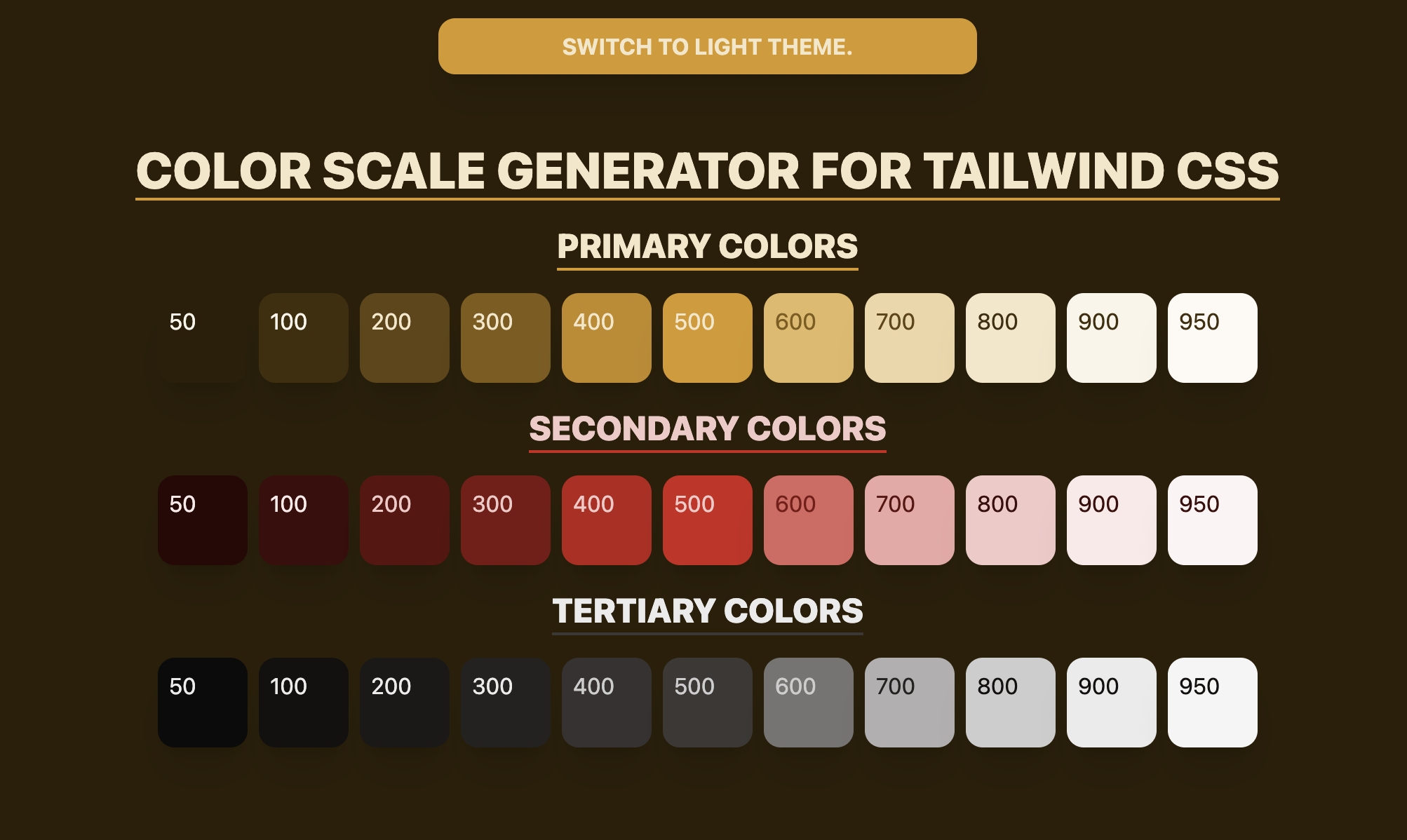
- ちなみにこのサンプルは、シードにgurvboxの配色を持ってきています。
終わりに
- Tailwind CSSはテーマのカスタマイズが標準でできますが、自分で一から定義しようと思うと結構大変。
- なので、つい標準のカラーパレットを使いがちですが、ある程度組んでからダークテーマ対応したり、全体的な色味を見直したりしようとするとそれもまた大変、差し替えられる仕組みを作っておくと便利ですね。