R Advent Calendar 2021 part2 25日目の記事です。
国境の長いトンネルを抜けると雪国であった。
川端康成の小説『雪国』の有名な冒頭の一節です。Rを用いたGISx気象データ解析でこの状況を再現できるトンネルとタイミングを調べてみます。
library(tidyverse)
library(lubridate) # 日時データ処理のため
library(leaflet) # 地図作成のため
library(tidync) # NetCDFデータ処理のため
library(trend) # 時系列トレンドの解析のため
library(broom) # 統計検定結果の処理のため
トンネルデータ
ある程度延長の長い50本のトンネルの入口・出口の緯度経度情報を整理しました。厳密には国境 (県境) かどうかは考慮していません。wikipediaの延長別日本の交通用トンネルの一覧1とgoogle mapを駆使して手打ちしたので、ミスに関してはあしからずご了承ください。
tunnel_wide <-
  read_csv("https://www.dropbox.com/s/u253n08lcxnev0f/tunnels.csv?dl=1") %>%
  na.omit

head(tunnel_wide)
# A tibble: 6 × 6
     id name     from_lat from_lon to_lat to_lon
  <dbl> <chr>       <dbl>    <dbl>  <dbl>  <dbl>
1     1 青函         41.1     141.   41.6   140.
2     2 八甲田       40.7     141.   40.8   141.
3     3 岩手一戸     40.0     141.   40.2   141.
4     4 飯山         36.9     138.   37.0   138.
5     5 大清水       36.7     139.   36.9   139.
6    10 榛名         36.4     139.   36.5   139.

tunnel_long <-
  tunnel_wide %>%
  tidyr::pivot_longer(cols = from_lat:to_lon, names_to = c("direction", "coord"), names_sep = "_", values_to = "deg") %>%
  tidyr::pivot_wider(id_cols = id:direction, names_from = coord, values_from = deg)

head(tunnel_long)
# A tibble: 6 × 5
     id name     direction   lat   lon
  <dbl> <chr>    <chr>     <dbl> <dbl>
1     1 青函     from       41.1  141.
2     1 青函     to         41.6  140.
3     2 八甲田   from       40.7  141.
4     2 八甲田   to         40.8  141.
5     3 岩手一戸 from       40.0  141.
6     3 岩手一戸 to         40.2  141.
まずは可視化しておきます。地図を書く場合にはleafletパッケージあるいはjpndistrictパッケージが便利です。今回はleafletを使いました。
basemap <-
  leaflet::leaflet() %>%
  leaflet::addProviderTiles(provider = leaflet::providers$Stamen)

path <-
  split(tunnel_long, tunnel_long$id)

addLines <-
  function(x, y){
    leaflet::addPolylines(x, lng = y$lon, lat = y$lat, color = "black", weight = 1, opacity = 1)
  }


for(p in path){
  basemap <- addLines(basemap, p)
}

print(basemap)


# library(jpndistrict)
# prefs <- purrr::map(1:20, jpn_pref)
#
# ggplot2::ggplot() +
#   purrr::map(prefs, ~ ggplot2::geom_sf(data = ., fill = NA, size = .1, col = "grey75")) +
#   ggplot2::geom_segment(data = tunnel_wide, ggplot2::aes(x = from_lon, xend = to_lon, y = from_lat, yend = to_lat)) +
#   ggplot2::geom_point(data = tunnel_wide, ggplot2::aes(x = from_lon, y = from_lat), col = "orange", size = .3) +
#   ggplot2::geom_point(data = tunnel_wide, ggplot2::aes(x = to_lon, y = to_lat), col = "dodgerblue", size = .3) +
#   ggplot2::lims(x = c(135, 145.5), y = c(35, 46))
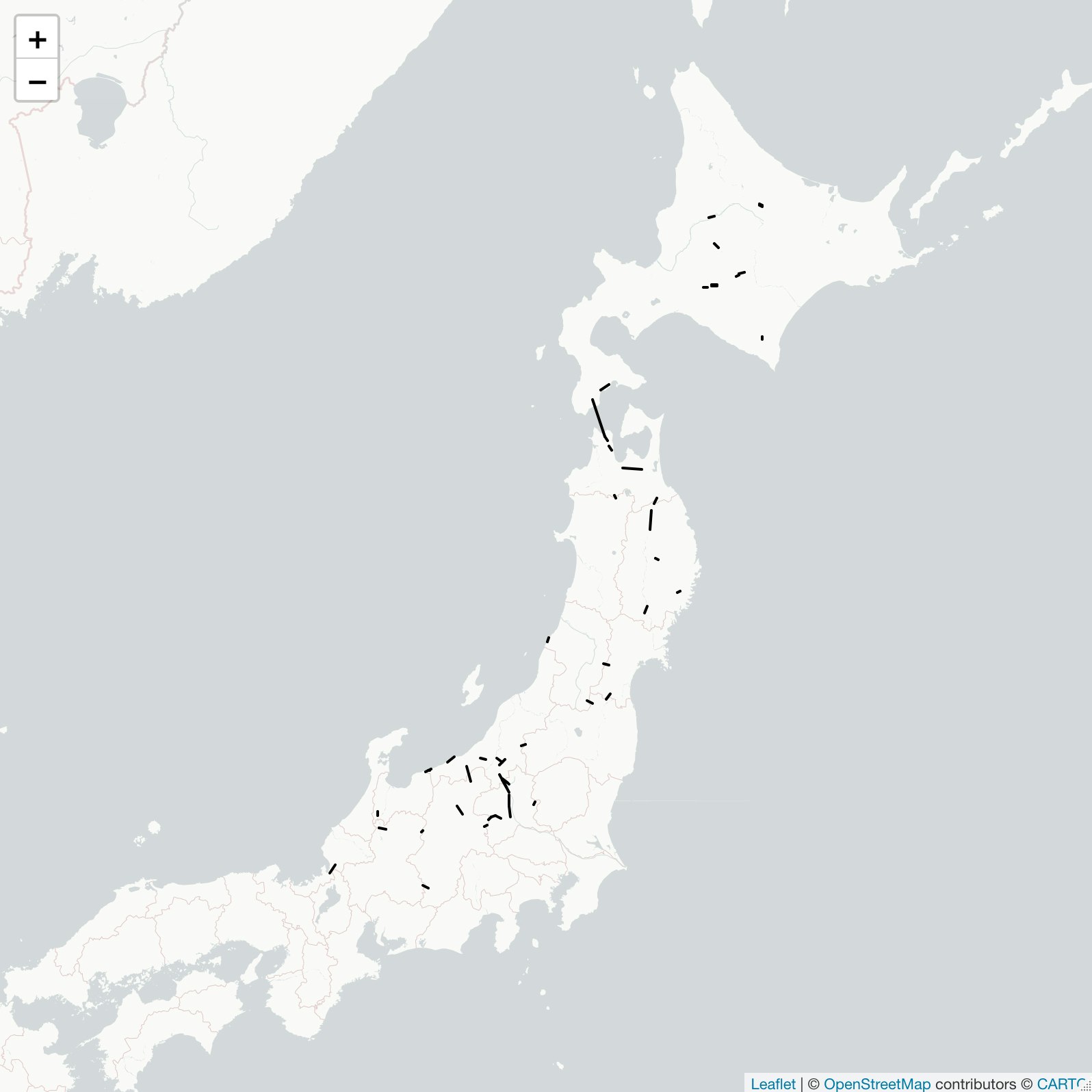
今回の解析に使ったトンネルの出入口を直線で結んで表示しています。
気象データ
農研機構が開発・運用しているメッシュ農業気象データ(The Agro-Meteorological Grid Square Data, 2,3)から日別の積雪深データをダウンロードしてきます。このサービスでは国内任意地点について、およそ1 km (3次メッシュに準拠) の解像度で各種気象データの過去値および予報値が配信されています。現在は試験的に無償で提供されており、利用にはアカウントの発行が必要です4。利用ツールとしてpythonまたはexcelでの環境が準備されていますが、気象データ自体は汎用的なNetCDF形式で取得できるので、それをRで扱います。
NetCDFファイルは1次メッシュ (= 80 x 80の3次メッシュの集合) ごと、1年ごとにまとめられており、OPeNDAPサーバに置かれています。OPeNDAPのアクセスフォームへのURLは以下の様式になっています。
url_form <- 'https://amd.rd.naro.go.jp/opendap/AMD/{year}/e{element}/AMDy{year}p{code}e{element}.nc.html'
ここで、yearは4桁の西暦、 elementは気象要素記号 (今回はSnow DepthのSD)、codeは1次メッシュコード番号です。OPeNDAPサーバでは、配列データの一部のみを切り出してダウンロードすることもできます。GUI操作も可能ですが、今回はデータ取得から解析まで一貫してRスクリプトで処理します。
下準備として、緯度・経度から対応する1次メッシュと1次メッシュ内での配列位置を取得する関数を作成します。返り値のfirstが1次メッシュコード、lat_index、lon_indexが1次メッシュ内での0始まり配列位置です。
coord2codes <-
  function(lat, lon){

    lat. <- lat * 60
    chr12 <- lat. %/% 40
    lat.. <- lat. %% 40
    chr5 <- lat.. %/% 5
    chr7 <- ((lat.. %% 5)*60) %/% 30

    lon. <- (lon - 100)
    chr34 <- lon. %/% 1
    lon.. <- (lon. %% 1)*60
    chr6 <- lon.. %/% 7.5
    chr8 <- ((lon.. %% 7.5)*60) %/% 45

    list(first = paste0(chr12, chr34),
         lat_index = as.numeric(paste0(chr5, chr7)),
         lon_index = as.numeric(paste0(chr6, chr8)))
  }
上記の関数を利用し、指定された緯度、経度、年における積雪深データを切り出し、ダウンロードし、読み込むための関数は以下の通りです。NetCDFファイルのハンドリングには複数の選択肢があるようですが、使いやすいのでtidyncパッケージを使っています。デフォルトでは3次メッシュの値を取得しますが、extract = FALSEとした場合には該当緯度経度を含む1次メッシュの全データを取得します。
# 以下の関数で.Renvironを開き、メッシュ農業気象データシステムの認証情報をローカル保存します
# usethis::edit_r_environ()
#
# id = YOUR_ID
# pw = YOUR_PW

fetch_meteorol <-
  function(lat, lon, year, doy, element = "SD", extract = TRUE){
      # Sys.getenv関数で.Renvironに保存した認証情報を読み込み認証のための文字列を生成
      cred <- stringr::str_glue('{Sys.getenv("id")}:{Sys.getenv("pw")}@')

      # 緯度経度情報からメッシュ位置情報を取得
      codes <- coord2codes(lat, lon)

      # 該当緯度経度の1次メッシュ内での配列位置を指定して切り出し
      if(extract){
        lat_domain <- stringr::str_glue("[{codes$lat_index}:1:{codes$lat_index}]")
        lon_domain <- stringr::str_glue("[{codes$lon_index}:1:{codes$lon_index}]")
      } else {
        lat_domain <- "[0:1:79]"
        lon_domain <- "[0:1:79]"
      }
      time_domain <- stringr::str_glue("[{min(doy) - 1}:1:{max(doy) - 1}]")
      domains <- stringr::str_glue("{time_domain}{lat_domain}{lon_domain}")

      # NetCDFファイルを一時ファイルとしてダウンロード
      url_netcdf <- stringr::str_glue('https://{cred}amd.rd.naro.go.jp/opendap/AMD/{year}/e{element}/AMDy{year}p{codes$first}e{element}.nc.nc?{element}{domains}')
      tmp <- tempfile()
      download.file(url = url_netcdf, destfile = tmp, quiet = TRUE)

      # 一時ファイルからNetCDFファイルを読み込み
      tidync::tidync(tmp) %>%
        tidync::hyper_tibble() %>%
        dplyr::mutate(time = as.Date(time, origin = "1900-01-01"))
  }
点データ取得例は以下の通りです。
snow_at_sapporo <-
  fetch_meteorol(lat = 43, lon = 141.4, year = 2021,
                 doy = c(335, 360), element = "SD")

ggplot2::ggplot(snow_at_sapporo, ggplot2::aes(x = time, y = SD)) +
  ggplot2::geom_line() +
  ggplot2::labs(x = "日付", y = "積雪深 [cm]")
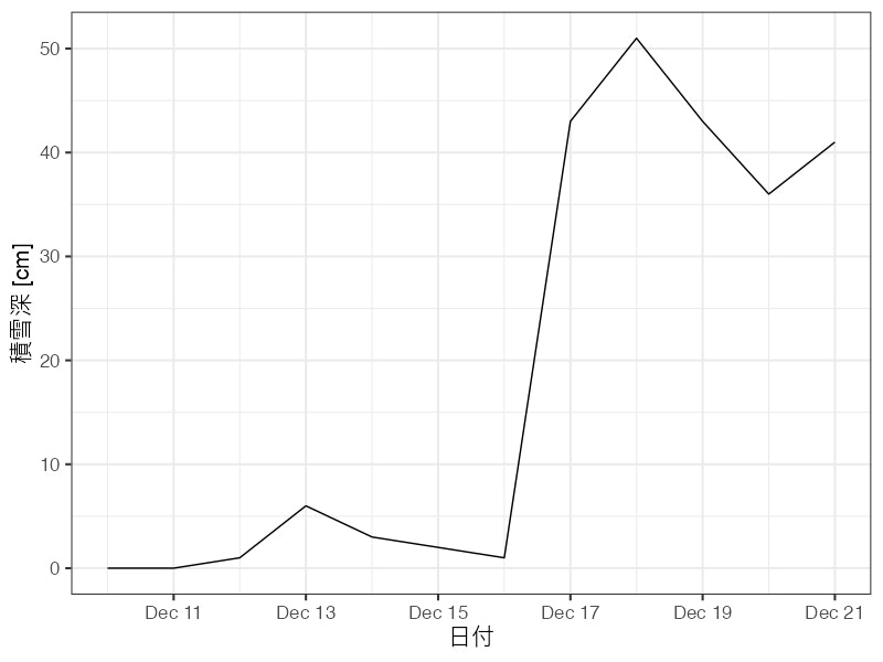
2021年12月17日に札幌で観測されたドカ雪が正しく確認できました。
面データ取得例は以下の通りです。
xmas <- "2021-12-24"
temp_at_sapporo <-
  fetch_meteorol(lat = 43, lon = 141.4, year = 2021,
                 doy = lubridate::yday(xmas),
                 element = "TMP_mea",
                 extract = FALSE)

# 数値を色に変換するためのパレットを作成
color_palette <- leaflet::colorNumeric(palette = "Blues", domain = temp_at_sapporo$TMP_mea)

basemap %>%
  leaflet::addRectangles(lng1 = temp_at_sapporo$lon - 0.01, lng2 = temp_at_sapporo$lon + 0.01,
                         lat1 = temp_at_sapporo$lat - 0.01, lat2 = temp_at_sapporo$lat + 0.01,
                         col = color_palette(temp_at_sapporo$TMP_mea)) %>%
  leaflet::addLegend(position = "bottomleft",
                     pal = color_palette,
                     values = temp_at_sapporo$TMP_mea,
                     title = "Mean temp. [°C]")
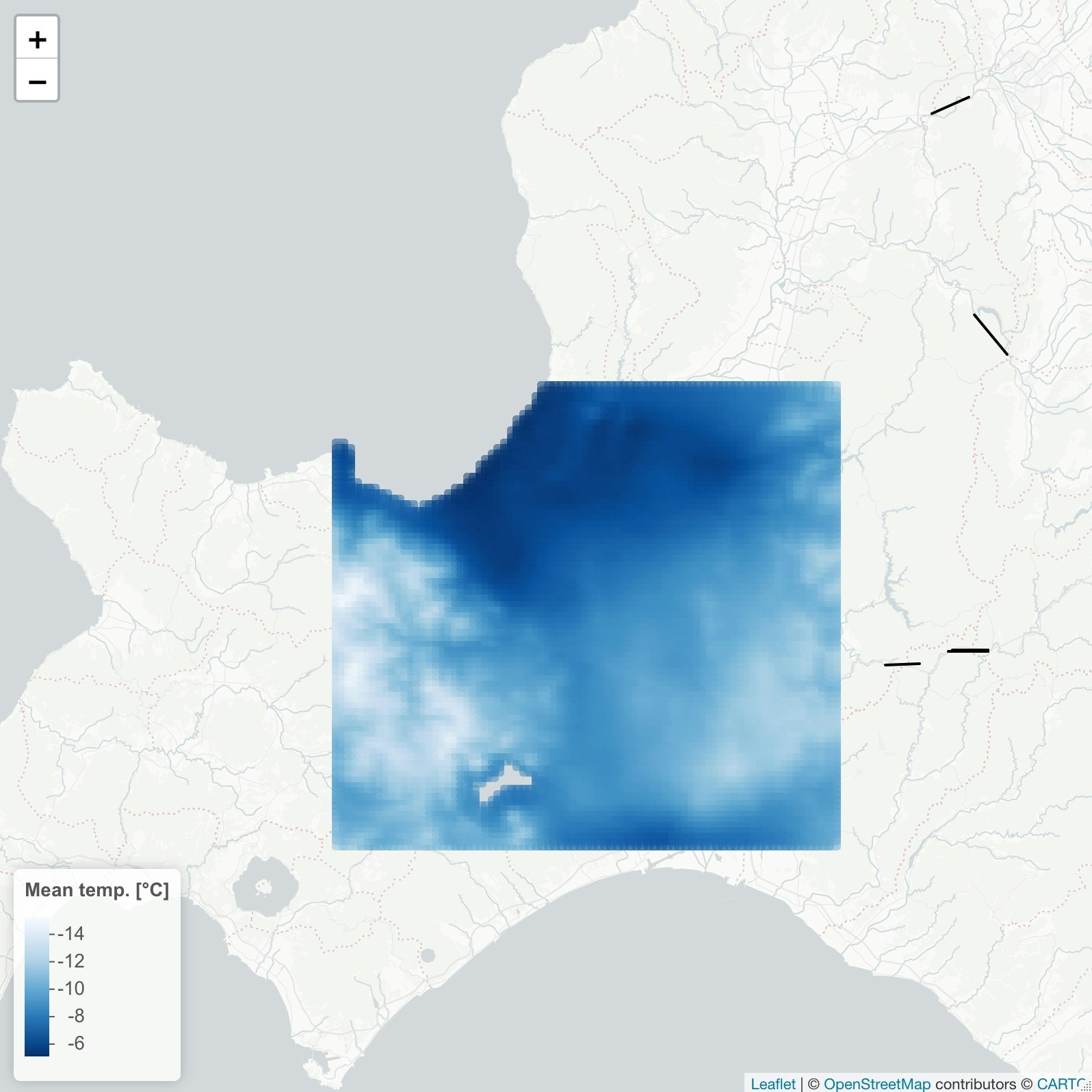
クリスマスイブもよく冷えました。
解析
準備ができたので、雪国を再現できるトンネルを探します。トンネルの出入口の緯度経度における日々の積雪深を比べ、一方の出入口で3 cm 以下かつ他方で20 cm 以上、となったときを“雪国”の冒頭の条件を満たしたと判定することにします。解析対象とする時間範囲を1981–2020年の1–3月 (正確には1月1日から1–90日) としました。
map脳で処理します。purrrパッケージやnest/unnest関数の使い方に関する資料は多数ある5,6ので、ここでは詳細は割愛します。
外側のmapで年次を回し、内側のmapでサイトを回しています。処理には少し時間がかかり、同時接続の状況によってはエラーになります。そのような場合には、時間をずらして実行する、年次を制限する、NetCDFファイルのダウンロードのみ事前に済ます、などの対処をとります。
snow <-
  purrr::map_dfr(1981:2020, function(yyyy){
    tunnel_long %>%
      tidyr::nest(latlon = lat:lon) %>%
      dplyr::mutate(data = purrr::map(latlon, ~ fetch_meteorol(lat = .$lat, lon = .$lon, year = yyyy, doy = c(1, 90))))
  })
得られるデータセットは以下のようなものになります。
head(snow)

# A tibble: 6 × 5
     id name     direction latlon           data
  <dbl> <chr>    <chr>     <list>           <list>
1     1 青函     from      <tibble [1 × 2]> <tibble [90 × 4]>
2     1 青函     to        <tibble [1 × 2]> <tibble [90 × 4]>
3     2 八甲田   from      <tibble [1 × 2]> <tibble [90 × 4]>
4     2 八甲田   to        <tibble [1 × 2]> <tibble [90 × 4]>
5     3 岩手一戸 from      <tibble [1 × 2]> <tibble [90 × 4]>
6     3 岩手一戸 to        <tibble [1 × 2]> <tibble [90 × 4]>
入れ子構造をとるので、適宜中身を見つつ進めます。dataの中身は以下のように、メッシュ農業気象データから取得してきた日別の積雪深、対象メッシュを代表する緯度経度、日付となっています。
head(snow$data[[1]])

# A tibble: 6 × 4
     SD   lon   lat time
  <dbl> <dbl> <dbl> <date>
1    17  141.  41.1 1981-01-01
2    18  141.  41.1 1981-01-02
3    25  141.  41.1 1981-01-03
4    24  141.  41.1 1981-01-04
5    38  141.  41.1 1981-01-05
6    52  141.  41.1 1981-01-06
処理しやすいように整形していきます。雪国条件を満たすかを判定し、40年 x 90日 = 計3600日のうち条件を満たした割合を計算します。
yukiguni_raw <-
  snow %>%
  tidyr::unnest(data) %>%
  tidyr::pivot_wider(id_cols = c(id, name, time), names_from = direction, values_from = SD) %>%
  dplyr::mutate(yukiguni = (from < 2 & to > 20) | (from > 20 & to < 2))

yukiguni_total <-
  yukiguni_raw %>%
  dplyr::group_by(id, name) %>%
  dplyr::summarise(total = dplyr::n(), prob_yukiguni = sum(yukiguni) / total * 100, .groups = "drop") %>%
  dplyr::arrange(desc(prob_yukiguni))

head(yukiguni_total)

# A tibble: 6 × 4
     id name   total prob_yukiguni
  <dbl> <chr>  <int>         <dbl>
1     5 大清水  3600         34.6
2    14 北陸    3600         27.7
3    12 中山    3600         11.0
4    24 飛騨    3600          6.78
5   136 親不知  3600          6.78
6   142 新仙人  3600          6.25
大清水トンネル、北陸トンネルなどのいくつかのトンネルで条件を満たす場合が多いようです。これらのトンネルに向かえば比較的高い確率で雪国ごっこができそうです。
雪国再現率の結果を可視化します。
yukiguni_total %>%
  dplyr::mutate(name = forcats::fct_inorder(name)) %>%
  ggplot2::ggplot(ggplot2::aes(x = name, y = prob_yukiguni, label = round(prob_yukiguni, 1))) +
  ggplot2::geom_bar(stat = "identity") +
  ggplot2::geom_text(hjust = 0, size = 4) +
  ggplot2::coord_flip() +
  ggplot2::labs(x = "トンネル", y = "雪国再現率 [%]")
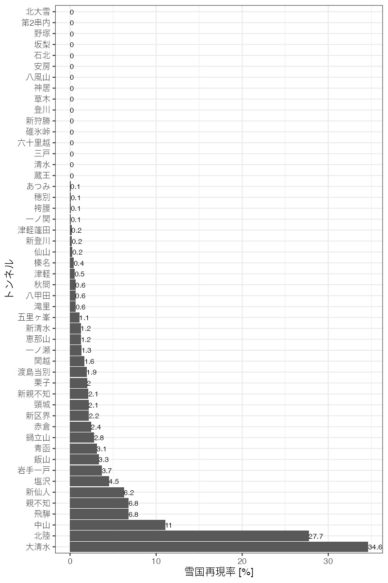
実際のモデルといわれる清水トンネルでは、1–3月の間に今回の条件を満たすことはありませんでした。
雪国再現率上位5トンネルについて「いつ行けば雪国ごっこできる期待値が高いのか」を可視化します。解析に使った40年のうち条件を満たした年の割合を日ごとに比較します。
top5 <-
  yukiguni_total %>%
  dplyr::top_n(5) %>%
  dplyr::pull(name)


dif_in_snow <-
  yukiguni_raw %>%
  dplyr::mutate(year = lubridate::year(time),
                julian_day = lubridate::yday(time),
                delta = to - from)

by_julian_day <-
  dif_in_snow %>%
  dplyr::filter(name %in% top5) %>%
  dplyr::group_by(name, julian_day) %>%
  dplyr::summarise(yukiguni_prob = sum(yukiguni) / 40 * 100)

by_julian_day %>%
  ggplot2::ggplot(ggplot2::aes(julian_day, yukiguni_prob, col = name, group = name)) +
  ggplot2::geom_line() +
  ggplot2::labs(x = "通日", y = "雪国再現率 [%]", col = "トンネル")
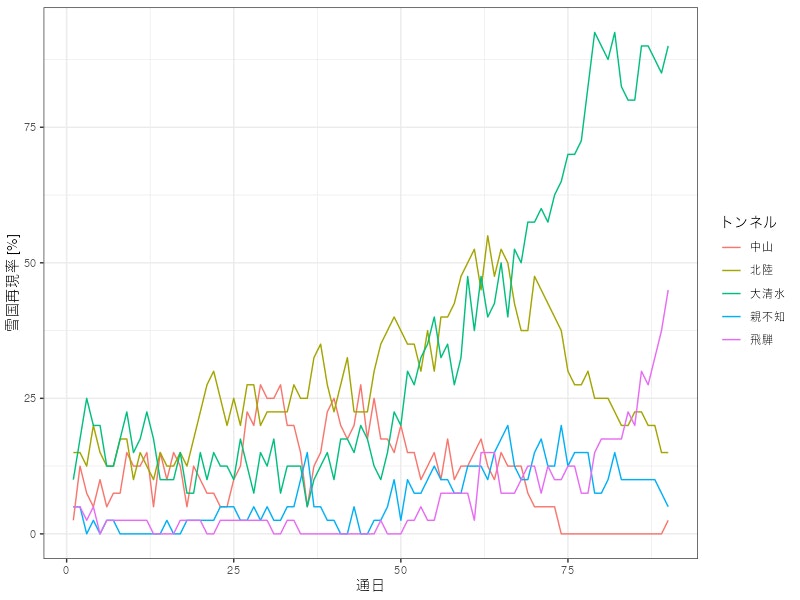
どうやら大きく分けると3月末型 (大清水, 飛騨)、2月末型 (北陸, 親不知)、1–2月型 (中山) に大別できそうです。
おまけとして、気候変動影響はあったのかを見てみます。30日刻み (≒ 月別) の雪国再現日数の経年推移を可視化します。
by_year <-
  dif_in_snow %>%
  dplyr::filter(name %in% top5) %>%
  dplyr::mutate(month = dplyr::case_when(julian_day < 31 ~ "01_JAN",
                                         julian_day < 61 ~ "02_Feb",
                                         TRUE ~ "03_Mar")) %>%
  dplyr::group_by(name, month, year) %>%
  dplyr::summarise(yukiguni_prob = sum(yukiguni) / 30 * 100)

by_year %>%
  ggplot2::ggplot(ggplot2::aes(year, yukiguni_prob, col = name, group = name)) +
  ggplot2::geom_point(alpha = .5) +
  ggplot2::geom_smooth(se = FALSE) +
  ggplot2::facet_grid(month ~ .) +
  ggplot2::labs(x = "西暦", y = "雪国再現率 [%]", col = "トンネル")
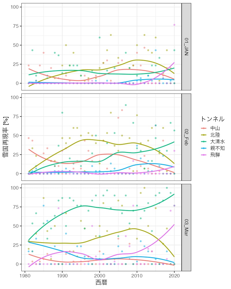
傾向としては再現率が上昇している時地点が増えているように見えます。統計検定をかけてみます。
by_year %>%
  tidyr::nest(trend = c(year, yukiguni_prob)) %>%
  dplyr::mutate(mann_kendall = map(trend,
                                   ~ trend::mk.test(.$yukiguni_prob) %>%
                                     broom::tidy())
                                   ) %>%
  tidyr::unnest(mann_kendall) %>%
  dplyr::transmute(name, month, p.value,
                   trend = dplyr::if_else(statistic > 0, "increase", "decrease"),
                   signif = dplyr::case_when(p.value < 0.001 ~ "***",
                                             p.value < 0.01 ~ "**",
                                             p.value < 0.05 ~ "*",
                                             TRUE ~ ""))

# A tibble: 15 × 5
# Groups:   name, month [15]
   name   month  p.value trend    signif
   <chr>  <chr>    <dbl> <chr>    <chr>
 1 中山   01_JAN 0.874   increase ""
 2 中山   02_Feb 0.0451  decrease "*"
 3 中山   03_Mar 0.0524  decrease ""
 4 北陸   01_JAN 0.0142  increase "*"
 5 北陸   02_Feb 0.232   increase ""
 6 北陸   03_Mar 1       decrease ""
 7 大清水 01_JAN 0.990   increase ""
 8 大清水 02_Feb 0.00881 increase "**"
 9 大清水 03_Mar 0.00323 increase "**"
10 親不知 01_JAN 0.115   increase ""
11 親不知 02_Feb 0.194   increase ""
12 親不知 03_Mar 0.0998  decrease ""
13 飛騨   01_JAN 0.0768  increase ""
14 飛騨   02_Feb 0.753   increase ""
15 飛騨   03_Mar 0.0348  increase "*"
統計的に有意なトレンドが検出された5時地点のうち、減少トレンドの認められる2月の中山以外は増加トレンドのようです。この結果はトンネルの出入口のうち、少雪側で積雪深が減ってきたことが原因だと思われます。雪国ごっこがしやすい気候になりつつあるようです。
あとがき
Rコミュニティーからtakeしてばかりだったのでgiveしたい気持ちで書きました。
皆様よいお年を。