はじめに
自分への備忘録も兼ねて、matplotlibでの等高線描写の基本をまとめてみます・・・
等高線の基本
等高線描写は「meshgridしてcontour」
まず等高線を描くにあたって必要なものを洗い出しましょう。
等高線を描くには基本的に以下の2つが必要になります。
等高線を書くために必要なもの
- 格子点
- 格子点における高さ
なので、まず格子点を作ります。
格子点を作る
格子点を作るにはnumpy.meshgridを用います。
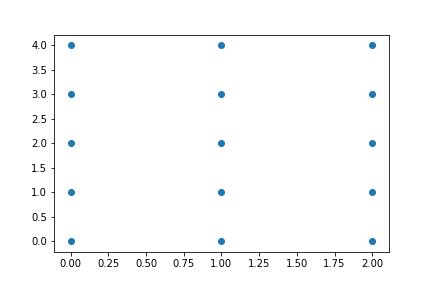
例えば、次のような15個の格子点を作りたいとします。
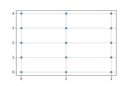
この場合、次のコードで格子点が作れます。
import numpy as np

# X座標
x = np.arange(3) # array([0, 1, 2])

# Y座標
y = np.arange(5) # array([0, 1, 2, 3, 4])

# 格子点作成
xx, yy = np.meshgrid(x, y)
これを実行すると、
print(xx)
-> array([[0, 1, 2],
          [0, 1, 2],
          [0, 1, 2],
          [0, 1, 2],
          [0, 1, 2]])

print(yy)
-> array([[0, 0, 0],
          [1, 1, 1],
          [2, 2, 2],
          [3, 3, 3],
          [4, 4, 4]])
のように同じ型を持った行列が生成されます。
これらの各成分を組み合わせることで、全ての格子点を表現できます。
# 格子点のリストとして表現
lattice_point_list = np.array([xx.ravel(), yy.ravel()]).T

print(lattice_point_list)
-> array([[0, 0],
          [1, 0],
          [2, 0],
          [0, 1],
          [1, 1],
          [2, 1],
          [0, 2],
          [1, 2],
          [2, 2],
          [0, 3],
          [1, 3],
          [2, 3],
          [0, 4],
          [1, 4],
          [2, 4]])
ndarray.ravelは行列を一次元化するメソッドです。
この格子点のリストを作り出す手法は機械学習とかでもよく使うので覚えておくとよいと思います。
散布図を出すにはmatplotlib.pyplotを使って以下のようにすれば一発です。
import matplotlib.pyplot as plt

# 描写
plt.scatter(xx, yy)
plt.show()
格子点における高さ
次に必要になってくるのは格子点における高さの値です。
ここでは例としてわかりやすいので原点からの距離を値としてみます。
原点からの距離は以下の式
$$
\sqrt{x^2 + y^2}
$$
で表されるので、
先程の15個の格子点の原点からの距離行列を求めると・・・
# 各点の原点からの距離を求める
distance_matrix = np.sqrt(xx**2 + yy**2)

print(distance_matrix)
-> array([[0.        , 1.        , 2.        ],
          [1.        , 1.41421356, 2.23606798],
          [2.        , 2.23606798, 2.82842712],
          [3.        , 3.16227766, 3.60555128],
          [4.        , 4.12310563, 4.47213595]])
のようになります。
等高線を描く
あとはplt.contourで一発です。
ちなみにcontourは等高線という意味の単語です!
plt.contour(xx, yy, distance_matrix)
plt.show()
ちなみにcontourfとすると塗りつぶされます。
fはなんなのか調べたところfilled contourのfみたいです。
plt.contourf(xx, yy, distance_matrix)
plt.show()

カラーマップ
カラーマップはcmapで指定できます。
おすすめのものをいくつか挙げておきます。
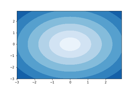
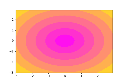
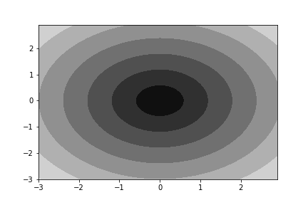
等高線は以下のデータで作成しています。
# データ作成
x = np.arange(-3, 3, 0.1)
y = np.arange(-3, 3, 0.1)
xx, yy = np.meshgrid(x, y)
z = np.sqrt(xx**2 + yy**2)
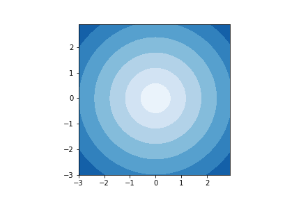
- Blues
plt.contourf(xx, yy, z, cmap='Blues')
- spring
plt.contourf(xx, yy, z, cmap='spring')
- gray
plt.contourf(xx, yy, z, cmap='gray')
matplotlib公式ドキュメントはこちら
いろんなカラーマップがあります!
アスペクト比について
アスペクト比とは簡単にいうと縦横の比のことです。
これを1:1にしたい場合、以下のコードを追加することで実現できます。
plt.gca().set_aspect('equal') # gcaはget current axesの略
これを追加することで先程のものはきれいな正方形になります!