自身の備忘を兼ねて記載を行っています。
「とりあえず動いた」程度のソースなどもございますので参考程度にブラシアップ頂けると幸いです。
また、誤りやもっとよいコーディングやきれいな書き方があるなどご指摘頂けるととてもうれしいです。
今回のお題
Excelでデータ分析を行っていた際に、可視化を行いたく折れ線グラフにしようと思い作成
要点は
- 表のデータを基に折れ線グラフで表記する
- 右端にデータラベルを付ける
- ↑以外のデータラベルは不要
- 凡例の表示はいらない
- 色合いは任意のスタイルを適用する
- 対象とするデータ(表)はそれぞれ別シートとする
こんな感じで始めようかと思います。
対象とするデータは
サーバのリソース状況を過程して下記のようになっています。
「サーバX」シート
| 日付 | 容量(MB) | 使用量(MB) | 残容量(MB) | 使用率(%) |
|---|---|---|---|---|
| 2019/9/1 | 51,200 | 31,825 | 19,375 | 62% |
| 2019/9/2 | 51,200 | 33,625 | 17,575 | 66% |
| 2019/9/3 | 51,200 | 34,570 | 16,630 | 68% |
このようなデータを3シート用意しました。
では、ソースです。
Module1
Option Explicit

Sub btnPush()

    Dim ServerNames() As String
    Dim ServerName    As Variant
    Dim loopCnt       As Integer

    ServerNames = Split("サーバA;サーバB;サーバC", ";")

    ' グラフを追加
    ActiveSheet.Shapes.AddChart.Select
    ' グラフの種類を指定(折れ線グラフ)
    ActiveChart.ChartType = xlLine
    ' 一度グラフの書式をクリア
    ActiveChart.ClearToMatchStyle
    ' グラフのテーマを指定
    ActiveChart.ChartStyle = 227

    loopCnt = 1
    ' サーバ数分ループ
    For Each ServerName In ServerNames()
        ' 新しい系列を追加
        ActiveChart.SeriesCollection.NewSeries
        ' 系列名を指定
        ActiveChart.FullSeriesCollection(loopCnt).Name = "=""" & ServerName & """"
        ' 系列値を指定(縦軸)
        ActiveChart.FullSeriesCollection(loopCnt).Values = "=" & ServerName & "!$F$3:$F$12"
        ' 項目を指定(横軸)
        ActiveChart.FullSeriesCollection(loopCnt).XValues = "=" & ServerName & "!$B$3:$B$12"

        loopCnt = loopCnt + 1
    Next ServerName

    ' グラフをアクティブにする
    ActiveSheet.ChartObjects(1).Activate
    ' グラフタイトルの表示
    ActiveChart.SetElement (msoElementChartTitleAboveChart)
    ' グラフタイトルの指定
    ActiveChart.ChartTitle.Text = "リソース推移"
    ' 凡例の非表示
    ActiveChart.SetElement (msoElementLegendNone)
    ' データラベルを非表示
    ActiveChart.SetElement (msoElementDataLabelNone)
    ' グラフの最小値の指定
    ActiveChart.Axes(xlValue).MinimumScale = 0 / 100    ' 元データがパーセンテージの為、100分の1に
    ' グラフの最大値の指定
    ActiveChart.Axes(xlValue).MaximumScale = 100 / 100  ' 元データがパーセンテージの為、100分の1に

    ' データラベルを表示する為、右端を空ける
    ActiveChart.PlotArea.Width = ActiveChart.PlotArea.Width - 35

    ' 右端にデータラベルを表示
    ' 系列数分ループ
    For loopCnt = 1 To ActiveChart.SeriesCollection.Count
        With ActiveChart.SeriesCollection(loopCnt)
            ' 系列の一番最後のポイントを選択
            .Points(.Points.Count).Select
            ' データラベルの表示
            ActiveChart.SetElement (msoElementDataLabelCallout)
            ' 系列名表示
            .Points(.Points.Count).DataLabel.ShowSeriesName = True
            ' 分類名非表示
            .Points(.Points.Count).DataLabel.ShowCategoryName = False
            ' 系列値非表示
            .Points(.Points.Count).DataLabel.ShowValue = False
            ' 凡例マーカー非表示
            .Points(.Points.Count).DataLabel.ShowLegendKey = False
            ' データラベルの背景色を凡例マーカーの色に合わせる
            .Points(.Points.Count).DataLabel.Format.Fill.ForeColor = .Format.Line.ForeColor
            ' データラベルを選択
            .Points(.Points.Count).DataLabel.Select
        End With
        ' データラベルの表示位置を調整(気持ち右下に表示)
        Selection.Left = 10 + Selection.Left
        Selection.Top = 10 + Selection.Top
    Next loopCnt
End Sub
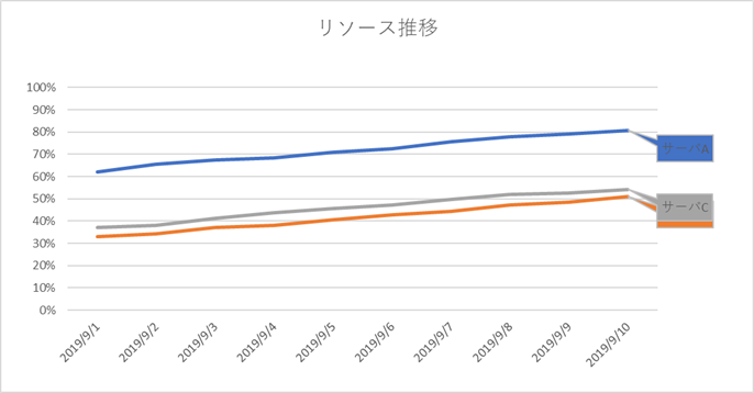
完成
下記のようなグラフが出来上がります。(Excelのバージョンによって色合いは変わります。)