必要最低限の使い方を覚書き。
pythonでグラフを描画
Pythonで計算結果をグラフなどで図表できると分かりやすい。そんな時にmatplotlibを使えばPythonでデータをグラフにプロットできるようになる。
1.ライブラリのインポート
import matplotlib.pyplot as plt
import numpy as np
2.データをプロットして描画
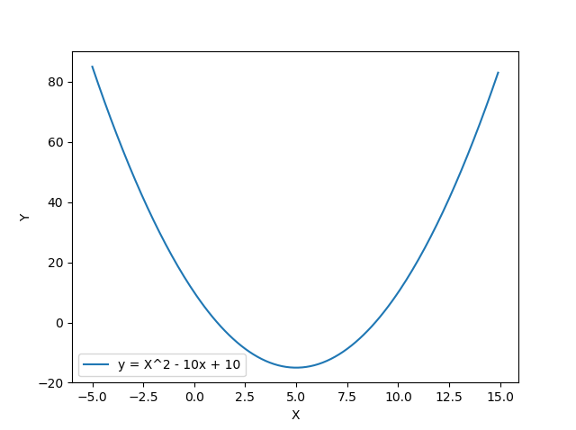
# 数値を生成し「x」にセット
x = np.arange(-5, 15, 0.1)

# (2次関数)y = X^2 - 10x + 10
y_2 = x**2 - 10*x + 10

# データをプロット
plt.plot(x, y_2, label="y = X^2 - 10x + 10")

# 縦横軸にラベル表示
plt.xlabel("X")
plt.ylabel("Y")

# 凡例を表示
plt.legend()

# プロットしたものを描画
plt.show()
描画結果