はじめに
VueTailwindはTailwindCssを用いてカスタマイズ可能なVue.jsのコンポーネント群です。
このコンポーネントを用いて入力フォームを作ってみようと思います。
VueTailwindの導入
公式のinstallationに沿って進めます。
settingsでコンポーネントのデザインを設定できるのですが、ここでは、テーマビルダーをポチポチして出力されたものを使います。
コンポーネントを作る
今回は名前とメールアドレスを入力してユーザを登録するという状況を想定したダイアログを作ります。
ダイアログはTDialog、名前とメールアドレスの入力にはTInputGroupとTInputが使えそうです。
親コンポーネントからv-modelで表示/非表示を制御できるようにし、また、開いた時に前回の入力値をリセットするようにします。
UserCreateDialog.vue
<template>
  <t-dialog
    v-model="isOpen"
    title="ユーザ新規登録"
    @before-open="reset"
  >
    <div class="flex flex-col">
      <t-input-group label="名前">
        <t-input v-model="name"/>
      </t-input-group>
      <t-input-group label="メールアドレス">
        <t-input v-model="mail"/>
      </t-input-group>
    </div>
    <template slot="buttons">
      <t-button type="button" variant="secondary" @click.prevent="closeDialog">キャンセル</t-button>
      <t-button type="button" @click.prevent="onOk">登録</t-button>
    </template>
  </t-dialog>
</template>

<script>
export default {
  props: {
    // ダイアログの表示状態の制御に用いる
    value: Boolean
  },
  data: function() {
    return {
      name: '',
      mail: ''
    }
  },
  computed: {
    isOpen: {
      get() {
        return this.value
      },
      set(newValue) {
        this.$emit('input', newValue)
      }
    }
  },
  methods: {
    closeDialog: function() {
      this.isOpen = false
    },

    onOk: function() {
      // 入力値をパラメータにしてAPIを実行したりする
      console.log(`name: ${this.name}`)
      console.log(`mail: ${this.mail}`)

      this.closeDialog()
    },

    reset: function() {
      // 既存の入力結果を破棄する
      this.name = ''
      this.mail = ''
    }
  }
}
</script>
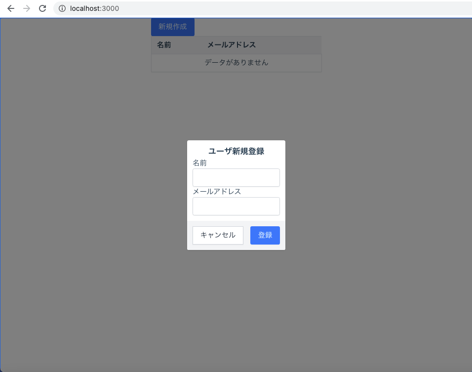
画像のように、中央にダイアログが表示されます。
登録ボタンをクリックするとコンソールにそのときの入力値が表示されます。
エラー処理
不正な入力値の時はAPIを実行せず、ダイアログにエラーを表示したいです。
入力項目ごとにメッセージを表示したいので、それぞれについてのエラーメッセージを保持するようにします。
data: function() {
  return {
    name: '',
    mail: '',
    // 追記
    errors: {
      name: '',
      mail: ''
    }
  }
},
エラーメッセージがある時はTInputGroupのvariantをdangerにします。また、feedbackプロパティにメッセージを設定します。
<t-input-group
  label="名前"
  :variant="{danger: errors.name}"
  :feedback="errors.name"
>
  <t-input v-model="name"/>
</t-input-group>
<t-input-group
  label="メールアドレス"
  :variant="{danger: errors.mail}"
  :feedback="errors.mail"
>
  <t-input v-model="mail"/>
</t-input-group>
さらに、エラーメッセージもリセットするようにします。
reset: function() {
  // ダイアログを開いた時に前回の入力結果を破棄する
  this.name = ''
  this.mail = ''
  // 追記
  this.errors.name = ''
  this.errors.mail = ''
}
今回は名前とメールアドレスについて、空欄ではないことを確認します。onOkを以下のように修正します。
onOk: function() {
  // 不正な値が入力されていたらエラーを表示する
  if(!this.validationCheck()) return

  // 入力値でAPIを実行したりする
  console.log(`name: ${this.name}`)
  console.log(`mail: ${this.mail}`)

  // APIサーバからのエラーが返ってきたら同様にエラーメッセージを設定する
  // 例) errors.mail = "このメールアドレスは既に使用されています"

  // 正常に終了したらダイアログを閉じる
  this.closeDialog()
},

// onOkで参照されるメソッド
validationCheck: function() {
  // nameについてのチェック
  this.errors.name = this.requiredCheck(this.name)
  // mailについてのチェック
  this.errors.mail = this.requiredCheck(this.mail)

  // エラーがない時にtrueを返す
  return !(this.errors.name || this.errors.mail)
},

requiredCheck: function(value) {
  if (!value) return "この項目は必須です"
  return ''
},
画像のように空欄の入力項目にメッセージを出すことができました。
