はじめに
WEBサイトの背景を「変化するグラデーション」にしたいなーと思って、検索したらCSS Gradient AnimatorというWEBサイトをみつけたので紹介させて下さい。むちゃくちゃ簡単です。
手順
- 元のHTMLを用意する
- CSS Gradient Animator で好みのグラデーションを作成する
- CSSを読みこませる
いーじょう!
元のHTMLを用意する
グラデーションさせるHTMLを用意して下さい。私のはテスト用で以下の様な簡単なHTMLを用意しました(準備中ページを作っているところだった)
index.html
<!DOCTYPE html>
<html lang="ja">
<head>
  <meta charset="UTF-8">
  <title>annp: under construction</title>
</head>
<body style="font-family: 'Helvetica', sans-serif;">
  <div class="wrapper" style="width:100%;">
    <div class="main" style="position: absolute;top: 0;left: 0;right: 0;bottom: 0;margin: auto;width: 600px; height: 600px">
      <h1 style="width: 600px;margin:0 auto;">
        <img src="img/annp_logo.png" alt="annp logo" style="width: 600px;">
      </h1>
      <p style="width: 600px;margin:0 auto 20px auto;text-align:center;font-weight: bold;">
        UNDER CONSTRUCTION
      </p>
      <p style="width: 600px;margin:0 auto;text-align:left;">
        "annp" is a rock creators of the group.<br>
      </p>
      <p style="width: 600px;margin:10px auto 0 auto;text-align:left;">
        In the future, we will continue to create a variety of work . It can be a system , or a web site , or even a paper thing , you might thing .
        Important to us that it is that even if many " exciting " and " surprise " and " evolving " will continue to work . <br>
        Ima shibaraku mate.
      </p>
      <p style="width: 600px;margin:20px auto 0 auto;text-align:center;font-size:70%;">
        2015/12/20 2:06
      </p>
    </div>
  </div>
</body>
</html>
この内容はあまり関係ないので用意したもので大丈夫です。
CSS Gradient Animator で好みのグラデーションを作成する
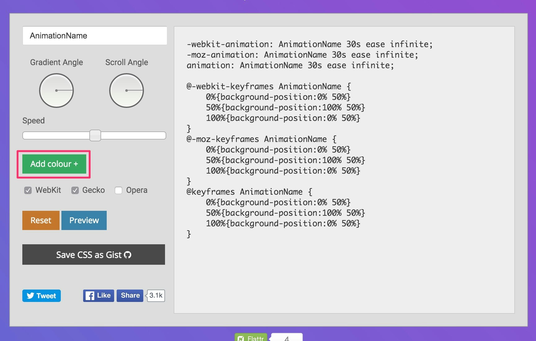
WEBサイトにアクセスしてグラデーションを作成します。
下記画像の「add colour+」を2色以上追加するといい感じに右側にコードが生成されます。
CSSを読みこませる
自分用のコードが作成されたらそれをCSSとして読み込ませます。
生成されたコードをbodyに設定しました。
gradation.css
body {background: linear-gradient(270deg, #ff78d9, #51acff);
background-size: 400% 400%;

-webkit-animation: AnimationName 30s ease infinite;
-moz-animation: AnimationName 30s ease infinite;
animation: AnimationName 30s ease infinite;
}

@-webkit-keyframes AnimationName {
    0%{background-position:0% 50%}
    50%{background-position:100% 50%}
    100%{background-position:0% 50%}
}
@-moz-keyframes AnimationName {
    0%{background-position:0% 50%}
    50%{background-position:100% 50%}
    100%{background-position:0% 50%}
}
@keyframes AnimationName {
    0%{background-position:0% 50%}
    50%{background-position:100% 50%}
    100%{background-position:0% 50%}
}
先ほどのHTMLのtitleタグの下に下記タグを追加しました。
<link rel="stylesheet" type="text/css" href="css/bg-gradation.css">
以上で設定完了です。
Before と AFTER
gifだと重かったので、画像ですみませんが、
これが素のHTMLで(before)、

以下の三枚みたく背景が変化していきます(after)。


ものすごく簡単なのでおためしあれー。