データサイエンティストにとって、データの可視化 (data visualization) はデータ解析に匹敵するほど大切な仕事だと言っていいでしょう。サイエンスの世界でも、いい論文というのは、ほとんど必ず美しい図が伴っているものです。
そのようなPublication-quality figure の作成は、R、Pythonなど好みの言語のツールを用いて行いますが、今回は自分の備忘録も兼ね、Matlab でフツーの図をPublication-quality figure に作り直す方法を簡単にまとめたいと思います。
###
単純に色々な美しい図をMatlabで作りたい!という場合には、以下のブログが素晴らしく参考になります。
###
R使えないけどggplotっぽい図を作りたい!という場合には、以下のライブラリを使うとR使える雰囲気を漂わせることができます。
データ準備#
適当な散布図 (scatter plot) と、そのデータに対する線形回帰直線 (linear regression line) と、$y=x$ のユニティーライン (unity line) を用意します。
%% generate artificial data and plot
close all;
figure;
xdata = rand(1,30);
ydata = rand(1,30);
scatter(xdata,ydata,30,'filled')

%% plot a linear regression line
b = glmfit(xdata,ydata,'normal','link','identity');
hold on;
plot([0 1],b(1) + b(2)*[0 1])

%% plot a unity line
hold on;
plot([0 1],[0 1])
これで、Matlab は散布図+2本の線をプロットしてくれます。
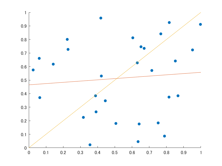
このままのraw figure だとクオリティが低いので、図からデータを抽出し、新しく図を作り直しましょう。
図からデータを抽出する#
研究などはチームで行うことが多いので、「誰かが作った図を美しく加工しなおす」 という仕事がしばしば発生します。Matlab で作られたraw figure であれば、データの抽出が以下のコマンドで簡単にできます。
%% extract data from the figure
% current figure handle;
h = gcf;

% axis object
axesObjs = get(h, 'Children');

% data object inside the axis
dataObjs = get(axesObjs, 'Children');

% extract 'scatter' objects
scatters = findobj(dataObjs, 'type', 'scatter');

% extract 'line' objects
lines = findobj(dataObjs, 'type', 'line');
流れとしては、
- 現在のFigure (gcf) を、h という変数に入れる
- 図の子供 (Children)、つまり軸であるaxes object を取り出す
- 軸の子供、つまりデータポイントであるdata object を取り出す
となります。例の図には'scatter', 'line' という2種類のタイプが含まれているので、最後の2行のコマンドで、deta object から、それぞれの要素をfindobj という関数を使って取り出しています。
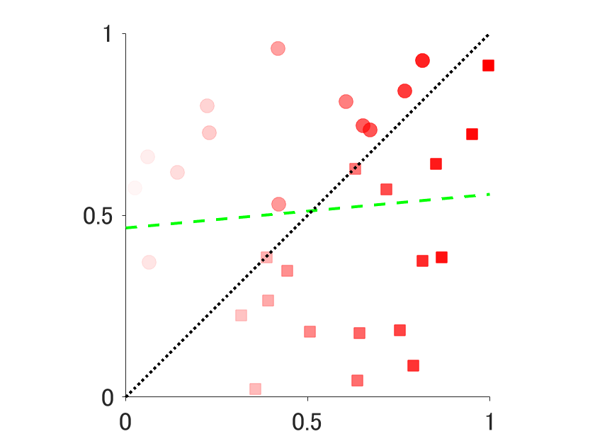
図を美しく加工しなおす#
データさえ抽出してしまえば、古い図は用済みです。美しく作り直しましょう。
scatter object について今回は、
- x-axis に沿って、データポイントの透明度を下げる
- 色を赤にする
- 大きさを100にする
- ユニティーラインより下のデータポイントのマーカーを四角にする
という加工をしてみましょう。
%% play with the extracted objects (scatter)
[xdata,idx] = sort(scatters.XData);
ydata = scatters.YData(idx);
figure;

% - change transparency in a gradient manner with x-axis
% - change color to red
% - change markersize to 100
% - change marker if datapoints are under the unity line
for i = 1:30
    if xdata(i) < ydata(i)
        scatter(xdata(i),ydata(i),100,'filled',...
            'markerfacecolor','r','markeredgecolor','r',...
            'markerfacealpha',i/30,'markeredgealpha',i/30);
    else
        scatter(xdata(i),ydata(i),100,'filled','s',...
            'markerfacecolor','r','markeredgecolor','r',...
            'markerfacealpha',i/30,'markeredgealpha',i/30);
    end
    hold on;
end
line object に関しては、
- 線を太くする
- 回帰直線は、緑色のダッシュ
- ユニティーラインは、黒の点線
にしてみましょう。
%% play with the extracted objects (line)
% - change width of the both lines
% - green dash regression line
% - black dotted unity line

% regression line
plot(lines(2).XData, lines(2).YData, '--g','linewidth', 2)
hold on;

% unity line
plot(lines(1).XData, lines(1).YData, ':k','linewidth', 2)
最後に、軸を少しいじります。
- box を取り除く
- 軸の Tick を外向きにする
- 軸の Tick を0, 0.5, 1 のみにする
- フォントを大きくする
- X軸とY軸の長さを等しくする
%% other cosmetics
% box off
set(gca, 'box', 'off')

% tick out
set(gca, 'TickDir', 'out')

% remove some ticks
set(gca, 'XTick',[0 0.5 1])
set(gca, 'YTick',[0 0.5 1])

% larger font size
set(gca,'FontSize',18)

% square axis
axis square
以上により、図が美しく描き換わりました。
まとめのまとめ##
Matlabのraw figure からデータを抽出するスクリプトは、
%% extract data from the figure
% current figure handle;
h = gcf;

% axis object
axesObjs = get(h, 'Children');

% data object inside the axis
dataObjs = get(axesObjs, 'Children');
終わりに##
Matlab は有料であるがゆえに、大学のような教育機関でしか使われていませんが、学習が容易で、このようにPublication-quality figure の図の作成も比較的簡単です。
ちなみに、Matlab の図は*.fig* という特別な拡張子でデフォルトでは保存されますが、以下の簡単なコマンドにより高解像度のPDFとして保存できます。
print(handle,'-dpdf',pdfFileName,sprintf('-r%d',dpi))
handle は現在の図でしたらgcf でいいです。pdfFileName はパス指定された図の名前で、dpi は解像度です。Publication-quality figure であれば、300ほどあれば良いはずです。