はじめに
.NET MAUI のUIコントロール (View) の一覧です。
開発環境
- Win11
- VS2022 Preview Version 17.3.0 Preview 3.0 new!
環境構築&プロジェクト作成の流れはこちらの記事でどうぞ。
サンプルソース
一式GitHubに公開してます。
Views
ActivityIndicator
ぐるぐる進捗状況

<Label Grid.Row="1" Grid.Column="0" Text="ActivityIndicator" />
<HorizontalStackLayout Grid.Row="1" Grid.Column="1" VerticalOptions="Center">
     <CheckBox IsChecked="True" x:Name="ActivityIndicatorCheckBox" />
     <ActivityIndicator WidthRequest="50" HeightRequest="50" IsRunning="{Binding Source={x:Reference ActivityIndicatorCheckBox}, Path=IsChecked}" Color="Red"  />
     <ActivityIndicator WidthRequest="50" HeightRequest="50" IsRunning="{Binding Source={x:Reference ActivityIndicatorCheckBox}, Path=IsChecked}" Color="Green" />
     <ActivityIndicator WidthRequest="50" HeightRequest="50" IsRunning="{Binding Source={x:Reference ActivityIndicatorCheckBox}, Path=IsChecked}" Color="Blue" />
</HorizontalStackLayout>
BlazorWebView
Blazorが動くWeb
Border
ボーダーライン

<Label Grid.Row="3" Grid.Column="0" Text="Border" />
<HorizontalStackLayout Grid.Row="3" Grid.Column="1" VerticalOptions="Center">
    <Border WidthRequest="50" HeightRequest="50" Margin="5" Stroke="Black"
            StrokeThickness="1" StrokeShape="Rectangle" />
    <Border WidthRequest="50" HeightRequest="50" Margin="5" Stroke="Red"
            StrokeThickness="2" StrokeShape="RoundRectangle 10,10,10,10"/>
    <Border WidthRequest="50" HeightRequest="50" Margin="5" Stroke="Green"
            StrokeThickness="3" StrokeShape="Rectangle" StrokeDashArray="5.0" StrokeDashOffset="1.0">
    </Border>
    <Border WidthRequest="50" HeightRequest="50" Margin="5" Stroke="Blue"
            StrokeThickness="6" StrokeShape="Ellipse" BackgroundColor="SkyBlue" />
</HorizontalStackLayout>
BoxView
箱

<Label Grid.Row="4" Grid.Column="0" Text="BoxView" />
<HorizontalStackLayout Grid.Row="4" Grid.Column="1" VerticalOptions="Center">
    <BoxView WidthRequest="50" HeightRequest="50" Margin="5" Color="Pink" />
    <BoxView WidthRequest="50" HeightRequest="50" Margin="5" Color="LightGreen" CornerRadius="10" />
    <BoxView WidthRequest="50" HeightRequest="50" Margin="5" Color="LightBlue" CornerRadius="20,0,0,0" />
</HorizontalStackLayout>
Button
ボタン
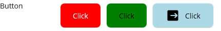
<Label Grid.Row="5" Grid.Column="0" Text="Button" />
<HorizontalStackLayout Grid.Row="5" Grid.Column="1" VerticalOptions="Center">
    <Button WidthRequest="80" HeightRequest="50" Margin="5" Text="Click" TextColor="White" Background="Red" />
    <Button WidthRequest="80" HeightRequest="50" Margin="5" Text="Click" TextColor="Black" Background="Green" />
    <Button WidthRequest="120" HeightRequest="50" Margin="5" Text="Click" TextColor="Black" Background="LightBlue" ImageSource="logout.png" />
</HorizontalStackLayout>
CarouselView
カルーセル(Windowsではうまく動かないよ)

<Label Grid.Row="6" Grid.Column="0" Text="CarouselView" />
<HorizontalStackLayout Grid.Row="6" Grid.Column="1" VerticalOptions="Center">
    <Label VerticalTextAlignment="Center" WidthRequest="120">
        <Label.FormattedText>
            <FormattedString>
                <Span Text="Current Item = " />
                <Span Text="{Binding Source={Reference CarouselView}, Path=CurrentItem.Name}" />
            </FormattedString>
        </Label.FormattedText>
    </Label>
    <CarouselView x:Name="CarouselView" WidthRequest="200" HeightRequest="100"
                  ItemsSource="{StaticResource UserArray}" ItemTemplate="{StaticResource UserViewTemplate}"
                  Position="0" PeekAreaInsets="60" BackgroundColor="#D9D9D9">
    </CarouselView>
</HorizontalStackLayout>
CheckBox
チェック (VisualStateがうまく動かないよ。)

<Label Grid.Row="7" Grid.Column="0" Text="CheckBox" />
<HorizontalStackLayout Grid.Row="7" Grid.Column="1" VerticalOptions="Center">
    <CheckBox Margin="5" Color="Red" />
    <CheckBox Margin="5" Color="Green" />
    <CheckBox x:Name="CheckBox3" Margin="5" Color="LightBlue" />
    <CheckBox x:Name="CheckBox4" Margin="5" IsEnabled="{Binding Source={Reference CheckBox3}, Path=IsChecked}">
        <CheckBox.Triggers>
            <DataTrigger TargetType="{x:Type CheckBox}" Binding="{Binding Source={x:RelativeSource Mode=Self}, Path=IsChecked}" Value="False">
                <Setter Property="Color" Value="Red" />
            </DataTrigger>
            <DataTrigger TargetType="{x:Type CheckBox}" Binding="{Binding Source={x:RelativeSource Mode=Self}, Path=IsChecked}" Value="True">
                <Setter Property="Color" Value="Green" />
            </DataTrigger>
            <DataTrigger TargetType="{x:Type CheckBox}" Binding="{Binding Source={x:RelativeSource Mode=Self}, Path=IsEnabled}" Value="False">
                <Setter Property="Opacity" Value="0.3" />
            </DataTrigger>
        </CheckBox.Triggers>
    </CheckBox>
    <CheckBox Margin="5" IsEnabled="{Binding Source={Reference CheckBox4}, Path=IsChecked}">
        <VisualStateManager.VisualStateGroups>
            <VisualStateGroup x:Name="CommonStates">
                <VisualState x:Name="Normal">
                    <VisualState.Setters>
                        <Setter Property="Color" Value="Red" />
                    </VisualState.Setters>
                </VisualState>
                <VisualState x:Name="IsChecked">
                    <VisualState.Setters>
                        <Setter Property="Color" Value="Green" />
                    </VisualState.Setters>
                </VisualState>
                <VisualState x:Name="Disabled">
                    <VisualState.Setters>
                        <Setter Property="Opacity" Value="0.3" />
                    </VisualState.Setters>
                </VisualState>
            </VisualStateGroup>
        </VisualStateManager.VisualStateGroups>
    </CheckBox>
</HorizontalStackLayout>
CollectionView
一覧
ContentView
カスタムビューの素
DatePicker
日付


<Label Grid.Row="9" Grid.Column="0" Text="DatePicker" />
<HorizontalStackLayout Grid.Row="9" Grid.Column="1" VerticalOptions="Center">
    <DatePicker Format="yyyy/MM/dd(ddd)" />
</HorizontalStackLayout>
Editor
複数行のテキスト
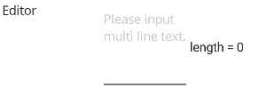
<Label Grid.Row="10" Grid.Column="0" Text="Editor" />
<HorizontalStackLayout Grid.Row="10" Grid.Column="1" >
    <Editor x:Name="Editor" WidthRequest="100" HeightRequest="100"
            Placeholder="Please input multi line text."
            MaxLength="100" Text="" />
    <Label VerticalOptions="Center">
        <Label.FormattedText>
            <FormattedString>
                <Span Text="length = " />
                <Span Text="{Binding Source={Reference Editor}, Path=Text.Length}" />
            </FormattedString>
        </Label.FormattedText>
    </Label>
</HorizontalStackLayout>
Ellipse
円
Entry
一行のテキスト
<Label Grid.Row="12" Grid.Column="0" Text="Entry" />
<HorizontalStackLayout Grid.Row="12" Grid.Column="1" VerticalOptions="Center">
    <Entry x:Name="Entry" WidthRequest="100"
            Placeholder="Please input single line text."
            MaxLength="100" Text="" />
    <Label VerticalOptions="Center">
        <Label.FormattedText>
            <FormattedString>
                <Span Text="length = " />
                <Span Text="{Binding Source={Reference Entry}, Path=Text.Length}" />
            </FormattedString>
        </Label.FormattedText>
    </Label>
</HorizontalStackLayout>
Frame
Border ※Xamarin.Formsの名残
GraphicsView
ペイント
Image
イメージ。影付き

<Label Grid.Row="14" Grid.Column="0" Text="Image" />
<HorizontalStackLayout Grid.Row="14" Grid.Column="1" VerticalOptions="Center">
    <Image Source="dotnet_bot.png" WidthRequest="50" HeightRequest="50" >
        <Image.Shadow>
            <Shadow Brush="Black"
                    Offset="20,20"
                    Radius="40"
                    Opacity="0.8" />
        </Image.Shadow>
    </Image>
    <Image Source="dotnet_bot.png" WidthRequest="50" HeightRequest="50" Opacity="0.5" />
    <Image Source="dotnet_bot.png" WidthRequest="50" HeightRequest="50" Opacity="0.2">
        <Image.Shadow>
            <Shadow Brush="Black"
                    Offset="20,20"
                    Radius="40"
                    Opacity="0.8" />
        </Image.Shadow>
    </Image>
</HorizontalStackLayout>
ImageButton
イメージのボタン
IndicatorView
インディケータ

<Label Grid.Row="16" Grid.Column="0" Text="IndicatorView" />
<HorizontalStackLayout Grid.Row="16" Grid.Column="1" VerticalOptions="Center">
    <VerticalStackLayout Spacing="10">
        <CarouselView WidthRequest="200" HeightRequest="100"
                ItemsSource="{StaticResource UserArray}" ItemTemplate="{StaticResource UserViewTemplate}"
                Position="0" PeekAreaInsets="60" BackgroundColor="#D9D9D9"
                IndicatorView="IndicatorView">
        </CarouselView>
        <IndicatorView x:Name="IndicatorView"
                       IndicatorColor="LightGray"
                       SelectedIndicatorColor="{StaticResource Primary}"
                       IndicatorSize="9"
                       HorizontalOptions="Center"/>
    </VerticalStackLayout>
</HorizontalStackLayout>
Label
ラベル
Line
線
ListView
選択できる一覧
Path
複雑な線
Picker
ピッカー


<Label Grid.Row="21" Grid.Column="0" Text="Picker" />
<HorizontalStackLayout Grid.Row="21" Grid.Column="1" VerticalOptions="Center">
    <Picker x:Name="Picker" WidthRequest="200"
                ItemsSource="{StaticResource UserArray}" ItemDisplayBinding="{Binding Name}">
    </Picker>
</HorizontalStackLayout>
Polygon
ポリゴン
Polyline
ポリライン
ProgressBar
進捗バー

<Label Grid.Row="24" Grid.Column="0" Text="ProgressBar" />
<HorizontalStackLayout Grid.Row="24" Grid.Column="1" VerticalOptions="Center" Spacing="5">
    <Button Text="animation" Clicked="ProgressBar_Animation" />
    <ProgressBar x:Name="ProgressBar1" WidthRequest="50" Progress="0.5" ProgressColor="Red" />
    <ProgressBar x:Name="ProgressBar2" WidthRequest="50" Progress="0.5" ProgressColor="Green" />
    <ProgressBar x:Name="ProgressBar3" WidthRequest="50" Progress="0.5" ProgressColor="Blue" />
    <ProgressBar x:Name="ProgressBar4" WidthRequest="50" Progress="0.5" ProgressColor="Green" />
    <ProgressBar x:Name="ProgressBar5" WidthRequest="50" Progress="0.5" ProgressColor="Red" />
</HorizontalStackLayout>
	private void ProgressBar_Animation(object sender, EventArgs e)
	{
		ProgressBar1.Progress = 0;
		ProgressBar1.ProgressTo(1.0, 3000, Easing.Linear);
        ProgressBar2.Progress = 0;
        ProgressBar2.ProgressTo(1.0, 3000, Easing.SpringIn);
        ProgressBar3.Progress = 0;
        ProgressBar3.ProgressTo(1.0, 3000, Easing.CubicIn);
        ProgressBar4.Progress = 0;
        ProgressBar4.ProgressTo(1.0, 3000, Easing.BounceIn);
        ProgressBar5.Progress = 0;
        ProgressBar5.ProgressTo(1.0, 3000, Easing.BounceOut);
    }
RadioButton
ラジオ

<Label Grid.Row="25" Grid.Column="0" Text="RadioButton" />
<HorizontalStackLayout Grid.Row="25" Grid.Column="1" VerticalOptions="Center" RadioButtonGroup.GroupName="Group1" Spacing="5">
    <RadioButton IsChecked="True"  Content="A" BorderColor="Red" TextColor="Red" BorderWidth="2" CornerRadius="5" BackgroundColor="Pink" />
    <RadioButton IsChecked="False" Content="B" BorderColor="Green" TextColor="Green"  BorderWidth="2" CornerRadius="5" BackgroundColor="LightGreen" />
    <RadioButton IsChecked="False" Content="C" BorderColor="Blue" TextColor="Blue"  BorderWidth="2" CornerRadius="5" BackgroundColor="LightBlue" />
</HorizontalStackLayout>
Rectangle
四角
RefreshView
更新できるビュー
RoundRectangle
角丸四角
ScrollView
スクロールできるビュー
SearchBar
検索窓
Slider
スライダ

<Label Grid.Row="31" Grid.Column="0" Text="Slider" />
<HorizontalStackLayout Grid.Row="31" Grid.Column="1" VerticalOptions="Center" Spacing="5">
    <Slider Value="0" Minimum="0" Maximum="100" WidthRequest="100" MinimumTrackColor="Pink" MaximumTrackColor="Gray" ThumbColor="Red" />
    <Slider Value="50" Minimum="0" Maximum="100" WidthRequest="100" MinimumTrackColor="LightGreen" MaximumTrackColor="Gray" ThumbColor="Green" />
    <Slider Value="100" Minimum="0" Maximum="100" WidthRequest="100" MinimumTrackColor="LightBlue" MaximumTrackColor="Gray" ThumbColor="Blue" />
</HorizontalStackLayout>
Stepper
ステッパ

<Label Grid.Row="32" Grid.Column="0" Text="Stepper" />
<HorizontalStackLayout Grid.Row="32" Grid.Column="1" VerticalOptions="Center">
    <Label VerticalTextAlignment="Center">
        <Label.FormattedText>
            <FormattedString>
                <Span Text="Current Value = " />
                <Span Text="{Binding Source={Reference Stepper}, Path=Value}" />
            </FormattedString>
        </Label.FormattedText>
    </Label>
    <Stepper x:Name="Stepper" Value="5" Minimum="0" Maximum="10" Increment="1" />
</HorizontalStackLayout>
SwipeView
スワイプできるビュー
Switch
スイッチ

<Label Grid.Row="34" Grid.Column="0" Text="Switch" />
<HorizontalStackLayout Grid.Row="34" Grid.Column="1" VerticalOptions="Center">
    <Switch IsToggled="False" OnColor="Pink" ThumbColor="Red" />
    <Switch IsToggled="True" OnColor="LightGreen"  ThumbColor="Green" />
    <Switch IsToggled="True" OnColor="LightBlue"  ThumbColor="Blue" IsEnabled="False" />
</HorizontalStackLayout>
TableView
テーブルビュー
TimePicker
時刻
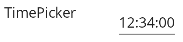
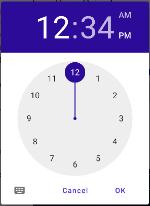
<Label Grid.Row="35" Grid.Column="0" Text="TimePicker" />
<HorizontalStackLayout Grid.Row="35" Grid.Column="1" VerticalOptions="Center">
    <TimePicker Format="HH:mm:ss" Time="12:34:00" />
</HorizontalStackLayout>
WebView
Web

<Label Grid.Row="36" Grid.Column="0" Text="WebView" />
<HorizontalStackLayout Grid.Row="36" Grid.Column="1" VerticalOptions="Center">
    <ScrollView WidthRequest="300" HeightRequest="200">
        <WebView HorizontalOptions="Fill" VerticalOptions="Fill" Source="https://github.com/" />
    </ScrollView>
</HorizontalStackLayout>
Pages
- ContentPage
- FlyoutPage
- NavigationPage
- TabbedPage
Layout
-
AbsoluteLayout
絶対位置指定のレイアウト -
BindableLayout
-
FlexLayout
CSSのFlexBoxに基づいたレイアウト -
Grid
行と列で並べる -
HorizontalStackLayout
横に並べる -
StackLayout
縦または横に並べる(切り替え可能) -
VerticalStackLayout
縦に並べる