先日、display:contents;というプロパティをはじめて知りました。
他のdisplayシリーズと比べるとあまり馴染みがなかったので、今回はdisplay:contents;とは何か、どんな場面で使えるのかについて紹介します。
1. 結論
-
display:contents;を指定した要素は、あたかも存在しないかのように扱うことができる - これにより、グリッドレイアウトやレスポンシブデザインを作成する際に便利に活用できる
- ただし、アクセシビリティに課題が残るため、慎重に使用する必要がある
2. display:contents; とは?
2-1. display:contents;の概要
display:contents;を指定した要素は、存在しないかのように扱われ、指定した要素の子要素が直接親要素内に挿入されます。
Mdn Web Docsでは以下のように説明されています。
これらの要素は自身のために特定のボックスを生成しません。擬似ボックスやその子ボックスで置き換えられます。
display:none;を指定した要素も存在しないかのように扱われますが、異なる点は子孫要素の扱いです。
display:contents;では子孫要素が表示されますが、display:none;では子孫要素も非表示になります。
2-2. display:contents;の注意点
display:contents;を指定した要素はボックスを生成しないため、width、height、padding、margin、background-colorなどのプロパティが無効になります。
一方、テキストは表示されるため、例えばcolorプロパティは有効です。
3. display:contents;のメリット・デメリット
メリット
- 複雑なHTML構造を維持しつつ、CSSをよりシンプルに記述できる
- 特定の要素をレイアウトから取り除き、その子要素を直接親要素に配置することで、スタイリングが柔軟になる
デメリット
- 一部のブラウザやスクリーンリーダーでは、
display:contents;が完全にサポートされていないため、アクセシビリティに問題が生じる可能性がある - 要素自体がボックスモデルから取り除かれるため、ボーダーや背景色などのスタイルが失われることに注意が必要
4. display:contents;の活用例
4-1. gridレイアウトと併用する
display:contents;をグリッドレイアウトと併用することで、HTML構造を整理しつつ、意図したデザインを実現できます。
例として、以下のようなカードデザインを作りたいとします。

グリッドレイアウトを用いて、シンプルにコーディングすると以下のようなコードになることが多いのではないでしょうか?
<!DOCTYPE html>
<html lang="ja">
<head>
    <meta charset="UTF-8">
    <meta name="viewport" content="width=device-width, initial-scale=1.0">
    <title>Sample Document</title>
</head>
<body>
    <div class="grid">
        <article>
            <h2>This is a heading</h2>
            <p>Working as a Marketing Assistant for XYZ Food Supply Company in London for three years, I was able to develop a strong understanding of the demands and needs of consumers. Last September, I was promoted to Team Leader at XYZ because of my talents for organizing and supervising.</p>
            <p>Footer stuff</p>
        </article>

        <article>
            <h2>This is a really really really super duper loooong heading</h2>
            <p>Your advertisement for an experienced Marketing Manager, posted on the CareerCross website, caught my attention.</p>
            <p>Footer stuff</p>
        </article>

        <article>
            <h2>This is a really really really super duper loooong heading.This is a really really really super duper loooong heading</h2>
            <p>Your advertisement for an experienced Marketing Manager, posted on the CareerCross website, caught my attention.</p>
            <p>Footer stuff</p>
        </article>
    </div>
</body>
</html>

<style>
    body {
        margin: 0;
        background: #eeeeee;
    }
    h2 {
        margin: 0;
        padding: 1em;
        background: #fefefe;
    }
    p {
        margin: 0;
        padding:  1em;
        background: #fefefe;
    }

    .grid {
        display: grid; /* gridレイアウトを使用 */
        grid-auto-flow: row; /* それぞれのカードを横並びにする */
        grid-template-columns: repeat(3, 1fr); /* 横列は三列均等 */
        grid-column-gap: 20px;
        width: 1000px;
        margin-top: 30px;
        margin-left: 30px;
    }
</style>
カード一つずつをブロックとみなして、articleタグを使って囲んでいます。
しかし、この方法では以下のようにカードの縦幅が揃わず、デザインが崩れてしまいます。
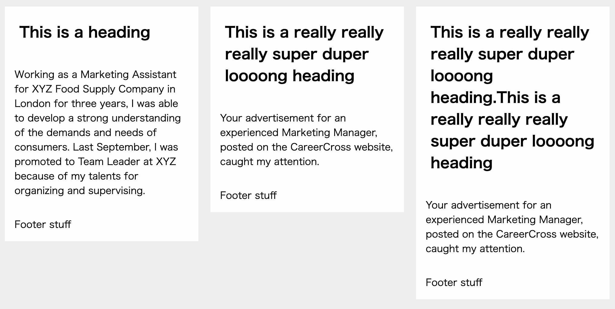
各カードの縦幅が揃っていないので、カッコ悪いですよね。
この問題は、display:grid;が子要素にのみ適用され、孫要素には適用されないことが原因です。
孫要素であるカード内の<h2>タグや<p>タグにはgridレイアウトが適用されていないので、縦幅がバラバラになってしまいます。
4-1-1. display:contents;以外の方法で改善する
縦幅を揃えるためには、display:grid;を孫要素であるh2タグやpタグまで適用させることが必要です。そのため、articleタグを削除する必要があります。
<div class="grid">
    <h2>This is a heading</h2>
    <p>Working as a Marketing Assistant for XYZ Food Supply Company in London for three years, I was able to develop a strong understanding of the demands and needs of consumers. Last September, I was promoted to Team Leader at XYZ because of my talents for organizing and supervising.</p>
    <p>Footer stuff</p>

    <h2>This is a really really really super duper loooong heading</h2>
    <p>Your advertisement for an experienced Marketing Manager, posted on the CareerCross website, caught my attention.</p>
    <p>Footer stuff</p>

    <h2>This is a really really really super duper loooong heading.This is a really really really super duper loooong heading</h2>
    <p>Your advertisement for an experienced Marketing Manager, posted on the CareerCross website, caught my attention.</p>
    <p>Footer stuff</p>
</div>

<style>
    .grid {
        display: grid; /* gridレイアウトを使用 */
        grid-auto-flow: column; /* gridレイアウト内の要素を縦に整列させる */
        grid-template-rows: auto 1fr auto; /* 縦列は3行で整列させる */
        grid-template-columns: repeat(3, 1fr); /* 横列は3列均等 */
        grid-column-gap: 20px;
        width: 1000px;
        margin-top: 30px;
        margin-left: 30px;
    }
</style>
このようにarticleタグを削除すると、以下の写真の通り綺麗にカードレイアウトを作ることができます。

しかし、articleタグを削除したことで、HTMLの構造が掴みにくくなってしまいました。
改行を入れているのでなんとなく区切れ目はわかりますが、gridレイアウト内の要素がカードごとにまとまっておらず、可読性が低いです。
4-1-2. display:contents;を使って改善する
コードの可読性が下がるのは避けたいのでarticleタグを使用しつつ、縦幅の揃ったきれいなカードレイアウトを作ることを目指します。この時に使うのがdisplay:contents;です。
<div class="grid">
    <li style="display: contents;">
        <h2>This is a heading</h2>
        <p>Working as a Marketing Assistant for XYZ Food Supply Company in London for three years, I was able to develop a strong understanding of the demands and needs of consumers. Last September, I was promoted to Team Leader at XYZ because of my talents for organizing and supervising.</p>
        <p>Footer stuff</p>
    </li>

    <article style="display: contents;">
        <h2>This is a really really really super duper loooong heading</h2>
        <p>Your advertisement for an experienced Marketing Manager, posted on the CareerCross website, caught my attention.</p>
        <p>Footer stuff</p>
    </article>

    <article style="display: contents;">
        <h2>This is a really really really super duper loooong heading.This is a really really really super duper loooong heading</h2>
        <p>Your advertisement for an experienced Marketing Manager, posted on the CareerCross website, caught my attention.</p>
        <p>Footer stuff</p>
    </article>
</div>
上記の通り、先ほどは消してしまったarticleタグにdisplay: contents;を指定します。
すると、display:grid;は子要素のarticleタグをないものとして扱い、孫要素のh2やpタグを参照するようになります。
その結果、HTMLの構造もわかりやすく、かつ意図したカードデザインを作ることができました。
5. レスポンシブデザインに応用する
display:contents;を使用することで、レスポンシブデザインを簡単に作ることができます。
例えば、以下の写真のように、画面幅が767px以下の場合と、768px以上の場合でデザインを別にしたいとします。
画面幅が767px以下の場合
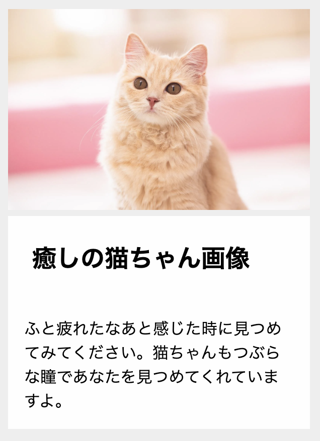
画面幅が768px以上の場合

このようなレスポンシブデザインも、display:contents;を活用した以下のコードで実現できます。
<!DOCTYPE html>
<html lang="ja">
<head>
    <meta charset="UTF-8">
    <meta name="viewport" content="width=device-width, initial-scale=1.0">
    <title>Sample Document</title>
</head>
<body>
    <section class="card">
        <div class="wrapper">
            <h2 class="title">癒しの猫ちゃん画像</h2>
            <p class="description">ふと疲れたなあと感じた時に見つめてみてください。猫ちゃんもつぶらな瞳であなたを見つめてくれていますよ。</p>
        </div>
        <div class="image">
            <img src="/images/nekocyanPAKE4522-436_TP_V.webp" alt="癒しの猫ちゃん画像">
        </div>
    </section>
</body>
</html>

<style>
    body {
        margin: 0;
        background: #eeeeee;
    }
    h2 {
        margin: 0;
        padding: 1em;
        background: #fefefe;
    }
    p {
        margin: 0;
        padding:  1em;
        background: #fefefe;
    }
    img {
        width: 100%;
        height: 100%;
        object-fit: cover;
    }
    .card {
        width: 300px;
        margin: 30px;
        display: flex;
        flex-direction: column;
        border-radius: 10px;
    }
    .wrapper {
        display: contents;
    }
    .image {
        order: 1;
    }
    .title {
        order: 2;
    }
    .description {
        order: 3;
    }
    @media (min-width: 768px) {
        .card {
            width: 600px;
            flex-direction: row;
        }
        .wrapper {
            display: block;
            width: 35%;
            background: #fefefe;
        }
        .image {
            width: 65%;
        }
    }
</style>
画面幅が767px以下の場合は.wapperのdisplay: contents;によって
.wrapper {
    display: contents;
}
以下のHTMLのdiv.wapperがないものとして扱われるので、
<div class="card">
    <div class="wrapper">
        <h2 class="title">癒しの猫ちゃん画像</h2>
        <p class="description">ふと疲れたなあと感じた時に見つめてみてください。猫ちゃんもつぶらな瞳であなたを見つめてくれていますよ。</p>
    </div>
    <div class="image">
        <img src="/images/nekocyanPAKE4522-436_TP_V.webp" alt="癒しの猫ちゃん画像">
    </div>
</div>
実質的には以下のような状態になります。
<div class="card">
    <h2 class="title">癒しの猫ちゃん画像</h2>
    <p class="description">ふと疲れたなあと感じた時に見つめてみてください。猫ちゃんもつぶらな瞳であなたを見つめてくれていますよ。</p>
    <div class="image">
        <img src="/images/nekocyanPAKE4522-436_TP_V.webp" alt="癒しの猫ちゃん画像">
    </div>
</div>
そのため、親要素の.cardにdisplay:flex; flex-direction: column;を付与した上で、以下のようにflexの対象となる各要素にorderを指定してあげると、順番を制御することができます。
.image {
    order: 1;
}

.title {
    order: 2;
}

.description {
    order: 3;
}
一方768px以上の場合は以下のように.wrapperに付与されていたdisplay:contens;をdisplay:block;で上書きします。
その上で.wrapperと.imageをflexレイアウトで横並びにしてあげると、767px以下とは異なるデザインを表現することができます。
@media (min-width: 768px) {
    .card {
        width: 600px;
        flex-direction: row;
    }

    .wrapper {
        display: block;
        width: 35%;
        background: #fefefe;
    }

    .image {
        width: 65%;
    }
}
このようにdisplay:contens;を活用することで、画面幅が767px以下の場合と768px以上の場合で異なるレイアウトが実現できます。
フレームワークによって自動追加されるタグに対応する
Railsなどのフレームワークを使用していると、divタグが自動的に挿入されることでスタイルが崩れてしまうことがあります。
例えば、form_withでフォームを生成した際にバリデーションエラーが発生すると、以下のようにdivタグが挿入されます。
<%= form_with model: @user do |f| %>
  <%= f.label :name %>
  <%= f.text_field :name %>
  <%= f.submit %>
<% end %>
バリデーションエラーが発生すると、以下の通りdivタグが挿入されてしまいます。
<form action="/users" method="post">
  <div class="field_with_errors">
    <label for="user_name">Name</label>
  </div>
  <div class="field_with_errors">
    <input type="text" name="user[name]" id="user_name" value="">
  </div>
  <input type="submit" value="Save User">
</form>
このような自動挿入されるdivタグが原因でCSSが崩れてしまうことがあります。
この解決策の一つとして.field_with_errorsにdisplay:contents;を付与する方法があります。
6. アクセシビリティの課題
最後に、アクセシビリティに関する課題を紹介します。
display:contents;は便利なプロパティですが、要素がアクセシビリティツリーから削除されるため、一部のブラウザやスクリーンリーダーで正しく動作しない可能性があります。
MDN Web Docsの説明は以下のとおりです。
多くのブラウザーの現在の実装では、アクセシビリティツリーから display の値が contents である要素を削除します。これにより、その要素は — また、一部の版のブラウザーではその子孫要素も — 読み上げ技術で読み上げられなくなります。これは CSSWG 仕様書によれば、正しくない動作です。
このように、display:contents;を使用する際にはアクセシビリティへの影響を考慮する必要があります。
7. まとめ
- display:contents;を使用することで、HTML要素をないものとして扱い、グリッドレイアウトやレスポンシブデザインをより柔軟に設計できる
- ただし、一部のブラウザやスクリーンリーダーでのサポートが不完全なため、アクセシビリティに注意が必要