このサイトを見ればMaterialのBottomNavigationViewのすべてがわかるようにまとめました。※Material3の方は近いうちにまとめます:)
足りない部分やUI/UXデザインは随時更新していく予定です。
*Document
・ Class -- Android Developers
・ Class Sourse (bottomnavigation) -- GitHub
・ Style Sourse (bottomnavigation) -- GitHub
・ Attrs Sourse (navigation) -- GitHub
・ Attrs Sourse (bottomnavigation) -- GitHub
使用場面
◉ アプリに3~5つのトップレベルで表示したい画面がある場合
◉ 上部Tabよりも親指で簡単に切り替えができるというメリット

コードまとめ
【Materialのデフォルト色】
Primary:#6200EE (night:#BB86FC)
On Primary:#FFFFFF (night:#000000)
Surface:#FFFFFF (night:#121212)
On Surface:#000000 (night:#FFFFFF)

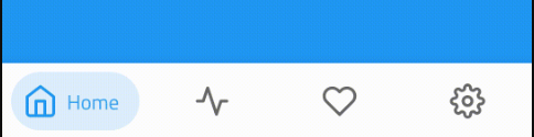
| 属性1 | 属性2 | 説明 | |
|---|---|---|---|
| ❶ | Container | ― | ― |
| ❷ | Navigation item | Icon | 非アクティブアイコン |
| ❸ | Navigation item | Text Label | 非アクティブテキストラベル |
| ❹ | Navigation item | Icon | アクティブアイコン |
| ❺ | Navigation item | Text Label | アクティブテキストラベル |
【❶Container属性】
| 要素 | 属性 | 関連 | デフォルト値 | 説明 |
|---|---|---|---|---|
| Color | app:backgroundTint |
N/A | ?attr/colorSurface |
#FFFFFF (night:#121212) |
| Elevation | app:elevation |
setElevation |
8dp | 値が大きいほど影が大きくなる |
【❷~❺Navigation item属性】
| 要素 | 属性 | 関連 | デフォルト値 | 説明 |
|---|---|---|---|---|
| Menuresource | app:menu |
inflateMenu,getMenu
|
N/A | アイテムを設定 |
| Ripple(非アクティブ) | app:itemRippleColor |
setItemRippleColor,getItemRippleColor
|
?attr/colorOnSurfaceat 8%(seeallstates) |
#000000 (night:#FFFFFF) の薄い色 |
| Ripple(アクティブ) | - | - |
?attr/colorPrimaryat 8%(seeallstates) |
#6200EE (night:#BB86FC) の薄い色 |
| Labelvisibilitymode | app:labelVisibilityMode |
setLabelVisibilityMode,getLabelVisibilityMode
|
LABEL_VISIBILITY_AUTO |
下に記載 |
LABEL_VISIBILITY_AUTO(デフォルト)
項目が 3 つ以下の場合、ラベルは「LABEL_VISIBILITY_LABELED」として動作し、項目が 4 つ以上の場合は「LABEL_VISIBILITY_SELECTED」として動作する。
LABEL_VISIBILITY_SELECTED
ラベルは選択したナビゲーション項目にのみ表示さる。
LABEL_VISIBILITY_LABELED
ラベルはすべてのナビゲーション項目に表示される。
LABEL_VISIBILITY_UNLABELED
すべてのナビゲーション項目のラベルが非表示になる。
【❷❹Icon属性】
| 要素 | 属性 | 関連 | デフォルト値 | 説明 |
|---|---|---|---|---|
| Icon |
android:iconin the menu resource |
N/A | N/A | メニューリソースファイルの中でアイコンを設定 |
| Size | app:itemIconSize |
setItemIconSize,setItemIconSizeRes,getItemIconSize
|
24dp | アイコンのサイズ(1:1) |
| Color (非アクティブ) | app:itemIconTint |
setItemIconTintList,getItemIconTintList
|
?attr/colorOnSurface at 60% |
#000000 (night:#FFFFFF)のやや薄い色 |
| Color (アクティブ) | ― | ― | ?attr/colorPrimary |
#6200EE (night:#BB86FC) |
【❸❺Text Label属性】
| 要素 | 属性 | 関連 | デフォルト値 | 説明 |
|---|---|---|---|---|
| Text label |
android:title in the menu resource |
N/A | N/A | メニューリソースファイルの中でテキストを設定 |
| Color (非アクティブ) | app:itemTextColor |
setItemTextColor,getItemTextColor
|
?attr/colorOnSurface at 60% |
#000000 (night:#FFFFFF)のやや薄い色 |
| Color (アクティブ) | ― | ― | ?attr/colorPrimary |
#6200EE (night:#BB86FC) |
| Typography (非アクティブ) | app:itemTextAppearanceInactive |
setItemTextAppearanceInactive,getItemTextAppearanceInactive
|
?attr/textAppearanceCaption |
textAppearanceCaptionのMaterialのデフォルト値はRegular 12sp
|
| Typography (アクティブ) | app:itemTextAppearanceActive |
setItemTextAppearanceActive,getItemTextAppearanceActive
|
?attr/textAppearanceCaption |
上に同じ |
レイアウト
1. 基礎コード
    <com.google.android.material.bottomnavigation.BottomNavigationView
        android:id="@+id/bottom_navigation"
        android:layout_width="match_parent"
        android:layout_height="wrap_content"
        app:menu="@menu/bottom_navigation_menu"/>
app:menuではアイテムの設定を行う。メニューリソースファイルにアイテムを書いてそのファイルを指定する。
    <menu xmlns:android="http://schemas.android.com/apk/res/android">
          <item
              android:id="@+id/page_1"
              android:enabled="true"
              android:icon="@drawable/icon_1"
              android:title="@string/text_label_1"/>
          <item
              android:id="@+id/page_2"
              android:enabled="true"
              android:icon="@drawable/icon_2"
              android:title="@string/text_label_2"/>
              :
    </menu>
アイテムの数は3~5つが適切な数
2. スタイルの設定
スタイルは大きく2つのスタイルがあり、3つ目は2つを状態によって切り替えるスタイル

| 要素 | スタイル | Containerの色 | NavigationItemの色(非アクティブ) | NavigationItemの色(アクティブ) |
|---|---|---|---|---|
| Default style | Widget.MaterialComponents.BottomNavigationView |
?attr/colorSurface #FFFFFF (night:#121212) |
?attr/colorOnSurface at 60% #000000 (night:#FFFFFF)のやや薄い色 |
?attr/colorPrimary #6200EE (night:#BB86FC) |
| Colored style | Widget.MaterialComponents.BottomNavigationView.Colored |
?attr/colorPrimary #6200EE (night:#BB86FC) |
?attr/colorOnPrimary at 60% #FFFFFF (night:#000000)のやや薄い色 |
?attr/colorOnPrimary #FFFFFF (night:#000000) |
| Dark theme supported style | Widget.MaterialComponents.BottomNavigationView.PrimarySurface |
?attr/colorPrimary in light theme #6200EE,?attr/colorSurface in dark theme (night:#121212) |
?attr/colorOnPrimary at 60% in light theme #FFFFFFのやや薄い色,?attr/colorOnSurface at 60% in dark theme (night:#FFFFFF) |
?attr/colorOnPrimary in light theme #FFFFFF,?attr/colorPrimary in dark theme (night:#BB86FC) |
Widget.MaterialComponents.BottomNavigationView.PrimarySurface スタイルは、ライトテーマとダークテーマの間で自動的に切り替わる。
デフォルトからスタイルを上のどれかに変えたいときはstyleをどれか1つ設定する。
    <com.google.android.material.bottomnavigation.BottomNavigationView
        android:id="@+id/bottom_navigation"
        android:layout_width="match_parent"
        android:layout_height="wrap_content"

        style="@style/Widget.MaterialComponents.BottomNavigationView"
        style="@style/Widget.MaterialComponents.BottomNavigationView.Colored"
        style="@style/Widget.MaterialComponents.BottomNavigationView..PrimarySurface"

        app:menu="@menu/bottom_navigation_menu"/>
デフォルトのスタイル属性: ?attr/bottomNavigationStyle
3. 色の変更
色は基本的にアプリに設定している ?attr/colorPrimary 、?attr/colorOnPrimary 、?attr/colorSurface 、?attr/colorOnSurface で配色される。
もし、このアプリの基本の色を変えずにBottomNavigationのみ色を変えたい場合は2つの方法がある。
初心者向けの色変更方法
1つ目は、コードまとめ(↑) の色に関係する部分をXMLに追加するという方法。
styleを使わないので初心者にわかりやすい書き方なはず。
    <com.google.android.material.bottomnavigation.BottomNavigationView
        android:id="@+id/bottom_navigation"
        android:layout_width="match_parent"
        android:layout_height="wrap_content"

        app:itemRippleColor="@color/orange_500"
        app:itemTextColor="@color/green_500"
        app:itemIconTint="@color/yellow_500"
        app:backgroundTint="@color/pink_700"

        app:menu="@menu/bottom_navigation_menu"/>
自分でカスタマイズするときは、マテリアルデザインを心がけよう!(このサイトが詳しく解説してるぞっ!)
ただし、この方法には
- ダークテーマなど他のテーマを実装するときに不便
- マテリアルデザインが崩れる
- 個々に設定するのめんどくさい などのデメリットも多い...。
【オススメ】 色変更方法
そこで、styleでカスタマイズする方法が一番オススメ。
    <com.google.android.material.bottomnavigation.BottomNavigationView
        android:id="@+id/bottom_navigation"
        android:layout_width="match_parent"
        android:layout_height="wrap_content"

        style="?attr/bottomNavigationStyle"

        app:menu="@menu/bottom_navigation_menu"/>
<style name="Theme.App" parent="Theme.MaterialComponents.DayNight.NoActionBar">
    :

    <item name="bottomNavigationStyle">@style/Widget.App.BottomNavigationView</item>

</style>
<style name="Widget.App.BottomNavigationView" parent="Widget.MaterialComponents.BottomNavigationView.PrimarySurface">
    <item name="materialThemeOverlay">@style/ThemeOverlay.App.BottomNavigationView</item>
</style>

<style name="ThemeOverlay.App.BottomNavigationView" parent="">
    <item name="colorPrimary">@color/citron_400</item>
    <item name="colorOnPrimary">@color/citron_900</item>
    <item name="colorSurface">@color/citron_100</item>
    <item name="colorOnSurface">@color/citron_900</item>
</style>
JAVAコード
👇選択を受け取るリスナー
BottomNavigationView bottomNavigationView = findViewById(R.id.bottom_navigation);

bottomNavigationView.setOnItemSelectedListener(new NavigationBarView.OnItemSelectedListener() {
    @Override
    public boolean onNavigationItemSelected(@NonNull MenuItem item) {
        switch (item.getItemId()){
            case R.id.page_1:
                //page_1のアイテムが選択されたときの処理
                break;
            case R.id.page_2:
                //page_2のアイテムが選択されたときの処理
                break;
            default:
                break;
        }
        return true;
    }
});
👇便利な処理
    //アイテムの選択を動的にする
    bottomNavigationView.setSelectedItemId(R.id.page_2);
UI/UXデザイン
おしゃれなデザインを作るには外部ライブラリを探して実装する
chip-navigation-bar
・ Source Code -- (GitHub)
・ Explanation -- (YouTube)
MeowBottomNavigation

・ Source Code -- (GitHub)
・ Explanation -- (YouTube)
おわりに
見落としなどあるかもしれません。
BottomNavigationView 関連また使う機会あったら更新します。
(Links)
▶ https://m2.material.io/components/bottom-navigation/android