はじめに
今回は View の Click や Enable や Disable の状態の変化に応じて、
色 や 図形 や アイコン が変わる Button や ImageButton を作成してみます。
色を変える Selector を定義する
状態によって色を変えるために 次の手順で Selector を定義します。
今回はClick中は赤、Enable中は黒、Disable中は青にする Selector を作成してみます。
- /res/color を右クリックし、New ➔ Color Resource File を選択する
- File Name に color_selector と入力して OK を押す。
- color_selector.xml を開いて、次の内容を記述する。
<?xml version="1.0" encoding="utf-8"?>
<selector xmlns:android="http://schemas.android.com/apk/res/android">
    <item android:color="#0000ff" android:state_enabled="false"/>
    <item android:color="#ff0000" android:state_pressed="true"/>
    <item android:color="#000000"/>
</selector>
※ 上から順番に判定処理が実行されるます。例えば state_enable=false で state_pressed=true のときは state_enable=false で定義したものが優先されます。
図形を変える Selector を定義する
状態によって図形を変えるために 次の手順で Selector を定義します。
今回はClick中は四角、Enable中は角が丸い四角、Disable中は円の図形を表示する Selector を作成してみます。
- /res/drawable を右クリックし、New ➔ Color Resource File を選択する
- File Name に background_selector と入力して OK を押す。
- background_selector.xml を開いて、次の内容を記述する。
<?xml version="1.0" encoding="utf-8"?>
<selector xmlns:android="http://schemas.android.com/apk/res/android">
    <item android:state_enabled="false">
        <shape android:shape="oval">
            <solid android:color="#aaaaff"/>
            <size android:width="50dp" android:height="50dp"/>
        </shape>
    </item>

    <item android:state_pressed="true">
        <shape android:shape="rectangle">
            <solid android:color="#ffaaaa"/>
            <size android:width="50dp" android:height="50dp"/>
        </shape>
    </item>

    <item>
        <shape android:shape="oval">
            <solid android:color="#aaaaaa"/>
            <size android:width="50dp" android:height="100dp"/>
        </shape>
    </item>
</selector>
※ 上から順番に判定処理が実行されるます。例えば state_enable=false で state_pressed=true のときは state_enable=false で定義したものが優先されます。
アイコンを変える Selector を定義する
状態によってアイコンを変えるために 次の手順で Selector を定義します。
今回はClick中は黄、Enable中は黒、Disable中は白のアイコンを表示する Selector を作成してみます。
- /res/drawable を右クリックし、New ➔ Color Resource File を選択する
- File Name に drawable_selector と入力して OK を押す。
- drawable_selector.xml を開いて、次の内容を記述する。
<?xml version="1.0" encoding="utf-8"?>
<selector xmlns:android="http://schemas.android.com/apk/res/android">
    <item android:state_enabled="false" android:drawable="@drawable/light_bulb_disabled"/>
    <item android:state_pressed="true" android:drawable="@drawable/light_bulb_pressed"/>
    <item android:drawable="@drawable/light_bulb_default"/>
</selector>
※ 上から順番に判定処理が実行されるます。例えば state_enable=false で state_pressed=true のときは state_enable=false で定義したものが優先されます。
定義した Selector を View に設定する
次のレイアウトを作成して、定義した Selector が本当に動作するか確認してみます。
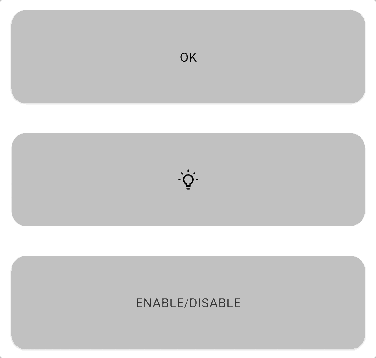
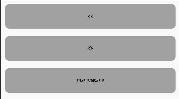
全体のレイアウトを定義する
次のような LinearLayout の中に OKボタン、電球ボタン、Enable/Disableボタンを配置したシンプルなレイアウトを作成します。
<?xml version="1.0" encoding="utf-8"?>
<LinearLayout xmlns:android="http://schemas.android.com/apk/res/android"
    xmlns:app="http://schemas.android.com/apk/res-auto"
    xmlns:tools="http://schemas.android.com/tools"
    android:layout_width="match_parent"
    android:layout_height="match_parent"
    android:orientation="vertical"
    tools:context=".MainActivity">

    <Button
        android:id="@+id/ok_button"
        android:layout_width="match_parent"
        android:layout_height="100dp"
        android:layout_margin="16dp"
        android:text="OK" />

    <ImageButton
        android:id="@+id/ng_image_button"
        android:layout_width="match_parent"
        android:layout_height="100dp"
        android:layout_margin="16dp"
        android:background="@drawable/background_selector"
        android:src="@drawable/drawable_selector" />

    <Button
        android:id="@+id/color_text_enable_button"
        android:layout_width="match_parent"
        android:layout_height="100dp"
        android:layout_margin="16dp"
        android:background="@drawable/background_selector"
        android:text="Enable/Disable" />
</LinearLayout>
OKボタンは色と背景が変わるようにする
OKボタンの Background には background_selector、TextColor には color_selector を設定してやります。これでテキストと背景が View の状態にあわせて変わるようになります。
    <Button
        android:id="@+id/ng_button"
        android:layout_width="100dp"
        android:layout_height="100dp"
        android:text="NG"
        android:textColor="@color/color_selector"
        android:background="@drawable/background_selector" />
電球ボタンはアイコンと背景が変わるようにする
電球ボタン の Background には background_selector、 src には drawable_selector を設定しています。これでテキストと画像が View の状態にあわて変わるようになります。
    <ImageButton
        android:id="@+id/ok_image_button"
        android:layout_width="100dp"
        android:layout_height="100dp"
        android:src="@drawable/drawable_selector"
        android:background="@drawable/background_selector" />
Disable/Enable ボタンに状態をトグルできるようにする。
また Disable と Enable が切り替わったときにどのように動作が変わるかも見たいので Disable/Enableボタンの Click 処理を追加し、状態をトグルできるようにしてやります。
class MainActivity : AppCompatActivity() {

    override fun onCreate(savedInstanceState: Bundle?) {
      super.onCreate(savedInstanceState)
      setContentView(R.layout.activity_main)
      color_text_enable_button.setOnClickListener {
          ok_button.isEnabled = !ok_button.isEnabled
          ng_image_button.isEnabled = !ng_image_button.isEnabled
      }
    }
}
おわりに
これでアプリをビルドしてみると、次のように動作します。
Click中 Enable中 Disable中などの状態ごとにリソースが変わっていますね。
作成したもの
本記事で作成したアプリは次のリポジトリで管理しています。
興味があれば見てみてください。