はじめに
DialogFragment の表示方法と Theme の変更方法を解説してみようと思います。本記事ではまずはじめにダイアログの表示方法について解説し、そのあとにダイアログの Theme の変更方法について解説しようと思います。ダイアログの表示方法に詳しい方は Theme の変更方法だけ見ていただいても有益な情報が得られるかと思います。
DialogFragment を表示する
はじめに DialogFragment を使ったダイアログの作成方法について解説します。
1. DialogFragment を継承したクラスを作成する
まず次のように DialogFragment を継承したクラス(NormalDialogFragment)を作成します。
class NormalDialogFragment : DialogFragment() {
    override fun onCreateView(
        inflater: LayoutInflater,
        container: ViewGroup?,
        savedInstanceState: Bundle?
    ): View? {
        return inflater.inflate(R.layout.dialog_fragment_normal, container,  false)
    }
}
2. DialogFragment で表示するレイアウトを変更する
上記で作成した DialogFragment では onCreateView で読み込んだ XML ファイルのレイアウトをダイアログに表示するようになっています。なので XML ファイルを編集して DialogFragment に表示するレイアウトを変更します。今回は次のような ConstraintLayout の中に TextView を配置したレイアウトを表示してみます。
<?xml version="1.0" encoding="utf-8"?>
<androidx.constraintlayout.widget.ConstraintLayout xmlns:android="http://schemas.android.com/apk/res/android"
    xmlns:app="http://schemas.android.com/apk/res-auto"
    android:layout_width="400dp"
    android:layout_height="300dp"
    android:background="#50ff0000">

    <TextView
        android:layout_width="300dp"
        android:layout_height="200dp"
        android:background="@color/white"
        android:gravity="center"
        android:text="@string/normal_dialog_fragment"
        app:layout_constraintBottom_toBottomOf="parent"
        app:layout_constraintEnd_toEndOf="parent"
        app:layout_constraintStart_toStartOf="parent"
        app:layout_constraintTop_toTopOf="parent" />

</androidx.constraintlayout.widget.ConstraintLayout>
3. DialogFragment を表示する
DialogFragment は生成したあとに show()を呼び出すだけで表示できます。
DialogFragment().show(fragmentManager, tag)
今回は MainActivity に配置した Button をタップしたときに DialogFragment を表示するようにします。次のようなレイアウトを定義して、MainActivity で Button をタップしたときに DialogFragment を生成して、show() を呼び出すようにしてやります。
<?xml version="1.0" encoding="utf-8"?>
<LinearLayout xmlns:android="http://schemas.android.com/apk/res/android"
    xmlns:app="http://schemas.android.com/apk/res-auto"
    xmlns:tools="http://schemas.android.com/tools"
    android:layout_width="match_parent"
    android:layout_height="wrap_content"
    android:layout_gravity="center"
    android:orientation="vertical"
    android:padding="8dp"
    tools:context=".MainActivity">

    <Button
        android:id="@+id/normal_dialog_fragment_button"
        android:layout_width="match_parent"
        android:layout_height="wrap_content"
        android:text="@string/normal_dialog_fragment" />
</LinearLayout>
class MainActivity : AppCompatActivity(R.layout.activity_main) {
    override fun onCreate(savedInstanceState: Bundle?) {
        super.onCreate(savedInstanceState)

        val normalDialogFragmentButton = findViewById<Button>(R.id.normal_dialog_fragment_button)
        normalDialogFragmentButton.setOnClickListener {
            // Activity で show を呼び出す場合には
            // 第1引数の fragmentManager に supportFragmentManager をセットしてやります。
            // 第2引数の tag は fragmentManager からタグ指定で Fragment を取得するためのものです。
            // なので第2引数の tag には任意の文字列をタグとして指定してあげればOKです。
            NormalDialogFragment().show(supportFragmentManager, "TAG")
        }
    }
}
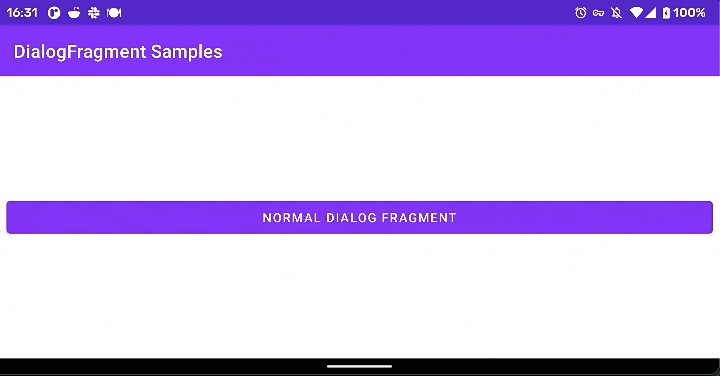
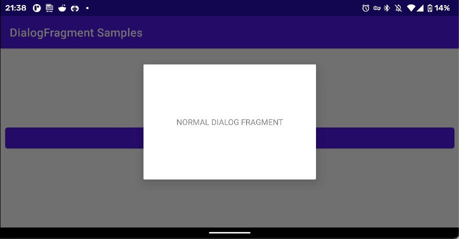
4. 動作を確認してみる
DialogFragment の動作を確認する
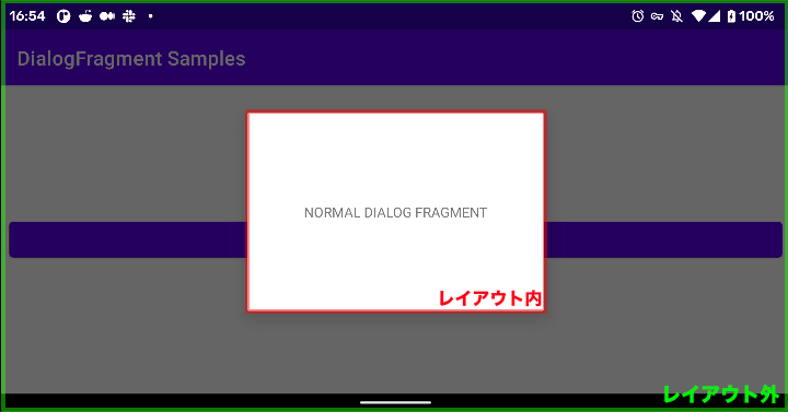
ここまで実装したらあとはアプリを起動して動作確認してみましょう。アプリを起動してボタンをタップすると次のような感じでダイアログが表示されます。
このように作成したレイアウトが中心に表示され、レイアウトの領域外は半透明の黒背景となります。
ちなみにこの半透明の黒背景をタップすることでダイアログを閉じれます。
(この表示や動作はカスタマイズできます、デフォルトでは上記の表示・動作するようになっています。)
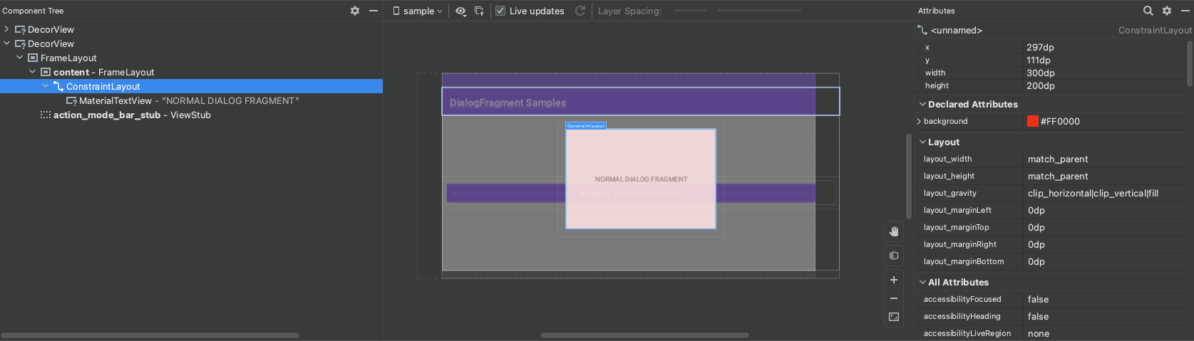
上手く表示できてそうだがルートビューの layout_width と layout_height が変わる
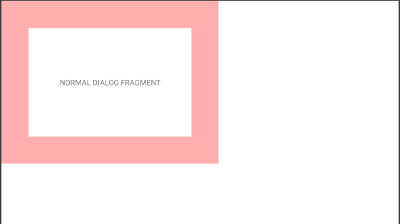
ダイアログが上手く表示できているかのように見えるのですが、よく見ると作成したレイアウトと異なっています。以下のように赤色背景が表示される想定でしたが、赤色背景が表示される領域が確保されていないため表示できていません。
| XMLファイルに定義したもの | 実際に表示されたもの |
|---|---|
|
 |
なぜこのような仕組みになっているかまではわからないのですが DialogFragment が XML ファイルから View を生成したあとルートビューである ConstraintLayout の layout_width と layout_height に match_parent が設定されるためです。ですので DialogFragment ではルートビューの layout_width や layout_height でダイアログの大きさを調整しようとすると上手くいかないので注意が必要です。
DialogFragment の Theme を変更する
先程はシンプルな DialogFragment を表示してみましたが実際の開発ではもう少し手の混んだレイアウトのDialogFragment を実装するかなと思います。DialogFragment では Theme を変更することで表示や動作を変更できるようになっています。今回はよく使いそうな Theme をまとめて紹介します。
変更方法
Theme は onCreate で setStyle を呼び出すことで変更できます。
今回は以下のクラスとレイアウトを用意し Theme を変更していきます。
class NormalDialogFragment : DialogFragment() {
    override fun onCreateView(
        inflater: LayoutInflater,
        container: ViewGroup?,
        savedInstanceState: Bundle?
    ): View? {
        return inflater.inflate(R.layout.dialog_fragment_normal, container,  false)
    }

    override fun onCreate(savedInstanceState: Bundle?) {
        super.onCreate(savedInstanceState)
        setStyle(getStyle(), getThemeResId())
    }

    private fun getStyle(): Int = STYLE_NORMAL
    private fun getThemeResId(): Int = R.style.Theme_AppCompat_Dialog
}
<?xml version="1.0" encoding="utf-8"?>
<androidx.constraintlayout.widget.ConstraintLayout xmlns:android="http://schemas.android.com/apk/res/android"
    xmlns:app="http://schemas.android.com/apk/res-auto"
    android:layout_width="match_parent"
    android:layout_height="match_parent"
    android:background="#50ff0000">

    <TextView
        android:layout_width="300dp"
        android:layout_height="200dp"
        android:background="@color/white"
        android:gravity="center"
        android:text="@string/normal_dialog_fragment"
        app:layout_constraintBottom_toBottomOf="parent"
        app:layout_constraintEnd_toEndOf="parent"
        app:layout_constraintStart_toStartOf="parent"
        app:layout_constraintTop_toTopOf="parent" />

</androidx.constraintlayout.widget.ConstraintLayout>
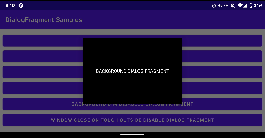
ダイアログの背景色を変える
    <style name="Theme.Sample.BlackDialog" parent="Theme.MaterialComponents.Light.Dialog">
        <item name="android:windowBackground">@android:color/black</item>
    </style>
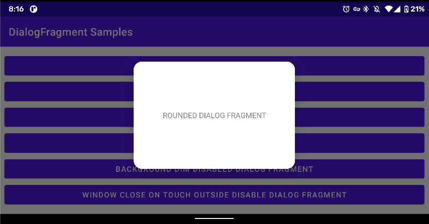
角丸のダイアログを表示する
    <style name="Theme.Sample.RoundedDialog" parent="Theme.MaterialComponents.Light.Dialog">
        <item name="dialogCornerRadius">16dp</item>
    </style>
領域外の半透明の黒背景を非表示にする
    <style name="Theme.Sample.BackgroundDimDisabledDialog" parent="Theme.MaterialComponents.Light.Dialog">
        <item name="android:backgroundDimEnabled">false</item>
    </style>
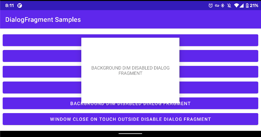
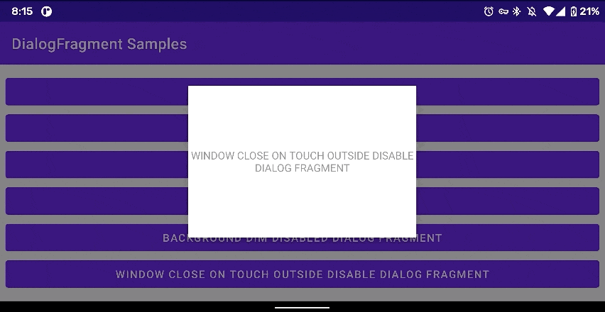
外部タッチで消えないダイアログを表示する
    <style name="Theme.Sample.WindowCloseOnTouchOutsideDisableDialogFragment" parent="Theme.MaterialComponents.Light.Dialog">
        <item name="android:windowCloseOnTouchOutside">false</item>
    </style>
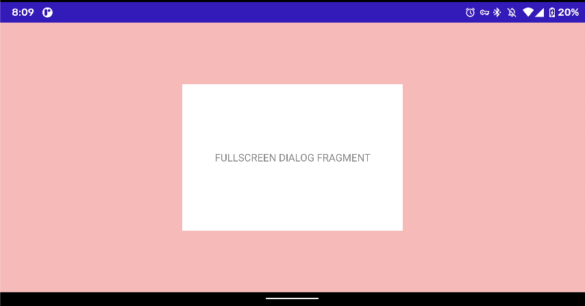
画面全体(フルスクリーン)にダイアログを表示する
    <style name="Theme.Sample.FullScreenDialog" parent="Theme.MaterialComponents.Light.Dialog">
        <item name="android:windowBackground">@android:color/white</item>
        <item name="android:windowIsFloating">false</item>
    </style>
おわりに
DialogFragment を使う際には本記事で紹介したポイントを押させておけばおおよそのダイアログを作成できると思います。ポイントを押さえれば難しいことはないのでサクッとダイアログを実装できるようになりましょう。今回作成した DialogFragment はこちらです。興味があるかたはこちらのリポジトリを確認してください。
