Pythonデータ可視化に使えるseabornのメソッド25個を一挙紹介します。また最後に、データ分析の流れを経験できるオススメ学習コンテンツを紹介したので、ご参考ください。
必要なライブラリ
import pandas as pd
import seaborn as sns
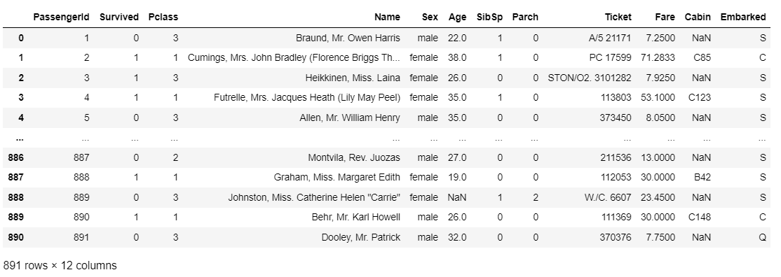
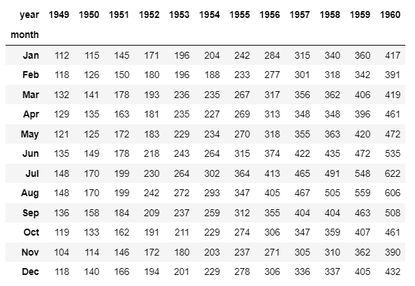
利用データ
可視化の具体例のサンプルデータは、下記の2つを使っています。
# https://www.kaggle.com/c/titanic/data?select=train.csv
df_1 = pd.read_csv("train.csv")
df_2 = sns.load_dataset("flights").pivot("month", "year", "passengers")
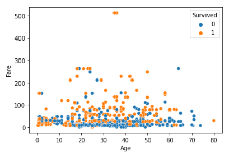
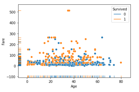
scatterplot(散布図)
sns.scatterplot(x="Age", y="Fare", hue="Survived", data=df_1)
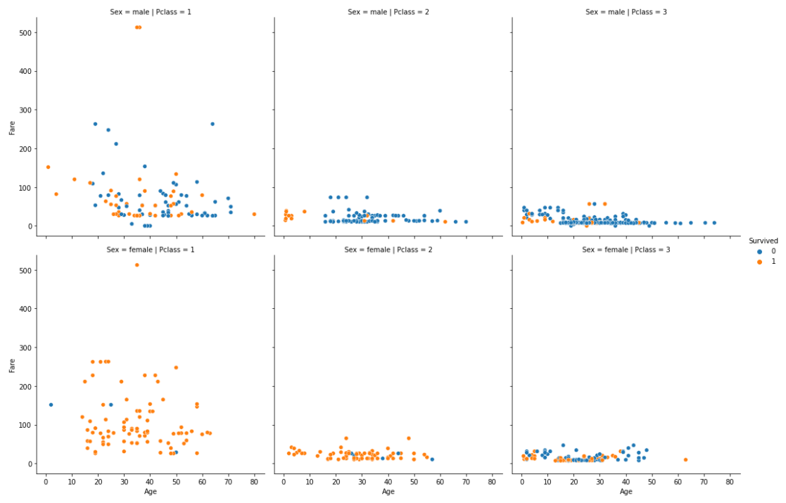
relplot(scatterplotを複数配置できるグラフ)
sns.relplot(x="Age", y="Fare", hue="Survived", col="Pclass", row="Sex", data=df_1)
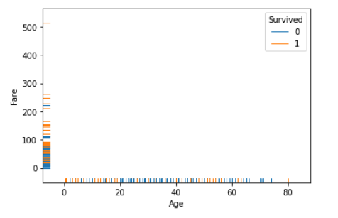
rugplot(軸へのプロット)
単体ではなく、重ねて使うことが多い。
sns.rugplot(x="Age", y="Fare", hue="Survived", data=df_1)
sns.scatterplot(x="Age", y="Fare", hue="Survived", data=df_1)
sns.rugplot(x="Age", y="Fare", hue="Survived", data=df_1)
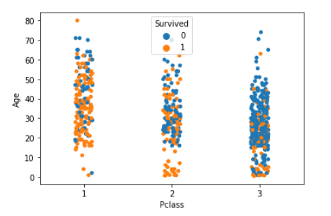
stripplot(1変数の散布図)
sns.stripplot(x="Pclass", y="Age", hue="Survived", data=df_1)
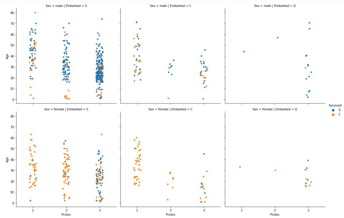
catplot(stripplotを複数配置できるグラフ)
sns.catplot(x="Pclass", y="Age", hue="Survived", col="Embarked", row="Sex", data=df_1)
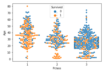
swarmplot(点を重ねない1変数の散布図)
sns.swarmplot(x="Pclass", y="Age", hue="Survived", data=df_1)
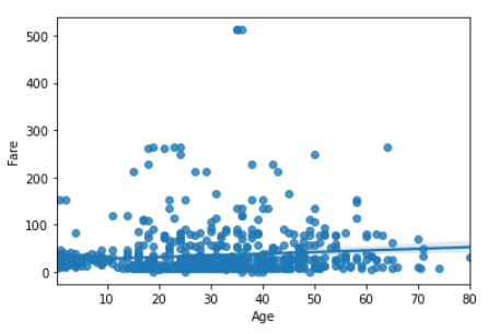
regplot(線形回帰モデルのグラフ)
sns.regplot(x="Age", y="Fare", data=df_1)
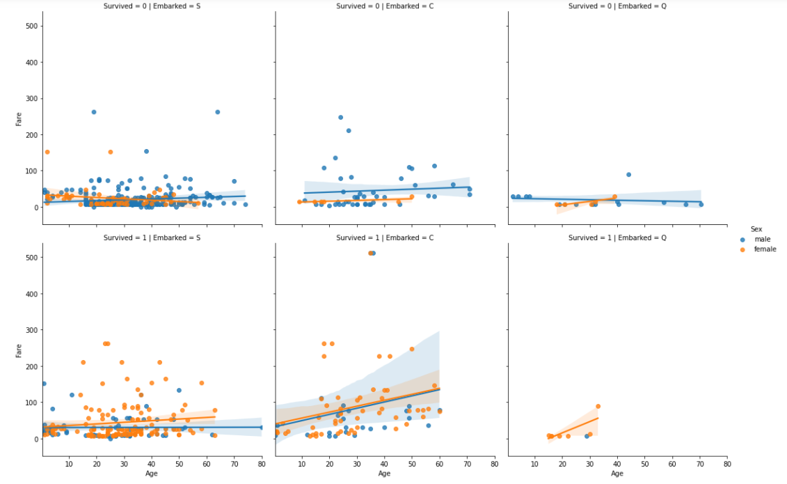
lmplot(regplotを複数配置できるグラフ)
sns.lmplot(x="Age", y="Fare", col="Embarked", row="Survived", hue="Sex", data=df_1)
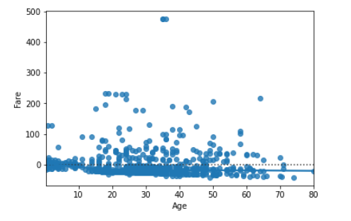
residplot(残差のプロット)
※y=0が線形回帰線で、そこからどのくらい離れているかを示すグラフ
sns.residplot(x="Age", y="Fare", data=df_1)
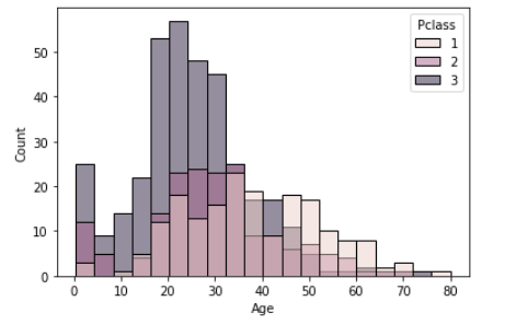
histplot(ヒストグラム)
sns.histplot(df_1, x="Age", hue="Pclass")
displott(histplotを複数配置できるグラフ)
sns.displot(df_1, x="Age", col="Pclass", row="Survived")

distplot(histplotと同じようなもの)
非推奨のため割愛
ecdfplot(累積分布関数)
sns.ecdfplot(x="Age", data=df_1)

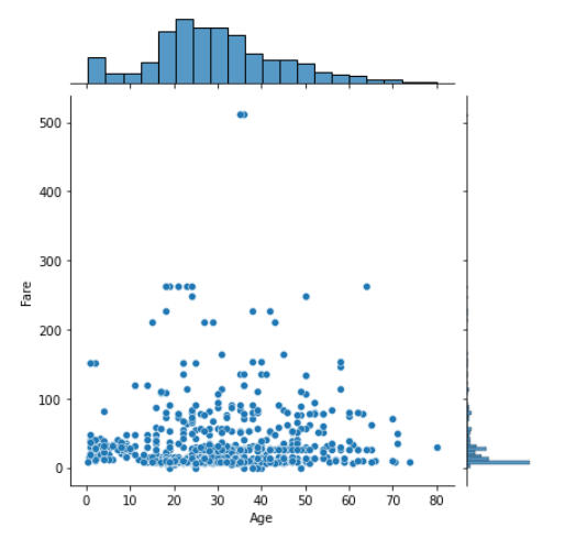
jointplot(ヒストグラムつき散布図)
sns.jointplot(x="Age", y="Fare", data=df_1)
kdeplot(カーネル密度推定を使用した分布)
sns.kdeplot(x="Age", hue="Survived", data=df_1)

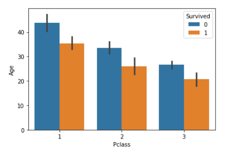
barplot(棒グラフ)
sns.barplot(x="Pclass", y = "Age", hue="Survived", data=df_1)
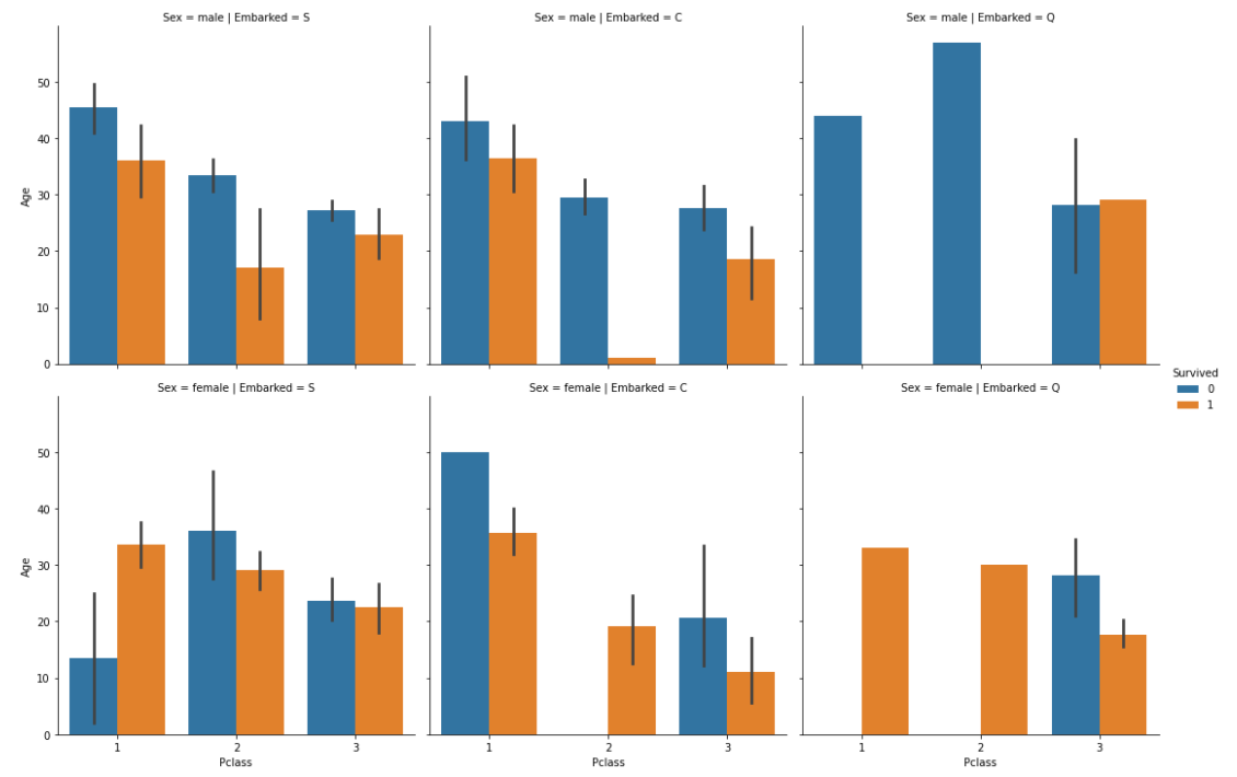
catplot(barplotを複数配置できるグラフ)
sns.catplot(kind="bar", x="Pclass", y="Age", hue="Survived", col="Embarked", row="Sex", data=df_1)
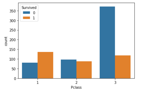
countplot(カテゴリ別のカウントグラフ)
sns.countplot(x="Pclass", hue="Survived", data=df_1)
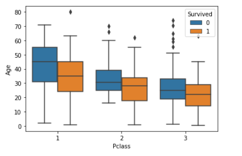
boxplot(箱ひげ図)
sns.boxplot(x="Pclass", y="Age", hue="Survived", data=df_1)
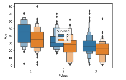
boxenplot(箱ひげ図の強化版)
sns.boxenplot(x="Pclass", y="Age", hue="Survived", data=df_1)
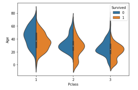
violinplot(バイオリン図)
sns.violinplot(x="Pclass", y="Age", hue="Survived", split=True, data=df_1)
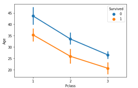
pointplot(平均値と信頼区間のグラフ)
sns.pointplot(x="Pclass", y="Age", hue="Survived", data=df_1)
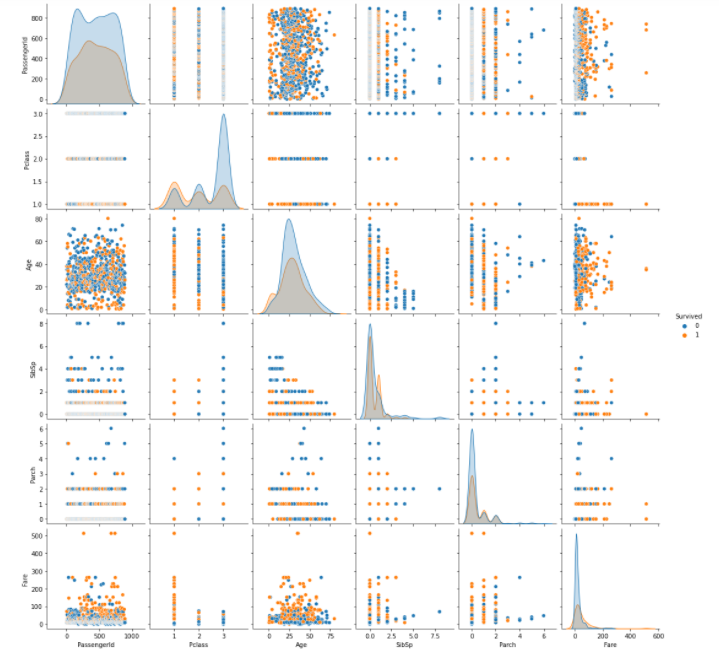
pairplot(全パターンの相関グラフ)
sns.pairplot(df_1, hue="Survived")
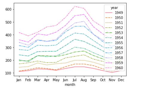
lineplot(折れ線グラフ)
sns.lineplot(data=df_2)
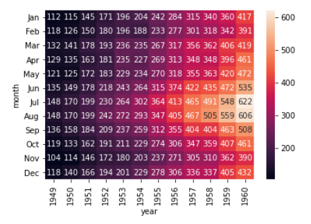
heatmap(ヒートマップ)
sns.heatmap(df_2, annot=True, fmt='d')
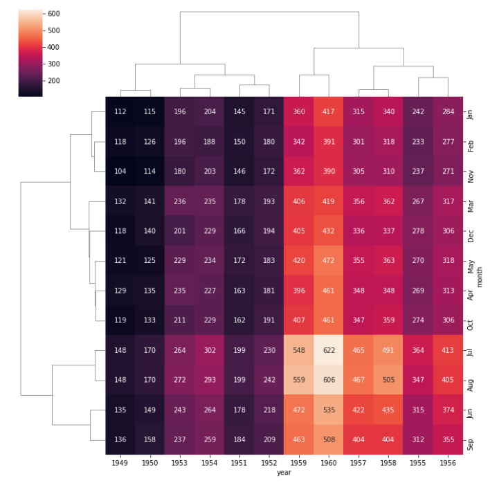
clustermap(クラスターマップ)
sns.clustermap(df_2, annot=True, fmt='d')
【最後に】データ分析手法のコンテンツ(私が制作したもの)
初心者向けのPythonデータ分析学習コンテンツ(私が制作したもの)です。データの取り込み、前処理から可視化の流れを学習できる教材です。考察イメージまで記載されているのでオススメです。一部無料公開されているので、ご興味あればお試しください。
参考サイト
https://seaborn.pydata.org/index.html
https://pythondatascience.plavox.info/