flexってスマホサイトや最新のブラウザ対応だったらめちゃ便利だけど業務だとそうは言ってられない...
古いIE9~も対応せねばだったりAndroid2.3もサポートだったりというケースがあるのでまとめておく٩( 'ω' )و
IE8以下などはfloatやtableを検討するのもありかもね(´Д`。)
flexのサポート範囲
https://caniuse.com/#search=flex
基本形
まずは基本となるベースを作っておく(色とサイズは適当)
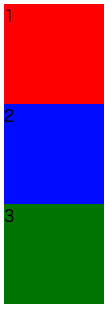
html
<body>
  <div class="wrap">
    <div style="background-color: red;">1</div>
    <div style="background-color: blue;">2</div>
    <div style="background-color: green">3</div>
  </div><!-- /.wrap -->
</body>
css
.wrap div{
  width: 100px;
  height: 100px;
}
display: flex
親要素(.wrap)につけることで子要素の横並びレイアウトが簡単にできます!
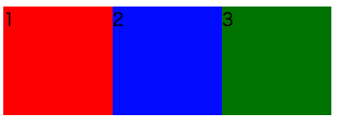
css
.wrap{
  display: -webkit-box;  //この辺が
  display: -webkit-flex; //Android2.3~とか
  display: -ms-flexbox; //IE9~用
  display: flex; //最新のブラウザのみであればflexだけでもよいかも
}
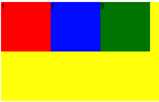
align-items
垂直方向の考え方
デフォルトは上揃え、左揃えになっている。
※白背景だとわかりにくかったため背景を黄色にしました。
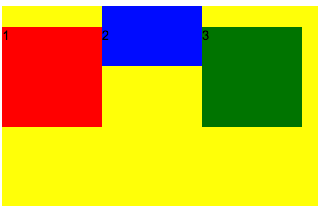
flex-start(上揃え)
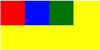
css
    -webkit-box-align: start;
    -webkit-align-items: flex-start;
    -ms-flex-align: start;
    align-items: flex-start;
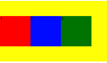
flex-end(下揃え)
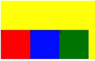
css
    -webkit-box-align: end;
    -webkit-align-items: flex-end;
    -ms-flex-align: end;
    align-items: flex-end;
center(中央寄せ)
css
    -webkit-box-align: center;
    -webkit-align-items: center;
    -ms-flex-align: center;
    align-items: center;
baseline
高さが異なる要素でも文字のベースラインを合わせることができる!
css
    -webkit-box-align: baseline;
    -webkit-align-items: baseline;
    -ms-flex-align: baseline;
    align-items: baseline;
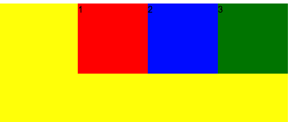
justify-content
水平方向の考え方
デフォルトは左上揃えになっている。
flex-start(左揃え)
css
    -webkit-box-pack: start;
    -webkit-justify-content: flex-start;
    -ms-flex-pack: start;
    justify-content: flex-start;
flex-end(右揃え)
css
    -webkit-box-pack: end;
    -webkit-justify-content: flex-end;
    -ms-flex-pack: end;
    justify-content: flex-end;
center(中央揃え)

css
    -webkit-box-pack: center;
    -webkit-justify-content: center;
    -ms-flex-pack: center;
    justify-content: center;
space-between(均等に間隔を空ける)
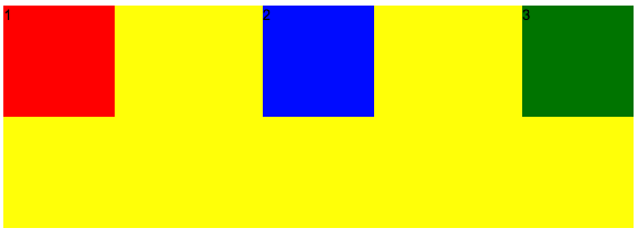
css
    -webkit-box-pack: justify;
    -webkit-justify-content: space-between;
    -ms-flex-pack: justify;
    justify-content: space-between;
space-around(均等に間隔を空ける)
左右の端にも半分ずつ間隔が空いているver
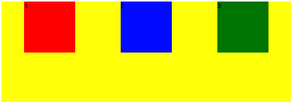
css
    -webkit-justify-content: space-around;
    -ms-flex-pack: distribute;
    justify-content: space-around;
長くなったので残りはdisplay:flex系をまとめる②にてまとめる(「゚ー゚)ドレドレ..